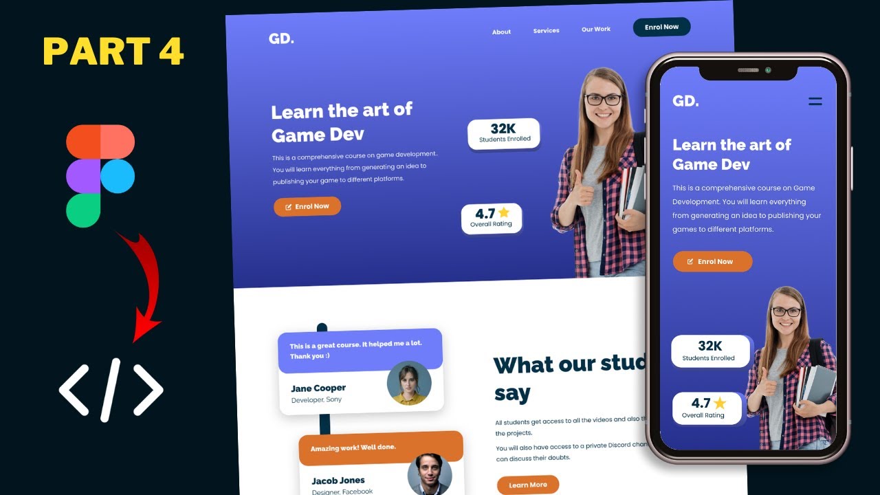
Figma To Real Website | Responsive Homepage | HTML, CSS & JavaScript | Part 12
Summary
TLDRThis tutorial series guides viewers through converting a sigma design into a fully functional website using HTML, CSS, and JavaScript. The instructor demonstrates the responsive design on various devices, including mobile and iPad Pro, and provides a clean-up of the code for better efficiency. The video concludes with deploying the website using Netlify and customizing it with a subscription box. Viewers are encouraged to watch the entire playlist for a comprehensive understanding of the design process.
Takeaways
- 😀 The tutorial series focuses on converting a design into a functional website using HTML, CSS, and JavaScript.
- 🔧 The website's code has been completed and is displayed correctly in the Chrome browser, including all sections and responsive designs.
- 📱 Responsive design testing is done using the 'Toggle device toolbar' feature in Chrome's developer tools to ensure the website looks good on mobile devices.
- 🛠️ The tutorial includes a step-by-step guide to clean up and improve the CSS code for better efficiency and design consistency.
- 📝 CSS properties that are redundant, like font-family set in child elements when already defined in the parent, are removed to streamline the code.
- 🎨 The hero section's text color is centralized in the parent division to avoid repetition and simplify the CSS structure.
- ✨ Adjustments are made to the layout of achievement cards to improve the visual balance and alignment of text and images.
- 👌 Padding and alignment issues in input fields are addressed to ensure a better user experience across different devices.
- 📱 Media queries are utilized to adjust the padding of input fields specifically for mobile views, maintaining responsiveness.
- 🚀 The website is deployed using Netlify, a service that allows easy drag-and-drop deployment and updates.
- 🔄 The process of updating the live website is demonstrated, showing how to redeploy changes made to the source code.
Q & A
What is the main focus of the tutorial series presented in the script?
-The main focus of the tutorial series is to show how to convert a sigma design into a real website using HTML, CSS, and JavaScript.
What browser is used to demonstrate the website design in the video?
-The Chrome browser is used to demonstrate the website design.
How can viewers see the responsive design of the website on different devices?
-Viewers can see the responsive design by right-clicking on the browser, selecting 'Inspect', and then clicking on the 'Toggle device toolbar' button to simulate different devices.
What is the source code link mentioned in the script, and where can it be found?
-The source code link is provided in the description of the video for viewers to check out and follow along with the tutorial.
What is the first improvement suggested in the CSS file of the website?
-The first improvement suggested is to remove the redundant font family setting of 'Poppins' from elements where it has already been set in the body.
How does the script suggest optimizing the CSS for the hero section?
-The script suggests moving the color setting of white from the 'h1' and paragraph elements to their parent division, which is the hero section, to avoid redundancy.
What issue is identified with the achievement cards in the script, and how is it resolved?
-The issue identified is the redundant color and font family settings for the text and paragraph within the achievement cards. It is resolved by removing these settings and applying them to the parent division instead.
What changes are made to the CSS for the image and text alignment within the achievement cards?
-The changes include setting the flex to one for both the 's3' and the image to ensure they have the same width, reducing the image height, and adding negative margin left to align the image correctly with the text.
How is the padding issue with the input field in the app section addressed in the script?
-The padding issue is addressed by specifying more padding on the right side of the input field to prevent the text from going under the button.
What service is used to deploy the website in the script, and how is it used?
-Netlify is used to deploy the website. The process involves signing up or logging in with a GitHub account, going to 'Sites', and dragging and dropping the site folder to deploy it.
How can viewers update the deployed website, as demonstrated in the script?
-Viewers can update the website by making changes to the local source code and then re-deploying the updated folder to the Netlify account.
Outlines

Этот раздел доступен только подписчикам платных тарифов. Пожалуйста, перейдите на платный тариф для доступа.
Перейти на платный тарифMindmap

Этот раздел доступен только подписчикам платных тарифов. Пожалуйста, перейдите на платный тариф для доступа.
Перейти на платный тарифKeywords

Этот раздел доступен только подписчикам платных тарифов. Пожалуйста, перейдите на платный тариф для доступа.
Перейти на платный тарифHighlights

Этот раздел доступен только подписчикам платных тарифов. Пожалуйста, перейдите на платный тариф для доступа.
Перейти на платный тарифTranscripts

Этот раздел доступен только подписчикам платных тарифов. Пожалуйста, перейдите на платный тариф для доступа.
Перейти на платный тарифПосмотреть больше похожих видео

Figma To Real Website | Responsive Homepage | HTML, CSS & JavaScript | Part 3

Figma To Real Website | Responsive Homepage | HTML, CSS & JavaScript | Part 2

Figma To Real Website | Responsive Homepage | HTML, CSS & JavaScript | Part 4

Figma To Real Website | Responsive Homepage | HTML, CSS & JavaScript | Part 1

Figma To Real Website | Responsive Homepage | HTML, CSS & JavaScript | Part 11

Figma To Real Website | Responsive Homepage | HTML, CSS & JavaScript | Part 10
5.0 / 5 (0 votes)
