Figma To Real Website | Responsive Homepage | HTML, CSS & JavaScript | Part 1

GTCoding
9 Dec 202104:18

Summary

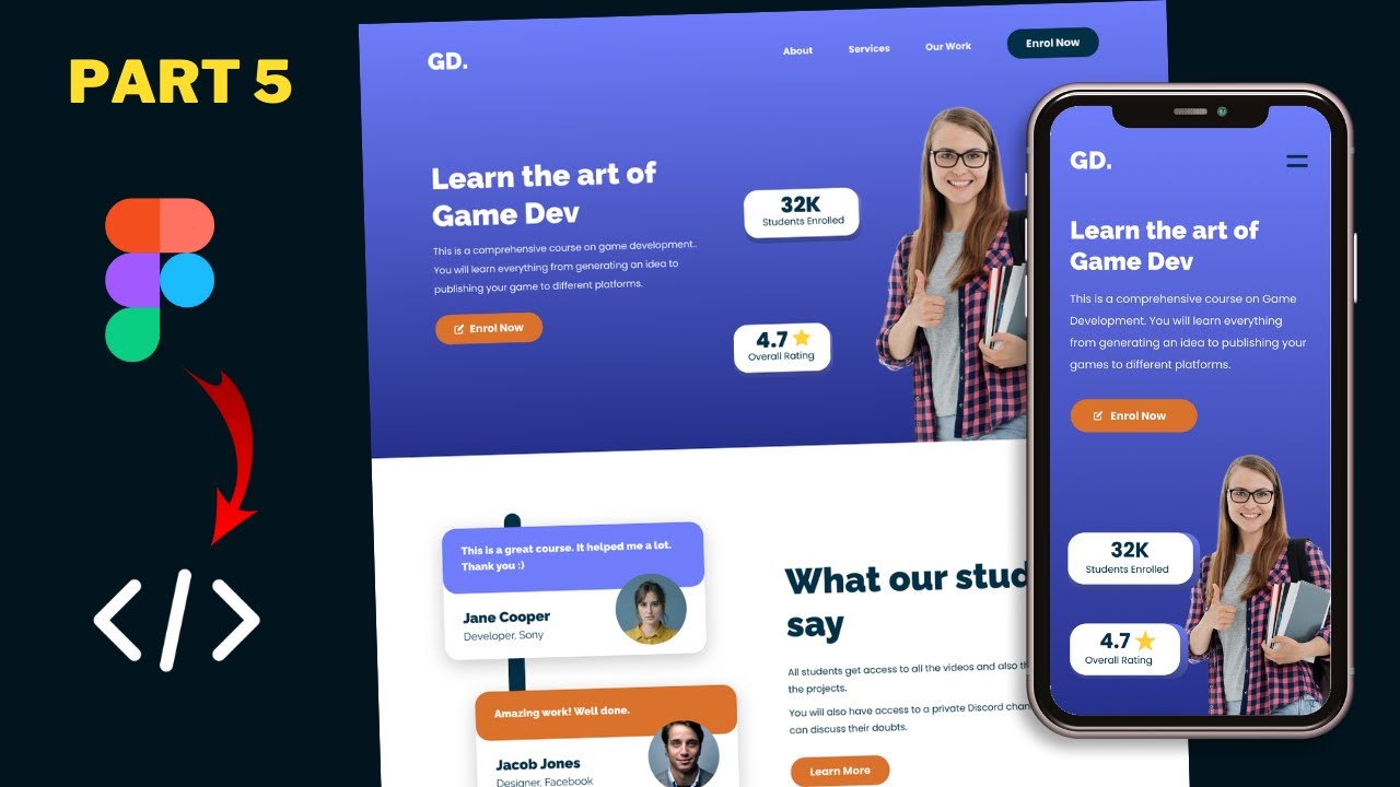
TLDRThis tutorial series will guide you through converting a Figma design into a fully functional website using HTML, CSS, and JavaScript. The instructor provides a link to the Figma file for reference and showcases the design's responsiveness across desktop, tablet, and smartphone versions. Viewers will see the transition from the Figma design to the completed website, including the hero section, menu items, and footer layout, ensuring a seamless user experience across all devices.

Takeaways

  • 🌐 This tutorial series will guide viewers through converting a Figma design into a functional website using HTML, CSS, and JavaScript.
  • πŸ”— The link to the Figma file will be provided in the video description for reference and to follow along with the tutorial.
  • 🎨 The video starts with an introduction to the color palette and components required for the website design.
  • πŸ–₯️ The design includes different layouts for desktop, tablet, and smartphone versions, showcasing responsiveness.
  • πŸ“² On the smartphone version, menu items are replaced with a menu icon for a more compact design.
  • πŸ”„ The layout for the footer changes between the tablet and smartphone versions, adapting to screen size.
  • πŸ“Ί A completed version of the website is shown, demonstrating the final outcome of following the tutorial series.
  • πŸ” The tutorial will cover the design of various sections, including a hero section, menu items, and footer.
  • πŸ› οΈ Viewers will learn to implement design changes for different devices, such as an iPad Pro and a Pixel 2 XL.
  • πŸ”„ The menu icon functionality is demonstrated, showing how it works across different devices and screen sizes.
  • πŸ“ The video encourages viewers to ask questions in the comments and to subscribe for updates on the tutorial series.

Q & A

  • What is the main focus of this tutorial series?

    -The main focus of this tutorial series is to convert a sigma design into a real website using HTML, CSS, and JavaScript.

  • Where can viewers find the Figma file mentioned in the video?

    -The Figma file link is provided in the description of the video.

  • Is there a separate video that teaches how to create the sigma design from scratch?

    -Yes, there is a video on how to design the sigma file from scratch, and the link to it is in the video description.

  • What does the first frame of the sigma file contain?

    -The first frame of the sigma file contains the color palette and all the necessary components for the website design.

  • How does the layout change from the desktop version to the tablet version in the sigma design?

    -In the tablet version, there is a slight change in the layout, with a two-column layout for the footer.

  • What is different about the smartphone version of the sigma design compared to the desktop and tablet versions?

    -In the smartphone version, the menu items are not displayed on the side; instead, there is a menu icon that, when clicked, reveals the menu.

  • What does the completed version of the website look like after the tutorial series?

    -The completed version of the website has a hero section and other elements that closely resemble the sigma design, with different styling for menu items when scrolling down.

  • How does the website layout differ on an iPad Pro compared to a desktop?

    -On an iPad Pro, the layout is adjusted for a tablet screen, with a different layout for the testimonial section and a two-column layout for the footer.

  • What changes occur in the layout when viewing the website on an iPad?

    -On an iPad, the menu items are not displayed on the side, and a menu icon is used to reveal the menu when clicked.

  • How is the mobile version of the website different from the desktop and tablet versions?

    -In the mobile version, the layout is further adjusted for a smaller screen, with a menu icon for navigation and a one-column layout for the footer.

  • What is the next step in the tutorial series after the introduction video?

    -The next step is to set everything up and start designing the website as per the sigma design using HTML, CSS, and JavaScript.

Outlines

00:00

πŸ“š Introduction to Website Conversion Tutorial

This paragraph introduces a tutorial series aimed at converting a sigma design into a functional website using HTML, CSS, and JavaScript. The instructor provides a link to the Figma file for reference and suggests watching a previous video for designing the sigma file from scratch. The content includes an overview of the design components, color palette, and layout variations for desktop, tablet, and smartphone versions. The paragraph concludes with a sneak peek at the completed website, showcasing the hero section, menu items, and footer in different device views.

Mindmap

Keywords

πŸ’‘Sigma Design

Sigma Design refers to a comprehensive design concept or blueprint for a website or application, typically created using design software like Figma. It includes layout, color schemes, typography, and interactive elements. In the video, the sigma design is the starting point for converting a digital mockup into a functional website, and the speaker mentions leaving a link to the Figma file for viewers to follow along.

πŸ’‘HTML

HTML, or HyperText Markup Language, is the standard markup language for creating web pages and web applications. It is used to structure content on the web and is one of the core technologies of the internet. In the context of the video, HTML will be used to give structure to the website, defining elements like headers, paragraphs, and lists.

πŸ’‘CSS

CSS stands for Cascading Style Sheets, a stylesheet language used for describing the presentation of a document written in HTML or XML. It includes layout, colors, and animations, and is essential for making websites visually appealing. The video script mentions using CSS to style the website, ensuring it matches the sigma design's aesthetic.

πŸ’‘JavaScript

JavaScript is a high-level, interpreted programming language commonly used for enhancing web pages with interactive elements. It can manipulate web page elements dynamically and is a key technology for creating responsive and interactive websites. In the video, JavaScript will be used to add functionality to the website, such as responsive menus and interactive sections.

πŸ’‘Figma

Figma is a cloud-based interface design tool and digital design platform where designers can create, collaborate, and share designs. It is mentioned in the video as the software used to create the sigma design file, which will be the basis for the website conversion process.

πŸ’‘Color Palette

A color palette in design refers to a set of colors that work harmoniously together and are used to create a consistent look and feel. In the video, the color palette is part of the sigma design and will be translated into the website's color scheme using CSS.

πŸ’‘Components

In web design, components refer to reusable pieces of the UI, such as buttons, forms, and navigation menus. The script mentions having all the necessary components for the design, which will be implemented in the website using HTML and styled with CSS.

πŸ’‘Responsive Design

Responsive design is an approach to web design that makes web pages render well on different devices and window or screen sizes. The video script discusses how the website will adapt its layout for desktop, tablet, and smartphone versions, showcasing the importance of responsive design in modern web development.

πŸ’‘Menu Icon

A menu icon, often represented by three horizontal lines (hamburger icon), is a UI element used to trigger a navigation menu, especially on mobile devices where screen space is limited. The script describes how the menu icon functions in the smartphone version of the website, indicating a key aspect of mobile-friendly design.

πŸ’‘Layout

Layout in web design refers to the arrangement of text, images, and other elements on a webpage. The video script describes different layouts for the website's footer and other sections, adapting to various screen sizes to ensure a good user experience.

πŸ’‘Hero Section

The hero section is a prominent part of a webpage, often the first thing users see, designed to attract attention and convey the main message or call to action. In the video, the hero section is mentioned as looking almost the same as in the sigma design, indicating its importance in the final website's appearance.

Highlights

Introduction to a tutorial series on converting a Figma design into a real website using HTML, CSS, and JavaScript.

Link to the Figma file provided in the video description for viewers to follow along.

A brief overview of the color palette and components needed for the website design.

Demonstration of the desktop version layout differences compared to tablet and smartphone versions.

Explanation of the menu icon functionality and layout changes in the smartphone version.

Showcase of the completed website project, highlighting the similarity to the Figma design.

Description of the hero section and its styling consistency with the design mockup.

Illustration of the menu items' different styling when the page is scrolled down.

Presentation of the website's sections and their alignment with the Figma design.

Introduction of the 'Get Our App' section and its placement within the website layout.

Display of the footer with a two-column layout for the tablet version.

Use of the browser's developer tools to inspect and toggle device toolbar for responsive design testing.

Observation of layout adjustments for the testimonial and course sections on the tablet version.

Demonstration of the menu icon and responsive menu display on an iPad.

Inspection of the mobile version on a Pixel 2 XL device, emphasizing the menu icon and one-column footer layout.

Assurance that the final design will be created using HTML, CSS, and JavaScript.

Announcement of the upcoming tutorial steps, starting with setup and design initiation.

Encouragement for viewers to ask questions in the comments and to like and subscribe for updates.

Transcripts

play00:00

hi everybody welcome to gt coding in

play00:01

this tutorial series we're going to

play00:02

convert this sigma design into a real

play00:05

website using html css and javascript

play00:08

and i will leave the link of the figma

play00:09

file in the description of this video so

play00:11

you can go ahead and download it and you

play00:13

can just follow along with me now this

play00:15

video is just an introduction to our

play00:16

tutorial series so let's get started

play00:19

[Music]

play00:24

all right here we can see we have this

play00:26

sigma file and i have a video on how to

play00:28

design all of this from scratch so if

play00:30

you want to learn how to create this

play00:32

sigma design from scratch you can watch

play00:34

that video i will leave the link in the

play00:35

description of this video now here we

play00:37

can see in the first frame we have the

play00:39

color palette of our website and then we

play00:41

have all the components that we need in

play00:42

our design and if you scroll down we can

play00:44

see that we have the desktop version on

play00:46

the left this is how it looks

play00:49

and then we have the tablet version and

play00:52

we have a slight change in

play00:54

the layout

play00:58

here we can see we have this two column

play00:59

layout for our footer

play01:01

and then we have the smartphone version

play01:03

so this is how it looks now for the

play01:04

smartphone version we don't have these

play01:06

menu items displayed over here instead

play01:08

we have this menu icon and if i click on

play01:10

this we're going to see this menu over

play01:12

here

play01:13

and if we scroll down we can see that we

play01:14

have a different layout for our

play01:16

smartphone version

play01:17

and for the footer we have a one column

play01:19

layout so this is our sigma design now

play01:22

let me show you the completed version of

play01:24

our real website all right this is our

play01:26

completed project so this is how it's

play01:28

gonna look after the tutorial series is

play01:30

finished and here we can see we have

play01:32

this hero section over here and it looks

play01:35

almost the same as the sigma design and

play01:37

if you scroll down we can see that we

play01:39

have all the other elements over here

play01:41

and we also have a different styling for

play01:43

these menu items over here when we

play01:45

scroll down so here we can see this is

play01:46

the default design and if we scroll down

play01:50

we have a different styling

play01:53

and

play01:54

here we can see all these

play01:56

sections are displayed just like we have

play01:58

in our sigma design and here we have the

play02:01

get our app section

play02:02

and then we have the footer over here

play02:04

right now let me show you the tablet

play02:06

version so just right click over here

play02:08

and click on inspect

play02:11

and let's click on this button called

play02:13

toggle device toolbar

play02:16

all right this is how it's going to look

play02:17

on an ipad pro and if you scroll down

play02:20

we can see all these elements over here

play02:23

and we have this different layout for

play02:25

this testimonial section and if you

play02:27

scroll down we have the course section

play02:30

then we have the app section and then we

play02:32

have the footer in

play02:33

two column layout all right now let's go

play02:35

ahead and check out a different device

play02:38

so let's click on this

play02:39

drop down and let's select ipad

play02:42

and here we can see for the ipad we have

play02:44

a slightly smaller screen and here we

play02:47

can see we don't have the menu items

play02:49

displayed over here but we have this

play02:50

menu icon and if i click on that

play02:52

we have the menu displayed over here and

play02:54

if i click on this close button it goes

play02:56

back and if you scroll down we can see

play02:58

that everything looks all right

play03:01

right now let's check out the mobile

play03:02

version so let's click on this

play03:04

drop down and let's select a device from

play03:06

here let's select pixel to excel

play03:09

and this is how it will look on a pixel

play03:11

2 xl device so here also we have this

play03:14

menu icon and if i click on that

play03:17

we have the menu displayed over here and

play03:18

if i click on the close button

play03:20

the menu goes back

play03:22

so let's scroll down and here we can see

play03:24

all these elements

play03:26

and it is looking just like the figma

play03:28

design

play03:30

and then we have this footer over here

play03:32

with a one column layout

play03:34

so everything is looking all right

play03:36

so this is what we're going to design in

play03:38

this tutorial series using html css and

play03:41

javascript

play03:42

all right so this was just an

play03:44

introduction of this tutorial series

play03:46

from the next video we will set

play03:48

everything up and we will start

play03:49

designing it alright so that's it for

play03:51

this video if you have any doubts you

play03:52

can ask in the comments below and if you

play03:54

like this video please click on the like

play03:56

button and subscribe to this channel to

play03:57

get the latest video updates thanks a

play03:59

lot for watching have a nice day

play04:03

[Music]

play04:18

you

Rate This
β˜…
β˜…
β˜…
β˜…
β˜…

5.0 / 5 (0 votes)

Related Tags
Web DevelopmentFigma DesignHTML TutorialCSS StylingJavaScriptResponsive DesignMobile LayoutTablet ViewDesktop VersionUI DesignCoding Tutorial