Figma To Real Website | Responsive Homepage | HTML, CSS & JavaScript | Part 10

GTCoding
30 Dec 202112:26

Summary

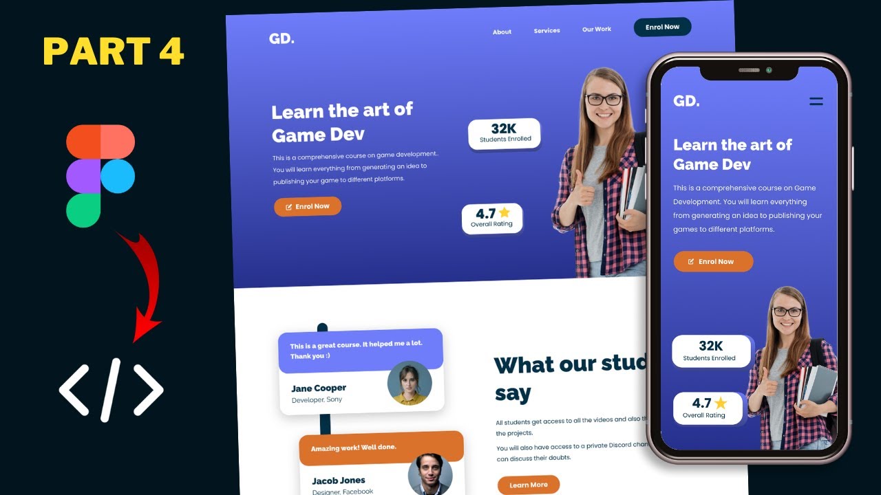
TLDRThis tutorial video guides viewers through the process of converting a sigma design into a responsive website using HTML, CSS, and JavaScript. The instructor demonstrates how to adjust the design for different devices, including creating a media query for screens less than 800 pixels wide, hiding the navigation menu, and adding a mobile-friendly menu icon. The video also covers styling the mobile navigation, implementing a 'scrolled' class for navigation changes on scroll, and using JavaScript to toggle the mobile menu's visibility. The tutorial concludes with testing the mobile menu's functionality across devices.

Takeaways

  • πŸ“± We are converting a Figma design into a real website using HTML, CSS, and JavaScript.
  • πŸ’» The design for the desktop and iPad Pro versions is complete.
  • πŸ“ Next step: creating a media query for screen sizes less than 800 pixels.
  • πŸ”„ For widths less than 800 pixels, the navigation menu will be replaced with an icon.
  • πŸ”§ A new mobile navigation menu will be created with a logo and menu icon.
  • πŸ–ΌοΈ In the HTML, the existing nav element is hidden and a new nav element for mobile is created.
  • βš™οΈ The mobile nav is styled in CSS to be responsive and match the design.
  • πŸ–±οΈ JavaScript is used to add and remove a 'scrolled' class for different styles based on scroll position.
  • πŸ“‚ Mobile menu items are created in HTML and styled in CSS.
  • πŸš€ The active class is toggled via JavaScript to show and hide the mobile menu on click.

Q & A

  • What is the main focus of the tutorial series mentioned in the script?

    -The main focus of the tutorial series is to convert a sigma design into a real website using HTML, CSS, and JavaScript.

  • What versions of the website design have been completed before this video?

    -The desktop version and the iPad Pro version of the website design have been completed before this video.

  • What is the purpose of creating a media query for size less than 800 pixels?

    -The purpose of creating a media query for size less than 800 pixels is to adapt the website design for smaller screens, such as mobile devices, by hiding the menu bar and adding a menu icon.

  • How does the tutorial handle the navigation menu for smaller screen sizes?

    -For smaller screen sizes, the tutorial suggests hiding the traditional navigation menu and replacing it with a menu icon that, when clicked, displays a mobile navigation menu.

  • What is the 'scrolled' class used for in the context of the navigation menu?

    -The 'scrolled' class is used to apply different styling to the navigation menu when the user scrolls down on the page, such as adding padding and a background color.

  • How is the 'scrolled' class added or removed in the mobile navigation menu?

    -The 'scrolled' class is added or removed in the mobile navigation menu using JavaScript, specifically by checking if the window has been scrolled more than 60 pixels.

  • What is the structure of the mobile navigation menu in the HTML file?

    -The mobile navigation menu in the HTML file consists of a 'nav' element with a class of 'mobile', containing a 'div' for the logo, a 'div' for the menu icon, and a 'div' for the mobile menu container with a class for the close icon and an unordered list for the menu items.

  • How is the mobile menu container initially positioned off-screen?

    -The mobile menu container is initially positioned off-screen by setting its left position to 100% in the CSS file.

  • What happens when the 'active' class is added to the mobile menu container?

    -When the 'active' class is added to the mobile menu container, the left position is reset to 0, bringing the menu into view, and the close icon becomes visible and clickable.

  • How are the menu icon and close icon referenced in the JavaScript file?

    -The menu icon and close icon are referenced in the JavaScript file using 'document.querySelector' with the appropriate class selectors, such as 'menu-icon' and 'mobile-menu-container close-icon'.

  • What event listeners are added to the menu icon and close icon, and what actions do they perform?

    -Click event listeners are added to both the menu icon and close icon. The menu icon's event listener adds the 'active' class to the mobile menu container, while the close icon's event listener removes the 'active' class, showing and hiding the mobile navigation menu respectively.

Outlines

00:00

πŸ› οΈ Website Design Adaptation for Smaller Screens

In this tutorial, the focus is on adapting a website design for screens smaller than 800 pixels using HTML, CSS, and JavaScript. The speaker has already completed the desktop and iPad Pro versions and now aims to create a media query for mobile devices. The tutorial begins with hiding the navigation menu and replacing it with an icon for smaller screens, similar to the mobile version. The speaker guides through adding a mobile navigation menu in the HTML file and styling it in the CSS file, including adding a scrolled class for different styling upon scrolling.

05:01

πŸ“± Creating Mobile Navigation Menu

The speaker proceeds to create a mobile navigation menu by adding a 'mobile menu container' in the HTML file, including a close icon and the same menu items as in the desktop version. The CSS styling is detailed, with the mobile menu container set to be fixed, full-screen, and initially off-screen. The close icon and list items are styled, and the unordered list is formatted without bullets and padding. The speaker also explains how to toggle the visibility of the mobile menu using JavaScript, adding and removing an 'active' class to show and hide the menu.

10:02

πŸ”„ Final Touches and Testing on Different Devices

The final part of the tutorial involves adding event listeners in JavaScript for the menu and close icons to control the display of the mobile navigation menu. The speaker tests the functionality, ensuring that the menu appears and disappears as expected. Adjustments are made to ensure compatibility with the iPad Pro version, hiding the mobile menu container when not needed. The tutorial concludes with a reminder to style the mobile version in the next video and an invitation for viewers to ask questions and subscribe for updates.

Mindmap

Keywords

πŸ’‘media query

A media query is a CSS technique used to apply styles based on the characteristics of the device, such as screen width. In the video, media queries are used to adjust the design for different screen sizes, like hiding the navigation menu when the width is less than 800 pixels.

πŸ’‘navigation menu

The navigation menu is a set of links typically displayed on a website to help users navigate to different sections. The video discusses how to hide the navigation menu on smaller screens and replace it with an icon to save space.

πŸ’‘mobile navigation

Mobile navigation refers to the navigation system optimized for mobile devices. In the video, this involves creating a mobile-friendly menu that appears when the screen width is below a certain threshold, including an icon for toggling the menu visibility.

πŸ’‘CSS

CSS (Cascading Style Sheets) is a language used to describe the presentation of a web page, including layout, colors, and fonts. The video demonstrates how to use CSS to style elements and apply different styles based on screen size using media queries.

πŸ’‘HTML

HTML (HyperText Markup Language) is the standard language for creating web pages. The video shows how to structure the HTML for different elements, like the navigation menu and icons, to ensure they display correctly on various devices.

πŸ’‘JavaScript

JavaScript is a programming language used to create interactive effects within web browsers. In the video, JavaScript is used to add and remove classes dynamically based on user actions, such as scrolling or clicking icons, to enhance the website's functionality.

πŸ’‘responsive design

Responsive design is an approach to web design that makes web pages render well on a variety of devices and screen sizes. The video focuses on converting a design into a responsive website that looks good on desktop, tablet, and mobile devices.

πŸ’‘menu icon

A menu icon is a graphical representation (usually a 'hamburger' icon) that, when clicked, displays the navigation menu on smaller screens. The video shows how to implement this icon in HTML and style it with CSS to replace the traditional navigation menu on mobile devices.

πŸ’‘box shadow

Box shadow is a CSS property used to add shadow effects around an element's frame. In the video, the box shadow is used to give the navigation menu a subtle shadow when it is scrolled, enhancing the visual appeal.

πŸ’‘class

A class in HTML and CSS is a way to define styles that can be applied to multiple elements. The video demonstrates how to use classes to style elements differently based on user interactions, such as adding the 'scrolled' class to change the appearance of the navigation menu when the page is scrolled.

Highlights

Introduction to the tutorial series on converting a sigma design into a responsive website using HTML, CSS, and JavaScript.

Completion of the desktop and iPad Pro version designs in previous videos.

Creating a media query for screen sizes less than 800 pixels to adapt the design for smaller devices.

Hiding the navigation menu bar and adding a menu icon for devices with a width less than 800 pixels.

Styling the mobile navigation menu with CSS, including display properties and flex settings.

Adding a scrolled class for navigation menu styling when scrolling on the iPad Pro version.

Using JavaScript to add or remove the 'scrolled' class based on window scroll position.

Creating a mobile menu container with a close icon and menu items copied from the desktop version.

Styling the mobile menu container with fixed positioning, background color, and centering content.

Hiding the mobile menu container by default and using the 'active' class to reveal it.

Adding smooth transitions for the mobile menu container and close icon with CSS.

Using JavaScript to toggle the 'active' class on the mobile menu container in response to menu icon and close icon clicks.

Ensuring the mobile menu container is hidden on the iPad Pro version for larger screens.

Final testing of the mobile navigation menu functionality on the website.

Upcoming tutorial on styling the mobile version of the website.

Invitation for viewers to ask questions in the comments and to subscribe for updates.

Transcripts

play00:00

hi everybody welcome to gt coding in

play00:01

this tutorial series we are converting

play00:03

this sigma design into a real website

play00:05

using html css and javascript and we

play00:07

have already completed the design of the

play00:09

desktop version and we also completed

play00:11

the design of the ipad pro version in

play00:14

the previous video so if you go to our

play00:16

browser now here we can see this is how

play00:18

it will look on an ipad and

play00:21

we have a different design on the ipad

play00:24

now the next thing i will do is i'll

play00:25

just create one more media query for

play00:28

size less than 800 pixels so right now

play00:31

we can see that the width is 1024 pixels

play00:33

for the ipad pro now if you open this in

play00:36

an ipad so if i just select the ipad

play00:39

device from here

play00:40

and this is how it looks we can see that

play00:42

all the design over here looks alright

play00:44

but we don't have enough space for the

play00:46

navigation menu so what we will do is

play00:48

when we have the width of the browser

play00:49

less than 800 pixels we will just hide

play00:51

this menu bar and we will add an icon

play00:54

over here just like the mobile version

play00:57

over here

play00:58

so we need to add this icon instead of

play01:00

this navigation menu and then we also

play01:02

have to create this

play01:04

mobile navigation menu so these are the

play01:06

things we're gonna do in this video

play01:07

let's get started

play01:09

[Music]

play01:14

right here i'm in the css and the first

play01:16

thing i will do is i'll just create a

play01:17

media query so just tap at media

play01:21

and we'll just have the max width to

play01:24

800 pixels so whenever the screen width

play01:27

is less than 800 pixels all the css that

play01:29

we have over here will be added to our

play01:31

website

play01:32

now let's go to our html file and

play01:35

let's scroll up

play01:36

and here we can see for this navigation

play01:38

menu we have this nav element

play01:40

so we'll just hide this so

play01:42

here i'll just type

play01:43

nav

play01:44

and i'll set the display to none

play01:47

right now let's create a navigation menu

play01:48

for the mobile devices so let's go to

play01:50

our html file and just after this

play01:52

comment i'll just create a nav element

play01:56

and i'll just give it a class of mobile

play01:57

now

play01:59

now in this we need to have this logo

play02:02

and this icon so let's create a division

play02:04

with a class of logo

play02:06

and i'll just type gd dot over here and

play02:09

the next thing we need to have is the

play02:10

menu icon so let's create a division of

play02:12

the class of menu icon

play02:15

and here just create an img tag

play02:18

and i'll just type images slash

play02:20

and i have saved it as menu icon dot svg

play02:24

all right now let's go to our css file

play02:26

and we will style this mobile nav

play02:28

so here i'll just type

play02:30

nav dot mobile nav

play02:33

and i'll just set the display to

play02:34

flex right now we also need to add a

play02:37

scrolled class so if you go back to the

play02:39

ipad pro version

play02:41

now for this navigation menu when you

play02:43

scroll down we can see that we have a

play02:44

different class

play02:45

and we also need to hide the other

play02:47

navigation menu over here so let's

play02:49

scroll up

play02:51

and

play02:53

here in the desktop version here i'll

play02:55

just type nav dot mobile nav

play02:57

and i'll just set it to display

play02:59

none

play03:00

right now here we can see when we scroll

play03:02

down we have a different styling and

play03:04

when we scroll up

play03:06

we have a different styling

play03:08

so for that we are adding a class called

play03:09

scrolled

play03:11

so

play03:12

here we can see for the nav element we

play03:13

are adding a class called scrolled and

play03:15

when we are adding that class we are

play03:17

adding these styles to the nav element

play03:20

so we will do the same for the mobile

play03:22

navigation menu as well

play03:23

so let's go back to the ipad version

play03:28

and here let's type nav

play03:30

dot mobile nav

play03:33

dot scrolled

play03:35

and when we have the scrolled class we

play03:37

will add a padding of 8 pixels top and

play03:39

bottom and 100 pixels left and right and

play03:42

we'll also add a background color and

play03:44

we'll set it to var light blue color

play03:47

and we'll also add a box shadow suggest

play03:49

a box shadow

play03:51

and we'll set the values to 0 9 pixels

play03:53

21 pixels negative 5 pixels rgb a

play03:58

0

play03:59

0 0 and 0.3 right now if you go back to

play04:02

our html file and here if we add the

play04:05

scrolled class

play04:09

we can see we have a different styling

play04:11

now in the desktop version we are adding

play04:13

the scrolled class using javascript so

play04:15

let's do the same for this mobile now so

play04:17

let's go to our main.js file and let's

play04:20

select

play04:21

the mobile nav so i'll just type const

play04:23

mobile nav

play04:24

equals document.queryselector

play04:28

nav dot mobile nav

play04:30

and here when the window has scrolled

play04:31

more than 60 pixels i'll just add the

play04:34

scrolled class to mobile now so just

play04:36

type mobile now dot class list dot add

play04:39

and here i'll just type scrolled

play04:42

and else we need to remove the class so

play04:44

i'll just type mobile now

play04:46

dot class list dot remove

play04:49

and i'll just tap scrolled

play04:52

and now if we scroll down we can see

play04:53

that the class is added and when we

play04:55

scroll up

play04:56

the class is removed

play04:58

all right now let's create the menu

play04:59

items that will be displayed when we

play05:01

click on this menu icon

play05:03

so for that let's go back to our html

play05:05

file

play05:06

and here we'll just create a division

play05:08

with the class of mobile menu container

play05:13

and if you go back to our figma file we

play05:15

can see that we also need to have this

play05:16

close icon

play05:18

so let's add that first of all so i'll

play05:20

just create a division with the class of

play05:21

close

play05:22

icon and i just add an img tag and here

play05:26

let's type images slash and i have saved

play05:28

it as close icon.svg

play05:31

right now the next things we need to add

play05:32

are the menu items so if we scroll up

play05:34

over here to this nav element

play05:37

we can see these menu items over here so

play05:40

we need to have the same menu items so

play05:42

just copy this ul from here

play05:44

and let's scroll down and paste it over

play05:46

here inside this mobile menu

play05:50

container and here i'll just create a

play05:53

comment and just type

play05:55

end of mobile navigation

play06:00

right now let's style this so let's go

play06:01

back to our style.css file

play06:04

and here i'll just type mobile menu

play06:07

container

play06:09

and i just set the position to fixed

play06:12

and i will set the height to 100 report

play06:15

height and the width to 100

play06:18

and we'll set the positions to

play06:21

top zero

play06:22

and

play06:23

left zero

play06:25

let's also add a background color so

play06:26

i'll just type background

play06:28

and we will add the dark color so i'll

play06:30

just have var and we have a variable

play06:32

called dark color

play06:34

let's also bring everything to the

play06:35

center so i'll just type display flex

play06:38

and align items to the center

play06:41

and justify content to the center and

play06:42

we'll also add some z index so that it

play06:44

is above all the other elements so just

play06:46

type z index

play06:48

and i'll just set the z index to 200

play06:51

right now let's style this close button

play06:53

for the close button we have a division

play06:54

of the class of close icon

play06:57

so here i'll just type mobile

play06:59

menu container close icon and we'll set

play07:02

the position to fixed

play07:04

and we'll set the top position to 32

play07:06

pixels and the right position to 100

play07:08

pixels

play07:10

right now let's style this unordered

play07:11

list because here you can see we have

play07:14

this ul inside the mobile menu container

play07:17

so let's style this

play07:19

here i'll just type mobile menu

play07:21

container ul

play07:22

and let's remove the bullets so i'll

play07:24

just type list style and set it to none

play07:27

and we'll also remove the padding so

play07:30

let's type padding and set it to zero

play07:32

right now let's tile the list items

play07:34

inside the ul

play07:35

so here let's type mobile menu container

play07:38

ulli

play07:40

and we will have a margin

play07:43

of 30 pixels top and bottom and 0 for

play07:45

left and right

play07:47

and we'll also text align it to the

play07:48

center

play07:50

right now let's tile the anchor tags

play07:52

inside the li so here we can see we have

play07:54

the anchor tags for

play07:56

the menu items

play07:57

so here i'll just type mobile menu

play08:00

container ullia

play08:02

and let's set the color of the text to

play08:04

white

play08:05

and let's remove the underline so i'll

play08:06

just type text decoration and set it to

play08:09

none and we'll also increase the font

play08:11

size a little bit so i'll just type font

play08:12

size 18 pixels all right now the next

play08:14

thing we need to do is we need to hide

play08:16

this

play08:17

mobile menu container by default so

play08:19

let's scroll up and go to the mobile

play08:21

menu container

play08:22

and here by default i'll just set the

play08:24

left position to 100 percent

play08:28

so right now the mobile menu container

play08:29

is outside the screen on the right side

play08:32

now what we will do is we will add a

play08:34

class called active to this mobile menu

play08:36

container and when we have the class

play08:38

active we will reset the left value so

play08:41

i'll just type mobile

play08:43

menu container dot active

play08:45

and i'll just set the left value to 0

play08:47

and we'll also add a smooth transition

play08:49

so let's tap transition

play08:51

and set it to all 400 milliseconds is

play08:55

and we also need to remove this close

play08:57

icon from here by default

play08:59

so here for the close icon i'll just set

play09:01

the opacity to 0

play09:03

and i will also set the pointer events

play09:05

to none

play09:06

so that it cannot be clicked

play09:09

and let's also add transition so that

play09:11

will have smooth animation now let's set

play09:13

it to all 400 milliseconds is

play09:16

now when we have the active class for

play09:18

the mobile menu container we will

play09:19

display the close icon so here i'll just

play09:22

type mobile menu container

play09:24

dot active and here let's type close

play09:26

icon

play09:27

and i'll set the opacity to 1

play09:30

and the pointer events to auto

play09:32

right now let's add and remove this

play09:34

active class using javascript so let's

play09:36

go to our main.js file and we need to

play09:38

reference the menu icon the close icon

play09:41

and the mobile menu container

play09:44

so let's go back to our index.html file

play09:46

and here we can see for the menu icon we

play09:48

have this class of menu icon

play09:50

and for the close icon we have a class

play09:52

of close icon and then for this division

play09:54

we have a class of mobile menu container

play09:56

so let's reference all of this in our

play09:58

javascript so here let's type const

play10:01

menu icon equals document.queryselector

play10:05

menu icon

play10:07

and let's type const close icon equals

play10:10

document.queryselector

play10:13

and here just have mobile menu container

play10:16

close icon

play10:20

and i'll just have const mobile menu

play10:22

container

play10:24

equals document.query selector

play10:28

mobile menu

play10:30

container right now let's add event

play10:32

listeners to the menu icon and the close

play10:35

icon

play10:36

so here let's type menu icon dot

play10:40

add event listener

play10:41

and we'll listen for the click event and

play10:44

let's create an arrow function over here

play10:46

and here just type mobile menu container

play10:48

dot class list dot add

play10:51

and we'll add the active class and we

play10:53

need to remove the active class when we

play10:54

click on the close button so here's the

play10:56

tab close icon

play10:58

dot add event listener and click

play11:01

and here i'll just type

play11:03

mobile menu container dot class list dot

play11:06

remove active

play11:08

right now let's see whether it works so

play11:10

let's click on this menu icon and we can

play11:12

see that the mobile navigation menu is

play11:14

displayed over here and let's click on

play11:16

this close icon and we can see it goes

play11:18

back

play11:19

so everything is working all right

play11:22

all right now let's go back to the ipad

play11:24

pro version and let's see whether we

play11:25

have any problems in that and here we

play11:28

can see we need to hide this mobile menu

play11:32

container over here so let's go back to

play11:34

our style.css file

play11:36

and here in the desktop version

play11:39

here you can see we are hiding this

play11:40

mobile nav so here i'll just add one

play11:43

more selector so i just type comma

play11:45

mobile menu container

play11:49

and now we don't have any problems so

play11:50

let's go back to the ipad version

play11:53

and

play11:54

everything is working all right

play11:56

all right so that's it for this video in

play11:58

the next video we will style the mobile

play11:59

version so if you have any doubts you

play12:01

can ask in the comments below and if you

play12:02

like this video please click on the like

play12:04

button and subscribe to this channel to

play12:05

get the latest video updates thanks a

play12:07

lot for watching have a nice day

play12:11

[Music]

play12:26

you

Rate This
β˜…
β˜…
β˜…
β˜…
β˜…

5.0 / 5 (0 votes)

Related Tags
Web DevelopmentResponsive DesignHTML TutorialCSS StylingJavaScriptMobile NavigationiPad ProMedia QueriesFigma DesignCoding TutorialWebsite Conversion