Bar Graphs For Kids | Math | Grade 4 & 5 | Tutway
Summary
TLDRIn this educational video, children learn about data charts, focusing on bar graphs. The script explains how bar graphs represent data using rectangular bars, with the y-axis showing numerical values and the x-axis displaying categories. Through examples like fruit sales and students' favorite games, the video demonstrates how to create bar graphs by plotting data and interpreting the results. Viewers also learn how to identify trends, such as the most and least popular items. The video concludes by encouraging students to take a quiz to reinforce their learning of bar charts and data visualization.
Takeaways
- 😀 Data charts are visual representations of data using symbols such as bars, lines, or slices in graphs.
- 😀 A bar graph uses rectangular bars to represent data, with the length of the bars corresponding to the value being measured.
- 😀 Bar graphs can be plotted horizontally or vertically depending on the data representation.
- 😀 Bar graphs are useful for comparing values of different items at a particular point in time.
- 😀 When creating a bar graph, the title should describe the data being represented (e.g., 'Quantities of Fruits Sold').
- 😀 The bar graph has two axes: the x-axis (categorical data like names of fruits) and the y-axis (numerical data such as quantities in kilograms).
- 😀 The y-axis (vertical axis) shows the scale, which in this case is the range of numeric values from 1 to 40.
- 😀 A bar graph can easily show which item has the highest and lowest value by comparing the lengths of the bars.
- 😀 In the fruit sales example, the longest bar represents the highest quantity sold, while the shortest bar shows the least quantity sold.
- 😀 A bar graph simplifies the process of comparing values and interpreting data by visualizing it clearly.
- 😀 The process of creating a bar graph involves first plotting the values on both axes, then drawing bars corresponding to those values.
Q & A
What is a data chart?
-A data chart is a type of diagram or graph that represents data using symbols such as bars in a bar graph, lines in a line graph, or slices in a pie chart.
What is a bar graph?
-A bar graph is a chart with rectangular bars where the lengths of the bars represent values. The bars can be plotted either horizontally or vertically.
What are the two axes in a bar graph?
-A bar graph has two axes: the x-axis (horizontal) and the y-axis (vertical). The x-axis typically represents categories, and the y-axis represents numeric data or values.
How do you read a bar graph?
-To read a bar graph, look at the labels on both axes. The length of each bar corresponds to the value it represents, and the position on the axis shows the category or item being measured.
What is the scale in a bar graph?
-The scale in a bar graph is the range of numbers used to measure the data along the y-axis. It helps quantify the value represented by the length of the bars.
What type of data is typically represented in a bar graph?
-Bar graphs are typically used to represent categorical data, where you compare the frequency or quantity of different items or categories.
How is the data about fruit sales represented in the example?
-In the example, the farmer's fruit sales data is represented using a bar graph. Each fruit is listed on the x-axis, and the quantity sold (in kilograms) is plotted on the y-axis with rectangular bars corresponding to the sales quantities.
In the fruit sales example, which fruit had the highest sales?
-In the fruit sales example, blueberries had the highest sales, with 40 kilograms sold.
How is the data about students' favorite games represented in the second example?
-The students' favorite game data is represented in a horizontal bar graph, with the game names listed on the y-axis and the number of students who like each game plotted on the x-axis.
What is the main difference between horizontal and vertical bar graphs?
-The main difference is the orientation of the bars. In a vertical bar graph, the bars are drawn up and down, while in a horizontal bar graph, the bars are drawn from left to right.
Outlines

Cette section est réservée aux utilisateurs payants. Améliorez votre compte pour accéder à cette section.
Améliorer maintenantMindmap

Cette section est réservée aux utilisateurs payants. Améliorez votre compte pour accéder à cette section.
Améliorer maintenantKeywords

Cette section est réservée aux utilisateurs payants. Améliorez votre compte pour accéder à cette section.
Améliorer maintenantHighlights

Cette section est réservée aux utilisateurs payants. Améliorez votre compte pour accéder à cette section.
Améliorer maintenantTranscripts

Cette section est réservée aux utilisateurs payants. Améliorez votre compte pour accéder à cette section.
Améliorer maintenantVoir Plus de Vidéos Connexes

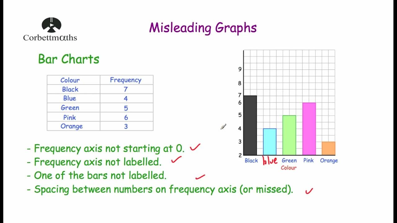
Misleading Graphs - Corbettmaths

Video Pembelajaran Matematika Kelas 7 SMP ( Pengolahan Data )

Statistik#1 : Diagram | Kelas X Fase E Kurikulum Merdeka

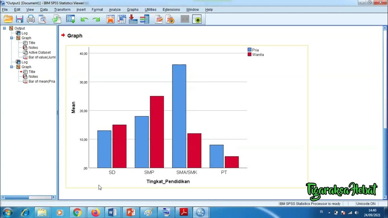
Penyajian Data Statistik Menggunakan SPSS

Grade 6 TLE Q1 Ep 6 Functions and Formulas in an Electronic Spreadsheet Tool

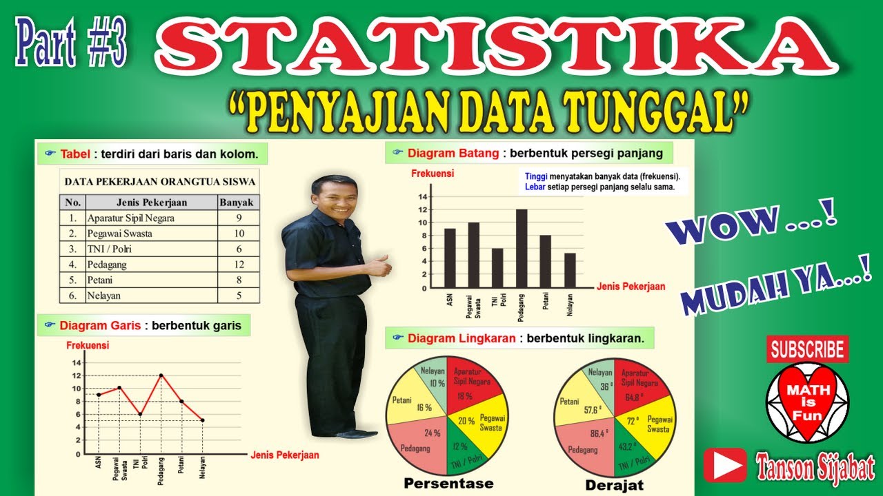
STATISTIKA | PENYAJIAN DATA TUNGGAL [Tabel, Diagram Garis, Diagram Batang, Lingkaran]
5.0 / 5 (0 votes)
