Statistics 101: Introduction to the Chi-square Test
Summary
TLDRIn this video, we explore the basics of the Chi-Square test, a crucial tool in hypothesis testing. Designed for beginners in statistics, the video explains key concepts like random variation, expected versus observed frequencies, and interpreting results. The instructor uses real-world data and visual aids such as graphs to clarify these concepts. A simple example involving a fair versus loaded die illustrates the Chi-Square test step-by-step. The video emphasizes understanding data visually and sets the stage for a more complex problem to be solved in the next session.
Takeaways
- 📚 The video series is designed to introduce basic statistics concepts, particularly for those new to the subject or in need of a review.
- 🗣️ The presenter emphasizes the correct pronunciation of 'Chi-square' as 'Kai Square', like 'kite', to avoid common mispronunciations.
- 📈 The video discusses the use of various graphs such as line graphs, stacked bar charts, stacked percentage bar charts, stacked area charts, stacked percentage area charts, and spider diagrams to visualize and understand data better.
- 🔍 The Kai Square test is introduced as a method to determine if observed data varies significantly from expected data, which can indicate more than just random chance at play.
- 🎯 The presenter sets up a hypothetical scenario involving a fair and a loaded die to illustrate how the Kai Square test works in practice.
- ⚖️ The concept of 'null hypothesis' (H0) and 'alternative hypothesis' (H1) is explained, where H0 assumes no significant difference (e.g., the die is fair), and H1 assumes there is a significant difference.
- 📉 The video explains the process of calculating the Kai Square statistic through observed versus expected frequencies, squaring the differences, and dividing by expected values.
- 📊 The importance of the critical Kai Square value is highlighted, which serves as a threshold to determine whether to reject the null hypothesis based on the calculated Kai Square statistic.
- 🔢 The degrees of freedom, a key component in the Kai Square test, are discussed, and in the context of the die example, it is simply one less than the number of categories (5 in this case).
- 💯 The impact of the chosen P-value on the strictness of the test is demonstrated, showing how a more stringent P-value (e.g., 0.01 vs. 0.05) increases the critical Kai Square value needed to reject the null hypothesis.
- 🔑 The video concludes with a reminder that the next installment will apply the concepts learned to a more complex data set involving student enrollment data over five years.
Q & A
What is the purpose of the video series on basic statistics?
-The purpose of the video series is to introduce and explain basic statistical concepts, particularly aimed at individuals who are new to statistics or need to review foundational ideas.
Why does the speaker prefer using the word 'stats'?
-The speaker prefers using 'stats' because it has fewer 'S's and 'T's, reducing the likelihood of tripping over their own tongue while speaking, which they admit happens often.
What is the primary focus of the video on the chi-square test?
-The video focuses on introducing the chi-square test, explaining its common misunderstandings, and demonstrating how to perform a simple chi-square test step by step.
What type of data is the speaker analyzing in the video?
-The speaker is analyzing data on the number of undergraduate students at different class levels (freshman, sophomore, junior, senior, and unclassified) over a 5-year period at a regional university.
What is the main question the speaker is trying to answer with the data?
-The main question is whether the variation in student headcount over the 5-year period is beyond what would be expected due to chance alone.
What types of graphs are discussed in the video to visualize data?
-The types of graphs discussed include simple line graphs, stacked bar charts, stacked percentage bar charts, stacked area charts, stacked percentage area charts, and spider or radar diagrams.
What does the speaker notice about the junior and senior class levels in the data?
-The speaker notices that the headcount for junior and senior class levels, as well as the unclassified students, has increased significantly over the 5-year period.
What is the correct pronunciation of 'chi-square' according to the speaker?
-The correct pronunciation is 'Kai Square', rhyming with 'kite', not 'cheetah' or 'chai'.
What are the two categorical variables in the dice experiment presented in the video?
-The two categorical variables in the dice experiment are the fairness of the die (fair or loaded) and the outcome of the dice rolls (numbers 1 through 6).
How does the speaker describe the relationship between the chi-square test and the observed versus expected data?
-The speaker describes the chi-square test as a tool to help understand the relationship between two categorical variables by comparing the observed data (actual outcomes) with what is expected (theoretical outcomes), and determining if the variation is due to random chance or something else.
What is the significance of the P value in the context of the chi-square test?
-The P value determines the level of tolerance for variation in the data. A lower P value means less tolerance for variation and a higher threshold for rejecting the null hypothesis, indicating that the observed data is significantly different from what would be expected by chance.
How does the speaker explain the concept of 'degrees of freedom' in the chi-square test?
-In the context of the dice experiment, the degrees of freedom are explained as the number of categories minus one, which in this case is 6 (the six sides of the die) minus 1, equaling 5.
What is the null hypothesis in the dice experiment?
-The null hypothesis in the dice experiment is that the die is fair, meaning that each roll has an equal chance of resulting in any of the six numbers.
What does the speaker conclude about the die based on the chi-square test results?
-Based on the chi-square test results, the speaker concludes that the die is not fair, as the observed frequencies of the numbers differ significantly from what would be expected on a theoretically fair die.
What is the effect of changing the P value on the chi-square critical value?
-Changing the P value affects the chi-square critical value. A lower P value results in a higher critical value, making it more difficult to reject the null hypothesis because the threshold for considering the variation as not due to chance is higher.
Outlines

This section is available to paid users only. Please upgrade to access this part.
Upgrade NowMindmap

This section is available to paid users only. Please upgrade to access this part.
Upgrade NowKeywords

This section is available to paid users only. Please upgrade to access this part.
Upgrade NowHighlights

This section is available to paid users only. Please upgrade to access this part.
Upgrade NowTranscripts

This section is available to paid users only. Please upgrade to access this part.
Upgrade NowBrowse More Related Video
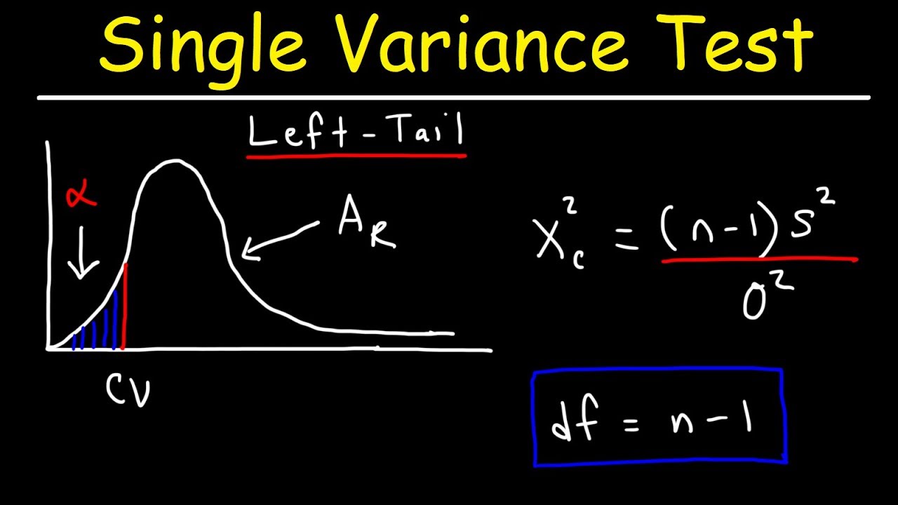
Chi Square Distribution Test of a Single Variance or Standard Deviation
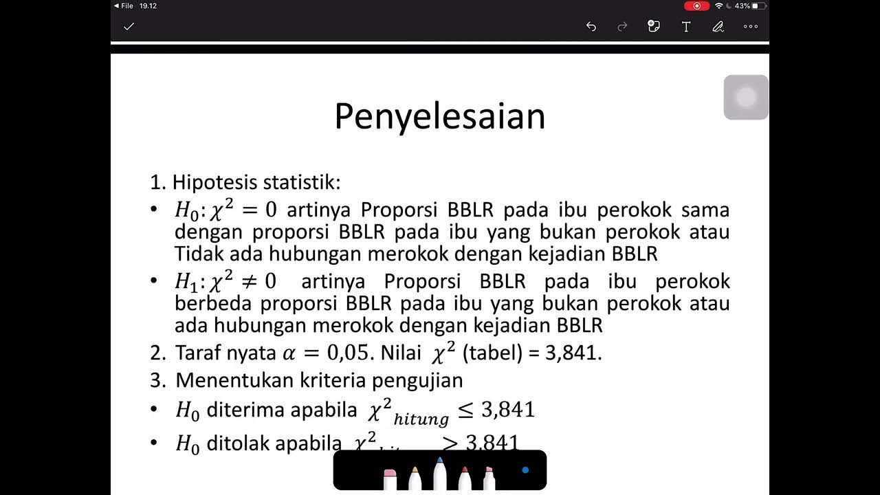
Uji Chi Square (Contoh soal dan penyelesaian)

video 14.2. chi-square test of independence

*M* Uji Kecocokan: Frekuensi yang Diduga Sama dan yang Tidak Sama dengan Microsoft Excel dan SPSS

UJI CHI-SQUARE TEORI DAN CONTOH KASUS PART 1

Statistics in 10 minutes. Hypothesis testing, the p value, t-test, chi squared, ANOVA and more
5.0 / 5 (0 votes)