How to Tally, Encode, and Analyze your Data using Microsoft Excel (Chapter 4: Quantitative Research)

Dorina Mae
3 Dec 202019:09

Summary

TLDRThis lesson introduces quantitative data analysis, explaining how to prepare, organize, and analyze data using statistical tools. It covers key concepts such as coding data, using software like SPSS and Excel, and presenting data through graphs and charts. The video also explores different statistical techniques, including descriptive statistics (mean, median, mode, and standard deviation) and advanced methods like correlation, regression, and ANOVA. Practical examples show how to apply these methods to research data, interpret results, and determine significant relationships or differences between variables, making complex data analysis accessible for beginners.

Takeaways

  • 📊 Quantitative data analysis simplifies the interpretation of data through statistical tools like SPSS or Excel.
  • 📋 The first step in quantitative data analysis is data preparation using a coding system to convert words, images, or pictures into numerical values.
  • 🖥️ Microsoft Excel or SPSS is used to input and process data from surveys, with Excel being appropriate for smaller datasets.
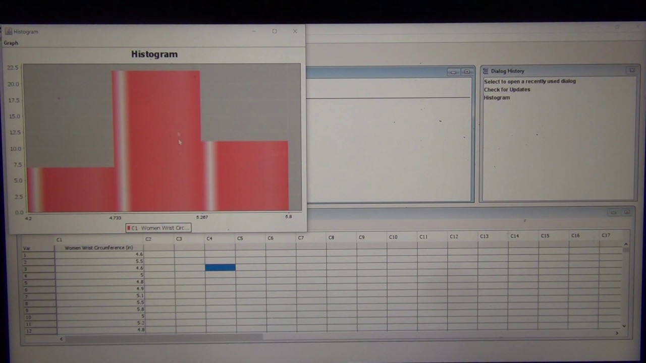
  • 📉 Different types of graphs are used based on the data type: bar graphs and pie charts for nominal data, histograms or frequency polygons for interval or ratio data.
  • 🔢 Data tabulation involves organizing data into categories and calculating percentages, such as the gender distribution in a survey.
  • 📈 Descriptive statistical techniques include frequency distribution, measures of central tendency (mean, median, mode), and standard deviation.
  • 🔬 Advanced analytical methods include correlation, ANOVA, and regression to determine relationships and predictions between variables.
  • 📊 Coding data into Excel involves assigning numerical values to variables (e.g., 1 for male, 2 for female) and analyzing responses using Likert scales or other metrics.
  • 📑 Descriptive statistics can help rank and interpret items based on their mean, median, and standard deviation, providing insights for research papers.
  • 🧪 Statistical tests like t-tests are used to determine if there is a significant difference between variables, with interpretation based on the t-stat value compared to a standard alpha value.

Q & A

  • What is the first step in quantitative data analysis?

    -The first step in quantitative data analysis is preparing your data using a coding system, where words, images, or pictures are converted into numbers to make them suitable for analytical procedures.

  • What tools are commonly used for data entry in large and small studies?

    -For large, complex studies, SPSS (Statistical Package for the Social Sciences) is commonly used, while for smaller datasets, Microsoft Excel is often sufficient.

  • What types of graphs are appropriate for different data types?

    -For nominal data, bar graphs and pie charts are used. Ordinal data also uses bar graphs, while interval and ratio data are often represented with histograms or frequency polygons.

  • What are the basic methods of analyzing quantitative data?

    -Quantitative data can be analyzed using descriptive statistical techniques such as frequency distribution, measures of central tendency (mean, median, mode), and standard deviation. Advanced methods include correlation, ANOVA (analysis of variance), and regression analysis.

  • What is the role of standard deviation in quantitative analysis?

    -Standard deviation measures the extent of variation or dispersion in a set of data values from the mean, helping to understand how spread out the data points are.

  • What is the difference between correlation and regression in data analysis?

    -Correlation measures the strength and direction of a relationship between two variables, while regression goes further to describe the nature of that relationship and whether one variable can predict another.

  • When would you use parametric vs. non-parametric tests?

    -Parametric tests are used for interval and ratio data, where assumptions about the data's distribution are made. Non-parametric tests are used for nominal or ordinal data that do not meet these assumptions.

  • What is the Pearson’s r coefficient used for?

    -Pearson’s r coefficient is used to measure the strength and direction of the relationship between two variables, where values closer to 1 or -1 indicate a stronger relationship.

  • How do you interpret a correlation coefficient value of 0.57?

    -A correlation coefficient of 0.57 suggests a moderate positive relationship between the two variables, as it is closer to 1 than to 0.

  • How can you determine if there is a significant difference between two variables using a t-test?

    -To determine if there is a significant difference, compare the t-test result (t-stat) to the alpha value (0.05). If the t-stat is greater than 0.05, there is a significant difference. Otherwise, there is no significant difference.

Outlines

00:00

📊 Introduction to Quantitative Data Analysis

This paragraph introduces the topic of quantitative data analysis, emphasizing its importance after data collection. It reassures the audience that with the help of statistical tools, the analysis process becomes easier. The objectives of the lesson include explaining procedures for preparing data, describing methods for organizing and presenting quantitative data, and using statistical techniques for data analysis.

05:02

🔢 Steps in Quantitative Data Analysis

This paragraph discusses the initial steps in quantitative data analysis, starting with preparing data using a coding system. It explains the conversion of words, images, or pictures into numbers for analytical purposes, and covers data entry and recording. The paragraph mentions tools like SPSS for large studies and Microsoft Excel for smaller datasets. It also details the types of graphs and charts suitable for different data types, including nominal, ordinal, interval, and ratio scales.

10:02

📈 Data Tabulation and Analysis Techniques

This paragraph focuses on data tabulation, including frequency and percentage distribution, and analyzing data using descriptive statistical techniques. It explains frequency distribution, measures of central tendency (mean, median, mode), and standard deviation. The paragraph also introduces advanced quantitative analytical methods like correlation, analysis of variance (ANOVA), and regression, which help describe relationships and determine differences between data categories.

15:03

🔍 Coding and Analyzing Data in Microsoft Excel

This paragraph provides a step-by-step guide on coding and analyzing data using Microsoft Excel. It covers the process of converting words into numbers, coding variables, and transferring data from survey questionnaires to Excel. The paragraph explains how to use color coding for categories, input data, and use Excel's data analysis tools to perform statistical treatments like correlation and descriptive statistics. It also describes how to interpret correlation coefficients and rank items based on descriptive statistics.

📑 Presenting Data Results in Research

This paragraph explains how to present data results in a research paper. It details the process of finding means, ranks, and verbal interpretations for survey items, and describes how to calculate and interpret average weighted means. The paragraph also discusses using t-tests to determine significant differences between variables, including how to interpret t-test results based on standard alpha values. The goal is to help researchers present their data analysis clearly and effectively in their reports.

Mindmap

Keywords

💡Quantitative Data Analysis

Quantitative data analysis refers to the process of analyzing data that can be quantified, or represented in numerical form. In the video, this involves converting collected data into numbers, allowing for statistical analysis using tools like SPSS or Microsoft Excel. The aim is to uncover patterns or relationships in the data.

💡Coding System

A coding system is used to convert non-numerical data (like words or images) into numerical form to make it suitable for analysis. In the video, the instructor explains how to code data by assigning numerical values to categories such as gender, where male is coded as '1' and female as '2'. This step is essential for quantitative analysis.

💡Descriptive Statistics

Descriptive statistics summarize and describe the features of a dataset, typically using measures like the mean, median, mode, and standard deviation. The video highlights how descriptive statistics are used to provide an overview of the data before performing more complex analyses, such as identifying which items in a survey have the highest averages.

💡SPSS (Statistical Package for the Social Sciences)

SPSS is a widely-used software tool for statistical analysis, particularly for large and complex datasets. In the video, SPSS is mentioned as an advanced tool for processing data, though smaller datasets can be analyzed using Microsoft Excel. SPSS simplifies data coding, entry, and analysis.

💡Correlation

Correlation measures the relationship between two variables and how they change together. In the video, Pearson's correlation coefficient is used to determine the strength of this relationship. A value closer to 1 or -1 indicates a strong relationship, while a value near 0 indicates little or no correlation.

💡T-Test

A T-test is a statistical method used to compare the means of two groups to determine if there is a significant difference between them. In the video, the T-test is applied to check if the data from two variables (Part A and Part B) show significant differences, with the result determining whether to accept or reject the null hypothesis.

💡ANOVA (Analysis of Variance)

ANOVA is a statistical test used to analyze the differences among group means and determine if they are statistically significant. The video briefly mentions ANOVA as a tool for comparing the means of different data categories to see if any of the differences between them are significant.

💡Frequency Distribution

Frequency distribution refers to the organization of data based on the frequency of occurrences of various responses. In the video, it is explained as the first step in descriptive statistical analysis, where one can determine how often certain responses or answers appear in a dataset.

💡Standard Deviation

Standard deviation is a measure of the dispersion or spread of a set of data points relative to the mean. In the video, the instructor explains that standard deviation is used to assess how much individual data points differ from the average, helping researchers understand the variability in their dataset.

💡Regression Analysis

Regression analysis explores the relationship between a dependent variable and one or more independent variables. It is used to determine if one variable can predict another. In the video, regression is explained as a more extensive method than correlation, helping researchers understand and predict relationships between variables.

Highlights

Introduction to quantitative data analysis, emphasizing the importance of statistical tools for easier data analysis.

Explanation of the three key objectives of the lesson: preparing data, organizing and presenting quantitative data, and using statistical techniques for analysis.

Introduction to different scales of measurement: nominal, ordinal, interval, and ratio, with corresponding chart types like bar graphs, pie charts, and histograms.

Explanation of coding system: converting qualitative data such as words, images, or pictures into numerical form for analytical procedures.

Demonstration of how to enter data into Microsoft Excel for analysis, using a coding system for variables like gender and age.

Introduction to data tabulation, with an example of calculating percentage distribution based on variables like gender and course.

Explanation of two methods for data analysis: descriptive statistical techniques and advanced quantitative methods, depending on the research design.

Detailed description of descriptive statistical techniques: frequency distribution, measure of central tendency (mean, median, mode), and standard deviation.

Introduction to advanced quantitative methods, including correlation, ANOVA (analysis of variance), and regression analysis to determine relationships between variables.

Steps to calculate correlation in Excel and interpret the results based on the correlation coefficient, with values closer to 1 indicating a stronger relationship.

Explanation of how to rank items based on their mean values using descriptive statistics and determining the item with the highest rank.

Explanation of verbal interpretation for mean values, with a scale ranging from 'strongly agree' to 'strongly disagree' for interpreting Likert scale results.

Instructions for performing a T-test in Excel, along with interpretation based on the T-stat value and alpha value (0.05).

Explanation of the interpretation of the T-test results: if the T-stat value is greater than 0.05, there is a significant difference between the two variables.

Final recap on analyzing and interpreting relationships between variables, using both descriptive and advanced statistical techniques to support research findings.

Transcripts

play00:00

for today we are going to learn about

play00:03

quantitative data analysis now that

play00:06

you're

play00:06

done collecting your data it is time to

play00:09

analyze

play00:10

them i hope you keep on watching as we

play00:12

start okay to start with

play00:14

let me show you these figures what comes

play00:16

to your mind when you see

play00:18

this symbols maybe there are some

play00:21

difficulty

play00:22

in your mind you see it hard

play00:26

but let me assure you that for

play00:28

quantitative data analysis

play00:30

with the help of our statistical tool

play00:34

your analysis will be easier the

play00:37

objectives of our lesson

play00:39

are the following explain the different

play00:42

procedures

play00:43

involved in preparing data for

play00:45

quantitative analysis

play00:48

describe the different ways of

play00:49

organizing and presenting quantitative

play00:51

data

play00:52

and use statistical techniques to

play00:54

analyze

play00:55

data when these data

play00:59

appears that in words images or pictures

play01:02

but in numerical forms such as fractions

play01:05

numbers and percentages

play01:07

they become quantitative data

play01:11

now we are going to learn steps in

play01:14

quantitative data analysis the first

play01:16

step is you prepare your data using

play01:19

coding system

play01:20

when we say coding system we convert the

play01:23

words

play01:24

images or pictures into numbers that

play01:27

they become

play01:28

fitted for any analytical procedures

play01:32

data entry or data recording that means

play01:35

to say

play01:36

you transfer information from

play01:38

questionnaires

play01:40

or code sheets to computer files

play01:44

for processing for large

play01:47

complex studies we use the aid of

play01:50

statistical package for the social

play01:52

sciences we call it as spss

play01:56

for smaller data microsoft excel

play02:00

can also be used

play02:04

graphs and charts one criterion for

play02:06

deciding on the most appropriate

play02:08

type of graph or chart to use

play02:12

depends on the type of data that you

play02:14

have

play02:15

collected we have different types of

play02:19

data

play02:19

such as nominal ordinal interval in

play02:22

eurasia's scale

play02:24

that we have already discussed for you

play02:27

and here are some examples for you to

play02:29

review upon those

play02:30

types of data for a nominal

play02:34

you could use bar graph and pi chart

play02:37

for ordinal you use bar graph

play02:40

and then for interval and ratio you

play02:43

could either use

play02:45

histogram or frequency

play02:48

polygon the second step is data

play02:51

tabulation

play02:53

when there are frequency and percentage

play02:56

distribution

play02:57

we use a data tabulation here's an

play03:00

example

play03:01

gender core school as your variables and

play03:04

then you could find the percentage

play03:07

of male respondent who participated

play03:10

in your survey and you do the same for

play03:13

the rest

play03:14

step two is analyzing the data

play03:18

there are two different ways to analyze

play03:20

your data depending

play03:22

on the purpose of your research

play03:26

if it is descriptive then we use

play03:29

descriptive statistical technique if it

play03:32

is correlational research design

play03:34

experimental research design comparative

play03:37

research design

play03:38

and so on and so forth then we use

play03:41

advanced quantitative analytical methods

play03:44

now let's go first to the descriptive

play03:48

statistical technique

play03:50

we have frequency distribution measure

play03:53

of central tendency

play03:54

and then standard deviation when we say

play03:58

frequency distribution this is where you

play04:01

determine

play04:02

the number of responses given repeatedly

play04:06

for one question okay

play04:10

measure of central tendency that's

play04:14

where you determine the mean which is

play04:17

the average

play04:18

of all the item

play04:22

median which is the score in the middle

play04:25

of a sep mode which means

play04:29

the item who has most repeated

play04:31

appearance

play04:33

in the set when we say standard

play04:35

deviation

play04:36

this is the extent of the difference of

play04:40

the data

play04:41

from the mean moving forward

play04:44

we have advanced quantitative analytical

play04:48

methods

play04:49

correlation uses statistical analysis to

play04:52

yield results that describe the

play04:54

relationship

play04:56

of two variables for analysis of

play04:59

variance anova

play05:01

used to determine if the difference in

play05:03

the means or averages

play05:05

of two categories of data are

play05:08

statistically

play05:09

significant regression shows the nature

play05:12

of relationship

play05:14

of variables and gives more extensive

play05:16

results

play05:17

than that of correlation it also

play05:20

determines whether a variable is capable

play05:22

of predicting

play05:23

the strength of the relation between

play05:26

independent variable

play05:27

and the dependent variable

play05:30

so to find whether there is a

play05:32

significant difference between

play05:33

samples we have here period sample

play05:36

thetas by the way

play05:38

when we say parametric this is usually

play05:41

used to test data

play05:42

that are in the interval and ratio

play05:45

levels of

play05:46

measurement and for non-parametric you

play05:49

test data that are original

play05:50

or nominal categorical data

play05:54

and then here are the following analysis

play05:56

tools

play05:59

okay that's it

play06:02

for finding significant relationship

play06:05

between

play06:06

variables when you only find the

play06:09

relationship between two variables we

play06:12

use

play06:12

pearson's r coefficient of correlation

play06:16

but when we find significant

play06:17

relationship more than

play06:19

two variables we usually use multiple

play06:23

regression

play06:26

right now i'm going to show you how to

play06:28

code and analyze

play06:30

your data i'm going to teach you

play06:33

how you could transfer data from

play06:36

survey questionnaire to a computer file

play06:40

using microsoft excel so the first step

play06:44

is to code your data when we see coding

play06:47

you convert

play06:49

words into numbers let's say your

play06:51

nominal categorical data is a gender

play06:56

so the male stands for

play06:59

one as you numerical conversion

play07:03

f stands for 2 as your

play07:07

code for each maybe you have 5h

play07:10

bracket so let's say your population

play07:14

is from ages 16 to 30

play07:17

so your first each bracket is 16

play07:21

and the next thing is you have to code

play07:24

each

play07:24

age bracket

play07:29

so you already have a code for your

play07:31

items

play07:32

so you are now ready to start

play07:34

transferring the information

play07:36

to this microsoft excel

play07:51

first respondent of course you stand it

play07:53

wanted one

play07:58

okay r stands for respondent and how

play08:01

many respondents do you have

play08:04

let's say you have 90 respondents

play08:14

and then next you determine now the

play08:16

gender of each respondent

play08:19

one stands for male and two stands for

play08:22

female and then

play08:26

you start coding the age bracket of

play08:29

your respondents in order for you to

play08:31

easily

play08:32

distinguish your categories you use

play08:35

color code

play08:39

you are now ready to code their

play08:41

responses to your

play08:42

items so let's say you have two

play08:45

parts or two variables first variable

play08:49

part a second variable part b

play08:52

for the part a you use the code a for

play08:55

the part b you use the code b

play08:57

statement you use the code s and then

play08:59

item number of course the number itself

play09:03

let's say you use four point likert

play09:06

scale so you have 4.0 you strongly agree

play09:11

to strongly disagree without using the

play09:13

neutral

play09:14

and then you start encoding their

play09:17

responses

play09:19

you do the same way to the part b

play09:22

variable

play09:26

after that you total the sum

play09:36

just drag it down

play09:46

usually microsoft excel doesn't have

play09:49

data analysis

play09:50

over here therefore you go to the file

play09:55

and click options to provide

play09:58

add-ins

play09:59

[Music]

play10:01

and click check box of analysis tool

play10:05

pack

play10:10

once you have your data analysis you now

play10:13

have your analysis

play10:14

tools to use for a statistical treatment

play10:17

the next thing that you have to do

play10:19

is to click the data analysis in which

play10:22

we start

play10:22

analyzing the two variables click

play10:26

correlation

play10:27

it says here input range

play10:30

so in this case we are going to

play10:33

determine

play10:34

part a and part b relation click

play10:37

part b click your shift

play10:41

button part a

play10:44

you still hold the shift you start

play10:47

clicking the

play10:48

control button and then click

play10:51

the arrow so you select all the

play10:54

responses

play10:57

where do you want to see the result

play10:59

output range

play11:00

beside the data we just click somewhere

play11:05

here

play11:05

and then we could see the data over

play11:08

there

play11:10

click ok so it says there

play11:14

you have 0.57

play11:18

40 25 so here is the interpretation

play11:23

the closer your correlation coefficient

play11:26

is to positive one or

play11:30

negative one then the more

play11:34

closely the two variables are related

play11:40

but if your correlation coefficient is

play11:43

closer to 0 then it means that there is

play11:47

no correlation if this is your result

play11:51

0.57 is it closer to 0

play11:55

or closer to one that is closer to one

play11:59

right so that means to say that there is

play12:03

a correlation between your part a and

play12:06

part b but if your result is

play12:10

closer to zero that means there is no

play12:13

correlation between them the usual

play12:16

results

play12:17

are zero point zero one

play12:21

zero point two

play12:24

and so on and so forth so here is a

play12:27

strength of relationship between

play12:29

two tests point zero

play12:33

zero two point

play12:36

twenty the strength of relationship is

play12:40

poor

play12:41

point 21 to point 40

play12:44

the strength of relationship is fair

play12:46

point 41

play12:48

to point 60 the strength of relationship

play12:53

is moderate point 61 2.80

play12:57

the strength of the relationship is

play12:59

substantial point

play13:00

81 to 1.00

play13:04

the strength of relationship is almost

play13:08

perfect there you go i hope you

play13:09

understand how to find

play13:11

significant relationship between two

play13:13

variables okay right now

play13:15

we will determine which item

play13:18

has the highest rank let's say

play13:22

your part a has seven items

play13:25

you determine now which among the items

play13:29

is the highest we use descriptive

play13:33

statistics click descriptive statistics

play13:38

and then your input range

play13:43

don't forget to click labels in first

play13:46

row

play13:47

where do you want to see your output you

play13:49

click

play13:50

output range click this one beside the

play13:53

data

play13:55

click any any cell don't forget to click

play13:58

summary statistics

play14:01

it's easier to know the median mode

play14:04

standard deviation and then the mean

play14:06

for each item of the part a

play14:09

so the first one that you have to do is

play14:11

you transfer

play14:13

the label aligning it to the result

play14:23

okay it's easier to see right so here's

play14:26

the mean of the first

play14:28

so right now you're going to determine

play14:30

which

play14:31

item ranks the highest okay take a look

play14:34

on that

play14:35

and as i can see this is the highest

play14:39

put the rank label here

play14:48

okay there you go you have your mean

play14:51

your median

play14:52

mode and then the standard deviation

play14:55

you just get all the results and

play14:58

transfer it

play14:59

to your thesis file

play15:02

okay so this is how you present the data

play15:06

result

play15:07

in your research paper here are the

play15:10

following

play15:11

statements by which you find out the

play15:14

mean

play15:14

and then its rank and then its verbal

play15:17

interpretation

play15:18

how can you determine the verbal

play15:20

interpretation for each item

play15:24

here's the scale for each verbal

play15:27

interpretation

play15:28

3.26 to 4 that interprets strongly agree

play15:32

2.51 to 3.25 that is agree

play15:37

1.76 to 2.50

play15:39

disagree and then 1.1 to 1.75

play15:43

is strongly disagree in the given

play15:46

instance

play15:47

your first item has 3

play15:51

weighted mean and therefore it's at the

play15:54

middle of

play15:55

2.51 to 3.25 that has its verbal

play15:59

interpretation of

play16:01

agree remember to also find out the

play16:04

average

play16:05

weighted mean and then its verbal

play16:07

interpretation

play16:08

after finding out which one is the

play16:10

highest you know interpret this way

play16:13

looking closely to the table item per

play16:15

item it has

play16:16

observed that the students use

play16:18

powerpoint presentation through laptop

play16:20

and

play16:20

smart television and it has the highest

play16:23

average

play16:24

weighted mean among the 10 items and

play16:26

interpreted as strongly agree

play16:28

after you've written a report for its

play16:32

analysis

play16:33

you know provide a supporting literature

play16:36

on the said result

play16:38

okay to find a significant difference

play16:40

between the two

play16:41

whether there is a significant

play16:44

difference or

play16:45

no significant difference at all between

play16:49

the two variables

play16:50

you use t-test

play16:54

let's go to data analysis and find

play16:58

peta's paired two sample for means

play17:06

your variable one is part a

play17:10

click the whole responses

play17:27

so how are we going to interpret the

play17:28

following numbers

play17:30

to determine whether there is a

play17:32

significant difference

play17:33

you take a look at the t-test that

play17:37

the result is 4.34

play17:40

your standard alpha is 0.05

play17:45

if the result is

play17:50

less than 0.05

play17:53

we accept our null hypothesis which is

play17:57

that there is no significant difference

play18:01

but if your t stat value is greater than

play18:05

0.05 then we

play18:07

reject our null hypothesis that there is

play18:10

no significant difference

play18:12

and therefore the interpretation is

play18:15

there is a significant

play18:16

difference between two variables

play18:19

let's see if the t-step value is

play18:23

greater than 0.05

play18:27

your t-step value is 4.34

play18:31

is it greater than 0.05 or

play18:35

less than 0.05 it is

play18:39

greater than 0.05

play18:42

so if it is greater than we reject

play18:45

our null hypothesis and therefore

play18:49

the interpretation is there is a

play18:52

significant difference

play18:53

between our part a and part b

play18:58

that's it i hope you learned something

play19:01

from our discussion today

Rate This

5.0 / 5 (0 votes)

Связанные теги
Data AnalysisQuantitative MethodsSPSSExcel TipsCoding DataDescriptive StatisticsT-testsRegression AnalysisCorrelationResearch Tools
Вам нужно краткое изложение на английском?