Descriptive statistics and data visualisation. An introduction to statistics and working with data
Summary
TLDRThis video introduces essential statistical concepts, focusing on how to describe, summarize, and visualize data. It covers the difference between categorical and numeric variables, explaining their types and how to analyze them through tools like histograms, box plots, and scatter plots. Viewers learn about key measures such as mean, median, mode, range, and standard deviation, and how these can reveal insights into data distributions. The tutorial emphasizes the importance of visualizing data for effective analysis and decision-making, offering practical tips for both beginners and those looking to strengthen their statistical skills.
Takeaways
- 😀 The primary goal of this video is to teach how to describe, summarize, and visualize data, which is foundational for good statistical analysis.
- 😀 A data set is structured like a spreadsheet, with rows representing observations and columns representing variables.
- 😀 Observations refer to individual data entries, like characteristics of a person (e.g., age, weight, gender).
- 😀 There are two main types of data: categorical (e.g., gender, height) and numeric (e.g., age, weight).
- 😀 Categorical variables can be divided into nominal (no inherent order) and ordinal (with natural order) types.
- 😀 Numeric variables can be discrete (e.g., age in integers) or continuous (e.g., weight, which can take any value).
- 😀 Describing data involves summarizing key statistics like the minimum, maximum, range, mean, median, mode, and standard deviation.
- 😀 The mean, median, and mode are measures of centrality, but can be affected by skewed distributions, with the median being more robust in such cases.
- 😀 The standard deviation measures how spread out the data is around the mean, with 68% of observations falling within one standard deviation in a normal distribution.
- 😀 Visualizing data can involve histograms, box plots, bar charts, and scatter plots, with each type serving specific purposes based on the data type and relationships.
- 😀 When dealing with two categorical variables, a two-way frequency table and stacked bar charts can help visualize the relationships and proportions between categories.
Q & A
What are the two main types of data we work with in statistics?
-The two main types of data are categorical data and numeric data. Categorical data includes variables like gender or height, while numeric data includes variables like age or weight.
What is the difference between nominal and ordinal categorical variables?
-Nominal categorical variables have no inherent order, such as gender (male, female). Ordinal categorical variables have a meaningful order, such as height (short, medium, tall), where the order matters.
How can we describe numeric data distributions using descriptive statistics?
-Numeric data distributions can be described using measures like the mean (average), median (middle value), mode (most frequent value), range (difference between minimum and maximum), interquartile range (IQR), and standard deviation (spread of data).
What is the purpose of the range and interquartile range (IQR) in data analysis?
-The range gives a sense of the total spread of the data by subtracting the minimum value from the maximum value. The interquartile range (IQR) focuses on the spread of the middle 50% of the data, giving a clearer picture of the central data distribution.
When is the median a better measure of centrality than the mean?
-The median is more robust than the mean when the data is skewed (has a long tail) because the mean can be disproportionately influenced by extreme outliers, whereas the median better represents the central tendency in skewed data.
What does standard deviation tell us about a data set?
-The standard deviation measures the average distance of data points from the mean, giving an indication of how spread out the data is. A low standard deviation means the data points are close to the mean, while a high standard deviation indicates greater variability.
What is the difference between a histogram and a box plot?
-A histogram displays the frequency distribution of numeric data by grouping values into intervals or bins. A box plot, on the other hand, shows the distribution of data through quartiles, highlighting the median, interquartile range, and potential outliers.
How can categorical variables like height or gender be visualized?
-Categorical variables like height or gender can be visualized using bar charts or pie charts. Bar charts show the frequency or percentage of each category, while pie charts display the proportion of each category in the data.
What is a two-way frequency table, and how is it used?
-A two-way frequency table shows the relationship between two categorical variables by displaying the counts or percentages of occurrences in each combination of categories. It is useful for understanding how the categories interact with each other.
How do scatter plots help in analyzing relationships between two numeric variables?
-Scatter plots show the relationship between two numeric variables by plotting each observation as a point based on its x and y values. This helps in visualizing patterns, trends, or correlations between the variables, and can be enhanced with a trend line to highlight the direction of the relationship.
How can you visualize the relationship between two numeric variables and one categorical variable?
-To visualize the relationship between two numeric variables and one categorical variable, you can use a scatter plot with different colors or markers for each category, or you can use box plots that show the distribution of the numeric variable, separated by the categorical variable.
What is the significance of using a trend line in a scatter plot?
-A trend line in a scatter plot helps to illustrate the overall direction or pattern of the relationship between the two numeric variables. It can show if there's a positive, negative, or no correlation, making it easier to identify trends in the data.
What is the difference between a stacked bar chart and a regular bar chart?
-A stacked bar chart displays multiple categories within each bar, where each segment of the bar represents a sub-category, making it easy to compare the proportions across categories. A regular bar chart simply represents the total count or frequency for each category without segmentation.
Outlines

This section is available to paid users only. Please upgrade to access this part.
Upgrade NowMindmap

This section is available to paid users only. Please upgrade to access this part.
Upgrade NowKeywords

This section is available to paid users only. Please upgrade to access this part.
Upgrade NowHighlights

This section is available to paid users only. Please upgrade to access this part.
Upgrade NowTranscripts

This section is available to paid users only. Please upgrade to access this part.
Upgrade NowBrowse More Related Video

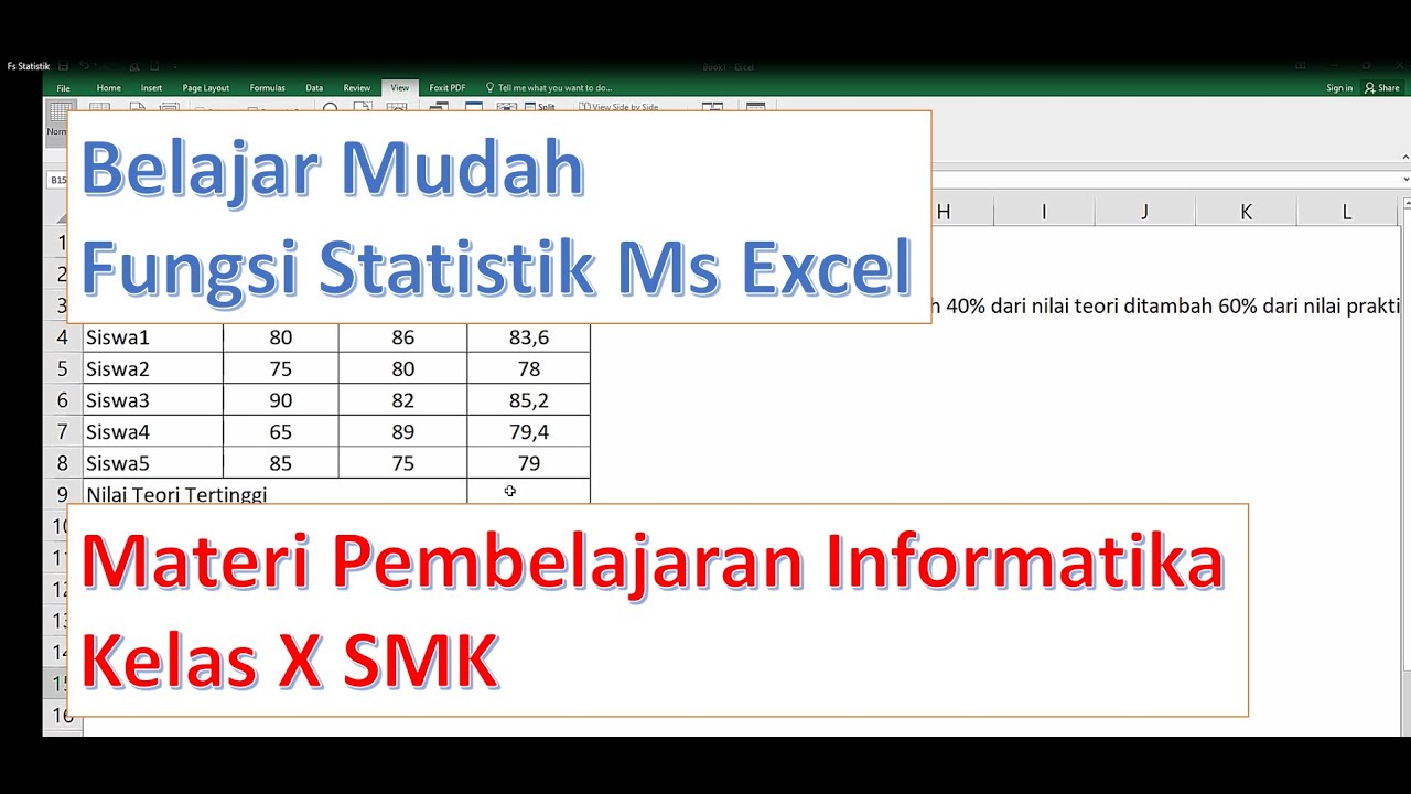
Fungsi Statistik dalam Microsoft Excel - Pembelajaran Informatika Kelas X SMK

Descriptive Statistics: FULL Tutorial - Mean, Median, Mode, Variance & SD (With Examples)

Pengantar Statistika

What is the difference between Descriptive Statistics and Inferential Statistics?

Statistics: The average | Descriptive statistics | Probability and Statistics | Khan Academy

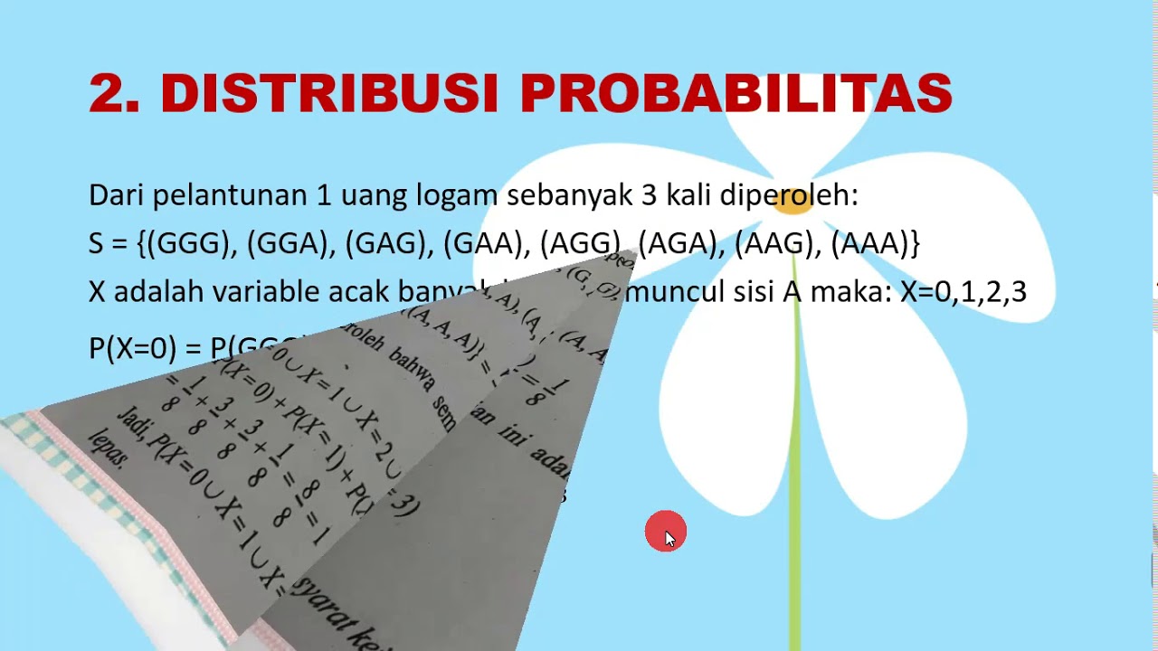
Variabel Acak dan Fungsi Probabilitas
5.0 / 5 (0 votes)