The Five Number Summary, Boxplots, and Outliers (1.6)
Summary
TLDRThis video explains the five-number summary, which describes a data distribution using the minimum, first quartile, median, third quartile, and maximum. It shows how to calculate these values and use them to create box plots, visually representing data. The interquartile range (IQR) and outliers are also covered, with methods to identify and account for outliers using modified box plots. The video emphasizes the utility of side-by-side box plots for comparing multiple data sets.
Takeaways
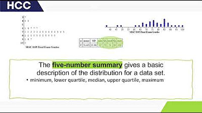
- 📊 The five number summary is a method to describe a data distribution using the minimum, first quartile (Q1), median, third quartile (Q3), and maximum.
- 🔢 The minimum is the smallest value in the dataset, and the maximum is the largest.
- 📈 The median is the middle value, dividing the dataset so that 50% of values are below and 50% are above it.
- 📌 Q1 is the median of the lower half of the dataset, with 25% of values below it and 75% above.
- 📍 Q3 is the median of the upper half, with 75% of values below and 25% above, essentially the opposite of Q1.
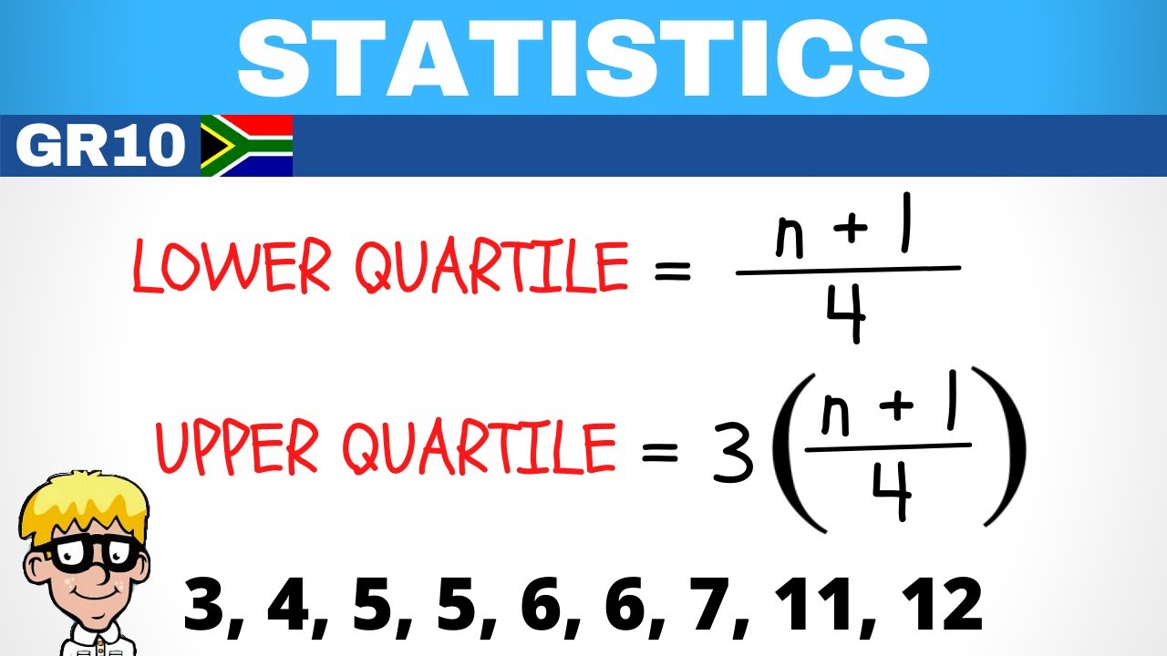
- 📝 To find the median and quartiles, one can visually inspect the data or use a formula based on the position in the dataset.
- 📚 The interquartile range (IQR) is calculated as Q3 minus Q1 and represents the middle 50% of the data.
- 📋 A box plot visually represents the five number summary, with a box for the IQR, whiskers extending to the minimum and maximum, and a line for the median.
- 🚫 Outliers are data points that fall below Q1 - 1.5 * IQR or above Q3 + 1.5 * IQR and are represented differently in a modified box plot.
- 📊 Modified box plots account for outliers, adjusting the whiskers to the new minimum or maximum if outliers are present.
- 🔍 Side by side box plots allow for easy comparison between two datasets, providing both visual and mathematical insights.
Q & A
What is the five-number summary in statistics?
-The five-number summary in statistics includes the minimum, first quartile (Q1), median, third quartile (Q3), and the maximum. It provides a way to describe a distribution using these five values.
How do you find the median in a data set?
-To find the median, you order the data values from smallest to largest and identify the middle value. If the number of data points is odd, the median is the middle value. If even, it is the average of the two middle values.
What is the first quartile (Q1) and how is it calculated?
-The first quartile (Q1) is the median of the bottom half of the data. It is the point where 25% of the data values are below it and 75% are above it. It can be found by identifying the median of the values below the overall median.
What is the third quartile (Q3) and how is it determined?
-The third quartile (Q3) is the median of the top half of the data. It is the point where 75% of the data values are below it and 25% are above it. It can be found by identifying the median of the values above the overall median.
How can the five-number summary be visualized?
-The five-number summary can be visualized using a box plot. The box plot includes a box from Q1 to Q3, with a line at the median. Whiskers extend from the box to the minimum and maximum values, or to the nearest non-outlier data points in a modified box plot.
What is the interquartile range (IQR) and how is it calculated?
-The interquartile range (IQR) is the range between the first and third quartiles. It represents the middle 50% of the data and is calculated as IQR = Q3 - Q1.
How can you identify outliers in a data set?
-Outliers can be identified by checking if a data value is less than Q1 - 1.5 times the IQR or greater than Q3 + 1.5 times the IQR. Values outside this range are considered outliers.
What is a modified box plot and how does it differ from a regular box plot?
-A modified box plot accounts for outliers by extending the whiskers only to the highest and lowest data values within the 1.5*IQR range from Q1 and Q3. Outliers are marked separately as individual points.
How are side-by-side box plots useful?
-Side-by-side box plots are useful for comparing multiple data sets. They allow for easy visual and mathematical comparisons of distributions, medians, quartiles, and potential outliers.
What is the significance of each vertical line in a box plot?
-Each vertical line in a box plot represents a number from the five-number summary: minimum, Q1, median, Q3, and maximum. These lines help visualize the distribution of the data.
Outlines

Dieser Bereich ist nur für Premium-Benutzer verfügbar. Bitte führen Sie ein Upgrade durch, um auf diesen Abschnitt zuzugreifen.
Upgrade durchführenMindmap

Dieser Bereich ist nur für Premium-Benutzer verfügbar. Bitte führen Sie ein Upgrade durch, um auf diesen Abschnitt zuzugreifen.
Upgrade durchführenKeywords

Dieser Bereich ist nur für Premium-Benutzer verfügbar. Bitte führen Sie ein Upgrade durch, um auf diesen Abschnitt zuzugreifen.
Upgrade durchführenHighlights

Dieser Bereich ist nur für Premium-Benutzer verfügbar. Bitte führen Sie ein Upgrade durch, um auf diesen Abschnitt zuzugreifen.
Upgrade durchführenTranscripts

Dieser Bereich ist nur für Premium-Benutzer verfügbar. Bitte führen Sie ein Upgrade durch, um auf diesen Abschnitt zuzugreifen.
Upgrade durchführen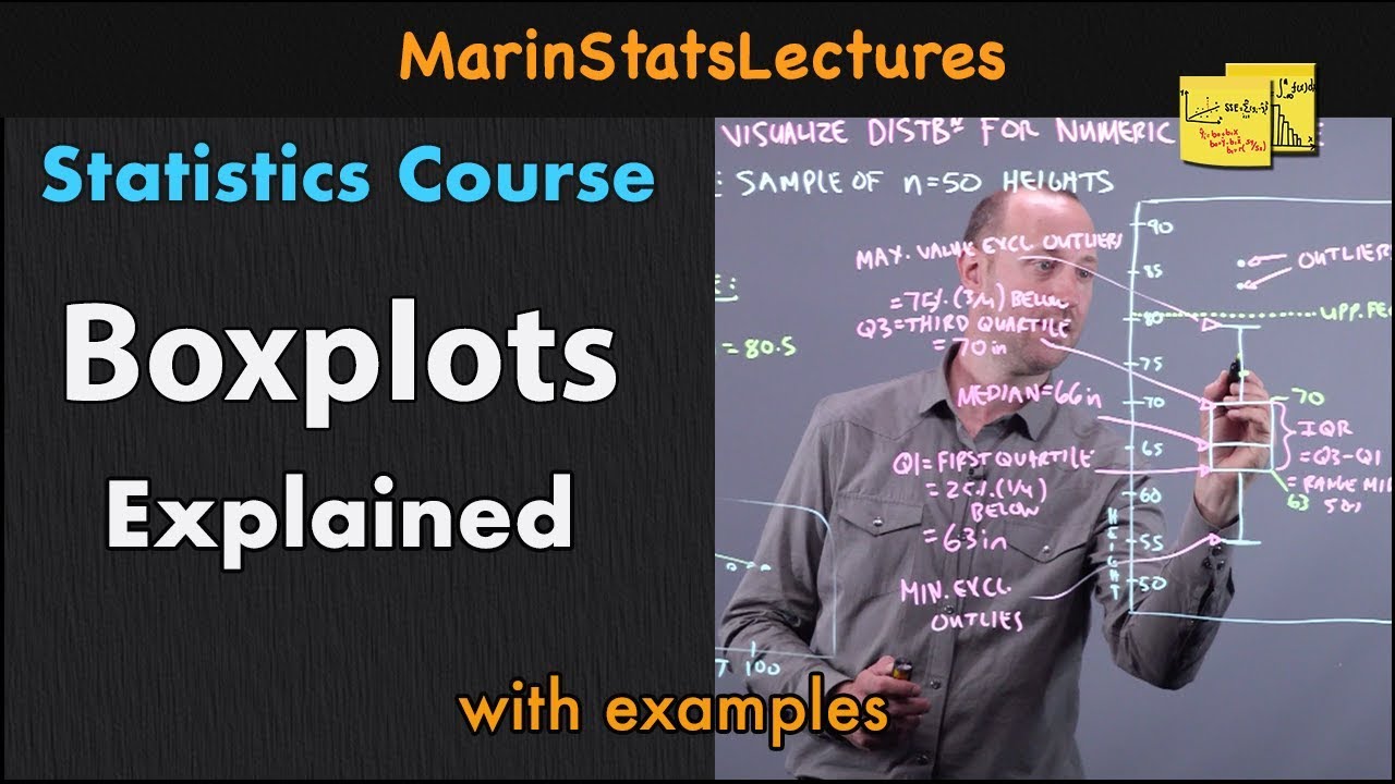


5.0 / 5 (0 votes)
