Boxplots in Statistics | Statistics Tutorial | MarinStatsLectures
Summary
TLDRThis video explains the concept of a boxplot, a statistical tool used to visualize data distribution through Tukey's five-number summary: minimum, first quartile, median, third quartile, and maximum. The speaker uses an example of 50 individuals' heights, discussing how the boxplot highlights the data's median, interquartile range (IQR), and outliers. Additionally, the video covers the calculation of 'fences' to define outliers and mentions related visualization tools like variable-width box plots and violin plots. The video emphasizes the importance of understanding these elements rather than manual calculation.
Takeaways
- 📊 A boxplot visually displays the distribution of a dataset and is useful for summarizing the data's spread.
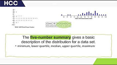
- 🧮 The boxplot shows Tukey’s five-number summary: minimum, first quartile (Q1), median, third quartile (Q3), and maximum.
- 📏 The median, marked inside the box, represents the middle value, splitting the dataset into two equal halves.
- 📉 Q1 represents the 25th percentile, meaning 25% of the data falls below this value.
- 📈 Q3 represents the 75th percentile, meaning 75% of the data falls below this value.
- 📐 The interquartile range (IQR) is the range between Q3 and Q1, showing the spread of the middle 50% of the data.
- 🚫 The whiskers extend to the minimum and maximum values, excluding outliers, which are represented as individual points.
- 🔍 Outliers are defined as values outside the upper and lower 'fences,' calculated as 1.5 times the IQR beyond Q3 and Q1.
- 🎻 Violin plots and notched boxplots are alternative visualizations, combining density estimates or adding notches around the median.
- 📉 Boxplots help identify the shape of the distribution, whether it is symmetric or skewed, based on the data layout.
Q & A
What does a boxplot show?
-A boxplot shows the distribution of a dataset, visually displaying key summary statistics like the minimum, first quartile, median, third quartile, and maximum values. It helps in understanding the spread and skewness of the data.
What is Tukey’s five-number summary?
-Tukey’s five-number summary consists of the minimum, first quartile (Q1), median, third quartile (Q3), and maximum. These are used to describe the spread and center of the dataset.
What does the median represent in a boxplot?
-The median represents the middle value of the dataset, where 50% of the data is below it and 50% is above. In the given example, the median height is approximately 66 inches.
What does the first quartile (Q1) represent?
-The first quartile (Q1) represents the value below which 25% of the data lies. In the example, Q1 is around 63 inches, meaning 25% of the individuals have a height of 63 inches or less.
What is the third quartile (Q3) and what does it indicate?
-The third quartile (Q3) is the value below which 75% of the data lies. In the example, Q3 is approximately 70 inches, indicating that 75% of individuals are 70 inches or shorter.
What is the interquartile range (IQR) in a boxplot?
-The interquartile range (IQR) is the difference between the third quartile (Q3) and the first quartile (Q1), representing the range of the middle 50% of the data. In this example, the IQR is 7 inches (70 - 63).
How are outliers represented in a boxplot?
-Outliers are represented as individual points outside the 'fences,' which are calculated using 1.5 times the IQR added to Q3 for the upper fence and subtracted from Q1 for the lower fence.
How is the upper fence calculated in a boxplot?
-The upper fence is calculated by adding 1.5 times the IQR to the third quartile (Q3). For example, with Q3 at 70 inches and the IQR at 7 inches, the upper fence is at 80.5 inches (70 + 1.5 * 7).
What is the lower fence and how is it calculated?
-The lower fence is calculated by subtracting 1.5 times the IQR from the first quartile (Q1). In the example, with Q1 at 63 inches and the IQR at 7 inches, the lower fence is at 52.5 inches (63 - 1.5 * 7).
What are variable width boxplots and how are they used?
-Variable width boxplots are used to compare multiple distributions, like the heights of males versus females. The width of each boxplot is proportional to the sample size, offering a comparison not only of the distribution but also of the sample size.
Outlines

This section is available to paid users only. Please upgrade to access this part.
Upgrade NowMindmap

This section is available to paid users only. Please upgrade to access this part.
Upgrade NowKeywords

This section is available to paid users only. Please upgrade to access this part.
Upgrade NowHighlights

This section is available to paid users only. Please upgrade to access this part.
Upgrade NowTranscripts

This section is available to paid users only. Please upgrade to access this part.
Upgrade NowBrowse More Related Video
5.0 / 5 (0 votes)


