Create an Animated Slide Menu in Figma
Summary
TLDRIn this tutorial, the creator demonstrates how to quickly animate a slide menu in Figma. The video covers the step-by-step process of creating a responsive slide menu with an animated hamburger menu icon that transforms into a dismiss icon. It includes tips on using component sets, smart animation, and prototypes to ensure smooth transitions between states. The tutorial also focuses on making the interface interactive, with a focus on practical adjustments for alignment and constraints, ensuring users can replicate the same animation effects for their own designs.
Takeaways
- 😀 Start by creating a responsive hamburger menu icon and a dismiss icon in Figma.
- 😀 Use Figma’s 'Smart Animate' option to create smooth transitions between different icon states.
- 😀 Create a component set for the hamburger menu icon and dismiss icon to enable interactive states.
- 😀 Ensure the icon changes from 'close' to 'open' by modifying variant values and connections.
- 😀 For the slide menu, create a component set and use responsive layouts to manage different screen sizes.
- 😀 Adjust the slide menu width and remove unnecessary text in the closed state to simplify the design.
- 😀 Set constraints for elements, like the dismiss icon, to ensure they stay in the correct position when resizing.
- 😀 Create interactivity by connecting components with the Prototype tab and choosing 'On Click' triggers.
- 😀 Experiment with 'Smart Animate' settings to achieve a quick animation effect for the slide menu transitions.
- 😀 Test the interactions by using an instance of the menu in a frame and verifying the smoothness of the animation.
- 😀 Watch out for the final testing phase to make sure the animation and transitions work properly before finalizing the design.
Q & A
What are the two main interactive elements in the slide menu animation?
-The two main interactive elements are the hamburger menu icon and the dismiss (X) icon.
Why is it important to rename the layers when animating the icon?
-Renaming layers ensures that Figma's Smart Animate can correctly map and transform layers from one variant to another, avoiding animation glitches.
How do you transform a hamburger menu icon into a dismiss icon in Figma?
-Duplicate the hamburger icon, remove the top and bottom lines, rotate the middle line 45 degrees, duplicate and flip it horizontally, then rename layers accordingly.
What is a component set in Figma and why is it used here?
-A component set is a group of related component variants. It is used here to manage different states of the icon and the slide menu, enabling smooth interactive animations.
Which animation type is used for the icon and menu transitions, and why?
-The Smart Animate type is used because it allows Figma to interpolate between layers and positions, creating smooth transitions between states.
How can you make the menu icon remain fixed in the top-right corner?
-By applying absolute positioning and setting the constraints to top and right in the design inspector.
What steps are taken to create the collapsed variant of the slide menu?
-Remove unnecessary text layers, resize the logo, align elements to the center, and adjust the dismiss icon placement to create a minimal, collapsed menu.
How are interactions created between the open and closed states in Figma?
-By connecting component variants in the Prototype Tab, setting the trigger to 'On Click', and choosing Smart Animate with quick velocity for smooth transitions.
Why is it important to test the menu instance after creating interactions?
-Testing ensures that the icons transform correctly, the menu expands and collapses smoothly, and all animations function as intended before final implementation.
How does using responsive layouts and constraints simplify menu animation?
-Responsive layouts automatically adjust element positions and sizes when the menu width changes, reducing the need for manual adjustments for different variants.
What role does the velocity setting play in Smart Animate?
-Velocity controls the speed and bounce effect of the animation, allowing for faster or slower transitions to create a desired visual effect.
How do you apply a component instance to a frame in Figma?
-Drag the component from the Assets Tab into a frame, then adjust its size, positioning, and state as needed.
Outlines

Dieser Bereich ist nur für Premium-Benutzer verfügbar. Bitte führen Sie ein Upgrade durch, um auf diesen Abschnitt zuzugreifen.
Upgrade durchführenMindmap

Dieser Bereich ist nur für Premium-Benutzer verfügbar. Bitte führen Sie ein Upgrade durch, um auf diesen Abschnitt zuzugreifen.
Upgrade durchführenKeywords

Dieser Bereich ist nur für Premium-Benutzer verfügbar. Bitte führen Sie ein Upgrade durch, um auf diesen Abschnitt zuzugreifen.
Upgrade durchführenHighlights

Dieser Bereich ist nur für Premium-Benutzer verfügbar. Bitte führen Sie ein Upgrade durch, um auf diesen Abschnitt zuzugreifen.
Upgrade durchführenTranscripts

Dieser Bereich ist nur für Premium-Benutzer verfügbar. Bitte führen Sie ein Upgrade durch, um auf diesen Abschnitt zuzugreifen.
Upgrade durchführenWeitere ähnliche Videos ansehen
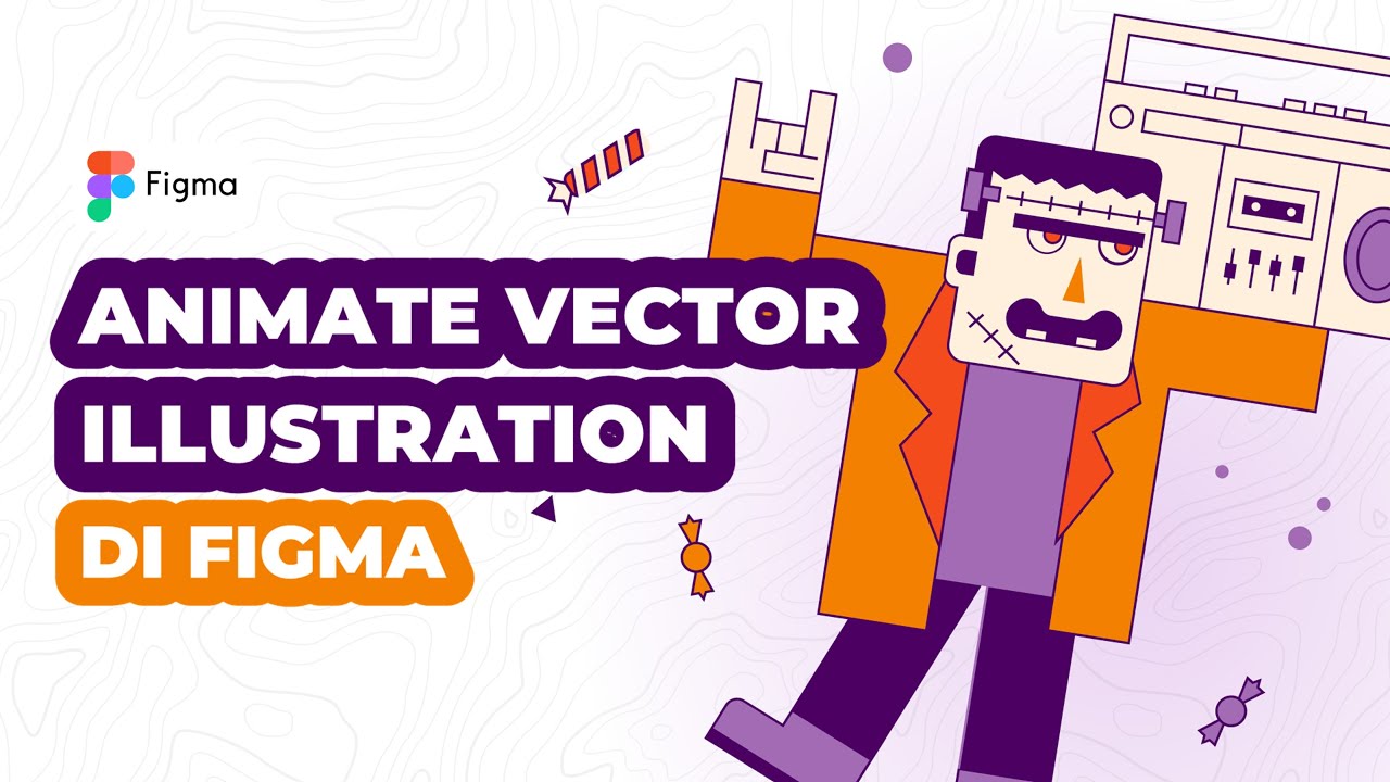
Cara Animasi Vector Simple pada Vector Illustration di Figma

Free Template PPT Study | Morph Transition + Tutorial | Powerpoint Slide Ideas

How to Build an Effective Design System: Episode 1 - Wrapping Radix UI DropdownMenu Components 🚀

How to make a good PowerPoint slide - Easy Tutorial

Read More Read Less Button Animation Using Figma (2022)

01 How to Manage and Navigate Slide
5.0 / 5 (0 votes)
