Research methods graphs
Summary
TLDRThis video provides essential guidelines for creating various types of graphs commonly used in exams, including scatter graphs, bar charts, histograms, and line graphs. It highlights the importance of correctly labeling axes, scaling, and accurately plotting data. The script explains the differences between these graph types, such as the need for gaps in bar charts for discrete data and the continuous nature of histograms. Additionally, it discusses the significance of line graphs for tracking changes over time and explores normal and skewed distribution curves in data analysis, offering practical tips for success in graph-related exam questions.
Takeaways
- 😀 Always label both the x-axis and y-axis of your graph accurately.
- 😀 Make sure to clearly distinguish between independent and dependent variables when plotting graphs.
- 😀 Include a title on every graph to specify what it represents.
- 😀 Proper scaling of both axes is essential to avoid losing marks in an exam.
- 😀 Scatter graphs are used for correlation studies, where the co-variables can be placed on either axis.
- 😀 Do not include a line of best fit unless specifically instructed to do so in scatter graphs.
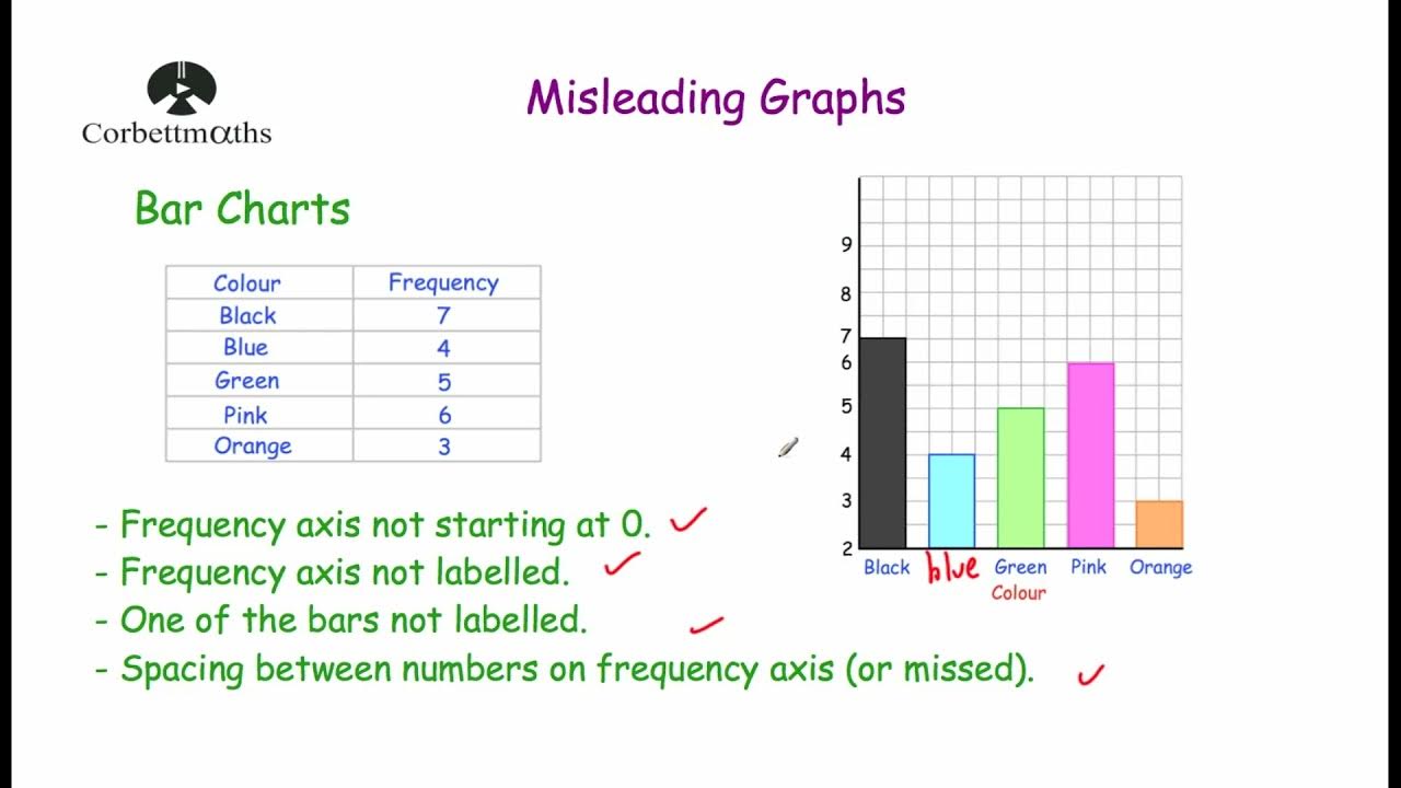
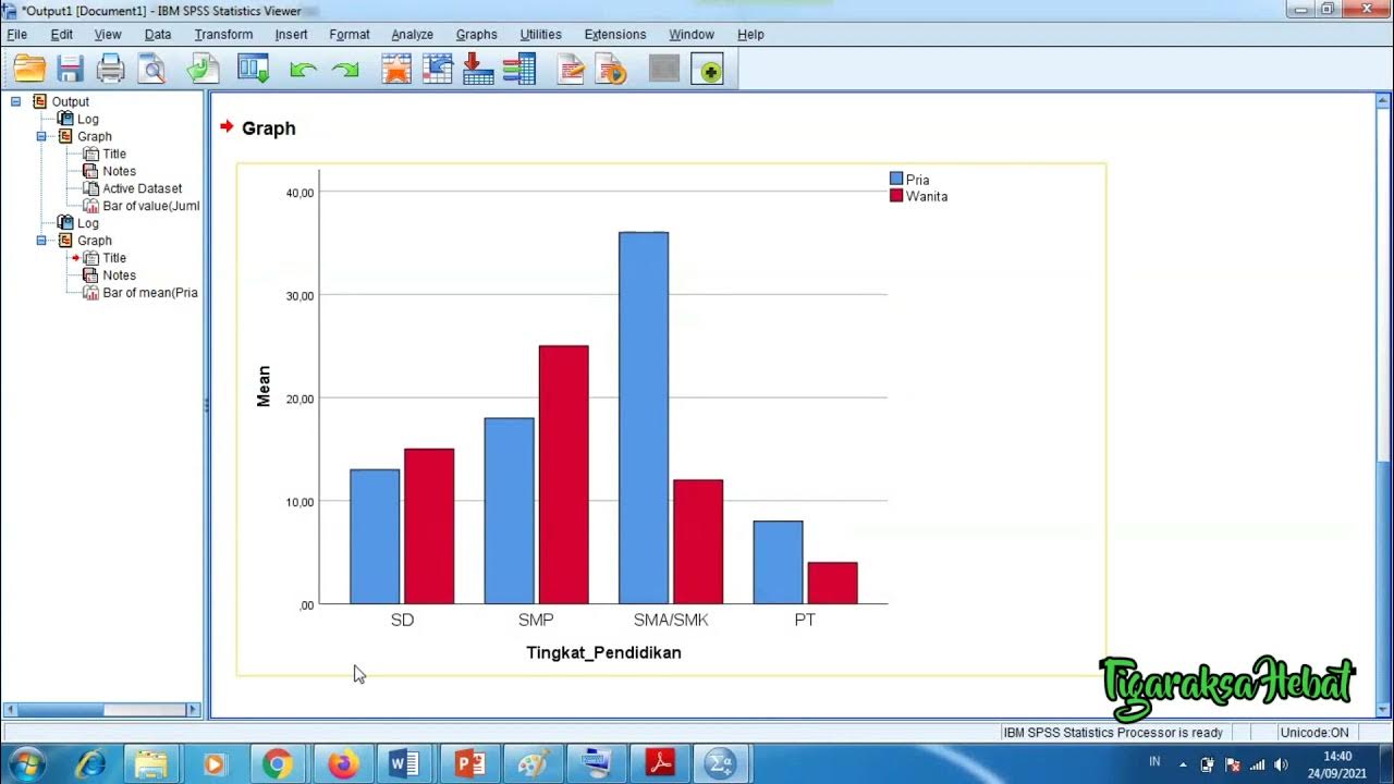
- 😀 In bar charts, ensure the bars do not touch unless they represent frequency data, and the independent variable is always on the x-axis.
- 😀 Histograms represent continuous data, and the bars must touch because the data falls into continuous intervals.
- 😀 Line graphs should be used to represent changes over time and should be carefully scaled and labeled.
- 😀 Distribution curves such as normal and skewed distributions should be understood, as they reflect the spread and frequency of data.
- 😀 Always be mindful of common mistakes, such as missing labels or incorrect axis placements, which can lead to lost marks.
Q & A
What is the key to scoring full marks when creating a graph in an exam?
-The key is to follow simple guidelines consistently, such as labeling the axes correctly, scaling them appropriately, adding a title, and ensuring that the independent and dependent variables are placed on the right axes.
When should a line of best fit be included in a scatter graph?
-A line of best fit should only be included in a scatter graph if the exam specifically asks for it. Otherwise, it is not necessary.
What is the most common mistake students make when drawing bar charts?
-The most common mistake is misplacing the independent and dependent variables on the axes. The independent variable should always go on the x-axis, and the dependent variable on the y-axis.
What is the purpose of a bar chart?
-A bar chart is used to display data in separate categories, particularly for discrete data where the bars do not touch each other. It is often used to compare distinct groups or individuals.
How does a histogram differ from a bar chart?
-A histogram is used for continuous data, where the bars touch each other, while a bar chart is used for discrete data with gaps between the bars.
What kind of data is appropriate for a histogram?
-A histogram is used when data is continuous, such as percentages, time intervals, or measurements that fall within a continuous range.
What is the typical use of a line graph?
-A line graph is typically used to show how something changes over time, with data points connected by a line to represent trends.
What is a normal distribution curve?
-A normal distribution curve is a bell-shaped graph that shows data where most values cluster around the mean, with fewer values at the extremes. It represents a balanced distribution of data.
How does a positive skewed distribution differ from a negative skewed distribution?
-In a positive skew, most values are concentrated on the lower end, with a few high values pulling the mean to the right. In a negative skew, most values are high, with a few low values dragging the mean to the left.
What does a positive skew in test scores indicate?
-A positive skew indicates that most students scored low, but a small number of students performed very well, causing the mean to be higher than the median.
Outlines

此内容仅限付费用户访问。 请升级后访问。
立即升级Mindmap

此内容仅限付费用户访问。 请升级后访问。
立即升级Keywords

此内容仅限付费用户访问。 请升级后访问。
立即升级Highlights

此内容仅限付费用户访问。 请升级后访问。
立即升级Transcripts

此内容仅限付费用户访问。 请升级后访问。
立即升级5.0 / 5 (0 votes)


