Presentation of Data
Summary
TLDRThis lecture covers the various ways to present data, focusing on tables and graphs. It explains how data, whether cross-sectional or time series, can be organized in tables (one-way and two-way) and visualized through different types of graphs such as bar charts, line charts, and scatter plots. The lecture emphasizes the importance of clarity in data presentation to aid decision-making and how graphical representations make trends and patterns easier to understand. It also discusses methods for presenting qualitative data quantitatively, as well as the use of infographics, highlighting various techniques for effective data visualization.
Takeaways
- 😀 Data presentation is key for making data comprehensible and accessible to decision-makers.
- 📊 Tables are a common way to present data, organizing it into categories for easy reading and comparison.
- 📈 Graphs are useful for visualizing data trends and relationships, making them easier to analyze at a glance.
- 🔢 Cross-sectional data is collected at a single point in time, providing a snapshot of various characteristics.
- ⏳ Time series data is collected over time, helping to analyze trends and changes across different periods.
- 📉 One-way tables display data for a single category, while two-way tables show relationships between two variables.
- 📚 Infographics combine numbers and visual elements to summarize data in an easy-to-understand way.
- 🔄 Multiple bar charts and line charts allow for the comparison of different datasets simultaneously.
- 🔍 Scatter plots show the distribution of data points, useful for identifying patterns or trends in datasets.
- 🎨 Pictograms use icons to visually represent data, making it engaging and easy to interpret.
- 🔶 Histograms show frequency distributions, while polygon graphs connect midpoints of histogram bars to reveal trends.
Q & A
What are the main types of data presentation discussed in the lecture?
-The lecture discusses presenting data in the form of tables, graphs, and infographics. Tables can be one-way or two-way, while graphs include bar charts, line charts, pie charts, scatter plots, and more.
What is cross-sectional data, and how is it presented?
-Cross-sectional data is collected at a specific point in time to show differences between categories. It is typically presented using one-way tables or two-way tables to display data from various categories or variables.
What distinguishes a one-way table from a two-way table?
-A one-way table displays data related to a single characteristic, such as the number of students from a particular province. A two-way table, on the other hand, shows the relationship between two variables, like the association between program types and professional membership.
What are the main types of graphs used for data presentation, and what are their uses?
-The main types of graphs include bar charts (for comparing categories), line charts (for showing trends over time), pie charts (for showing proportions), and scatter plots (for visualizing the distribution of data points). These graphs help in analyzing trends, making comparisons, and presenting data visually.
How are line charts and multiple line charts different?
-A line chart uses a single line to show trends over time, whereas a multiple line chart uses more than one line to compare trends of different variables simultaneously.
What is the purpose of using graphs for time series data?
-Graphs for time series data are used to observe trends or changes over time. This data type helps to understand patterns, such as increases or decreases over a specified period.
What is the role of infographics in data presentation?
-Infographics summarize key data in a visually engaging way using symbols or simplified representations, making complex data easier to understand and interpret.
What is the difference between histogram and frequency polygon graphs?
-A histogram displays data using bars to represent the frequency of a variable in intervals, whereas a frequency polygon connects the midpoints of each interval with lines, providing a visual representation of frequency distribution.
How can qualitative data be presented graphically without quantifying it?
-Qualitative data can be presented in graphical form by directly showing the categories (e.g., letter grades like A, B, C) without converting them into numerical values. This allows for visual comparison without quantification.
What is a scatter plot used for in data analysis?
-A scatter plot is used to visualize the distribution or correlation between two numerical variables. It helps identify patterns, trends, or outliers within the data.
Outlines

This section is available to paid users only. Please upgrade to access this part.
Upgrade NowMindmap

This section is available to paid users only. Please upgrade to access this part.
Upgrade NowKeywords

This section is available to paid users only. Please upgrade to access this part.
Upgrade NowHighlights

This section is available to paid users only. Please upgrade to access this part.
Upgrade NowTranscripts

This section is available to paid users only. Please upgrade to access this part.
Upgrade NowBrowse More Related Video
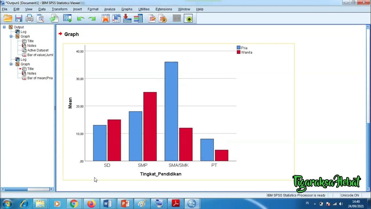
Penyajian Data Statistik Menggunakan SPSS
Penyajian Data (Part-1) ~ Tabel dan Diagram (Materi PJJ Kelas VII / 7 SMP)
Penyajian Data Kelas 7 - Menyajikan Data Dalam Tabel dan Diagram | Jenis Diagram | Statistika

Video Pembelajaran Matematika Kelas 7 SMP ( Pengolahan Data )
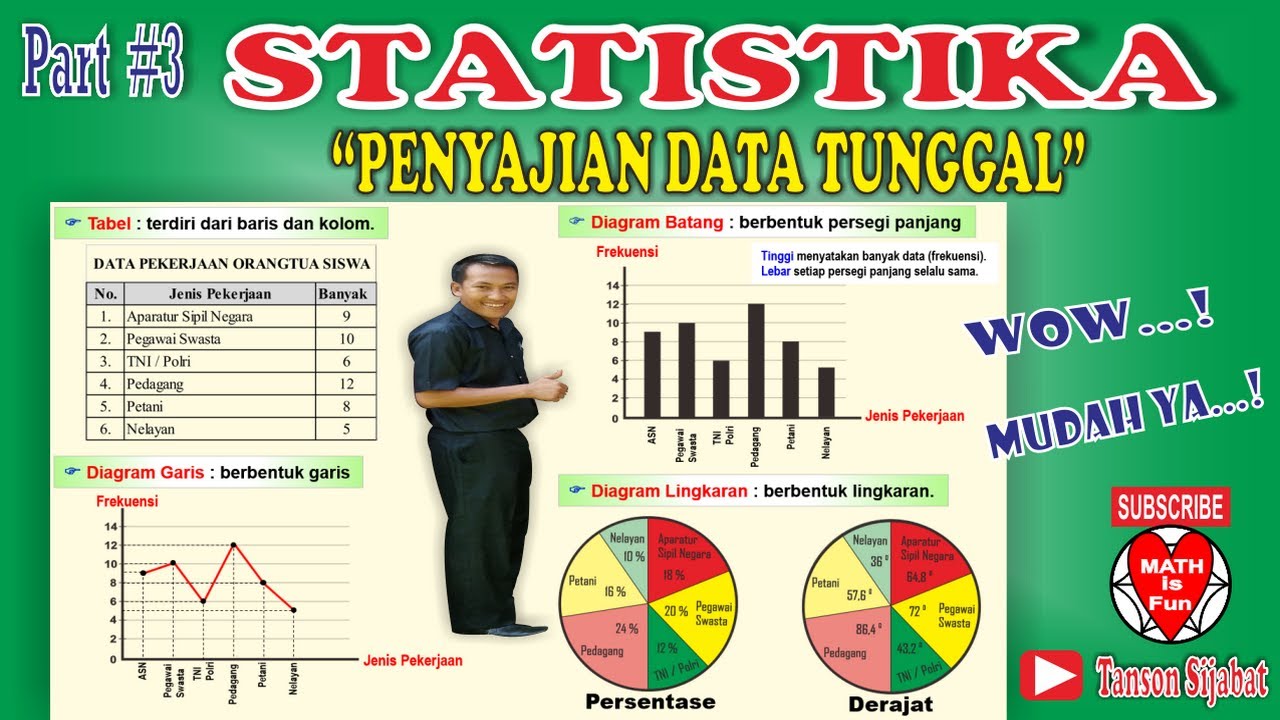
STATISTIKA | PENYAJIAN DATA TUNGGAL [Tabel, Diagram Garis, Diagram Batang, Lingkaran]

STATISTIKA PART 1
5.0 / 5 (0 votes)