BOX PLOT, HISTOGRAM, DOT PLOT STATISTIKA KELAS 10
Summary
TLDRThis educational video covers fundamental statistical concepts, focusing on boxplots, histograms, and dotplots. It starts with an introduction to boxplots, explaining key components like the minimum, maximum, quartiles, and median, as well as how to identify outliers. The video then moves on to histograms, showcasing their use for visualizing data and discussing the differences between histograms and bar charts. Finally, it explains dotplots, a simple way to represent numerical data distribution. Throughout, the video emphasizes practical methods for creating and interpreting these visualizations, helping students understand data distribution and trends effectively.
Takeaways
- 😀 Boxplots are useful for visualizing data distribution, showing five key summary statistics: minimum, maximum, lower quartile (Q1), median (Q2), and upper quartile (Q3).
- 😀 Boxplots help identify outliers and extreme values, with specific formulas used to determine these values based on the interquartile range (IQR).
- 😀 Boxplots can be vertical or horizontal, and their shape can indicate whether the data is symmetric, left-skewed, or right-skewed.
- 😀 Histograms are bar graphs used to represent data frequency within specific intervals, where the bars are contiguous, unlike bar charts with gaps.
- 😀 Histograms are beneficial for understanding the distribution of data and can be used as an alternative to bar charts when working with continuous data.
- 😀 Dotplots are simple graphs where each data point is represented as a dot on a number line, making it easy to see the mode and distribution of small datasets.
- 😀 The median (Q2) in a boxplot divides the data into two equal parts, while Q1 and Q3 represent the lower and upper quartiles, respectively.
- 😀 The interquartile range (IQR) is used to detect outliers, with the upper outlier being values greater than Q3 + 1.5 * IQR and the lower outlier being values less than Q1 - 1.5 * IQR.
- 😀 A boxplot with no skew indicates a symmetric distribution, while a skew to the right or left suggests a positive or negative distribution, respectively.
- 😀 Dotplots are particularly effective for small datasets and provide a clear visualization of individual data points, making it easy to observe trends like the mode and distribution.
Q & A
What is the purpose of using a boxplot in data visualization?
-A boxplot is used to summarize and visually represent data distribution, highlighting key statistical metrics like the minimum, maximum, median, and quartiles. It also helps in identifying data spread, skewness, and outliers.
What are the five key components shown in a boxplot?
-The five key components in a boxplot are: 1) Minimum value, 2) Maximum value, 3) Lower quartile (Q1), 4) Upper quartile (Q3), and 5) Median (Q2).
What does the length of the box in a boxplot represent?
-The length of the box in a boxplot represents the interquartile range (IQR), which is the distance between Q1 and Q3. It shows the spread of the middle 50% of the data.
How can a boxplot help in detecting skewness in data distribution?
-A boxplot helps detect skewness by comparing the median's position relative to the quartiles. If the median is closer to Q3, the distribution is skewed left, and if it's closer to Q1, the distribution is skewed right.
What is an outlier in the context of a boxplot?
-An outlier is a data point that lies significantly outside the expected range. In a boxplot, outliers are defined as values that fall outside the calculated limits based on the interquartile range (1.5 times IQR above Q3 or below Q1).
How do you calculate the interquartile range (IQR) for a dataset?
-The interquartile range (IQR) is calculated by subtracting the first quartile (Q1) from the third quartile (Q3): IQR = Q3 - Q1.
What distinguishes a histogram from a bar chart?
-The key difference between a histogram and a bar chart is that in a histogram, the bars are adjacent to one another, representing continuous data, whereas bar charts have gaps between bars and are used for categorical data.
Why is a histogram useful for data analysis?
-A histogram is useful for visualizing the distribution of data, making it easy to observe frequency patterns, identify skewness, and detect the presence of outliers or gaps in the dataset.
What are the steps involved in creating a histogram?
-To create a histogram, first, determine the class intervals and their boundaries, then calculate the frequency for each interval, and finally, plot the intervals on the x-axis and their corresponding frequencies on the y-axis.
What is the purpose of a dot plot in data analysis?
-A dot plot visually displays individual data points, making it easy to identify the frequency of values, observe the distribution, and find patterns like modes and medians in small datasets.
Outlines

This section is available to paid users only. Please upgrade to access this part.
Upgrade NowMindmap

This section is available to paid users only. Please upgrade to access this part.
Upgrade NowKeywords

This section is available to paid users only. Please upgrade to access this part.
Upgrade NowHighlights

This section is available to paid users only. Please upgrade to access this part.
Upgrade NowTranscripts

This section is available to paid users only. Please upgrade to access this part.
Upgrade NowBrowse More Related Video

STATISTIKA Part 4 - PERBEDAAN BOX PLOT, HISTOGRAM DAN DOT PLOT

UJI NORMALITAS: Kenapa & Variabel apa yang dapat Diuji Normalitas-nya?

04-1 Memahami Data Melalui Eksplorasi Data

Representações Gráficas I | Estatística Básica 03

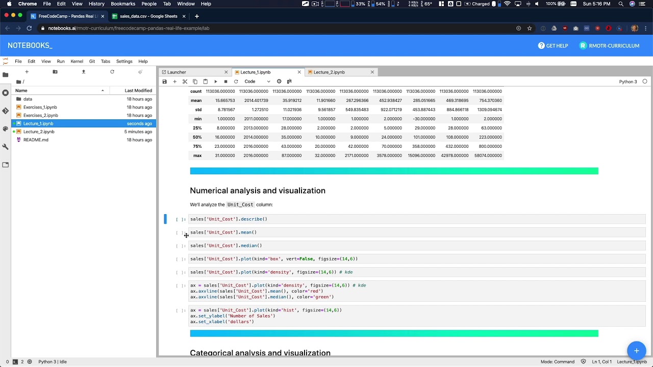
Data Analysis Example A - Data Analysis with Python

Statistik#1 : Diagram | Kelas X Fase E Kurikulum Merdeka
5.0 / 5 (0 votes)