04-1 Memahami Data Melalui Eksplorasi Data
Summary
TLDRThis video covers the topic of exploratory data analysis (EDA), focusing on understanding data through various techniques. It introduces the concept of EDA, including its importance in analyzing data before performing complex statistical analysis. The video discusses methods such as boxplots, histograms, and scatter plots to visualize data patterns, distributions, and relationships between variables. It also provides practical guidance on creating these visualizations using Excel. The video aims to enhance viewers' ability to explore data effectively and intuitively.
Takeaways
- 😀 Exploratory Data Analysis (EDA) is an essential first step in understanding data before performing more complex statistical analyses.
- 😀 EDA helps to visualize data through graphs like boxplots, histograms, and scatter plots, making it easier to spot trends and patterns.
- 😀 Boxplot is a type of visualization that displays the spread and concentration of data, identifies outliers, and compares distributions across multiple data sets.
- 😀 The process to create a boxplot includes calculating the five-number summary (min, Q1, median, Q3, and max) and detecting outliers based on data points outside the fences (lower and upper thresholds).
- 😀 In Excel, you can create a boxplot by selecting the data, inserting a box-and-whisker chart, and adjusting the settings to match the desired output.
- 😀 A histogram is used to visualize the distribution of data, helping to identify outliers, mode, and the overall shape of the data distribution.
- 😀 To create a histogram in Excel, select your data, choose 'Insert' and then 'Histogram' from the chart options to generate a visual representation of the data distribution.
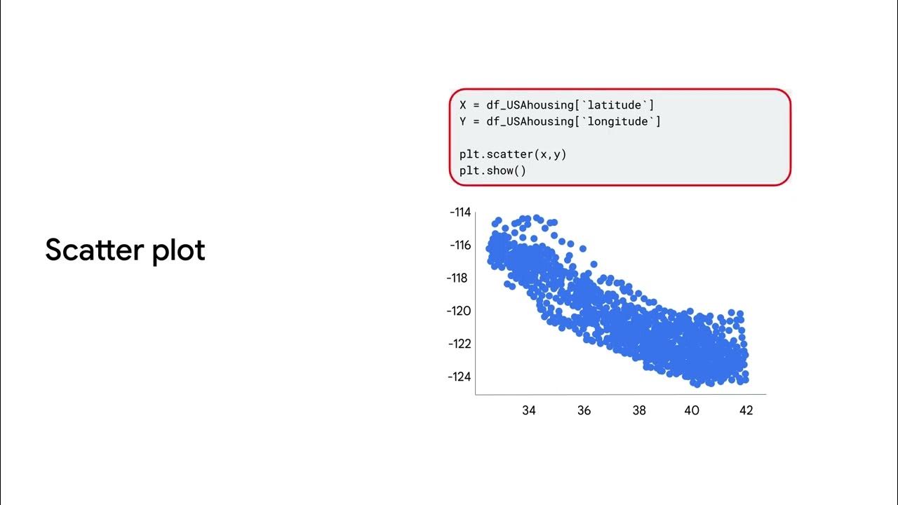
- 😀 Scatter plots (scatter plots) help observe the relationship between two continuous variables by plotting points on a two-dimensional graph with each axis representing one variable.
- 😀 A scatter plot can be used to analyze relationships like advertising expenditure vs. sales revenue, which helps in visualizing the correlation between variables.
- 😀 In Excel, a scatter plot can be created by selecting the data, clicking 'Insert,' and choosing 'Scatter' from the chart options. Ensure axis labels are correctly assigned for clarity.
Q & A
What is Exploratory Data Analysis (EDA)?
-Exploratory Data Analysis (EDA) is the initial step in data analysis, aimed at understanding the characteristics and patterns of data through visualization, before applying complex statistical techniques.
Why is EDA important before performing detailed analysis?
-EDA helps to identify trends, patterns, and anomalies in the data, which can guide more complex analysis and ensure the data is suitable for further examination.
What are some common visualization methods used in EDA?
-Common visualization methods in EDA include boxplots, histograms, and scatter plots. These tools help to explore data distribution, relationships, and outliers.
How does a boxplot help in data analysis?
-A boxplot visualizes the spread and central tendency of data, helps detect outliers, and enables comparisons between different groups of data.
What are the steps to create a boxplot?
-To create a boxplot, calculate the five-number summary (minimum, Q1, median, Q3, maximum), identify outliers, and plot the box with lines representing the data range. If outliers exist, they are marked separately.
What is a histogram used for in data analysis?
-A histogram is used to visualize the distribution of data. It shows the frequency of data points within specific ranges and helps detect the central tendency, spread, and outliers.
How do you create a histogram in Excel?
-To create a histogram in Excel, select the data, go to the 'Insert' tab, choose the 'Histogram' option from the chart menu, and customize the appearance as needed.
What is a scatter plot and when should it be used?
-A scatter plot is a graph that uses dots to represent values of two variables. It is used to observe the relationship or correlation between these variables, for example, advertisement spending versus revenue.
How do you create a scatter plot in Excel?
-To create a scatter plot in Excel, select the data, go to the 'Insert' tab, choose the 'Scatter' chart option, and adjust the axes and labels for clarity.
What role do outliers play in EDA?
-Outliers are data points that differ significantly from others. Identifying them through visualizations like boxplots helps in understanding data variability and may suggest errors or special phenomena.
Outlines

This section is available to paid users only. Please upgrade to access this part.
Upgrade NowMindmap

This section is available to paid users only. Please upgrade to access this part.
Upgrade NowKeywords

This section is available to paid users only. Please upgrade to access this part.
Upgrade NowHighlights

This section is available to paid users only. Please upgrade to access this part.
Upgrade NowTranscripts

This section is available to paid users only. Please upgrade to access this part.
Upgrade NowBrowse More Related Video

Exploratory Data Analysis (EDA) Using Python | Python Data Analysis | Python Training | Edureka
Data analysis and visualization

EXPLORATORY ANALYSIS OF GEOLOCATIONAL DATA (MINI PROJECT)

What is exploratory data analysis

Understanding Your Data | Day 19 | 100 Days of Machine Learning

#1 Unlock The Secrets Of Data Analysis: A Comprehensive Tutorial On The Data Analysis Lifecycle
5.0 / 5 (0 votes)