How to get the right tone in your paintings -PRACTICAL EXERCISE
Summary
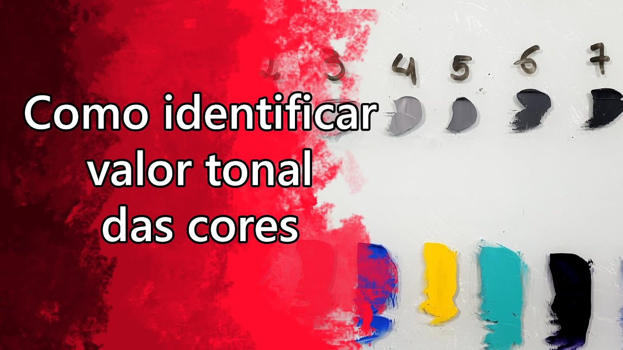
TLDRIn this tutorial, the artist explores the relationship between tonal values and colors through a simple exercise. By painting a cube first in black-and-white shades and then in red, they demonstrate how to match tones between the two versions. The tutorial covers key concepts such as creating gradations of light and shadow, using complementary colors, and ensuring accurate tonal matching. A helpful trick is shared—using a phone's black-and-white photo mode to compare tones effectively. The tutorial concludes with a fun challenge for viewers to apply their knowledge and an offer for free access to the artist's course.
Takeaways
- 😀 Start building a black-and-white tone scale by gradually adding black to white to create a range of gray shades.
- 😀 Always start mixing colors with the lightest tone and add dark tones carefully, as it's easier to darken than lighten a mix.
- 😀 The intensity of light falling on an object determines the tone used to paint its visible faces — brighter for light areas and darker for shadowed ones.
- 😀 Shadows should match the tone of the part of the object in shadow; avoid using pure black for shadows.
- 😀 To darken a color for shadows, mix the base color (e.g., red) with its complementary color (e.g., green).
- 😀 Use the 'black and white photo' setting on your phone to compare tonal values in your painting without being distracted by color.
- 😀 The tone of a painted object in color should match the corresponding tone in black and white for consistency.
- 😀 When painting a colored object, ensure that the light and shadow areas match the corresponding tonal values of the black-and-white version.
- 😀 The tutorial emphasizes the importance of checking the tonal accuracy by comparing and adjusting as you go along.
- 😀 The exercise encourages you to experiment with tones and colors to deepen your understanding of tonal relationships in painting.
Q & A
What is the main focus of this tutorial?
-The main focus of this tutorial is to demonstrate how black-and-white tonal values relate to colors, and how to ensure that the tonal values of a painted object remain consistent when working with both grayscale and colored versions.
Why is it important to start with the lightest color when mixing tones?
-Starting with the lightest color makes it easier to adjust the tone by adding darker colors. It's always easier to darken a mix than to lighten it, which helps maintain better control over the tonal gradation.
What is the significance of comparing the tones of the grayscale cube with the red cube?
-Comparing the tones of the grayscale cube with the red cube helps ensure that the tonal values remain consistent across both the black-and-white and color versions. This process teaches how to match tonal values despite the difference in colors.
How does the intensity of light affect the tonal choices for the cube faces?
-The intensity of light affects the tonal choices because the faces of the cube exposed to more light are painted with lighter tones, while the faces in shadow are painted with darker tones. This simulates how light interacts with objects in real life.
What is the trick to ensuring the tones are accurate in your painting?
-The trick is to use your phone’s camera to take a photo in black and white mode. This allows you to compare the tones without the distraction of colors, making it easier to ensure tonal accuracy.
How can you identify the brightest tone when using a color like red?
-To identify the brightest tone, you should mix the base color (red) with white, starting with the white and then gradually adding red. This allows you to create a lighter version of the color for the brightest tones.
Why is it necessary to darken the shadow face of the cube with a complementary color?
-Darkening the shadow face with a complementary color, such as green for red, helps create a more realistic and natural shadow. Complementary colors work together to provide depth and contrast in the artwork.
What is the purpose of comparing the image in black and white with the color version?
-Comparing the image in black and white with the color version helps confirm that the tonal values are consistent across both versions. If the tonal values match, the painting will appear realistic and cohesive regardless of the color applied.
What does the challenge at the end of the tutorial encourage viewers to do?
-The challenge encourages viewers to recreate the exercise by painting the same cube with both black and white tones and colors, and then submit their drawings for feedback. This engages the audience and encourages them to practice and improve their understanding of tonal values.
What additional resource is offered to viewers in the tutorial?
-The tutorial offers viewers a chance to win a video book containing eight lessons from the basic drawing and painting course. This is given as a reward for commenting on the lessons in a meaningful way.
Outlines

This section is available to paid users only. Please upgrade to access this part.
Upgrade NowMindmap

This section is available to paid users only. Please upgrade to access this part.
Upgrade NowKeywords

This section is available to paid users only. Please upgrade to access this part.
Upgrade NowHighlights

This section is available to paid users only. Please upgrade to access this part.
Upgrade NowTranscripts

This section is available to paid users only. Please upgrade to access this part.
Upgrade NowBrowse More Related Video

5.0 / 5 (0 votes)