Visualisasi Data dengan Chart Microsoft Excel
Summary
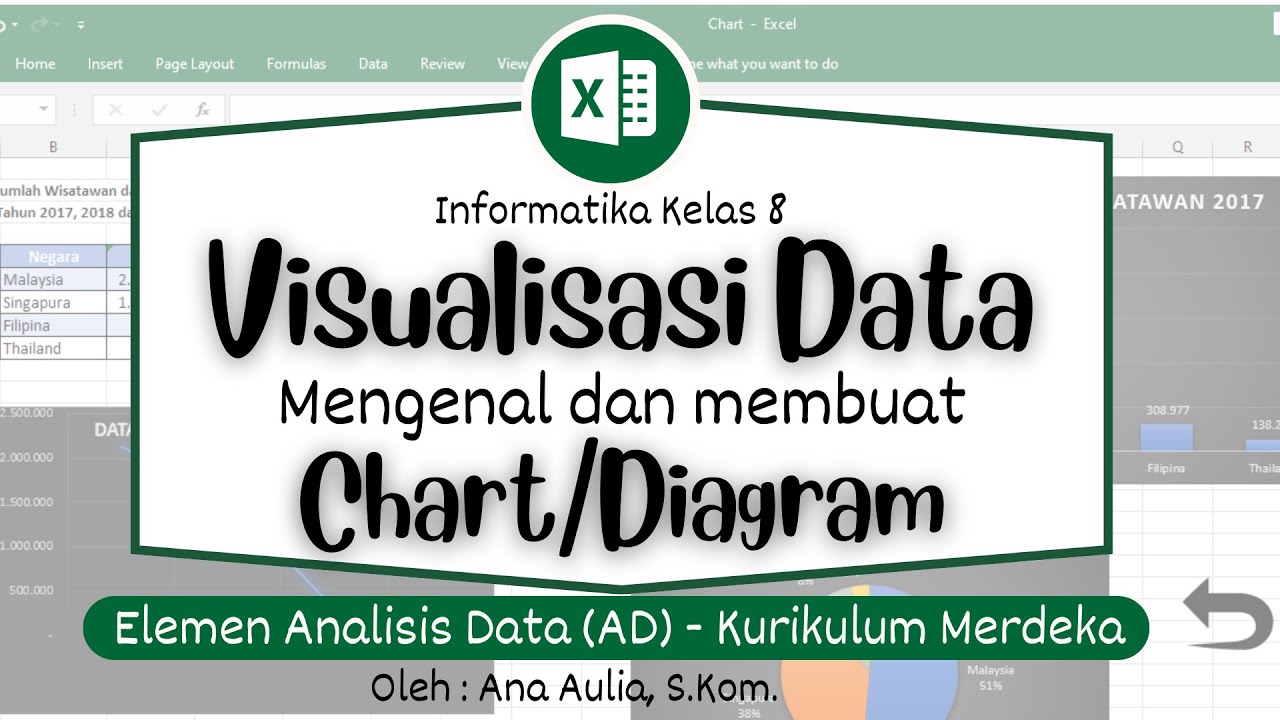
TLDRThis tutorial demonstrates how to create a data visualization using bar charts in Microsoft Excel 2013. It covers the process of preparing data, selecting a chart type, and customizing elements like axes and labels. The video guides viewers through creating a clear and readable chart, including steps for resizing columns, labeling axes, and adding data labels for clarity. It concludes by showing how to save the chart to a specific file location, ensuring users can create professional visualizations with ease.
Takeaways
- 😀 Introduction to data visualization using charts in Microsoft Excel.
- 😀 Charts are effective tools for visualizing numerical data like comparisons and trends.
- 😀 There are various types of charts available, such as bar, column, line, and area charts.
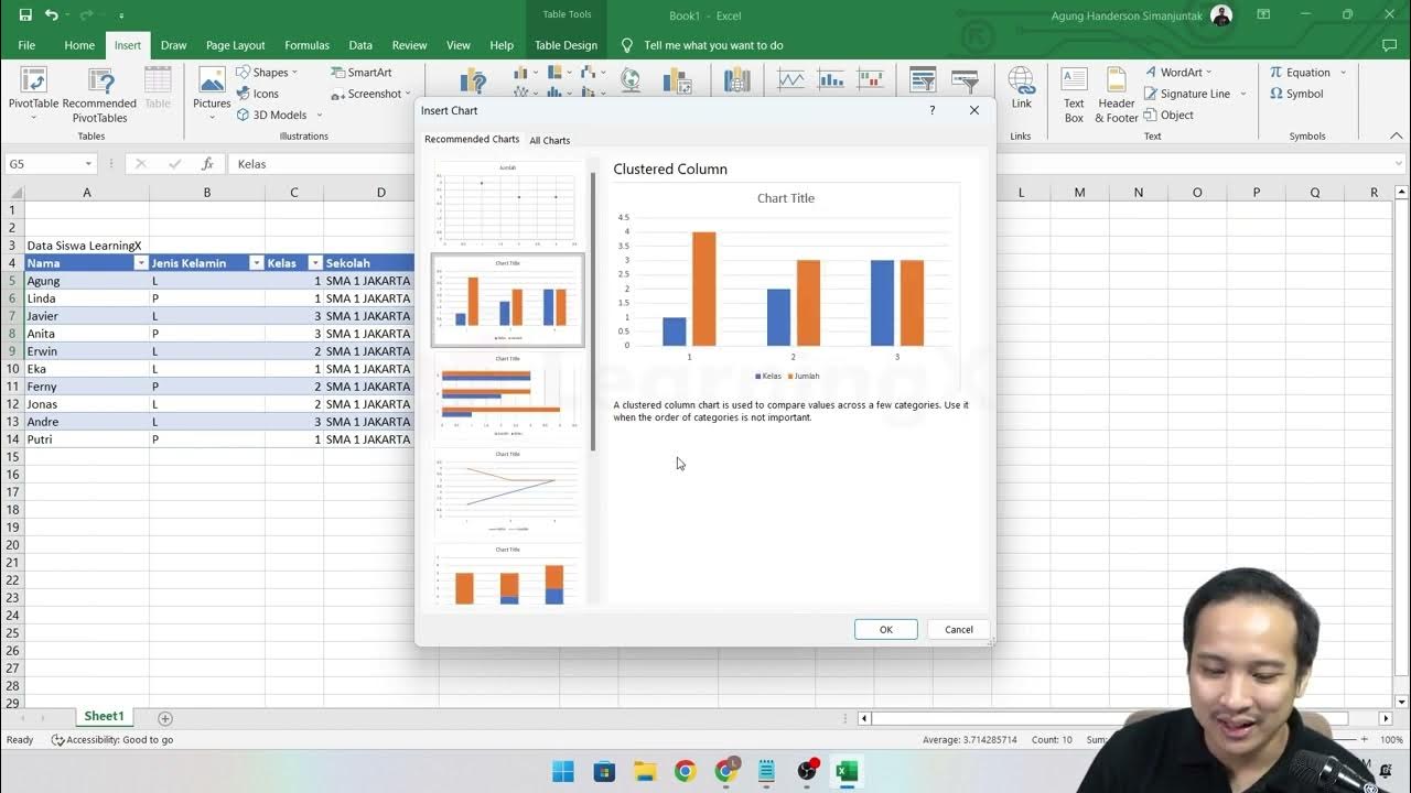
- 😀 The tutorial demonstrates creating a chart in Microsoft Excel 2013.
- 😀 The first step is to prepare a table of data with columns for periods and population numbers.
- 😀 To make the data easier to read, you can adjust column widths in Excel.
- 😀 After entering data, select the range and insert a chart using the 'Insert' tab in Excel.
- 😀 In this example, a column chart is used to visualize the population data.
- 😀 The chart title and axes labels can be customized by clicking on the chart elements.
- 😀 Data labels can be added to the bars to show exact values for each data point.
- 😀 The chart and data can be saved in a specified folder on the computer with a custom file name.
Q & A
What is the purpose of data visualization in this tutorial?
-The purpose of data visualization in this tutorial is to help in understanding and presenting numerical data more easily, such as comparing and showing trends, by using charts in Microsoft Excel.
Which version of Microsoft Excel is being used in this tutorial?
-The tutorial is using Microsoft Excel 2013.
What is the first step in creating a chart in Excel?
-The first step is to open Microsoft Excel and select a blank workbook.
What kind of data is used as an example in this tutorial?
-The example data consists of a table showing periods (e.g., 1, 2, 3, 4) and corresponding population numbers (e.g., 100, 299, 125).
How can you adjust the width of a column in Excel?
-To adjust the width of a column, place the cursor at the edge of the column header (e.g., C), click and drag it to the desired width.
How do you select a range of data to create a chart?
-You select the data by clicking and dragging the mouse to highlight the range, such as the population numbers.
Which type of chart is being used in this tutorial?
-The tutorial uses a column chart to visualize the data.
How can you rename the title of a chart in Excel?
-To rename the title of a chart, click on the title text in the chart and replace it with the new title, such as 'Population Numbers.'
How can you add axis labels to the chart?
-To add axis labels, select the chart, go to the 'Design' menu, and choose 'Add Chart Element' to add horizontal (X-axis) and vertical (Y-axis) labels. Then, rename the X-axis as 'Period' and the Y-axis as 'Population.'
How do you add data labels to the chart?
-To add data labels, right-click on one of the bars in the chart, choose 'Add Data Labels,' and the population numbers will appear on each bar.
How do you save the Excel file with the chart?
-To save the file, click the 'Save' icon (the floppy disk) and choose a folder to save the file. Name the file according to the format specified, such as including your class, attendance number, and full name.
What should be done after saving the file in Excel?
-After saving the file, you can close the program, completing the process of creating and saving the data visualization in Excel.
Outlines

This section is available to paid users only. Please upgrade to access this part.
Upgrade NowMindmap

This section is available to paid users only. Please upgrade to access this part.
Upgrade NowKeywords

This section is available to paid users only. Please upgrade to access this part.
Upgrade NowHighlights

This section is available to paid users only. Please upgrade to access this part.
Upgrade NowTranscripts

This section is available to paid users only. Please upgrade to access this part.
Upgrade NowBrowse More Related Video

TOP 5 Excel Data Visualization Tips (Become a Data Visualization PRO)
Chapter 5 - Tutorial Analisa Data Part 1 (COUNT IF)
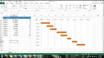
Gantt Chart Excel Tutorial - How to make a Basic Gantt Chart in Microsoft Excel
Your first 10 minutes of Power BI - A no-nonsense getting started tutorial for beginners
Workplace Productivity Tools Part 3
(#3) Visualisasi Data Elemen Analisis Data Kelas 8 - Mengenal dan Membuat Aneka Bentuk Chart/Diagram
5.0 / 5 (0 votes)