Your first 10 minutes of Power BI - A no-nonsense getting started tutorial for beginners
Summary
TLDRThis video provides a comprehensive guide to using Power BI, a data analysis and visualization tool. It demonstrates how to import data, create charts, and explore various visualizations such as column charts, bar charts, and line charts. The tutorial also highlights interactive features like filtering and AI-driven insights for trend analysis. Additionally, it covers the process of saving and sharing reports, making it easy for users to collaborate within organizations. Whether you're a beginner or looking to deepen your skills, this tutorial offers valuable insights for leveraging Power BI in data-driven decision-making.
Takeaways
- 😀 Power BI is a data analysis and visualization tool that helps users understand and analyze data from different sources, including Excel, SQL, and pasted data.
- 😀 To start using Power BI, download the Power BI Desktop application from Microsoft's website and install it on your computer.
- 😀 Power BI offers a simple interface with three main areas: a ribbon for accessing features, a canvas for visualizations, and panels for customization.
- 😀 Data can be imported into Power BI from sources like Excel, and users can transform the data before loading it into the system for analysis.
- 😀 After importing data, Power BI automatically generates a field panel where you can select data to build visualizations like charts, tables, and graphs.
- 😀 Visualizations in Power BI are interactive by default. Clicking on a data point in one chart will highlight related data in other charts.
- 😀 Power BI supports multiple chart types like column charts and bar charts, which can be customized and resized to fit the canvas.
- 😀 Users can change the colors of visuals, including selecting colors via a search function, to improve readability and design.
- 😀 Power BI allows users to create line charts to analyze trends over time, with the ability to drill down into specific time periods like year, quarter, or month.
- 😀 Power BI's 'Analyze' feature uses artificial intelligence to help explain changes in data, such as analyzing the cause of a drop in sales over a period of time.
- 😀 Once a report is complete, users can save the Power BI file or publish it to the Power BI service for sharing and collaboration, with additional features available through Pro and Premium packages.
Q & A
What is Power BI, and how is it used?
-Power BI is a data analysis and visualization software that helps users analyze data from various sources, like Excel, SQL databases, or directly pasted data, to create interactive reports and visualizations.
How do you install Power BI Desktop?
-To install Power BI Desktop, go to powerbi.microsoft.com, click on 'Products', and select 'Power BI Desktop'. Download the software, run the installer, and open it to get started.
What are the main sections of the Power BI interface?
-The Power BI interface consists of three main sections: the ribbon (for accessing features), the canvas area (where visuals and data are displayed), and the right-hand panels (for visual customization and accessing data).
How do you import data into Power BI?
-To import data, click on 'Get Data', choose the 'Excel' option, and navigate to the file you want to import. After selecting the data, you can either load it directly or use the 'Transform Data' option to clean it before loading.
Can you modify the data before loading it into Power BI?
-Yes, Power BI allows you to transform and clean the data before loading it into the application using the 'Transform Data' feature, which is helpful for correcting data formatting or removing unnecessary columns.
What types of charts can you create in Power BI?
-Power BI offers various visualization types, including column charts, bar charts, line charts, pie charts, and more. These can be used to display data in different formats to analyze trends and patterns.
What is the difference between a column chart and a bar chart in Power BI?
-A column chart displays data with vertical bars, whereas a bar chart displays data with horizontal bars. Both charts are useful for comparing data across categories but vary in visual presentation.
How does interactivity work in Power BI?
-Interactivity in Power BI allows you to click on any visual, such as a country or product, and instantly filter or highlight related data in other visuals. This helps users drill down into specific insights and explore the data in greater detail.
What is the purpose of the 'Analyze' feature in Power BI?
-The 'Analyze' feature in Power BI provides AI-based insights into the data. For example, if a sudden drop in sales is observed, users can right-click and use the 'Explain the Decrease' option to automatically analyze and identify the cause of the decrease.
How can you share Power BI reports with others?
-To share Power BI reports, you need to publish them to the Power BI service. However, sharing requires a Power BI Pro or Premium license. Once published, reports can be accessed and viewed by others within your organization.
What is the significance of date hierarchies in Power BI?
-In Power BI, when using date data, it automatically creates a hierarchy that includes year, quarter, month, and day levels. This allows users to analyze trends over time at different granularities and makes it easier to visualize data across multiple time periods.
Outlines

This section is available to paid users only. Please upgrade to access this part.
Upgrade NowMindmap

This section is available to paid users only. Please upgrade to access this part.
Upgrade NowKeywords

This section is available to paid users only. Please upgrade to access this part.
Upgrade NowHighlights

This section is available to paid users only. Please upgrade to access this part.
Upgrade NowTranscripts

This section is available to paid users only. Please upgrade to access this part.
Upgrade NowBrowse More Related Video

1 Power BI Introduction
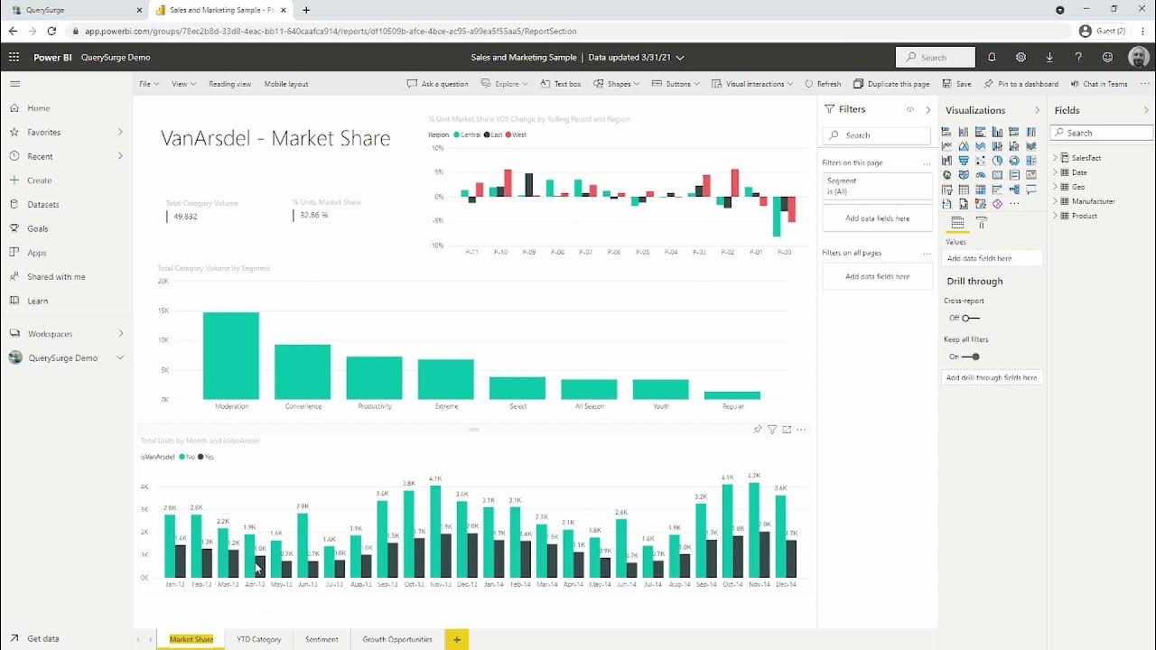
Using QuerySurge to Test & Validate Data in Microsoft Power BI

Introduction to Power BI: What is it?

Dasar Dasar Power BI | Pembuatan Dashboard Covid-19 Indonesia
How to pick the "perfect" chart for your situation in Power BI?

The Evolution Of Data Visualization | Dustin Cabral | TEDxBryantU
5.0 / 5 (0 votes)