(#3) Visualisasi Data Elemen Analisis Data Kelas 8 - Mengenal dan Membuat Aneka Bentuk Chart/Diagram
Summary
TLDRIn this video, Ana Aulia explains how to visualize data using various chart types in Microsoft Excel. The video covers different chart options like column, line, pie, bar, and area charts, each with its specific use cases for displaying data trends, comparisons, and contributions. Ana also demonstrates how to create these charts from raw data, add labels, and customize their appearance. She emphasizes the importance of selecting the right chart for the data and offers practical steps for creating both single and multiple data charts. The video is part of a series on data analysis for middle school students.
Takeaways
- 😀 Visualizing data helps to present information clearly and make it easier to understand through charts and graphs.
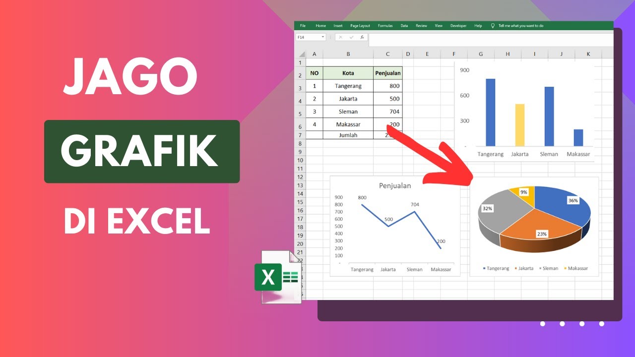
- 😀 The video teaches how to create various types of charts in Microsoft Excel, such as column charts, line charts, pie charts, bar charts, and area charts.
- 😀 Data visualization is a crucial step in data analysis and helps in making data predictions, especially when dealing with time-based data.
- 😀 A line chart is useful for showing trends in data over time, and the x-axis should typically represent time or sequential labels.
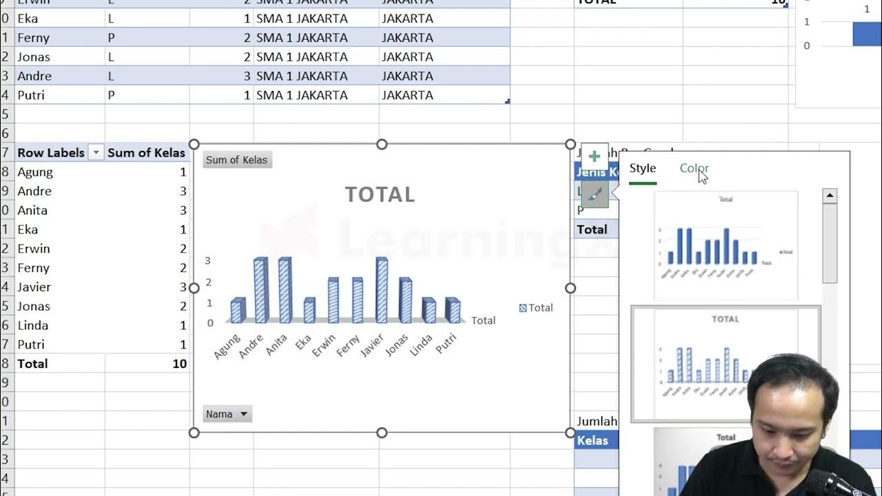
- 😀 A column chart is great for comparing values across different categories using vertical bars.
- 😀 Pie charts are used to show the contribution of each data value to the total and are typically used for single-group data.
- 😀 A bar chart, the horizontal version of a column chart, is helpful for data with wide text labels.
- 😀 An area chart is similar to a line chart but fills the area below the line with color, helpful for showing how individual parts contribute to a total over time.
- 😀 When creating charts, it’s essential to select the right chart type based on the type of data and the message you wish to convey.
- 😀 For multi-data sets, legends should be used to differentiate each data group, and proper labels should be added to the x-axis and y-axis for clarity.
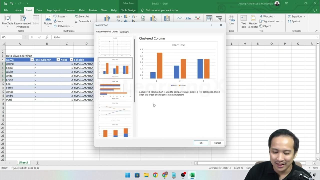
- 😀 To create charts in Excel, you must first select the data, insert the chart type, and customize it with the necessary data labels and styling options.
Q & A
What is data visualization?
-Data visualization is the process of representing data in a graphical format, such as charts or graphs. It helps to make the data easier to understand and analyze by showing the patterns, trends, and insights clearly.
What are the key types of charts used in data visualization in Microsoft Excel?
-The key types of charts used for data visualization in Microsoft Excel include Column Charts, Line Charts, Pie Charts, Bar Charts, and Area Charts. Each of these charts is suited for different kinds of data representation.
What is the purpose of a Column Chart?
-A Column Chart is used to compare values across different groups or categories using vertical bars. It is effective for displaying data where you want to compare different items within categories.
When should a Line Chart be used?
-A Line Chart is ideal for showing data trends over time. It is commonly used when the data points are sequential (e.g., months, years), making it easier to analyze changes or trends across time periods.
What is the function of a Pie Chart?
-A Pie Chart is used to show the proportional contributions of different values to the total. Each slice represents a part of the whole, making it suitable for displaying single-group data.
Why would you use a Bar Chart instead of a Column Chart?
-A Bar Chart is the horizontal version of a Column Chart. It is typically used when the data labels are too long or when the comparison of data categories with wide labels is needed.
What is an Area Chart and when should it be used?
-An Area Chart is a Line Chart with the area beneath the line filled with color. It is useful for showing trends over time while emphasizing the volume or magnitude of change in the data.
What are the important things to consider when creating a chart?
-When creating a chart, it is important to select the correct chart type based on the data, determine if the chart represents single or multiple data sets, and ensure that the chart is properly labeled with titles, axis labels, and data labels.
How can data labels be added to a chart in Excel?
-Data labels can be added to a chart in Excel by right-clicking on the chart elements (such as bars, slices, or lines) and selecting the 'Add Data Labels' option. This displays the numerical values of the data directly on the chart.
Why can’t Pie Charts be used for multiple datasets?
-Pie Charts are designed to represent a single data set, showing the parts of a whole. For multiple datasets, other types of charts like Column or Line Charts are better suited for comparison.
Outlines

This section is available to paid users only. Please upgrade to access this part.
Upgrade NowMindmap

This section is available to paid users only. Please upgrade to access this part.
Upgrade NowKeywords

This section is available to paid users only. Please upgrade to access this part.
Upgrade NowHighlights

This section is available to paid users only. Please upgrade to access this part.
Upgrade NowTranscripts

This section is available to paid users only. Please upgrade to access this part.
Upgrade NowBrowse More Related Video
Chapter 5 - Tutorial Analisa Data Part 3 (Pivot Table) | Informatika Booster

#2 Mengenal Perkakas Lembar Kerja Pengolahan Angka | Mengenal Bagian-Bagian Microsoft Excel

How to Create Charts and Graphs in Microsoft Excel - Quick and Simple
Chapter 5 - Tutorial Analisa Data Part 1 (COUNT IF)

Which is the best chart: Selecting among 14 types of charts Part II
Cara Membuat Grafik di Excel Untuk Pemula
5.0 / 5 (0 votes)