QGIS Tutorials 28: Using Categorized Symbology in QGIS | Symbolize Vector Data | Vector Styling
Summary
TLDRThis tutorial demonstrates how to effectively classify and symbolize vector data in QGIS. It covers point, line, and polygon layers, showing how to categorize data based on unique attributes such as names. For points, the tutorial focuses on using categorized symbols and customizing them with SVG markers. For lines, different road types (e.g., highways, canals) are symbolized with varied line styles, widths, and colors. For polygons, unique attributes are used to apply color ramps or patterns. The tutorial emphasizes customization options to make the map more informative and visually appealing by tailoring the symbols for individual features.
Takeaways
- 😀 Learn how to classify vector data effectively in GIS using categorized symbols for point, line, and polygon layers.
- 😀 Use the 'Categorized' option in the symbology settings to categorize point data based on unique attributes like 'name'.
- 😀 Customize point symbols using different SVG markers and adjust the size and color for clear differentiation between categories.
- 😀 Symbolize points based on their unique features, like 'bus stand', 'hospital', 'railway station', etc., for better visualization.
- 😀 Categorize line data based on attribute values (e.g., road types like 'highway', 'canal', 'state highway') for clearer representation.
- 😀 Apply color ramps to line data for better differentiation, and invert the color scheme if needed.
- 😀 Customize line widths, colors, and patterns (e.g., dashed, dotted lines) to represent different road types or categories.
- 😀 Learn to categorize polygon data based on its unique attribute values, like 'name', and customize each polygon's color.
- 😀 Use gradient fills and line pattern fills for polygons to enhance visibility and representation in maps.
- 😀 Customize symbols for individual layers and features by adjusting transparency, size, stroke style, and color.
- 😀 You can also copy and paste symbols for consistent classification across similar features in your GIS project.
Q & A
What is the purpose of the tutorial in the video?
-The tutorial aims to demonstrate how to classify vector data effectively in QGIS, focusing on categorizing points, lines, and polygons based on their unique attributes to improve map readability and analysis.
How do you classify point data in QGIS?
-To classify point data in QGIS, right-click the point data layer, go to 'Properties,' then choose 'Categorized' under the Symbology tab. You can categorize the points based on attributes like 'name' and apply a color ramp to distinguish each category.
What is the role of the attribute table when classifying vector data?
-The attribute table stores the unique values for each feature in the vector data, such as names, types, or other characteristics. This information is used to classify and symbolize the features appropriately in the map view.
What options are available for customizing point symbols in QGIS?
-Point symbols can be customized by selecting different symbol types, such as SVG markers. You can further customize the symbols by choosing specific icons (e.g., bus, hospital) and adjusting their colors and sizes.
How do you apply different symbologies to lines based on attributes?
-To classify line data, right-click the line layer, go to 'Properties,' and select 'Categorized' under Symbology. Use an attribute like 'name' to categorize the lines (e.g., highways, state highways), and then apply color ramps and adjust the width, style, and color of the lines accordingly.
What customization options are available for line symbology in QGIS?
-For line symbology, you can adjust the color, width, and style (e.g., solid, dashed, or dotted lines). Additionally, you can modify joint styles and apply multiple layers of different line types (e.g., solid with a dashed overlay).
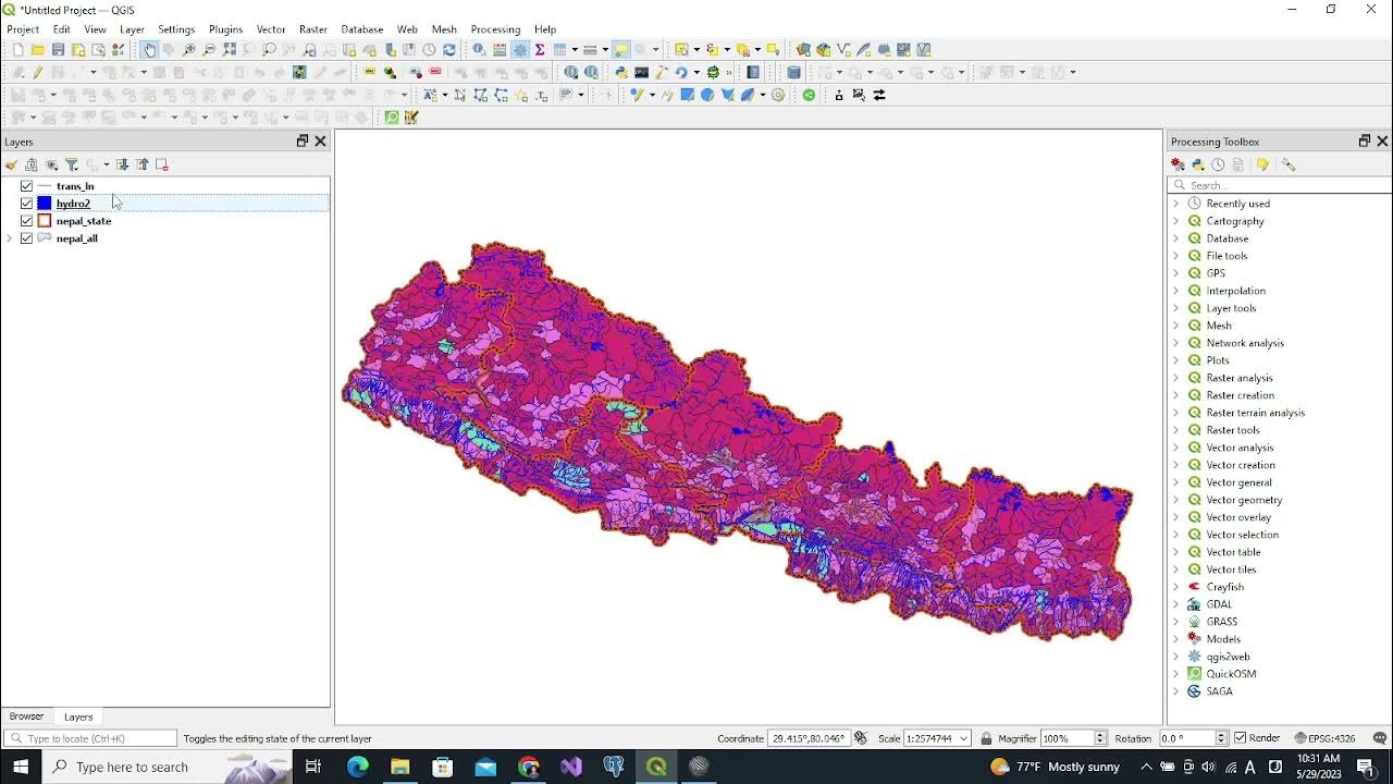
Can you classify polygon data in QGIS? How?
-Yes, polygon data can be classified in QGIS. Right-click the polygon layer, go to 'Properties,' select 'Categorized' under Symbology, and choose an attribute like 'name' to categorize the polygons. You can then apply color ramps and further customize the polygon fills, including gradients or patterns.
How can transparency be used to enhance polygon visualization?
-Transparency can be adjusted to make polygons more transparent, allowing underlying layers to be visible. This is useful for overlaying multiple layers and improving map clarity. The transparency can be set to specific percentages, such as 20%, 30%, or 35%.
What are some of the color ramp options in QGIS for categorizing data?
-QGIS offers various color ramp options for categorizing data, such as Turbo, and allows users to customize the color ramps. You can also invert the color ramp or select from a wide range of predefined options to suit the data visualization needs.
How do you handle customizing individual polygon features in QGIS?
-Individual polygon features can be customized by right-clicking the feature in the layer, selecting 'Properties,' and then adjusting the color, transparency, and fill patterns. You can also use specific SVG markers or gradient fills to represent different polygon types or categories.
Outlines

This section is available to paid users only. Please upgrade to access this part.
Upgrade NowMindmap

This section is available to paid users only. Please upgrade to access this part.
Upgrade NowKeywords

This section is available to paid users only. Please upgrade to access this part.
Upgrade NowHighlights

This section is available to paid users only. Please upgrade to access this part.
Upgrade NowTranscripts

This section is available to paid users only. Please upgrade to access this part.
Upgrade Now


5.0 / 5 (0 votes)