How to Create Charts and Graphs in Microsoft Excel - Quick and Simple
Summary
TLDRIn this tutorial, Jamie teaches viewers how to create and customize charts and graphs in Microsoft Excel. The video covers various methods to insert charts, including using shortcuts like 'Alt + F1', and the 'Insert' tab. Jamie demonstrates how to add data series, customize chart elements like titles and legends, and adjust the appearance using colors and styles. The tutorial also highlights the ability to combine different chart types and add images for a more engaging visual presentation. Finally, Jamie shows how to save the chart as an image or embed it in other Microsoft Office documents.
Takeaways
- 📕 Jamie introduces a tutorial on creating and customizing charts and graphs in Microsoft Excel.
- 🔍 A link to example data is provided in the video description for practice purposes.
- 💵 Three methods are demonstrated for quickly adding charts to data in Excel: using a shortcut (Alt + F1), selecting from recommended charts, and manually selecting data and choosing a chart type.
- 📖 Customization options are highlighted, such as adding titles, data labels, and adjusting the legend.
- 💲 The importance of organizing data properly before creating a chart is emphasized, including selecting multiple data ranges and rows.
- 📗 The video shows how to add and customize multiple data series to a chart, such as adding TikTok and YouTube revenue data.
- 📔 Tips on changing chart elements like axis titles, data labels, and series colors are provided.
- 💵 The use of the 'Chart Design' and 'Format' tabs for further customization is explained.
- 💲 The ability to change the chart type after creation is demonstrated, including the option to create combo charts with different types for each data series.
- 📗 The script discusses adding images to charts for visual interest and provides a brief guide on resizing and positioning images within Excel.
- 💵 The video concludes with suggestions on how to save or export charts, including saving as a picture or embedding in other Microsoft Office applications with dynamic linking.
Q & A
What is the main topic of the video?
-The main topic of the video is how to create and customize charts and graphs inside Microsoft Excel.
How can viewers access the same data used in the tutorial?
-Viewers can access the same data by clicking on a link provided in the video description, which allows them to download a copy of the data to use in Excel.
What are the three different ways shown to add a chart in Excel?
-The three ways shown are: using the shortcut 'Alt + F1' after selecting data, using the 'Insert' tab and choosing from the recommended charts, and selecting data and then choosing a chart type from the 'Insert' tab without having the data selected.
What is the significance of holding down the 'Control' key while selecting data for a chart?
-Holding down the 'Control' key allows the user to select multiple non-adjacent data ranges to include in the chart.
How can you add more series to an existing chart?
-You can add more series by selecting the chart, going to the 'Chart Design' tab, clicking on 'Select Data', and then choosing 'Add' to select the additional data series.
What does the video suggest to do if you want to change the order of data series in a chart?
-To change the order of data series, you can go to the 'Chart Design' tab, click 'Select Data', and then use the 'Move Up' or 'Move Down' buttons to rearrange the series.
How can you customize the appearance of a chart element like the axis title?
-You can customize the appearance of a chart element by double-clicking on it to open the 'Format' pane, where you can change properties like font, color, and line style.
What is the 'Combo' feature mentioned in the video, and how can it be used?
-The 'Combo' feature allows you to combine two different chart types in one chart, such as having a line graph for one data series and a clustered column graph for another.
How can you add images to a chart in Excel as shown in the video?
-You can add images to a chart by going to the 'Illustrations' tab and choosing 'Picture' to insert an image from your device or by copying and pasting from the internet.
What are the different ways to save a chart after it's been created and customized?
-You can save a chart as a picture by right-clicking on it and choosing 'Save as Picture', or you can copy and paste it into other Microsoft Office documents like Word or PowerPoint.
What is the tip given for selecting multiple rows at once in Excel for chart creation?
-The tip is to use the 'Insert' tab to create a graph and then select all four quarters, which allows you to create a chart with all the selected data at once.
Outlines

This section is available to paid users only. Please upgrade to access this part.
Upgrade NowMindmap

This section is available to paid users only. Please upgrade to access this part.
Upgrade NowKeywords

This section is available to paid users only. Please upgrade to access this part.
Upgrade NowHighlights

This section is available to paid users only. Please upgrade to access this part.
Upgrade NowTranscripts

This section is available to paid users only. Please upgrade to access this part.
Upgrade NowBrowse More Related Video

Google Sheets Charts Tutorial // How to create charts and graphs in Google Sheets

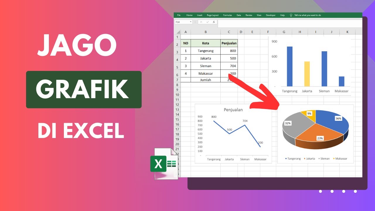
Cara Membuat Grafik di Excel Untuk Pemula

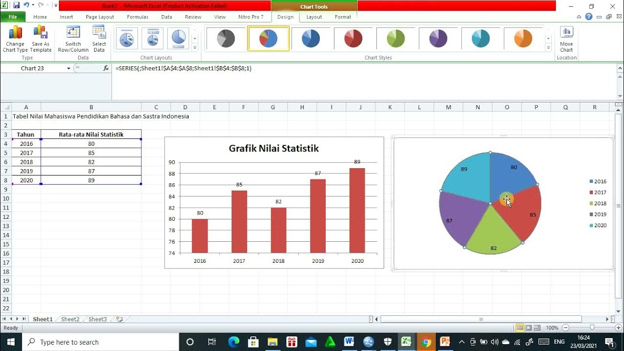
Cara membuat Diagram Batang, Diagram Lingkaran, dan Diagram Garis

Microsoft PowerPoint Tutorial - Beginners Level 1

Visualisasi Data | Menyajikan Data dengan Grafik di Ms Excel | Materi Informatika Kelas 8

Cara Membuat Grafik di Microsoft Excel (2021)
5.0 / 5 (0 votes)