Cara membuat Diagram Batang, Diagram Lingkaran, dan Diagram Garis
Summary
TLDRIn this tutorial, Amalia Fitri demonstrates how to create various types of charts in Excel, including bar, pie, and line graphs. She walks through the process of visualizing student grades data from 2016 to 2020, explaining how to select data, customize chart types, and add labels and titles for clarity. The tutorial highlights the steps for creating both 2D and 3D charts, offering tips on making the data easier to read. Whether you’re looking to display data in percentages or absolute values, this guide covers the essentials of chart creation in Excel.
Takeaways
- 😀 How to create bar charts, pie charts, and line charts in Excel.
- 😀 To create a bar chart, first select your data, then go to 'Insert' and choose the bar chart option.
- 😀 You can customize bar charts by adding data labels and changing the chart title to make it more informative.
- 😀 To create a pie chart, follow similar steps by selecting data and choosing the pie chart option from 'Insert'.
- 😀 Pie charts can also be modified by adding data labels to show the values for each year.
- 😀 The pie chart can be displayed as percentages or values, depending on your preference.
- 😀 Line charts can be created by selecting data and choosing the line chart option from 'Insert'.
- 😀 Data labels in line charts can help make the graph more readable by showing specific values.
- 😀 You can adjust the colors and layout of the charts to suit your preferences.
- 😀 Additional chart types, like horizontal bar charts and scatter plots, are available in Excel for varied data visualization.
- 😀 All steps for creating and customizing these charts can be done easily using the 'Insert' tab and the options available for each chart type.
Q & A
What is the main focus of Amalia Fitri's tutorial?
-The main focus of Amalia Fitri's tutorial is to demonstrate how to create various types of charts and graphs, including bar charts, pie charts, and line charts, using Excel.
What kind of data is used for the charts in the tutorial?
-The tutorial uses a pre-prepared table of student scores ranging from 80 to 89 for the years 2016 to 2020.
How does Amalia Fitri begin creating a bar chart?
-To create a bar chart, Amalia Fitri clicks outside the data table, selects 'Insert,' and then chooses the bar chart option. She further customizes the chart by selecting the relevant data for the values and periods.
What is the purpose of adding data labels to the charts?
-Adding data labels helps make the chart easier to read by showing the exact values for each year, which enhances the clarity of the information being presented.
How does the speaker adjust the horizontal axis in the bar chart?
-The speaker edits the horizontal axis by clicking 'Edit' and selecting the period data (years) to reflect the timeline for the bar chart.
What customization options are available for the pie chart in the tutorial?
-The pie chart can be customized by adding data labels, which indicate the values for each segment. Additionally, the chart can display percentages, though in this case, the speaker uses raw numbers.
How does Amalia Fitri change the chart title in the tutorial?
-To change the chart title, Amalia clicks on 'Layout,' selects 'Chart Title,' and then edits it to match the desired title, such as 'Nilai Statistik' for the charts in this example.
What are the benefits of using a line chart in this tutorial?
-A line chart is useful for visualizing trends over time, allowing the user to easily see whether the values increase or decrease across the years, as demonstrated with the student scores.
What other chart types does Amalia briefly mention in the tutorial?
-Amalia briefly mentions other chart types such as horizontal bar charts and scatter plots, though these are not detailed in the video.
What does Amalia Fitri say about the customization of colors in the charts?
-Amalia mentions that users can customize the colors of the chart elements to suit their preferences, such as changing the color of bars in the bar chart or sections in the pie chart.
Outlines

This section is available to paid users only. Please upgrade to access this part.
Upgrade NowMindmap

This section is available to paid users only. Please upgrade to access this part.
Upgrade NowKeywords

This section is available to paid users only. Please upgrade to access this part.
Upgrade NowHighlights

This section is available to paid users only. Please upgrade to access this part.
Upgrade NowTranscripts

This section is available to paid users only. Please upgrade to access this part.
Upgrade NowBrowse More Related Video
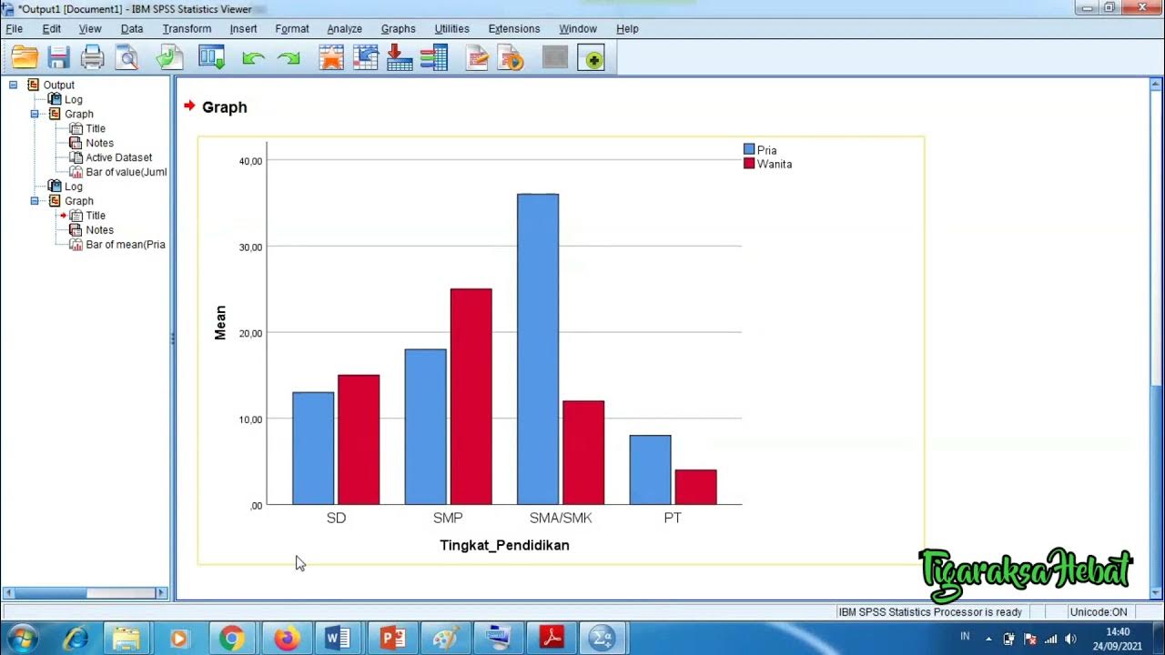
Penyajian Data Statistik Menggunakan SPSS
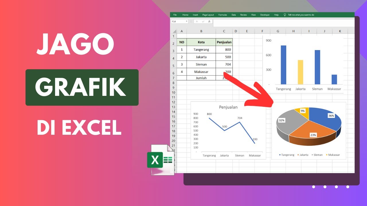
Cara Membuat Grafik di Excel Untuk Pemula

Matematika Kelas 7: Penyajian Data

Visualisasi Data | Menyajikan Data dengan Grafik di Ms Excel | Materi Informatika Kelas 8
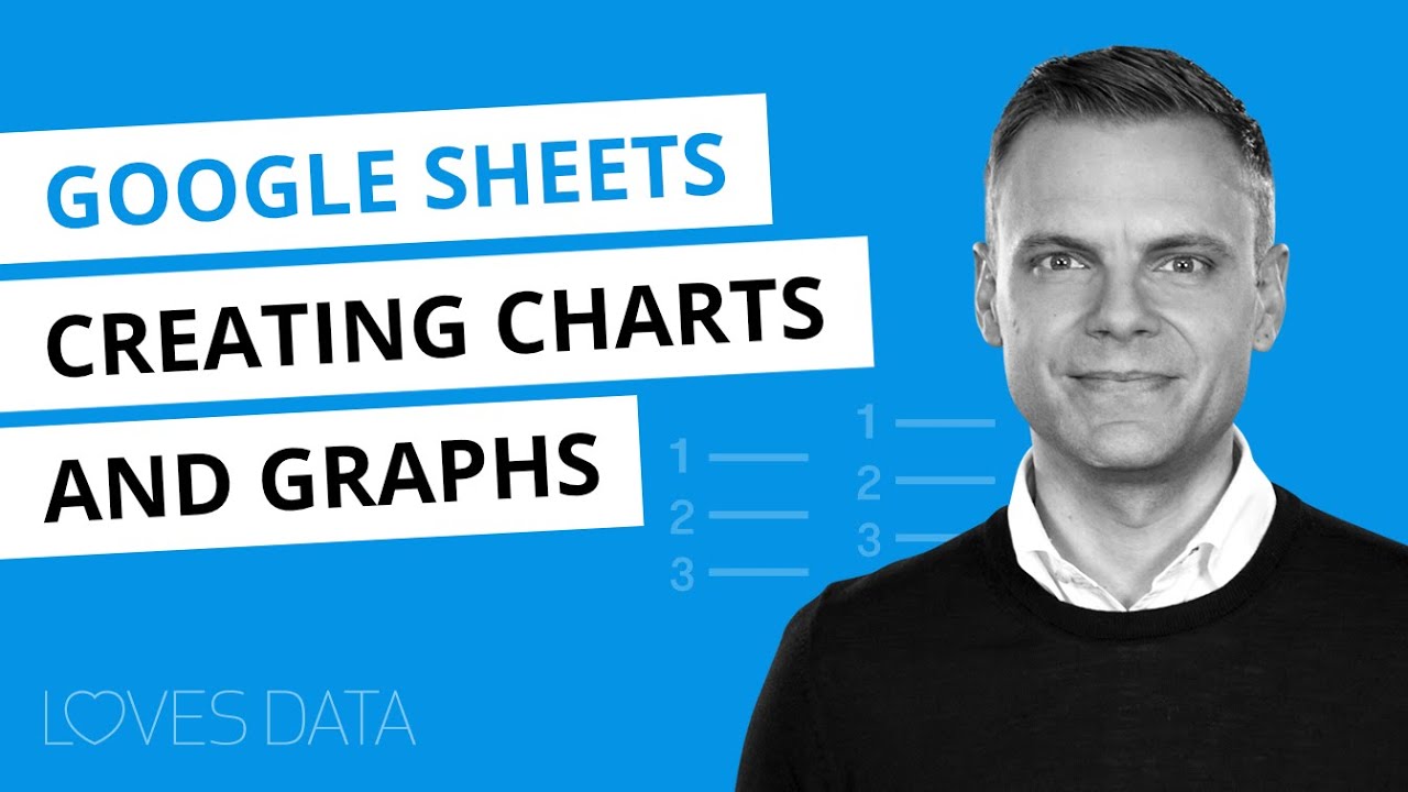
Google Sheets Charts Tutorial // How to create charts and graphs in Google Sheets
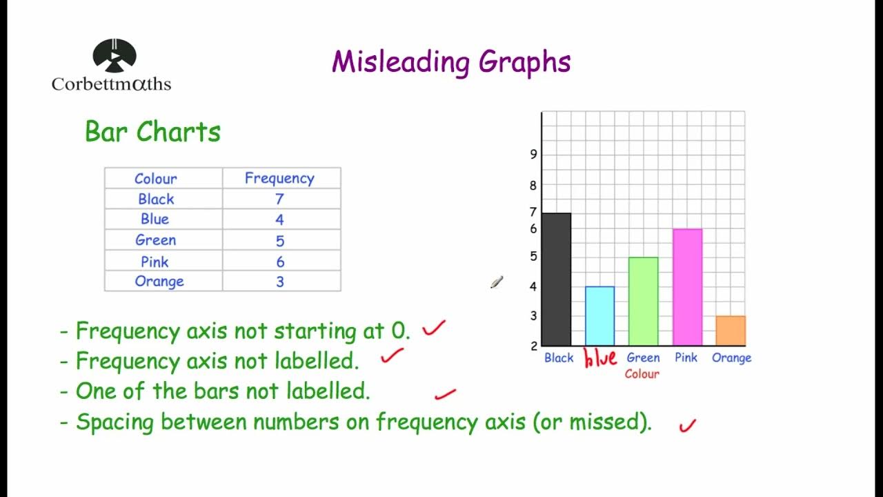
Misleading Graphs - Corbettmaths
5.0 / 5 (0 votes)