Figma To Real Website | Responsive Homepage | HTML, CSS & JavaScript | Part 1
Summary
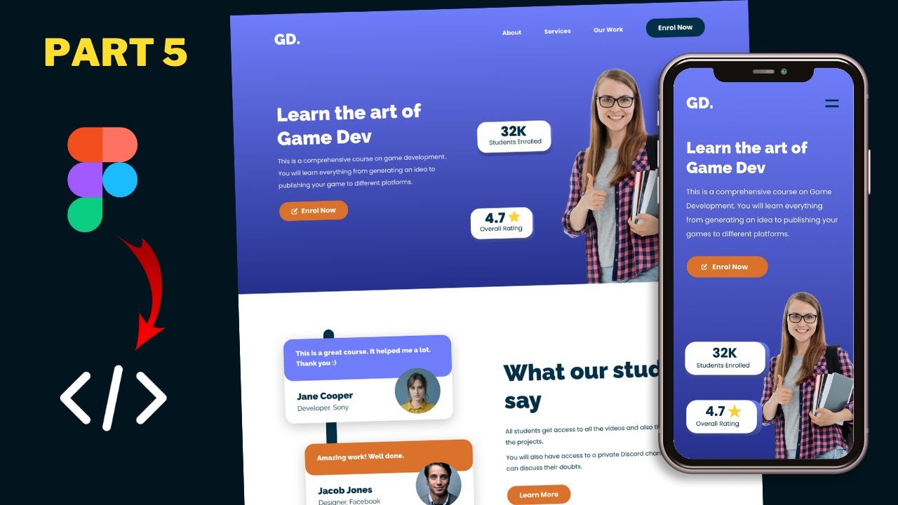
TLDRThis tutorial series will guide you through converting a Figma design into a fully functional website using HTML, CSS, and JavaScript. The instructor provides a link to the Figma file for reference and showcases the design's responsiveness across desktop, tablet, and smartphone versions. Viewers will see the transition from the Figma design to the completed website, including the hero section, menu items, and footer layout, ensuring a seamless user experience across all devices.
Takeaways
- 🌐 This tutorial series will guide viewers through converting a Figma design into a functional website using HTML, CSS, and JavaScript.
- 🔗 The link to the Figma file will be provided in the video description for reference and to follow along with the tutorial.
- 🎨 The video starts with an introduction to the color palette and components required for the website design.
- 🖥️ The design includes different layouts for desktop, tablet, and smartphone versions, showcasing responsiveness.
- 📲 On the smartphone version, menu items are replaced with a menu icon for a more compact design.
- 🔄 The layout for the footer changes between the tablet and smartphone versions, adapting to screen size.
- 📺 A completed version of the website is shown, demonstrating the final outcome of following the tutorial series.
- 🔍 The tutorial will cover the design of various sections, including a hero section, menu items, and footer.
- 🛠️ Viewers will learn to implement design changes for different devices, such as an iPad Pro and a Pixel 2 XL.
- 🔄 The menu icon functionality is demonstrated, showing how it works across different devices and screen sizes.
- 📝 The video encourages viewers to ask questions in the comments and to subscribe for updates on the tutorial series.
Q & A
What is the main focus of this tutorial series?
-The main focus of this tutorial series is to convert a sigma design into a real website using HTML, CSS, and JavaScript.
Where can viewers find the Figma file mentioned in the video?
-The Figma file link is provided in the description of the video.
Is there a separate video that teaches how to create the sigma design from scratch?
-Yes, there is a video on how to design the sigma file from scratch, and the link to it is in the video description.
What does the first frame of the sigma file contain?
-The first frame of the sigma file contains the color palette and all the necessary components for the website design.
How does the layout change from the desktop version to the tablet version in the sigma design?
-In the tablet version, there is a slight change in the layout, with a two-column layout for the footer.
What is different about the smartphone version of the sigma design compared to the desktop and tablet versions?
-In the smartphone version, the menu items are not displayed on the side; instead, there is a menu icon that, when clicked, reveals the menu.
What does the completed version of the website look like after the tutorial series?
-The completed version of the website has a hero section and other elements that closely resemble the sigma design, with different styling for menu items when scrolling down.
How does the website layout differ on an iPad Pro compared to a desktop?
-On an iPad Pro, the layout is adjusted for a tablet screen, with a different layout for the testimonial section and a two-column layout for the footer.
What changes occur in the layout when viewing the website on an iPad?
-On an iPad, the menu items are not displayed on the side, and a menu icon is used to reveal the menu when clicked.
How is the mobile version of the website different from the desktop and tablet versions?
-In the mobile version, the layout is further adjusted for a smaller screen, with a menu icon for navigation and a one-column layout for the footer.
What is the next step in the tutorial series after the introduction video?
-The next step is to set everything up and start designing the website as per the sigma design using HTML, CSS, and JavaScript.
Outlines
📚 Introduction to Website Conversion Tutorial
This paragraph introduces a tutorial series aimed at converting a sigma design into a functional website using HTML, CSS, and JavaScript. The instructor provides a link to the Figma file for reference and suggests watching a previous video for designing the sigma file from scratch. The content includes an overview of the design components, color palette, and layout variations for desktop, tablet, and smartphone versions. The paragraph concludes with a sneak peek at the completed website, showcasing the hero section, menu items, and footer in different device views.
Mindmap
Keywords
💡Sigma Design
💡HTML
💡CSS
💡JavaScript
💡Figma
💡Color Palette
💡Components
💡Responsive Design
💡Menu Icon
💡Layout
💡Hero Section
Highlights
Introduction to a tutorial series on converting a Figma design into a real website using HTML, CSS, and JavaScript.
Link to the Figma file provided in the video description for viewers to follow along.
A brief overview of the color palette and components needed for the website design.
Demonstration of the desktop version layout differences compared to tablet and smartphone versions.
Explanation of the menu icon functionality and layout changes in the smartphone version.
Showcase of the completed website project, highlighting the similarity to the Figma design.
Description of the hero section and its styling consistency with the design mockup.
Illustration of the menu items' different styling when the page is scrolled down.
Presentation of the website's sections and their alignment with the Figma design.
Introduction of the 'Get Our App' section and its placement within the website layout.
Display of the footer with a two-column layout for the tablet version.
Use of the browser's developer tools to inspect and toggle device toolbar for responsive design testing.
Observation of layout adjustments for the testimonial and course sections on the tablet version.
Demonstration of the menu icon and responsive menu display on an iPad.
Inspection of the mobile version on a Pixel 2 XL device, emphasizing the menu icon and one-column footer layout.
Assurance that the final design will be created using HTML, CSS, and JavaScript.
Announcement of the upcoming tutorial steps, starting with setup and design initiation.
Encouragement for viewers to ask questions in the comments and to like and subscribe for updates.
Transcripts
hi everybody welcome to gt coding in
this tutorial series we're going to
convert this sigma design into a real
website using html css and javascript
and i will leave the link of the figma
file in the description of this video so
you can go ahead and download it and you
can just follow along with me now this
video is just an introduction to our
tutorial series so let's get started
[Music]
all right here we can see we have this
sigma file and i have a video on how to
design all of this from scratch so if
you want to learn how to create this
sigma design from scratch you can watch
that video i will leave the link in the
description of this video now here we
can see in the first frame we have the
color palette of our website and then we
have all the components that we need in
our design and if you scroll down we can
see that we have the desktop version on
the left this is how it looks
and then we have the tablet version and
we have a slight change in
the layout
here we can see we have this two column
layout for our footer
and then we have the smartphone version
so this is how it looks now for the
smartphone version we don't have these
menu items displayed over here instead
we have this menu icon and if i click on
this we're going to see this menu over
here
and if we scroll down we can see that we
have a different layout for our
smartphone version
and for the footer we have a one column
layout so this is our sigma design now
let me show you the completed version of
our real website all right this is our
completed project so this is how it's
gonna look after the tutorial series is
finished and here we can see we have
this hero section over here and it looks
almost the same as the sigma design and
if you scroll down we can see that we
have all the other elements over here
and we also have a different styling for
these menu items over here when we
scroll down so here we can see this is
the default design and if we scroll down
we have a different styling
and
here we can see all these
sections are displayed just like we have
in our sigma design and here we have the
get our app section
and then we have the footer over here
right now let me show you the tablet
version so just right click over here
and click on inspect
and let's click on this button called
toggle device toolbar
all right this is how it's going to look
on an ipad pro and if you scroll down
we can see all these elements over here
and we have this different layout for
this testimonial section and if you
scroll down we have the course section
then we have the app section and then we
have the footer in
two column layout all right now let's go
ahead and check out a different device
so let's click on this
drop down and let's select ipad
and here we can see for the ipad we have
a slightly smaller screen and here we
can see we don't have the menu items
displayed over here but we have this
menu icon and if i click on that
we have the menu displayed over here and
if i click on this close button it goes
back and if you scroll down we can see
that everything looks all right
right now let's check out the mobile
version so let's click on this
drop down and let's select a device from
here let's select pixel to excel
and this is how it will look on a pixel
2 xl device so here also we have this
menu icon and if i click on that
we have the menu displayed over here and
if i click on the close button
the menu goes back
so let's scroll down and here we can see
all these elements
and it is looking just like the figma
design
and then we have this footer over here
with a one column layout
so everything is looking all right
so this is what we're going to design in
this tutorial series using html css and
javascript
all right so this was just an
introduction of this tutorial series
from the next video we will set
everything up and we will start
designing it alright so that's it for
this video if you have any doubts you
can ask in the comments below and if you
like this video please click on the like
button and subscribe to this channel to
get the latest video updates thanks a
lot for watching have a nice day
[Music]
you
関連動画をさらに表示
Figma To Real Website | Responsive Homepage | HTML, CSS & JavaScript | Part 8
Figma To Real Website | Responsive Homepage | HTML, CSS & JavaScript | Part 7
Figma To Real Website | Responsive Homepage | HTML, CSS & JavaScript | Part 11
Figma To Real Website | Responsive Homepage | HTML, CSS & JavaScript | Part 3
Figma To Real Website | Responsive Homepage | HTML, CSS & JavaScript | Part 9
Figma To Real Website | Responsive Homepage | HTML, CSS & JavaScript | Part 2
5.0 / 5 (0 votes)