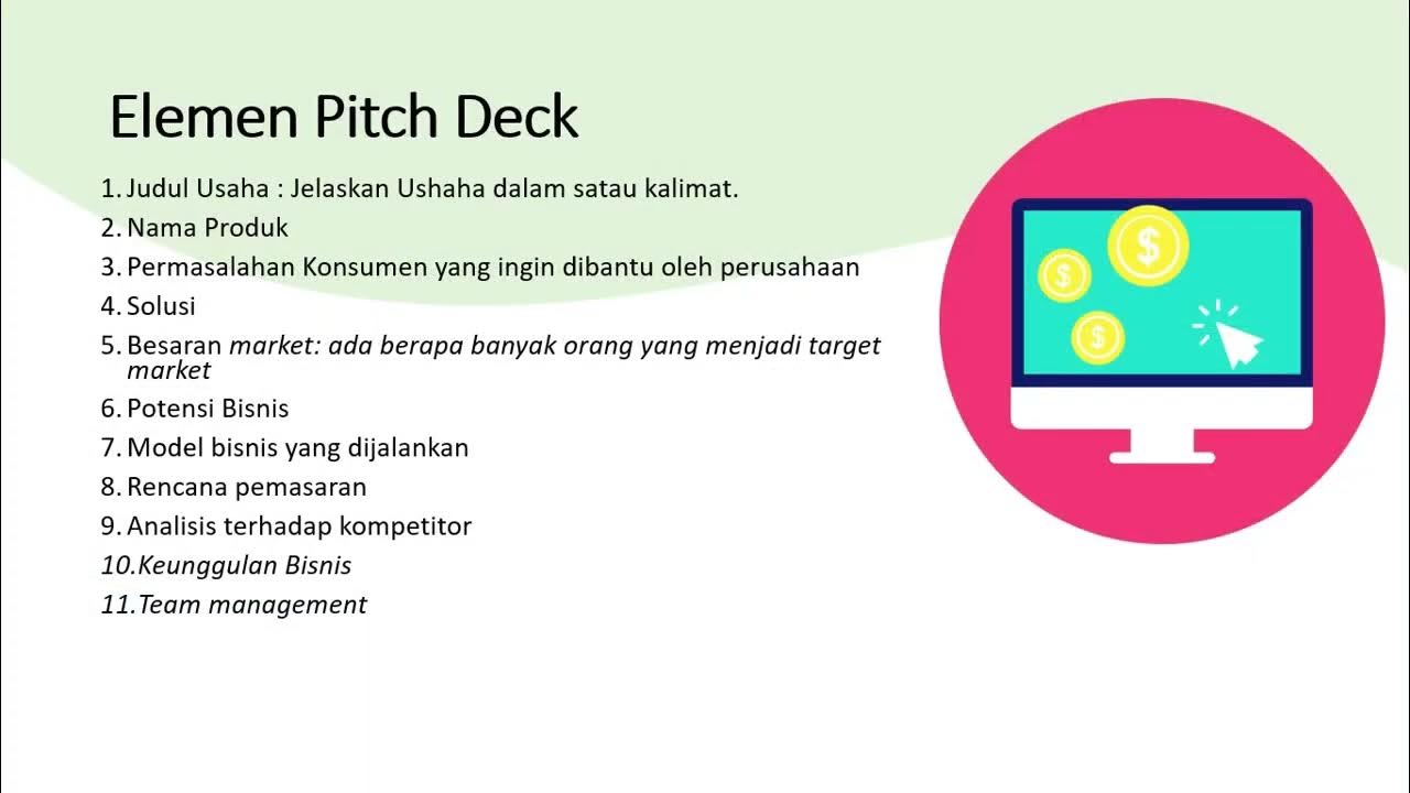
13 Pitch Deck Design Tips for Creating the Perfect Startup Pitch

Visme
19 Jun 202010:13

Summary

TLDRThis video script offers 13 tips for creating an impressive pitch deck to captivate investors. It emphasizes the importance of visual hierarchy, data visualization, storytelling, and emotional appeal. The speaker introduces customizable templates from Vis Me, highlighting the need for consistency, creativity, and understanding the audience. The key is to present information concisely and engagingly, with a focus on clarity and branding.

Takeaways

  • 📊 Maximize first impressions with a strong pitch deck design, crucial for engaging investors.
  • 🎨 Consider the visual hierarchy in design, including colors, fonts, elements, sizes, and alignment.
  • 📈 Transform data into compelling visualizations to make it more understandable and persuasive.
  • 👀 Use a minimalistic approach with a few dominant colors to draw attention and convey passion.
  • 💖 Appeal to investors' emotions by incorporating storytelling, quotes, and imagery.
  • 🚀 Add motion to your pitch deck to elevate the presentation and keep the audience engaged.
  • 🔍 Ensure font colors have high contrast with the background for readability.
  • 🎨 Maintain branding consistency in pitch decks with appropriate color schemes.
  • 🤯 Get creative but avoid overdoing it with too many colors or fonts; focus on standing out with interactive elements.
  • 👥 Understand your audience to tailor the pitch deck's design to their preferences and tastes.
  • 📈 Use a variety of charts and data visualizations from platforms like Visme to effectively communicate information.
  • 🌟 Incorporate shapes and consistent design elements to create a unique and memorable pitch deck.
  • 📝 Keep the pitch deck concise, ideally no more than 19 slides, and ensure information is not overwhelming.
  • 📝 Use templates for visual consistency and to streamline the slide creation process.
  • 🎭 Each slide should follow a theme for a cohesive and professional presentation.

Q & A

  • What is the main purpose of a pitch deck according to the script?

    -The main purpose of a pitch deck is to make a strong first impression on investors, effectively communicate your business ideas, and secure funding.

  • What are the key elements to consider when designing a pitch deck?

    -Key elements include visual hierarchy, colors, fonts, elements, sizes, spacing, and alignment, all of which should align with the message you want to convey.

  • Why is data visualization important in a pitch deck?

    -Data visualization is important because it turns lists of numbers into clear, understandable charts or graphs, making it easier for investors to grasp the information without having to piece it together themselves.

  • How can storytelling be used in a pitch deck to appeal to investors' emotions?

    -Storytelling can be used by sharing personal anecdotes, incorporating tweets or quotes, and using imagery through static images or videos to create an emotional connection and make the pitch more engaging.

  • What is the recommended approach to using colors in a pitch deck?

    -The recommended approach is to use two or three colors throughout the entire pitch deck with strong contrast, ensuring that the text is easy to read against the background.

  • Why is consistency in branding important in a pitch deck?

    -Consistency in branding is important because it reinforces the company's identity and makes the pitch deck recognizable and memorable to investors.

  • What are some creative ways to make a pitch deck stand out?

    -Creative ways include using interactive charts, adding animated characters or audio, and incorporating gifts or unique design elements that align with the pitch's theme.

  • How can understanding the audience affect the design of a pitch deck?

    -Understanding the audience helps tailor the pitch deck's design to match their preferences, whether they prefer loud and colorful designs or simple and straightforward ones.

  • What is the recommended maximum number of slides for a pitch deck?

    -The recommended maximum number of slides for a pitch deck is 19, to ensure brevity and maintain the audience's attention.

  • How can templates help in maintaining visual consistency throughout a pitch deck?

    -Templates help by providing a uniform design from beginning to end, with consistent colors, fonts, and themes, making it easier to create slides that look cohesive.

  • What is the final tip provided in the script for creating an effective pitch deck?

    -The final tip is to keep the pitch deck clean, organized, and consistent, as professionalism can be compromised without these elements.

Outlines

00:00

📊 Crafting a Compelling Pitch Deck

This paragraph introduces the importance of a strong pitch deck for impressing investors during a big tech pitch. It emphasizes the need for a visually appealing and organized presentation to make a lasting first impression. The speaker promises to share 13 tips to enhance the pitch deck, highlighting the significance of visual hierarchy, color choices, and data visualization. The use of a minimal color palette and the importance of turning numbers into clear data visualizations are discussed. The paragraph also touches on the need to appeal to investors' emotions through storytelling and imagery, while ensuring readability and consistency with the brand's identity.

05:05

🎨 Enhancing Pitch Decks with Creativity and Audience Understanding

The second paragraph delves into the creative aspects of pitch deck design, cautioning against overuse of colors and fonts that may detract from the message. It stresses the importance of understanding the audience's preferences and tailoring the presentation's style accordingly. The paragraph suggests various creative techniques such as using charts, flow diagrams, timelines, and shapes to maintain visual consistency and stand out. It also recommends incorporating images and testimonials to add a human element and leverage social proof. The speaker advises keeping the pitch deck concise, using templates for visual consistency, and following a theme throughout the presentation to project professionalism.

Mindmap

Keywords

💡Pitch Deck

A pitch deck is a visual presentation tool used by entrepreneurs to communicate and sell their business idea to potential investors. It's a critical component in securing funding and is often the first impression an investor gets of a business. In the video, the pitch deck is the central focus, with advice on how to design it effectively to 'wow' investors.

💡Visual Hierarchy

Visual hierarchy refers to the arrangement or grouping of elements in a design to guide the viewer's eye through the content in a logical sequence. It's essential in pitch decks to ensure that the most important information is noticed first. The video mentions the importance of considering visual hierarchy in terms of colors, fonts, elements, sizes, and alignment.

💡Data Visualization

Data visualization is the graphical representation of information and data. It helps to analyze and understand large amounts of data quickly and efficiently. In the context of the video, turning lists of numbers into charts or graphs is highlighted as a way to make data more accessible and persuasive to investors.

💡Branding

Branding is the process of creating a unique name, symbol, or design that identifies and differentiates a product or service from others. The video emphasizes the importance of maintaining consistent branding in a pitch deck, including the use of specific colors associated with the brand, to create a cohesive and recognizable identity.

💡Creativity

Creativity in this context refers to the ability to transcend traditional ideas, rules, and patterns to create meaningful new ideas, forms, and interpretations. The video encourages getting creative with pitch decks to stand out, suggesting the use of unique fonts, interactive charts, or even animated characters to differentiate from typical presentations.

💡Audience

Understanding the audience is crucial for effective communication. The video script talks about tailoring the pitch to the audience's preferences and expectations, whether they prefer a loud and colorful presentation or a simple and straightforward one.

💡Consistency

Consistency in design refers to the uniformity of elements throughout a pitch deck, such as colors, fonts, and themes. The video stresses the importance of maintaining visual consistency to ensure a professional and cohesive presentation.

💡Templates

Templates are pre-designed layouts that can be used as a starting point for creating presentations, documents, or other materials. The video introduces various templates available in Visme that can be customized to fit the specific needs of a pitch deck, making the design process more efficient.

💡Storytelling

Storytelling is the art of telling stories to engage an audience and make information more relatable and memorable. The video suggests using storytelling techniques, such as sharing personal anecdotes or incorporating quotes, to appeal to investors' emotions and make a pitch more compelling.

💡Imagery

Imagery in a pitch deck refers to the use of images, either static or dynamic, to enhance the visual appeal and convey information more effectively. The video mentions the impact of using imagery, such as photos of the team at work, to add a human element and make the presentation more engaging.

💡Testimonials

Testimonials are positive feedback or endorsements from customers or clients. They serve as social proof of the value and effectiveness of a product or service. The video encourages using testimonials in pitch decks as a persuasive tool, highlighting their power in influencing potential investors.

Highlights

Maximizing chances of securing investors with a strong pitch deck design.

Importance of first impressions in pitching to investors.

13 tips to create an impactful pitch deck with design templates available in Visme.

Visual hierarchy in pitch deck design including colors, fonts, elements, and spacing.

Purposeful design decisions aligning with the message conveyed.

Minimalist design approach using white, blue, and red to grab attention.

Transforming data into compelling visualizations for better audience understanding.

Appealing to investor emotions beyond just presenting numbers.

Using storytelling, tweets, quotes, and imagery to connect with investors.

Incorporating motion in pitch decks to enhance presentations.

Ensuring high readability by avoiding font colors that blend into the background.

Maintaining a simple and consistent color scheme throughout the pitch deck.

Aligning pitch deck design with brand identity for a cohesive look.

Customizing Visme templates to fit brand colors and preferences.

Balancing creativity with simplicity to avoid overwhelming investors.

Understanding the audience's preferences to tailor the pitch deck's design.

Using a variety of charts and data visualizations for clarity and impact.

Incorporating shapes and consistent design elements for visual appeal.

Adding images and testimonials to humanize the pitch and build trust.

Keeping pitch decks concise with no more than 19 slides.

Utilizing templates for visual consistency and ease of slide creation.

Maintaining a clean, organized, and consistent pitch deck for professionalism.

Transcripts

play00:00

big pitch tech coming up and want to

play00:01

maximize your chances of locking in

play00:03

investors we can help you only have one

play00:11

chance to make a first impression while

play00:14

investors sit in front of you

play00:16

eager to dip their hands into new stakes

play00:18

it's up to you to wow them you feel

play00:21

strong about your ideas your content is

play00:23

fresh and creative business plan is

play00:25

ready and structure is organized you've

play00:27

never felt better about your product and

play00:29

you're ready to make a final push for

play00:32

funding the one thing that you may not

play00:34

have is a strong pitch deck design

play00:36

that's what we're here for

play00:39

hello world unlike plugger here with

play00:41

visby the digital platform that can turn

play00:43

your pitch deck dreams into reality over

play00:46

the next few minutes I'm going to share

play00:48

13 tips that are guaranteed to WoW your

play00:51

investors the best part all of the tips

play00:54

include design templates that are

play00:56

available in viz me right now shall we

play01:02

from the moment you begin designing your

play01:05

pitch deck you should be thinking about

play01:06

the visual hierarchy I'm talking the

play01:09

colors fonts elements sizes spacing

play01:13

alignment if you're unfamiliar check out

play01:15

our video on the twelve visual hierarchy

play01:17

principles that all designers should

play01:20

know nonetheless you want to ensure that

play01:22

every decision you make when it comes

play01:24

your design has a purpose why that font

play01:27

why those colors these decisions should

play01:30

fall in line with your message

play01:32

our first template example takes a

play01:34

minimal approach using just white blue

play01:37

and that popping red for color why that

play01:40

red red demands attention and elicits

play01:43

passion in action

play01:48

turning lists of numbers into beautiful

play01:50

data visualizations is key when it comes

play01:53

to informing or even persuading an

play01:55

audience what do I mean well rather than

play01:58

pull up a spreadsheet show the

play02:00

differences in data with charts or

play02:02

graphs viewers will see the difference

play02:04

more clearly rather than have to piece

play02:06

it together themselves we've put out a

play02:09

video on these several ways you can use

play02:11

data visualizations in your professional

play02:13

life and if you're not sure where to

play02:15

begin on building one viz me can help

play02:17

with a huge selection of data

play02:19

visualizations just like these okay so

play02:26

you've hooked to the fish aka the

play02:27

investors and they're interested after

play02:30

you showed them the numbers now you must

play02:32

reel them in but how it's time to tug at

play02:36

their heartstrings a little bit numbers

play02:38

can only get you so far before you need

play02:40

to appeal to their emotions this

play02:42

template here uses a variety of methods

play02:45

you can share a story incorporate tweets

play02:48

or quotes and you should definitely

play02:50

include imagery through static images or

play02:52

even videos to really bring it to life

play02:55

bringing a motion into a pitch deck is

play02:57

one of the best ways to take your

play02:59

presentation to the next level this may

play03:05

go unsaid but too many times have we

play03:07

seen font colors that blend in with the

play03:09

background color in a presentation

play03:11

they're difficult to read don't get too

play03:14

fancy when deciding your colors stick to

play03:17

two or three throughout the entire pitch

play03:19

deck and make sure there's strong

play03:21

contrast between them hey dark text

play03:23

should fall on a light background and

play03:25

vice versa just like we see here in this

play03:28

great example the same goes for your

play03:30

font as well keep it simple and easy to

play03:33

read nobody's going to say no because

play03:35

your font was simple and clean but they

play03:38

might if it's bizarre and sloppy

play03:44

with any newsletter or email from a

play03:46

major company the design fits their

play03:49

branding target we'll use their strong

play03:51

red Starbucks sticks with Green and

play03:53

Twitter would be surrounded by blue all

play03:56

of your presentations in public material

play03:58

should be the same especially for a

play04:00

pitch deck if your brand is say blue and

play04:03

yellow use blue and yellow don't go

play04:06

overboard and start using reds and

play04:07

greens or other colors stay consistent

play04:10

to your branding all the VIS Me's

play04:12

templates are fully customizable

play04:15

while this example uses shades of purple

play04:17

they could easily be changed to blue or

play04:20

yellow or whatever color fits your needs

play04:23

I bring our next tip with a touch of

play04:29

caution get creative yes show potential

play04:32

investors what's between those ears and

play04:34

how you're different from past pitch

play04:36

decks that they've already seen however

play04:38

don't fall back on those ridiculous

play04:40

fonts and ten different colors that I've

play04:43

already mentioned there are other ways

play04:45

to stand out maybe you include gifts

play04:47

maybe you add interactive charts like we

play04:50

see with this template here or maybe we

play04:52

even add animated characters or audio to

play04:54

your pitch deck there's endless options

play04:57

to get creative and I'll actually share

play04:59

even more of these here shortly

play05:05

understanding your audience is key

play05:07

everything from their wants needs

play05:09

lifestyle you name it if you're pitching

play05:12

to someone who is more old-school a

play05:14

design like this might not be your best

play05:17

bet

play05:17

considering it was aimed at Millennials

play05:19

when it was being designed your content

play05:21

can be the same but have two very

play05:23

different looks depending on who you're

play05:25

talking to what's going to click with

play05:27

your audience loud and colorful or

play05:29

simple and straight to the point

play05:31

consider who you're talking to in their

play05:33

tastes before stepping in front of them

play05:39

okay back on the topic of getting

play05:41

creative let's look at a couple great

play05:43

ways to do so in turn locking your

play05:46

viewers in first try adding charts I

play05:49

know I mentioned this already but

play05:50

emphasizing is key to get a point across

play05:54

bhisma has over 30 types of charts to

play05:57

select from and they're already made for

play05:58

you all you have to do is plug in your

play06:00

own data one of those charts is this

play06:03

flow chart here right next to me and if

play06:05

it's not what you're looking for that's

play06:07

fine

play06:07

maybe this timeline here is more your

play06:10

style here it's used to show the growth

play06:12

of a company and the milestones reached

play06:14

over time you could use it for the same

play06:16

thing including the times your grand

play06:19

idea came to mind in the evolution to

play06:21

where it is now still not doing it for

play06:23

you well this visit template here uses

play06:26

shapes in its design which is a great

play06:28

way to stand out and rather than using

play06:31

triangles in one slide circles in the

play06:33

next squares in another they use

play06:35

triangles throughout the entire pitch

play06:37

deck smart when it comes to maintaining

play06:40

visual consistency take some time to

play06:43

think about it and draw some inspiration

play06:45

from the world around you going back to

play06:51

something I mentioned earlier adding

play06:53

images to your pitch deck is a great way

play06:56

to draw motion and really bring a pitch

play06:58

deck to life really these images don't

play07:01

even need to be in the forefront as they

play07:03

can make for powerful background images

play07:05

choose photos that you feel will make

play07:07

the biggest impact one idea use photos

play07:10

of your teammates hard at work adding a

play07:13

human element to a design and a pitch

play07:15

deck can be incredibly impactful to a

play07:17

viewer

play07:21

if you have positive testimonials

play07:23

regarding your idea already use them

play07:26

recommendations and reviews are

play07:28

incredibly strong persuasion tools think

play07:31

about it do you go to a new restaurant

play07:32

without looking up reviews or hearing a

play07:35

recommendation from a friend

play07:36

personally I don't vis me has templates

play07:40

where you can easily embed tweets or

play07:42

other quotes from users use this to your

play07:44

advantage

play07:48

one thing about pitch decks they have to

play07:51

be brief no more than 19 slides okay one

play07:55

way to combat this is by fitting a few

play07:58

mini slides in to one this template here

play08:01

allows us to do just that I get it

play08:03

sometimes your information is pretty

play08:05

complex however you must try to compress

play08:08

that information into the most pertinent

play08:10

bits of information and lay them out

play08:12

like so it's important that your

play08:15

information isn't overwhelming and is

play08:17

easily digestible you don't want to lose

play08:19

if you are halfway through your pitch

play08:20

deck and templates like this are sure to

play08:23

help have I mentioned consistency yet I

play08:29

think I may have a time or two and

play08:31

here's another a big bonus of using a

play08:35

template is the visual consistency from

play08:37

beginning to end the overall look of the

play08:39

slide it doesn't vary much from slide to

play08:42

slide and you don't have to start fresh

play08:45

every single time you create a new slide

play08:47

which actually brings me to my last tip

play08:54

you should have noticed that all of our

play08:56

templates have individual themes now

play08:59

this doesn't mean that each slide

play09:00

features the same exact design because

play09:03

that would be terribly boring and dry up

play09:05

very quickly instead our templates

play09:07

follow a theme throughout each slide

play09:09

colors remain mostly identical fonts are

play09:12

the same images are consistent in data

play09:14

visualizations follow the same idea I

play09:17

cannot emphasize enough keeping your

play09:19

pitch deck clean organized and

play09:22

consistent your professionalism can go

play09:25

right out the window if you don't follow

play09:26

that one simple rule and with that my

play09:31

work here is done in yours

play09:33

it's just beginning if you haven't

play09:35

learned bismi is your home for pre-built

play09:37

templates and they're waiting for you

play09:39

right now and vis me calm if you have

play09:42

any further questions our channel can

play09:44

likely assist you

play09:45

we're always here to help making videos

play09:48

on everything in presentation and design

play09:50

feel free to share below what you

play09:52

learned in the comments we'll hope to

play09:54

catch you again soon and until then I'm

play09:56

Mike plugger with viz me helping you

play09:58

make information beautiful

play10:07

[Music]

Rate This

5.0 / 5 (0 votes)

Etiquetas Relacionadas
Pitch DeckInvestor AttractionDesign TemplatesVisual HierarchyData VisualizationBranding ConsistencyCreative PresentationAudience UnderstandingPresentation TipsInvestment Strategy
¿Necesitas un resumen en inglés?