Menggunakan Data [Part 2] - Mengorganisasikan Data
Summary
TLDRIn this educational video, Pak Benny explains key concepts related to organizing data, including the range, frequency distribution tables (both single and grouped), and histograms. The video begins by defining the range as the difference between the largest and smallest data points. It then walks through the process of creating frequency distribution tables, explaining the importance of grouping data and calculating frequencies. Finally, Pak Benny demonstrates how to visualize data with histograms, highlighting differences between bar charts and histograms. The lesson concludes with an invitation for viewers to practice the concepts with a follow-up exercise.
Takeaways
- 😀 The main goal of the video is to teach how to organize data, including calculating range, creating frequency tables, and presenting data with histograms.
- 📊 The range of data is the difference between the largest and smallest values in a dataset.
- 📝 A frequency table for single data lists each unique value along with its frequency (number of occurrences).
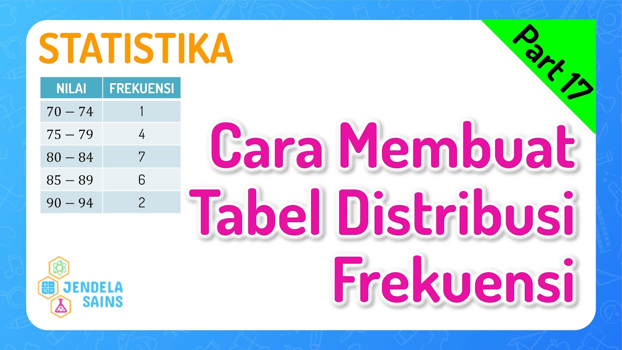
- 📏 Data can also be grouped into intervals for a grouped frequency table, especially useful for continuous measurement data.
- 🔢 Key terms for grouped data include class (group), class interval (range of each group), class value (midpoint), and class frequency (count of data in the group).
- 📈 Histograms are used to visualize grouped data, with bars drawn adjacent to each other and heights corresponding to class frequencies.
- 📉 Bar charts differ from histograms as they are used for single data values and have spaces between bars.
- 🧮 Single data frequency tables are better for discrete data like the number of students or favorite colors.
- 📏 Grouped frequency tables are better for continuous data such as measurements from experiments.
- 💡 The video encourages hands-on practice by asking viewers to pause and solve example problems, reinforcing learning.
- 🎯 After mastering data organization, the next topic in the series will be relative frequency.
Q & A
What is the concept of range in data, and how is it calculated?
-The range of a dataset is the difference between the largest and smallest values. It is calculated by subtracting the smallest value from the largest value. For example, if the largest value is 15.5 and the smallest is 8.0, the range is 15.5 - 8.0 = 7.5.
What is a frequency distribution table?
-A frequency distribution table is a table that organizes data into categories, showing how often each data point or range of data occurs. It is used to summarize large datasets into more manageable forms, displaying the frequency (count) of data in each category.
How does a frequency distribution table for grouped data differ from one for single data?
-A frequency distribution table for single data lists individual data points with their frequencies, while a grouped data table organizes the data into ranges or intervals. For example, instead of listing each specific value, grouped data might show how many values fall between 8-9 cm, 9-10 cm, etc.
What is the significance of the 'class interval' in grouped data?
-The 'class interval' refers to the range of values within each class or category in the grouped data. For example, in a table where the data is grouped in intervals of 1 cm, the class interval would be the difference between the lower and upper limits of each group (e.g., 8-9 cm).
What is the purpose of using the 'class mark' or 'class value' in a frequency distribution table?
-The class mark or class value represents the midpoint of each class interval. It is used to simplify the analysis of the data by summarizing each interval with a single value, which is the average or midpoint between the lower and upper boundaries of the interval.
What is the difference between a histogram and a bar chart?
-A histogram is similar to a bar chart but is used for continuous data, where the bars are adjacent to each other with no gaps. In contrast, a bar chart is used for categorical data, with gaps between the bars to show distinct categories. Histograms represent grouped data, while bar charts represent individual or discrete categories.
How are the heights of bars in a histogram determined?
-The height of each bar in a histogram corresponds to the frequency of data within a specific class interval. For example, if the class interval 8-9 cm has a frequency of 3, the bar for that interval will be 3 units high.
Why is it important to maintain equal spacing between bars in a histogram?
-Maintaining equal spacing ensures the histogram is visually accurate and clear. It helps prevent misleading interpretations of the data, as unequal spacing could imply a false relationship between the intervals or distort the visual representation of frequencies.
When should we use a frequency distribution table for grouped data?
-A frequency distribution table for grouped data should be used when the dataset contains continuous data or measurements, such as height, weight, or time, where grouping the data into intervals makes it easier to analyze and visualize.
How can we calculate the frequency of data in a grouped frequency distribution table?
-To calculate the frequency in a grouped frequency distribution table, count how many data points fall within each interval. For instance, if there are 3 values that fall between 8 and 9 cm, the frequency for that interval would be 3.
Outlines

Esta sección está disponible solo para usuarios con suscripción. Por favor, mejora tu plan para acceder a esta parte.
Mejorar ahoraMindmap

Esta sección está disponible solo para usuarios con suscripción. Por favor, mejora tu plan para acceder a esta parte.
Mejorar ahoraKeywords

Esta sección está disponible solo para usuarios con suscripción. Por favor, mejora tu plan para acceder a esta parte.
Mejorar ahoraHighlights

Esta sección está disponible solo para usuarios con suscripción. Por favor, mejora tu plan para acceder a esta parte.
Mejorar ahoraTranscripts

Esta sección está disponible solo para usuarios con suscripción. Por favor, mejora tu plan para acceder a esta parte.
Mejorar ahoraVer Más Videos Relacionados
CARA PENYAJIAN DATA KELOMPOK - MATEMATIKA SMA
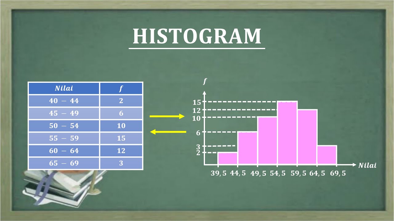
HISTOGRAM
Ukuran Pemusatan Data Kelompok
Statistika 05 | Distribusi Frekuensi dalam Statistika | Frequency Distribution | Belajar Statistika

Distribusi Frekuensi: Definisi, Fungsi, dan Jenis-Jenisnya
Statistika • Part 17: Cara Membuat Tabel Distribusi Frekuensi
5.0 / 5 (0 votes)
