CARA PENYAJIAN DATA KELOMPOK - MATEMATIKA SMA
Summary
TLDRThis video provides a detailed explanation of how to present grouped data using frequency distribution tables, cumulative frequency, and graphical representations such as Ogive curves, histograms, and frequency polygons. It covers the steps involved in organizing and analyzing data, including sorting, determining ranges, class intervals, and frequency calculations. Additionally, it explains how to visualize data through various chart forms, with specific examples of both cumulative frequency 'less than' and 'more than' tables, as well as how to create Ogive curves and histograms. This tutorial is aimed at helping viewers understand the concept of grouped data presentation in statistics.
Takeaways
- 😀 The script explains how to present grouped data using frequency distribution tables, cumulative frequency tables, and histograms.
- 😀 Data with 30 or more values can be grouped for easier presentation using cumulative frequency distribution tables.
- 😀 To create a cumulative frequency distribution table, the data should first be sorted from smallest to largest.
- 😀 The range of data is calculated by subtracting the smallest value from the largest value. For example, the range is 58 (88 - 30).
- 😀 The number of classes (k) in a frequency distribution table is calculated using the formula k = 1 + 3.3 log(n), where n is the number of data points.
- 😀 The class width is calculated by dividing the range by the number of classes. In this case, it was 58 divided by 6, resulting in a class width of 10.
- 😀 Cumulative frequency tables (less than and more than types) help summarize data and make it easier to understand the distribution.
- 😀 The 'Ogive' curve, a graphical representation of cumulative frequencies, can be either positive (increasing) or negative (decreasing).
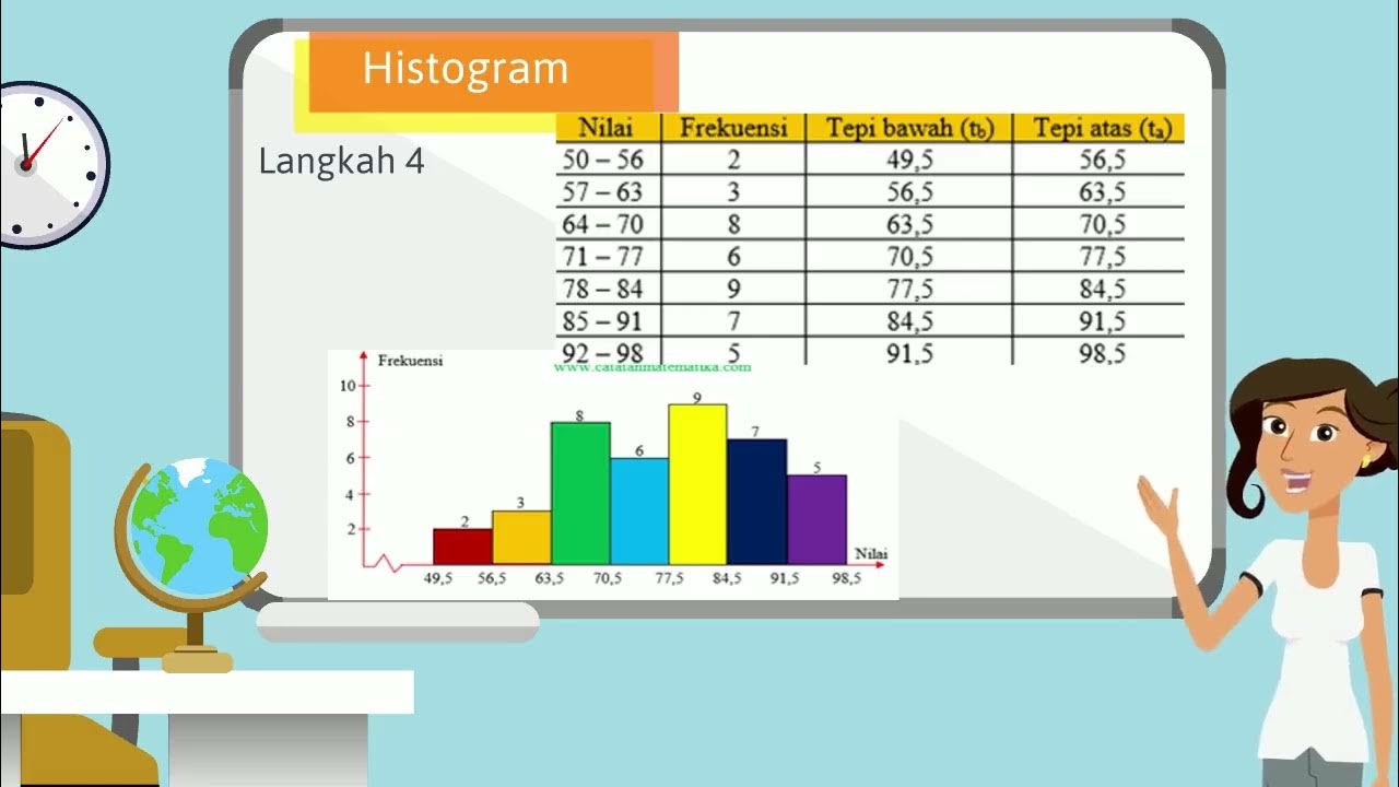
- 😀 A histogram is used to present data visually, with bars representing the frequency of data within specific intervals.
- 😀 The script also explains how to create a frequency polygon (a line graph connecting the midpoints of the top of the histogram bars), which is another way to visualize the data distribution.
Q & A
What is the purpose of grouping data in a frequency table?
-Grouping data in a frequency table helps to simplify and organize large datasets, making it easier to understand the distribution and identify patterns in the data.
How do you determine the range of a dataset?
-The range of a dataset is determined by subtracting the smallest value (Xmin) from the largest value (Xmax). In this example, the range is 88 - 30 = 58.
What formula is used to calculate the number of classes for a grouped data set?
-The number of classes is calculated using the formula: k = 1 + 3.3 log n, where 'n' is the number of data points. In this example, with 30 data points, the calculated number of classes is 6.
Why do we round up the number of classes when using the formula?
-Rounding up the number of classes is necessary when the result is a decimal, as it ensures that all data can be represented within the classes and avoids incomplete class intervals.
How do you determine the class width in a grouped data table?
-Class width is determined by dividing the range of the data by the number of classes. In this example, the class width is 58 / 6 = 9.67, which is rounded to 10.
What is the difference between a cumulative frequency table 'less than' and 'more than'?
-The 'less than' cumulative frequency table shows the cumulative total up to the upper boundary of each class interval, while the 'more than' table shows the cumulative total starting from the lower boundary of each class interval.
How do you create an Ogive curve from a cumulative frequency table?
-An Ogive curve is created by plotting cumulative frequencies on the vertical axis and the upper class boundaries (for 'less than' Ogives) or lower class boundaries (for 'more than' Ogives) on the horizontal axis, then connecting the points with a smooth curve.
What is the key difference between a positive and a negative Ogive curve?
-A positive Ogive curve increases as you move along the x-axis, reflecting increasing cumulative frequencies, while a negative Ogive curve decreases as you move along the x-axis, reflecting decreasing cumulative frequencies.
How do you draw a histogram from a frequency table?
-To draw a histogram, you plot the frequency of each class interval as a vertical bar. The x-axis represents the class intervals, and the y-axis represents the frequency. The width of each bar corresponds to the class width.
What is a frequency polygon, and how is it constructed?
-A frequency polygon is created by connecting the midpoints of the bars of a histogram with straight lines. It helps to visualize the distribution of data and identify trends over the intervals.
Outlines

This section is available to paid users only. Please upgrade to access this part.
Upgrade NowMindmap

This section is available to paid users only. Please upgrade to access this part.
Upgrade NowKeywords

This section is available to paid users only. Please upgrade to access this part.
Upgrade NowHighlights

This section is available to paid users only. Please upgrade to access this part.
Upgrade NowTranscripts

This section is available to paid users only. Please upgrade to access this part.
Upgrade NowBrowse More Related Video

Statistika - Membaca dan Menyajikan data, Poligon Histogram Ogive

4.2 | DATA COLLECTION & PRESENTATION | DATA MANAGEMENT | MATHEMATICS IN THE MODERN WORLD | ALOPOGS

VIDEO ANIMASI MATEMATIKA MATERI PENYAJIAN DATA KELAS 10

Distribusi Frekuensi: Definisi, Fungsi, dan Jenis-Jenisnya

Statistika 05 | Distribusi Frekuensi dalam Statistika | Frequency Distribution | Belajar Statistika

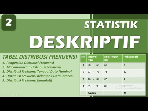
DISTRIBUSI FREKUENSI - STATISTIK DESKRIPTIF | BAB 2
5.0 / 5 (0 votes)