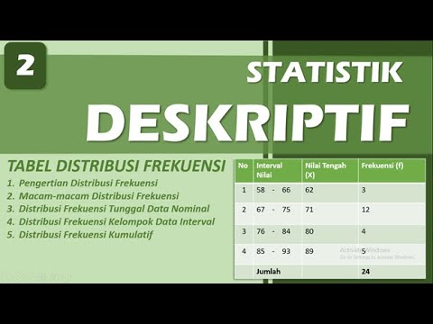
Distribusi Frekuensi: Definisi, Fungsi, dan Jenis-Jenisnya
Summary
TLDRThis script provides an insightful explanation of frequency distribution within statistics. It covers key concepts like the difference between statistics and statistical science, data collection methods (census and sampling), and organizing data into graphs, tables, and diagrams. It discusses data classification (qualitative and quantitative) and highlights the importance of frequency distribution for simplifying and interpreting data. The script also explains various ways to represent data visually, such as bar charts, histograms, polygons, pie charts, and curves, emphasizing how these methods enhance data comprehension and presentation.
Takeaways
- 📊 Statistics is the science of collecting, analyzing, classifying, and presenting data.
- 📈 The process of statistics involves data collection, editing, classification, tabulation, presentation, analysis, and interpretation.
- 📋 Data can be presented in various forms such as graphs, diagrams, or tables to make it more understandable and visually appealing.
- 🔢 Classification of data involves grouping similar attributes or characteristics into homogenous categories to highlight key features.
- 🗂️ The main purpose of classifying data is to categorize similar data, facilitate comparison, highlight important information, and simplify data for analysis.
- 📊 Distribution frequency or frequency distribution is a method of classifying data that simplifies the presentation and understanding of data.
- 📊 There are two types of classification: by attributes or characteristics, and by numbers or variables.
- 📈 Data can be classified based on time (chronological series), geographical area (geographical series), or frequency (frequency series).
- 📊 Data can be organized systematically by time, area, or condition/frequency to facilitate analysis.
- 📊 Data visualization techniques such as bar charts, histograms, polygons, pie charts, and curve graphs make data easier to understand and more engaging.
- 📈 The choice between discrete and continuous data classification depends on whether the data can only be expressed as whole numbers or can include fractions.
Q & A
What is the difference between statistics and statistika?
-Statistics refers to the data or information gathered, while statistika is the science that deals with the collection, analysis, and interpretation of data.
What are the main stages involved in the process of statistika?
-The main stages are data collection, organization, presentation, analysis, and interpretation.
What is meant by data classification?
-Data classification involves sorting heterogeneous data into homogeneous groups, making it easier to observe prominent characteristics and understand the data.
What are the main types of data classification?
-There are two main types of data classification: frequency distribution based on characteristics or attributes, and classification based on numbers or variables.
What are the benefits of classifying data?
-Classifying data helps in grouping similar data, making comparisons easier, highlighting important information, and simplifying data analysis.
What is frequency distribution?
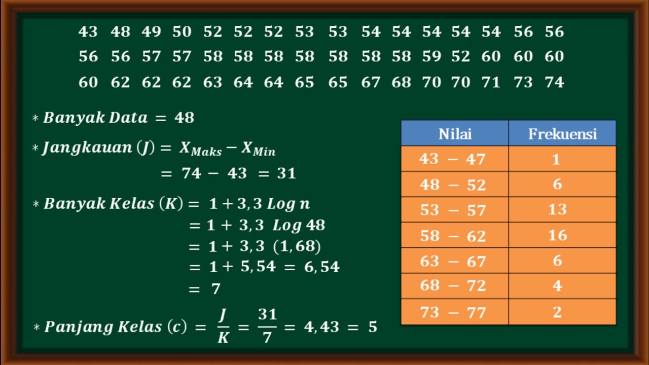
-Frequency distribution is a method used to organize data into specific intervals or classes, allowing easier presentation, understanding, and analysis of data.
How can data be classified based on time?
-Data classified based on time is organized chronologically, often referred to as time-series or historical series, to analyze trends over time.
What is systematic data arrangement (tabulation)?
-Systematic data arrangement, also known as tabulation, is the process of organizing data in a structured way, such as based on time, region, or frequency.
What is the difference between discrete and continuous data?
-Discrete data can only be represented in whole numbers, such as the number of children or cars, while continuous data can take any value, including decimals, such as height or weight.
Why is data visualization important?
-Data visualization is important because it makes data more attractive, easier to understand, and visually engaging, helping in better interpretation and communication of the information.
Outlines

This section is available to paid users only. Please upgrade to access this part.
Upgrade NowMindmap

This section is available to paid users only. Please upgrade to access this part.
Upgrade NowKeywords

This section is available to paid users only. Please upgrade to access this part.
Upgrade NowHighlights

This section is available to paid users only. Please upgrade to access this part.
Upgrade NowTranscripts

This section is available to paid users only. Please upgrade to access this part.
Upgrade NowBrowse More Related Video
5.0 / 5 (0 votes)
