HISTOGRAM
Summary
TLDRIn this tutorial, the Matematika Hebat channel explains how to create histograms and frequency distribution tables from data. The first part covers converting a frequency distribution table into a histogram, detailing steps like adjusting class boundaries and plotting bars based on frequency. The second part demonstrates how to reverse the process by converting a histogram back into a frequency distribution table, with clear steps on calculating class values and filling in frequencies. The video is both instructional and accessible, aimed at helping viewers understand and apply basic statistical concepts related to histograms and frequency distributions.
Takeaways
- 😀 The video covers the topic of histograms and how to represent data using them.
- 😀 The first example explains how to convert grouped frequency distribution data into a histogram.
- 😀 To create the histogram, subtract 0.5 from the lower limit of each class to find the lower boundary.
- 😀 The process involves adjusting the class limits, with the final class being adjusted by adding 0.5 to the upper boundary.
- 😀 The histogram is created by plotting bars for each class according to their frequencies.
- 😀 It's important to ensure that dashed lines in the histogram are removed for a cleaner, more professional appearance.
- 😀 The second example demonstrates how to reverse the process—converting a histogram back into a grouped frequency distribution table.
- 😀 In the second example, 0.5 is added to the lower boundaries of each class to generate the corresponding class intervals.
- 😀 The frequencies for each class are determined by observing the heights of the bars in the histogram.
- 😀 The video emphasizes that constructing histograms and frequency tables is a straightforward process if you follow the steps carefully.
Q & A
What is the main topic of the video?
-The main topic of the video is about understanding and creating histograms, specifically how to convert a frequency distribution table into a histogram and vice versa.
What is the first step in creating a histogram from a frequency distribution table?
-The first step is to observe the lower class boundaries of each class in the frequency distribution table.
How do you calculate the class boundaries when creating a histogram?
-To calculate the class boundaries, subtract 0.5 from the lower class boundary of each class interval. For example, if the class is 40, subtract 0.5 to get 39.5.
Why is it important to subtract 0.5 when calculating class boundaries?
-Subtracting 0.5 helps to ensure that the class boundaries are properly represented on the histogram, as this adjusts the intervals to align with the correct data points.
What should be done after calculating the class boundaries?
-After calculating the class boundaries, plot the values on the x-axis of the histogram and use the frequencies to determine the height of each bar.
What is the key difference between a histogram and other types of charts?
-The key difference is that histograms use bars without gaps between them, which represent the frequency of data within continuous intervals. Additionally, histograms often have a heartbeat-like line at the top to differentiate them from other types of charts.
What should be removed from the histogram diagram for clarity?
-The dashed lines within the bars of the histogram should be removed to ensure the diagram looks clean and clear.
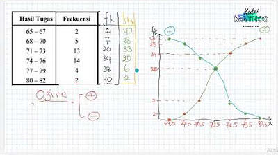
What is the process to convert a histogram back into a frequency distribution table?
-To convert a histogram back into a frequency distribution table, identify the class boundaries by adding or subtracting 0.5 from the given values, then determine the class intervals and record the frequency by observing the height of the bars.
How do you determine the frequency for each class in a histogram?
-The frequency for each class is determined by the height of the corresponding bar in the histogram. For example, if the bar for a particular class reaches a height of 3, the frequency for that class is 3.
Why is it important to follow these steps for both creating and interpreting histograms?
-Following these steps ensures accurate construction and interpretation of histograms. Properly calculating class boundaries and frequencies is crucial for obtaining reliable insights from the data and maintaining clarity in the visual representation.
Outlines

This section is available to paid users only. Please upgrade to access this part.
Upgrade NowMindmap

This section is available to paid users only. Please upgrade to access this part.
Upgrade NowKeywords

This section is available to paid users only. Please upgrade to access this part.
Upgrade NowHighlights

This section is available to paid users only. Please upgrade to access this part.
Upgrade NowTranscripts

This section is available to paid users only. Please upgrade to access this part.
Upgrade NowBrowse More Related Video
CARA PENYAJIAN DATA KELOMPOK - MATEMATIKA SMA
Statistika - Membaca dan Menyajikan data, Poligon Histogram Ogive

Menggunakan Data [Part 2] - Mengorganisasikan Data
FREQUENCY DISTRIBUTION: Common Terminologies Vid#4 FREE Tutorial | Statistics | EASILY EXPLAINED!
Statistika Deskriptif (Bag 1): Cara Membuat dan Membaca OGIVE
Ide Kewirausahaan: Kiat Menyajikan Data di dalam Teks Narasi, Tabel, Grafik/Diagram, Infografis
5.0 / 5 (0 votes)