STATISTIKA PART 1
Summary
TLDRThis video tutorial provides an introduction to statistics, covering essential terms like statistical data, population, sample, and various statistical methods such as ranking and the five-number summary (Q1, Q2, Q3, Xmax, Xmin). It discusses the different ways to present data, including tables, bar charts, line graphs, and pie charts. Practical examples are provided, such as how to analyze student graduation data and display it in different graphical forms. The video emphasizes the importance of data presentation and analysis techniques in research and academic work, particularly for students working on theses or dissertations.
Takeaways
- 😀 Statistics is a branch of mathematics that studies how to collect, process, present, and analyze data, and draw conclusions based on data properties.
- 😀 Statistics is a compulsory subject in many university programs, especially for students working on their theses or research projects.
- 😀 A population refers to the entire set of objects or individuals that are being studied, such as all students in a school.
- 😀 A sample is a subset of the population, selected to represent the population and help infer its characteristics.
- 😀 Descriptive statistics helps summarize and present data in an easily understandable form, such as through tables and diagrams.
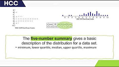
- 😀 The five-number summary of statistics includes Q1 (lower quartile), Q2 (median), Q3 (upper quartile), X_max (maximum), and X_min (minimum).
- 😀 Data can be presented in several ways, including tables, bar charts, line graphs, and pie charts.
- 😀 A bar chart can be presented in vertical or horizontal format, depending on the desired visualization style.
- 😀 Data tables can be modified to include more detailed information, such as gender breakdowns of students.
- 😀 Pie charts are useful for showing proportions of data, such as the distribution of students across different educational levels in a specific area.
Q & A
What is the main focus of statistics?
-Statistics is a branch of mathematics that focuses on collecting, processing, presenting, analyzing data, and drawing conclusions based on the properties of the data.
Why is statistics an important subject in higher education?
-Statistics is a mandatory subject in higher education, especially for students working on their thesis, as it plays a key role in research and data analysis.
What is the difference between 'statistics' and 'statistical analysis'?
-Statistics refers to the summary data obtained from processing a dataset, while statistical analysis involves the techniques used to analyze and draw conclusions from that data.
What does 'population' mean in statistical research?
-In statistical research, 'population' refers to the entire set of objects or individuals being studied, such as all students in a particular school.
What is a 'sample' in the context of statistics?
-A sample is a subset of the population that is selected for research, intended to provide insights into the characteristics of the population.
How is 'statistical ranking' different from other forms of statistical analysis?
-Statistical ranking, or 'statistical peringkat', involves sorting data from the smallest to the largest, providing an ordered perspective of the data.
What is the 'Five Number Summary' in statistics?
-The Five Number Summary consists of Q1 (lower quartile), Q2 (median or middle quartile), Q3 (upper quartile), Xmax (maximum), and Xmin (minimum). It helps to describe the spread and central tendency of a dataset.
What are the different ways to present data in statistics?
-Data can be presented in various forms, including tables, bar charts, line graphs, and pie charts, depending on the level of detail and the desired visual representation.
How do you create a bar chart from a dataset?
-A bar chart can be created by plotting the data on a horizontal or vertical axis. The frequency or quantity is represented by the length of the bars, with each bar corresponding to a category or time period.
How can a pie chart be created from data?
-To create a pie chart, you first calculate the percentage of each category in the dataset, then convert these percentages into angles in a 360-degree circle. The categories are then represented by slices of the pie.
Outlines

Esta sección está disponible solo para usuarios con suscripción. Por favor, mejora tu plan para acceder a esta parte.
Mejorar ahoraMindmap

Esta sección está disponible solo para usuarios con suscripción. Por favor, mejora tu plan para acceder a esta parte.
Mejorar ahoraKeywords

Esta sección está disponible solo para usuarios con suscripción. Por favor, mejora tu plan para acceder a esta parte.
Mejorar ahoraHighlights

Esta sección está disponible solo para usuarios con suscripción. Por favor, mejora tu plan para acceder a esta parte.
Mejorar ahoraTranscripts

Esta sección está disponible solo para usuarios con suscripción. Por favor, mejora tu plan para acceder a esta parte.
Mejorar ahoraVer Más Videos Relacionados
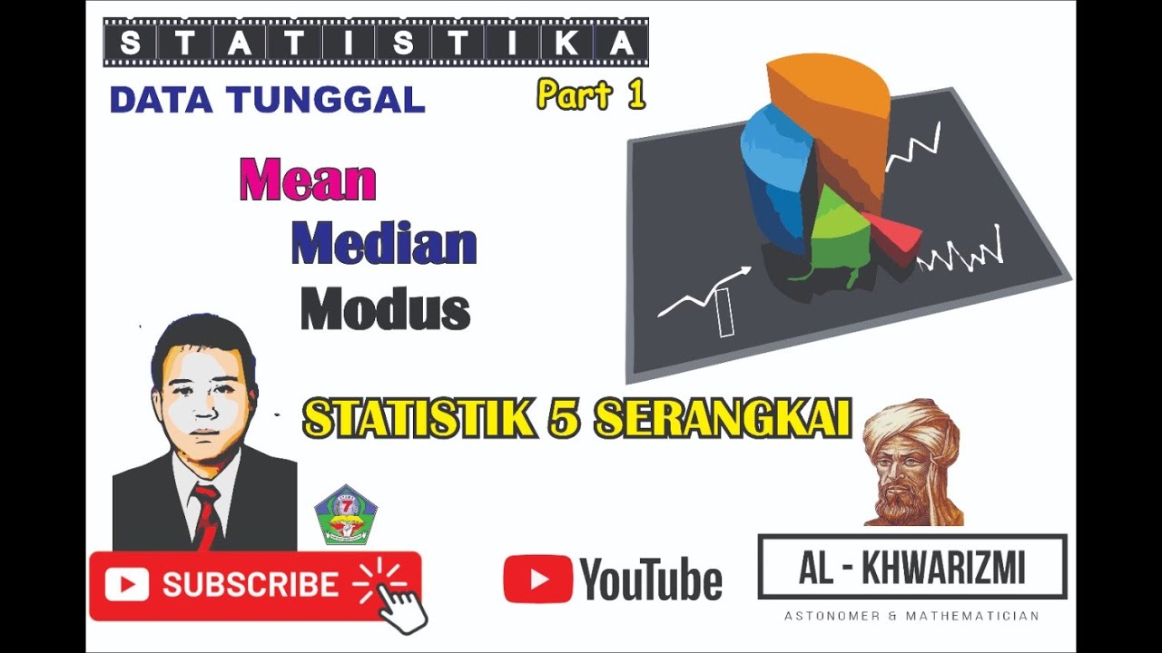
STATISTIKA (MEAN,MEDIAN,MODUS DAN STATISTK LIMA SERANGKAI)
What is Statistics? A Beginner's Guide to Statistics (Data Analytics)!

Statistics Grade 10: Box and whisker

Menentukan Kuartil Q1 Q2 Q3 Median Mean Modus Statistika kelas 12

Statistika Bagian 4 - Median dan Kuartil Data Tunggal dan Data Kelompok Matematika Wajib Kelas 12
How Do I Compare to the Group?
5.0 / 5 (0 votes)
