AP Statistics: Topic 1.4 Representing a Categorical Variable with Graphs
Summary
TLDRThis video tutorial explores representing categorical data with graphs, focusing on bar charts and pie charts. It explains how to create bar charts for displaying frequencies and relative frequencies, emphasizing the importance of equal bar widths and gaps for clarity. The video also covers the use of pie charts for showing proportions and the comparison of categorical data between two datasets, highlighting the significance of using proportions over counts when sample sizes differ for a fair comparison.
Takeaways
- 📊 Bar charts are used to represent categorical variables by displaying frequencies or relative frequencies, and are not suitable for quantitative data.
- 📈 A bar graph can quickly show the distribution of a categorical variable, but it may not be precise in conveying exact counts.
- 🔢 Equal width bars and consistent gaps between them are important for clarity in a bar chart.
- 📊 Relative frequency tables convert counts into proportions or percentages, which can then be represented in a bar graph to show the distribution relative to the total.
- 🍰 Pie charts are effective for showing the proportion of categories but cannot display actual counts or frequencies.
- 📊 When comparing two data sets of the same variable, side-by-side bar graphs can facilitate easy comparison of the distributions.
- 🔍 Proportions are preferred over counts for comparison when sample sizes are uneven or unknown, as they provide a fairer representation of the distribution relative to the whole.
- 📈 Relative frequency bar graphs are useful for showing the proportion of each category in comparison to the total, which can be helpful for understanding the data's composition.
- 📊 The order of categories on the x-axis in a bar graph does not need to follow any specific order and can be arranged as desired.
- 📈 It's important to note that the height of the bars in a bar graph should be the differentiating factor, not the width, to accurately represent the data.
- 📈 When comparing data from two different groups, understanding the sample size is crucial for interpreting the data correctly, especially when using proportions.
Q & A
What is the main focus of the video script?
-The main focus of the video script is on representing categorical variables with graphs, specifically discussing different types of graphs like bar charts and pie charts.
What is the first type of graph mentioned for representing categorical variables?
-The first type of graph mentioned is the bar chart, also known as a bar graph, which is used to display frequencies or relative frequencies for categorical variables.
Why should you not use a bar chart for quantitative data?
-You should not use a bar chart for quantitative data because bar charts are specifically designed for categorical data, not for continuous or quantitative data.
What is the limitation of a bar graph when it comes to displaying exact counts?
-The limitation of a bar graph is that it does not easily convey the exact counts of categories. One can only estimate the counts from the graph without the exact numbers.
What is the difference between a frequency table and a relative frequency table?
-A frequency table shows the counts of occurrences for each category, while a relative frequency table shows the proportion or percentage of each category relative to the total.
What is the advantage of using a bar graph to display data?
-The advantage of using a bar graph is that it allows for a quick and easy visual comparison of the frequency or relative frequency of different categories.
Why are the gaps between bars in a bar graph important?
-The gaps between bars in a bar graph are important because they make it easier to distinguish between different categories and to accurately compare the heights of the bars.
What is a pie chart and what does it represent?
-A pie chart is a circular graph that is divided into sectors, where each sector represents a proportion of the whole. It is used to display categorical data as percentages or proportions.
Why can pie charts only show relative frequencies and not counts?
-Pie charts can only show relative frequencies because they represent parts of a whole as proportions, and displaying counts would not be meaningful without knowing the total.
What is the purpose of comparing two data sets of the same variable using bar graphs?
-The purpose of comparing two data sets of the same variable using bar graphs is to visually assess similarities and differences between the two groups, such as which categories are more or less represented in each group.
Why is it better to compare proportions rather than counts when sample sizes are unequal?
-It is better to compare proportions rather than counts when sample sizes are unequal because proportions give a relative measure that is independent of the total number of observations, making the comparison fairer and more meaningful.
Outlines

Dieser Bereich ist nur für Premium-Benutzer verfügbar. Bitte führen Sie ein Upgrade durch, um auf diesen Abschnitt zuzugreifen.
Upgrade durchführenMindmap

Dieser Bereich ist nur für Premium-Benutzer verfügbar. Bitte führen Sie ein Upgrade durch, um auf diesen Abschnitt zuzugreifen.
Upgrade durchführenKeywords

Dieser Bereich ist nur für Premium-Benutzer verfügbar. Bitte führen Sie ein Upgrade durch, um auf diesen Abschnitt zuzugreifen.
Upgrade durchführenHighlights

Dieser Bereich ist nur für Premium-Benutzer verfügbar. Bitte führen Sie ein Upgrade durch, um auf diesen Abschnitt zuzugreifen.
Upgrade durchführenTranscripts

Dieser Bereich ist nur für Premium-Benutzer verfügbar. Bitte führen Sie ein Upgrade durch, um auf diesen Abschnitt zuzugreifen.
Upgrade durchführenWeitere ähnliche Videos ansehen
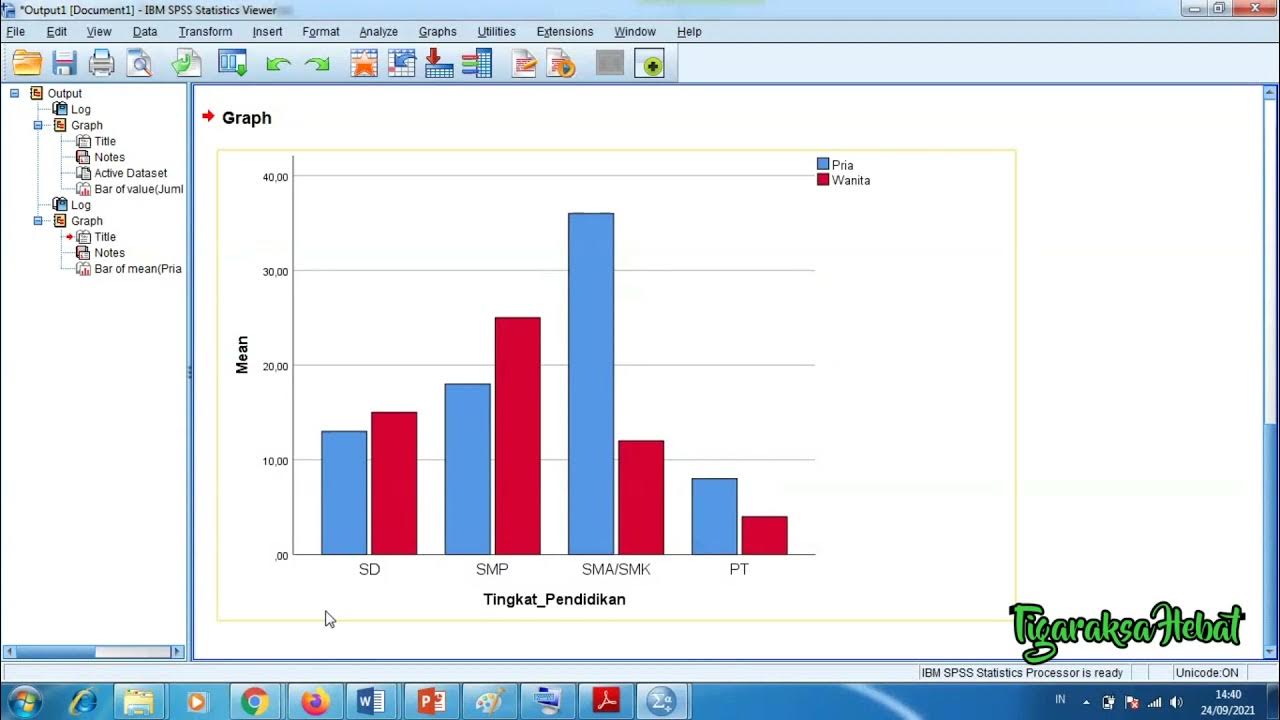
Penyajian Data Statistik Menggunakan SPSS

Kurikulum Merdeka Materi Matematika Kelas 7 Bab 6 Data dan Diagram
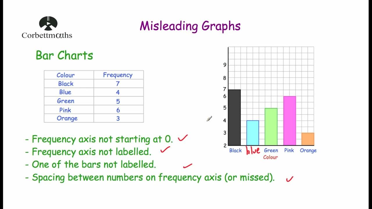
Misleading Graphs - Corbettmaths
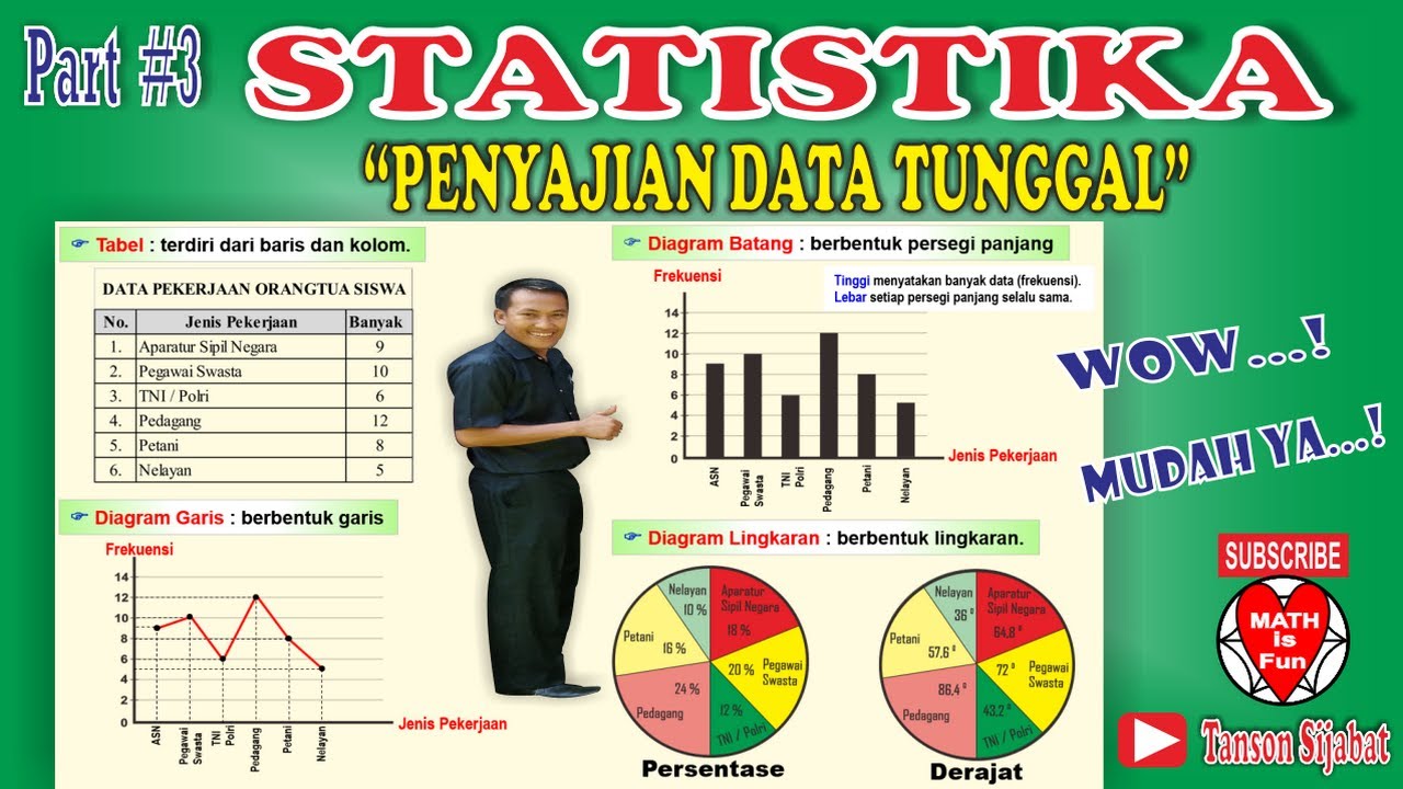
STATISTIKA | PENYAJIAN DATA TUNGGAL [Tabel, Diagram Garis, Diagram Batang, Lingkaran]

Statistik#1 : Diagram | Kelas X Fase E Kurikulum Merdeka
Statistika - Penyajian Data Eps.2 l Ruang Belajar #StudyWithDiida
5.0 / 5 (0 votes)
