Figma To Real Website | Responsive Homepage | HTML, CSS & JavaScript | Part 8
Summary
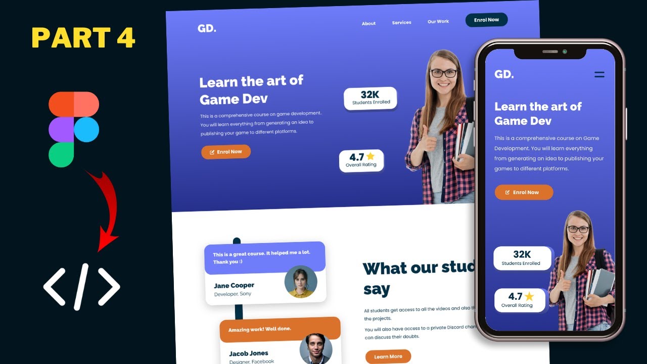
TLDRIn this tutorial, the instructor guides viewers through converting a Figma design into a responsive website using HTML, CSS, and JavaScript. They start by enhancing the navigation bar's appearance upon scrolling and then proceed to adapt the design for tablet views, specifically for an iPad Pro. The process includes adjusting media queries, button styles, padding, and layout adjustments for various sections like the hero section and achievement cards, ensuring a seamless user experience across devices.
Takeaways
- 🌐 The tutorial series focuses on converting a Figma design into a functional website using HTML, CSS, and JavaScript.
- 🖥️ The desktop version of the website has been completed, featuring sections like the hero section, testimonials, courses, get our app, and footer.
- 📱 The video specifically addresses the design adjustments for the tablet version, starting with the navigation bar styles when scrolling.
- 🔧 A 'scrolled' class is added to the navigation bar to change its appearance upon scrolling down, including background color, box shadow, and border radius adjustments.
- 🎨 JavaScript is used to add or remove the 'scrolled' class based on the scroll position, enhancing the interactive user experience.
- 📚 Media queries are employed to apply tablet-specific styles when the screen width is less than 1100 pixels, targeting the iPad Pro view.
- 🛠️ The styling for buttons, padding adjustments for the wrapper, and navigation bar width are modified to suit the tablet view.
- 📊 The hero section layout is altered for the tablet version, changing from a side-by-side display to a columnar flex direction.
- 🖼️ The position of the 'right' division in the hero section is set to absolute and aligned to the bottom to accommodate the image properly.
- 📝 The achievement cards' positions are adjusted from absolute to relative, and margins are added for better spacing within the hero section.
- 🔄 The video concludes with the final touches on the hero section's styling, including font size adjustments and increasing the image height for better visual appeal.
Q & A
What is the main focus of the tutorial series?
-The tutorial series focuses on converting a Figma design into a real website using HTML, CSS, and JavaScript.
What sections of the website have been designed so far?
-The sections that have been designed include the hero section, testimonials section, our courses section, get our app section, and the footer.
What is the first task mentioned for the tablet version design?
-The first task for the tablet version design is to add different styles to the navigation bar when the page is scrolled up.
How is the navigation bar styled when the page is scrolled down?
-When the page is scrolled down, a class called 'scrolled' is added to the navigation bar, changing its background color, adding a box shadow, and adjusting the border radius.
What JavaScript function is used to detect when the page is scrolled down?
-An event listener for the 'scroll' event on the window object is used to detect when the page is scrolled down.
What is the purpose of the 'scrolled' class in the navigation bar?
-The 'scrolled' class is used to apply a different set of styles to the navigation bar when the user scrolls down the page.
How is the transition effect applied to the navigation bar changes?
-A smooth transition effect is applied by setting the CSS 'transition' property to 'all' with a duration of 500 milliseconds.
What is the method to apply tablet-specific styles in the website?
-A media query with a max-width of 1100 pixels is used to apply tablet-specific styles when the screen width is less than 1100 pixels.
How is the content width adjusted for the tablet version in the script?
-The content width is adjusted by setting the width of the navigation bar, header, hero section, and wrapper to 100% and adding padding to these elements.
What changes are made to the hero section for the tablet version?
-The hero section changes include setting the flex direction to column, adjusting the position of the right division to absolute with a bottom position of zero, and styling the achievement cards to be positioned relative to their container.
How are the achievement cards positioned in the tablet version?
-The achievement cards are positioned by setting their position to relative, unsetting the left and top values, and applying margin to create spacing between them.
What is the final step mentioned for styling the hero section in the tablet version?
-The final step is to set the font size and line height of the heading in the hero section's left division, and to increase the height of the image in the right division.
Outlines
🛠️ Designing Tablet Version with Navigation Bar Enhancements
The tutorial begins with the host introducing the project of converting a Figma design into a website using HTML, CSS, and JavaScript. The current progress showcases the desktop version with various sections like hero, testimonials, courses, and footer, all designed according to the Figma reference. The focus of this video is to start adapting the design for tablet versions. Initially, the host addresses the navigation bar's style issues when scrolling up, implementing a 'scrolled' class for a distinct look with a dark background, box shadow, and border radius adjustments. JavaScript is employed to add or remove this class based on scroll position, enhancing the user experience with a smooth transition effect. The tutorial then proceeds with the tablet version design, starting with adjusting the navigation bar and button styles within a media query for screens less than 1100 pixels wide.
📱 Tablet View Styling and Media Query Implementation
Continuing with the tablet version design, the host creates a media query for screen widths less than 1100 pixels to apply iPad-specific styles. The button padding is adjusted according to the Figma design, and the overall page layout is modified with padding adjustments for the wrapper and navigation bar to accommodate the tablet view. The navigation bar's width and padding are set to ensure it spans the full width of the screen, with additional changes to the 'scrolled' class for consistency. The hero section's layout is altered to a column flex direction, and the right division's image is given an absolute position at the bottom. The achievement cards' styling is updated to remove absolute positioning and instead use relative positioning within a flex container, with margins adjusted for better spacing.
🎨 Final Touches to the Hero Section for Tablet View
In the final part of the video, the host refines the hero section for the tablet view. The achievement cards are realigned to remove unnecessary gaps and positioned to the left with increased margins for better visual balance. The left section of the hero area is centered vertically between the achievement cards and the navbar using flexbox properties. The button within the left section is adjusted to span the full width, and the hero section's heading font size is increased as per the Figma design. The image height in the right division is also increased for better visibility. Lastly, the host encourages viewers to ask questions in the comments, like the video, and subscribe for updates, concluding the tutorial on a friendly note.
Mindmap
Keywords
💡Figma Design
💡HTML
💡CSS
💡JavaScript
💡Navigation Bar
💡Media Query
💡Flexbox
💡Styling
💡Responsive Design
💡Scrollbar
💡Transition
Highlights
Introduction to the tutorial series on converting a Figma design into a website using HTML, CSS, and JavaScript.
Overview of the completed desktop version of the website with sections like hero, testimonials, courses, get our app, and footer.
Explanation of the process to add different styles to the navigation bar when the page is scrolled up.
Adding a 'scrolled' class to the navigation bar for styling changes upon scrolling.
Use of CSS variables for consistent theming, such as 'dark color' for the navigation bar background.
Implementation of a box shadow and border radius to the navigation bar for a more modern look.
JavaScript code to add or remove the 'scrolled' class based on scroll position.
Adjustment of the navigation bar's default position and padding for better aesthetics when scrolling.
Transition effect added to the navigation bar for smoother visual changes.
Switching to tablet view for responsive design adjustments using media queries.
Modification of button padding and styling for the tablet version to match the Figma design.
Adding padding to the wrapper division to create a consistent layout on tablet screens.
Styling the navigation bar width and padding to fit the tablet screen dimensions.
Adjusting the hero section layout to a column direction for better readability on smaller screens.
Positioning the right division of the hero section absolutely to align with the content.
Styling the achievement cards to be positioned relatively and adjusting the margins for better spacing.
Aligning the left section of the hero section vertically to center it between the achievement cards and navbar.
Increasing the image height in the hero section's right division for a more prominent visual effect.
Final adjustments to the header's max width for a balanced layout on tablet screens.
Conclusion of the tutorial with an invitation for questions, likes, and subscriptions for further updates.
Transcripts
hi everybody welcome to gt coding in
this tutorial series we are converting
this figma design into a real website
using html css and javascript now this
is our progress as of now if i go to the
chrome
here we can see we have designed the
desktop version so here we can see we
have the hero section we have the
testimonials section
we have the our courses section the get
our app section and also the footer so
we have designed all of this with
reference to this figma design over here
you can watch my previous videos in the
playlist to see how we designed all of
that now in this video we will start
with the design of the tablet version so
let's get started
[Music]
now before getting started with the
tablet version the first thing i will do
is i will add some styles to this
navigation bar when we scroll up so here
we can see
the navigation bar is displayed over
here and it clashes with all the other
elements in our web page so the first
thing we will do is we will add some
different styles to this nav bar when we
scroll up so for that let's go to our
code
and let's scroll up and go to the nav
bar
so here we can see we have the styles
for the nav now what we will do is we
will add a class called scrolled to this
nav and when we scroll down we will add
that class to this nav so here i'll just
tap nav dot scroll
and make sure that you don't have any
space between nav and scrolled right now
when we scroll down let's add a
background color to this nav element so
i'll just type background
and let's add
the dark color so i'll just type var
dark color
so we have already created some
variables over here so we are adding
this color right here
right let's go back
over here and
let's also add a box shadow so i'll just
have box shadow
and we'll set the values to 0 16 pixels
14 pixels negative 8 pixels rgba 0 0 0
and 0.3 and we will add some border
radius to the bottom so i'll start
border radius and i'll just set it to 0
0 for top left and top right
and 8 pixels for
the bottom right now let's go back to
our html and let's add the scrolled
class over here
in the nav
so here for the nav i'll just add a
class of scrolled
and let's go back to our design
and now you can see we have the styles
for this now we also want it to be
positioned at the top so let's go back
and let's set the top to zero
and we'll also add some padding so i'll
just type padding of 12 pixels
let's go back and now we can see that it
looks alright right now let's go back
and let's remove the scrolled class from
here
and let's add it using javascript so
when we scroll down we need to add the
scrolled class to this nav element
so if we scroll down we can see that we
have already linked our main.js file
over here so let's go to our main.js
file and the first thing we will do is
we will reference the nav element solid
step const nav
equals document dot query selector and
here i'll just tap nav
and now let's add an event listener to
the window solid staff window dot add
event listener and we will listen for
the scroll event
and let's create an arrow function over
here
and here we'll just type if
window
dot page y offset is greater than
60
so this means that if we scroll past 60
pixels then whatever code we have over
here will be executed
so let's add the class scrolled to the
nav so just type nav dot class
at
and here's this tab scrolled
and now let's add an else over here and
here we'll just tap
nav.classlist.remove
and we'll just tap scroll over here so
when we scroll past 60 pixels we will
add the scrolled class to this nav
element or else we will remove the
scroll class and let's go to stylor css
and we'll also add a smooth transition
so here i'll just tap transition
and i'll set it to all
500 milliseconds is right now let's go
back to our browser and let's scroll
down
and now we can see when we scroll down
60 pixels we have a different styling
for the nav and i think we need to add a
top value of 0 for this
nav element by default because when we
scroll down we can see that we have this
background displayed over here at the
top
so we don't want that so let's go back
and
here in the nav i'll just set the top to
zero
and i'll just add a padding of 36 pixels
top and bottom
and zero for left and right all right
now let's go back and let's scroll down
and now we can see it looks all right
so everything looks all right all right
so that's it with the nav bar now let's
start with the design of the tablet
version so just right click over here
and click on inspect and let's select a
tablet view from here so you have to
click on this button called toggle
device toolbar
and then you have to
select a tablet from here so i'll just
select ipad pro
and i'll just increase
the zoom to 50
all right now here we can see for the
ipad we have a width of 1024 pixels so
what we will do is we will add a media
query for less than 1100 pixels now
whenever the screen width is less than
1100 pixels we will have the ipad styles
applied to the website all right so
let's start with the styling right so
the first thing we will do is we'll
create a media query so let's scroll
down and
let's type at media and here we'll just
have max width of 1100 pixels
so whenever the screen width is less
than 1100 pixels we will have the styles
that we write over here applied to our
website all right now the first thing we
will do is we will change the styling
for the button inside the tablet version
so let's go back to our figma file
and let's double click on this button
and let's go to inspect and here we can
see for the button we have a padding of
12 pixels top and bottom and 32 pixels
left and right and everything else is
the same i think so let's double click
over here and we have the font size set
to 16 pixels so everything else is the
same so let's go back
and here we'll just type dot btn to
select the button
and we'll set a padding of 12 pixels top
and bottom and 32 pixels left and right
and now we can see we have the styling
applied to the button now the next thing
we will do is we will add some padding
to the left and the right so let's go
back to our figma file and if you click
on this element and if i hover over this
left area we can see that we have a gap
of 100 pixels so let's go back to our
styles and
we will have a padding of 100 pixels for
left and right for the wrapper so if you
go back to our index.html file we can
see that we have the wrapper division
for all the content so here we can see
we have the wrapper inside the header so
we will add some padding for this
wrapper so we will add a padding of 100
pixels for left and right for this
wrapper so here i'll just type
dot wrapper
and let's set a padding of 0 for top and
bottom and 100 pixels for left and right
now we can see we have the padding
applied
all right now the next thing we will do
is we will style this nav element so
let's type nav
and we will set the width of the nav to
100 percent
and we will set the left to zero and the
right to zero so that we have the
correct width and we'll also add a
padding of 100 pixels for this nav so
let's tap padding
and for top and bottom we will have a
padding of 36 pixels
and left and right we will have a
padding of
100 pixels
now we will change the padding for the
scrolled class as well so here i'll just
type
nav dot scroll
and we'll set a padding of 16 pixels top
and bottom and 100 pixels left and right
now we can see everything looks all
right
all right now the next thing we will do
is we will set a max width of 1000
pixels for the header the hero section
and the wrapper so here i'll just type
header
hero section
and header
wrapper
and let's set a max height of 1000
pixels all right now if we go back to
our figma file we can see that we have
all these elements over here at the top
and we have the achievement cards over
here at the bottom so for that let's go
back to our code now we already set a
display of flex for the hero section so
here let's tap hero section
and we will set the flex direction to
column
so that both these elements will be one
below the other now let's see what is
the width of this left division so if we
go back to our index.html file here we
can see in the hero section we have the
left division and in that we have the
heading the paragraph and the button so
here i'll just target the left section
so i'll just type hero section
left
and let's add a background color to see
what is the width so this type
background of red and here we can see we
don't have the full width for this left
division so here i'll just type width of
100
and now we can see we have the full
width right now let's remove this
background color and now the next thing
we will do is we will set a position of
absolute for this right division so if
we go back to our index.html file here
we can see we have this left division
and then we have this right division and
in that we have this image
so let's go back to our style.css file
and let's target the right division so
i'll just type hero section right
and we'll set the position to absolute
and we'll set the bottom position to
zero
right now the next thing we will do is
we will style these achievement cards so
for that we have a division with the
class of achievement cards and in that
we have divisions with the class of
achievement card so if you just right
click over here and click on inspect
here we can see for the achievement
cards we have the position set to
absolute so we have to change this to
relative
and we have to remove the left and the
top positions from here
and we have to do the same for
the other achievement card so here we
have to remove the left and the top
positions and now we can see both the
achievement cards are displayed over
here so we have to now just position it
to the left over here so let's do all of
that
let's refresh this
and here we'll just type hero section
achievement card and we'll set the
position to relative
all right now let's select the
individual achievement card so let's
type achievement card
and we have this class of students
enrolled
and let's also select achievement card
with overall rating and let's set the
left to unset and the top to unset
so this will unset the left and the top
values right now we can see we have
these achievement cards over here we
also have some gap between these
achievement cards so if you go back to
our figma file here we can see we have a
lot of gap i think we don't need to have
this much gap because
in our chrome we can see that we haven't
set such a large height for our screen
so we'll just add
some margin over here so here i'll just
type margin bottom
and let's try 40 pixels and i think
we'll just change this to 80 pixels
i think that looks alright now we also
need to position this to the left
so
if right click over here and click on
inspect
we can see for the container division
which is the hero section
we have set a display of flex over here
so for that we have to go ahead and we
have to type align self to flex start so
let's select the achievement card so
i'll stop hero section
achievement cards and let's set align
self and let's set it to flex start
which will align it to the left
and we will have a little bit of margin
over here on the left
so here i'll just type margin and set it
to 40 pixels
and that looks all right now the next
thing we will do is we will position
this left section to the center
vertically between the achievement cards
and the snare bar so let's select the
left division and he will just type
display of flex
and flex direction to column
and
justify content to center
and now we can see for this button we
have a width of 100 percent so for that
let's select the button and for the
button we have a class of btn so let's
type hero section left
btn and we have to type align self
and we have to set it to flex start and
now we can see we have the correct width
for the button and everything looks
alright now the last thing we will do
over here is we will set the font size
of
this heading so let's go back to our
figma file
and let's double click over here and if
we scroll down we can see that we have a
font size of 50 pixels and we have a
line height of 125 percent so let's copy
both these styles from here
and let's go back to our code and here
we'll just type hero section left h1
and we'll just paste the styles over
here all right now the next thing we can
do is increase the height of this image
so for the image we have
an img tag inside the right division so
here let's type hero section
right
img and let's set a height of
let's try 540 pixels
let's increase it a little bit more so
let's try 580 pixels
and that looks alright and i think we
can increase the max width of this
header over here so i'll just increase
this to let's try 1100 pixels and i
think that looks alright so that's
basically it with the styling of the
hero section in the tablet version so
that's it for this video if you have any
doubts you can ask in the comments below
and if you like this video please click
on the like button and subscribe to this
channel to get the latest video updates
thanks a lot for watching have a nice
day
[Music]
you
تصفح المزيد من مقاطع الفيديو ذات الصلة
Figma To Real Website | Responsive Homepage | HTML, CSS & JavaScript | Part 1
Figma To Real Website | Responsive Homepage | HTML, CSS & JavaScript | Part 11
Figma To Real Website | Responsive Homepage | HTML, CSS & JavaScript | Part 4
Figma To Real Website | Responsive Homepage | HTML, CSS & JavaScript | Part 9
Figma To Real Website | Responsive Homepage | HTML, CSS & JavaScript | Part 6
Figma To Real Website | Responsive Homepage | HTML, CSS & JavaScript | Part 3
5.0 / 5 (0 votes)