Figma To Real Website | Responsive Homepage | HTML, CSS & JavaScript | Part 12
Summary
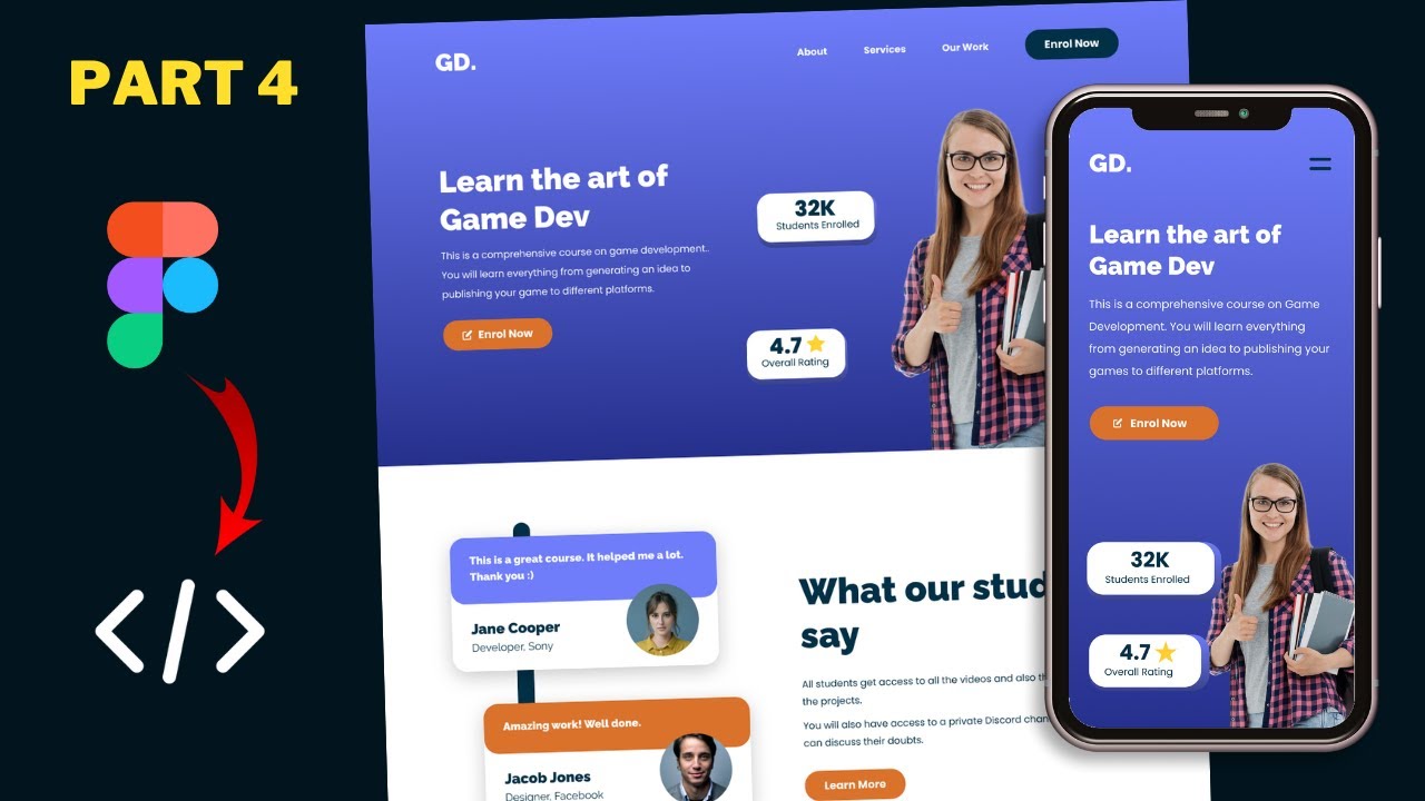
TLDRThis tutorial series guides viewers through converting a sigma design into a fully functional website using HTML, CSS, and JavaScript. The instructor demonstrates the responsive design on various devices, including mobile and iPad Pro, and provides a clean-up of the code for better efficiency. The video concludes with deploying the website using Netlify and customizing it with a subscription box. Viewers are encouraged to watch the entire playlist for a comprehensive understanding of the design process.
Takeaways
- 😀 The tutorial series focuses on converting a design into a functional website using HTML, CSS, and JavaScript.
- 🔧 The website's code has been completed and is displayed correctly in the Chrome browser, including all sections and responsive designs.
- 📱 Responsive design testing is done using the 'Toggle device toolbar' feature in Chrome's developer tools to ensure the website looks good on mobile devices.
- 🛠️ The tutorial includes a step-by-step guide to clean up and improve the CSS code for better efficiency and design consistency.
- 📝 CSS properties that are redundant, like font-family set in child elements when already defined in the parent, are removed to streamline the code.
- 🎨 The hero section's text color is centralized in the parent division to avoid repetition and simplify the CSS structure.
- ✨ Adjustments are made to the layout of achievement cards to improve the visual balance and alignment of text and images.
- 👌 Padding and alignment issues in input fields are addressed to ensure a better user experience across different devices.
- 📱 Media queries are utilized to adjust the padding of input fields specifically for mobile views, maintaining responsiveness.
- 🚀 The website is deployed using Netlify, a service that allows easy drag-and-drop deployment and updates.
- 🔄 The process of updating the live website is demonstrated, showing how to redeploy changes made to the source code.
Q & A
What is the main focus of the tutorial series presented in the script?
-The main focus of the tutorial series is to show how to convert a sigma design into a real website using HTML, CSS, and JavaScript.
What browser is used to demonstrate the website design in the video?
-The Chrome browser is used to demonstrate the website design.
How can viewers see the responsive design of the website on different devices?
-Viewers can see the responsive design by right-clicking on the browser, selecting 'Inspect', and then clicking on the 'Toggle device toolbar' button to simulate different devices.
What is the source code link mentioned in the script, and where can it be found?
-The source code link is provided in the description of the video for viewers to check out and follow along with the tutorial.
What is the first improvement suggested in the CSS file of the website?
-The first improvement suggested is to remove the redundant font family setting of 'Poppins' from elements where it has already been set in the body.
How does the script suggest optimizing the CSS for the hero section?
-The script suggests moving the color setting of white from the 'h1' and paragraph elements to their parent division, which is the hero section, to avoid redundancy.
What issue is identified with the achievement cards in the script, and how is it resolved?
-The issue identified is the redundant color and font family settings for the text and paragraph within the achievement cards. It is resolved by removing these settings and applying them to the parent division instead.
What changes are made to the CSS for the image and text alignment within the achievement cards?
-The changes include setting the flex to one for both the 's3' and the image to ensure they have the same width, reducing the image height, and adding negative margin left to align the image correctly with the text.
How is the padding issue with the input field in the app section addressed in the script?
-The padding issue is addressed by specifying more padding on the right side of the input field to prevent the text from going under the button.
What service is used to deploy the website in the script, and how is it used?
-Netlify is used to deploy the website. The process involves signing up or logging in with a GitHub account, going to 'Sites', and dragging and dropping the site folder to deploy it.
How can viewers update the deployed website, as demonstrated in the script?
-Viewers can update the website by making changes to the local source code and then re-deploying the updated folder to the Netlify account.
Outlines
🛠️ Website Design and Code Cleanup
In this paragraph, the speaker introduces a tutorial series on converting a sigma design into a functional website using HTML, CSS, and JavaScript. They demonstrate the completed design in a Chrome browser, showcasing responsive design features for mobile and tablet devices. The speaker also explains the process of cleaning up the code by removing redundant CSS properties and centralizing the alignment of text. The focus is on refining the website's code for better organization and performance.
📱 Responsive Design Adjustments and Deployment
The speaker continues by discussing adjustments made to the website's responsive design, specifically addressing issues with input field padding and ensuring text does not overlap with buttons. They provide a step-by-step guide on how to adjust padding for different devices using CSS media queries. The paragraph concludes with instructions on deploying the website using Netlify, a service that allows for easy website updates and customizations.
🎉 Finalizing the Tutorial Series
In the final paragraph, the speaker wraps up the tutorial series by encouraging viewers to like the video if they enjoyed the content and to ask questions in the comments for any doubts. They also remind viewers of the availability of the source code in the video description and thank them for watching, signaling the end of the series with a friendly sign-off.
Mindmap
Keywords
💡HTML
💡CSS
💡JavaScript
💡Responsive Design
💡Figma
💡Chrome Browser
💡Code Cleanup
💡Deployment
💡Netlify
💡Media Query
💡Font Family
Highlights
Introduction to the tutorial series on converting a sigma design into a real website using HTML, CSS, and JavaScript.
Completion of coding with a demonstration of the website's appearance in the Chrome browser.
Design responsiveness showcased with a toggle to view the website on mobile devices.
Navigation menu functionality displayed on different device layouts.
Source code link provided in the video description for viewers to follow along.
Recommendation to watch the entire playlist for a comprehensive understanding of the design process.
CSS file review to identify areas for code improvement.
Redundant font family declarations removed for cleaner code.
CSS inheritance utilized to streamline color and font settings for child elements.
Achievement cards' text color and paragraph color standardized for consistency.
Space adjustment between number and star image in the achievement cards for better aesthetics.
Flex properties applied to elements to ensure equal width and alignment.
CSS specificity and overriding properties to ensure correct text alignment and spacing.
Removal of redundant CSS properties to simplify the codebase.
Input field padding adjustments for improved user interface on desktop views.
Media query modifications to ensure consistent padding on mobile devices.
Deployment of the website using Netlify with a step-by-step guide.
Custom domain setup and site name editing in Netlify for personalization.
Subscription box integration suggestion using email services for functionality.
Demonstration of website update process and immediate reflection on the live site.
Encouragement for viewers to customize the code to fit their needs.
Closing remarks with an invitation to like the video and ask questions in the comments.
Transcripts
hi everybody welcome to gt coding in
this tutorial series i showed you how to
convert this sigma design into a real
website using html css and javascript
and we have already completed writing
all the code so if you go to our chrome
browser
this is how the design looks so if we
scroll down we can see that all the
sections are displayed correctly
and we have also designed the responsive
versions so if i right click over here
and click on inspect and here we can
click on this button called toggle
device toolbar
and this is how it will look on a mobile
device
so here we can see we have all the
sections displayed
just like we have in the figma design
and we also have this button over here
for the navigation menus and
we can see that the menus are displayed
over here and if i go ahead and select
another device from here let's select
ipad
and this is how it will look on an ipad
so we have a different layout we have
two columns for the footer
and
let's select a larger device so if i
select ipad pro
we have a different design
so we have completed writing all the
code for this design now in this video
we will just clean up some of the code
and then we'll deploy this website
online now i will leave the link of the
source code in the description of this
video so you can go ahead and check that
out but i recommend you to watch all the
videos in the playlist and write the
code along with me so that you'll
understand how everything is
designed alright so let's get started
[Music]
right here i'm in the source code of our
website and this is the css file
so let's take a look at this css and
let's see what we can improve so here
you can see in the body we have set a
font family of poppins and sanserif so
whenever we have this font family set to
pop ins in any of the elements we can
just delete that so let's scroll down
and
here you can see in the nav element
inside the anchor tag we have the phone
family set to pop ins but we have
already set the phone family to poppins
in the body so we can just delete this
line of code
and if you go back to our design we can
see that we don't have any problems
all right let's scroll down
and now you can see in the hero section
we have
these elements over here and
for the h1 and for the paragraph we have
set a color of white so we can just cut
this line of code from here and add it
to the parent division which is the hero
section so i'll just add it over here
and we can just delete this line of code
color of white from the h1
and here in the paragraph we can just
delete the font family line
let's go back to the website and we can
see we don't have any problems
right let's scroll down and
here are the achievement cards
if we scroll down we can see that we
have set the color of
the text to
dark blue color and even for the
paragraph we have set a color of
dark blue color so we can just cut this
line of code from here
and we can just add this to the parent
division which is the achievement card
division so let's scroll up and
let's paste it over here
and we can also delete the color from
the s3
and we'll also remove the font family
pop-ins from here
and also from the paragraph
all right let's go back to our website
and we don't have any problems
now the next thing we will do is we will
decrease the space between
this number and this star image so let's
go back to our code here we can see we
have this content division and in that
we have this div and in that we have the
s3 and the image so if you go back to
the html file
and let's scroll up
and here we can see we have the
achievement cards and here inside the
content division we have a div
and in that we have the s3 and the image
so first of all let's add a background
color to this div and let's see
the space that it takes so i'll just add
a background color over here
and i'll just set it to red
and this is the space that it takes and
one more thing that i notice over here
is that this paragraph is not center
aligned
so let's go back and
let's go over here to the paragraph and
here let's tap text align center
all right now let's go back to our css
and what i will do is i will set the
flex to one for the s3 and the image so
that both of them will have the same
width so here i'll just type achievement
card img
and let's set the flex to one
and here also i'll just set the flex to
one
and now we can see both of them have the
same width and now i'll just reduce the
height of this image
so here i'll just type height and i'll
just set the height to 42 pixels
and now i'll just add some negative
margin left to this image
so let's type margin left and i'll just
type
negative 24 pixels
and now we can see it looks alright so
i'll just remove this background color
all right now let's go back to our css
and let's scroll down
and here in the section paragraph we
have set a font family of poppins so we
can just remove this
and if we scroll down we don't have any
problems
and here inside the app section we have
this
font family set to pop in so i'll just
delete this line of code
and here for the input field we have set
a font family of pop-ins but we have to
specify the font family in input fields
so if i remove this font family line
from here and if i go back to our
website
we can see it doesn't have the correct
font so we have to specify the phone
family in the input fields
now one issue that we have with the
input field is that we don't have the
correct padding
so if i just type something over here
we can see that the text goes under the
button
so we have to add some more padding over
here on the right so here i'll just type
padding and set the padding to 8 pixels
top and for the left i'll just set a
padding of 160 pixels
and for the bottom i'll just have a
padding of 8 pixels and for the left we
will have a padding of 32 pixels right
now let's go back
and
now we can see we have the correct
padding
so we can see that it doesn't go under
the button right now that we have added
this padding of right for this input
field we have to check whether we have
the correct padding for the mobile
version
so let's open
the mobile version
and let's type something over here
and here also we have a padding of 160
for the right so we have to reset the
padding over here in the mobile device
so let's go back to our css
and let's scroll down
and here in the media query for 700
pixels i'll just scroll down
and i'll just add the selector of the
input field over here so just a footer
form input
and i just add a padding of 8 pixels top
and bottom and 32 pixels left and right
let's go back and let's see whether we
have the correct padding
and now we can see we have the correct
padding all right that's pretty much it
with the code of our website so
everything looks alright
now you can go ahead and customize this
code to your needs all right now the
final thing we need to do is deploy this
website online so let's go back to our
browser now for deploying our website
we're going to use this service called
netlify so you can just sign up for free
or you can just log in using your github
account so just log in
and then you have to go to sites and you
can just drag and drop your
site folder over here so here's my
folder which has all the files so here
you can see we have the images
in the html javascript and the css files
so i'll just drag and drop this over
here
and here we can see that the site has
already been deployed now you can just
go over here to domain settings
and you can just add a custom domain if
you want or you can just change this
name
so let's go over here to edit site name
and i'll just type
my new website
let's see whether we have the name
available
let's add some number over here
right now we can see we have this url my
new website 123.net life.app so let's
open this
and this is how it looks we can see that
everything looks all right
now for the subscription box you can go
ahead and sign up for an email
subscription service or an email
newsletter service so you can go ahead
and get the code and paste it over here
in place of this input box and then the
input field will be functional
right now let's check out the mobile
version
and we can see it looks alright
let's check out the ipad
pro version
and everything looks alright
now if you want to update this website
you can go ahead and do that pretty
easily
so here we can see in the title we have
document so i'll just change this to
welcome and let's update our website
let's go back to our source code
and let's go to our index.html file and
let's scroll up and here in the title
i'll just type welcome
now let's save it and now let's drag and
drop this updated folder into our
netlify account
so i'll just go back to
deploys
and now if we scroll down we can see
that we can just drag and drop the
updated site folder over here this is my
updated folder so i'll just drag and
drop this over here
and we can see it is being uploaded and
here we can see it has been published so
let's open this website
and let's see whether the title is
displayed
and now we can see that welcome is
displayed over here so everything is
working all right
all right so that's it for this video so
this was the final video in this
playlist so if you enjoyed this series
please click on the like button and if
you have any doubts you can ask in the
comments below and i will also leave the
link of the source code in the
description of this video alright so
that's it for this video thanks a lot
for watching have a nice day
[Music]
you
浏览更多相关视频
Figma To Real Website | Responsive Homepage | HTML, CSS & JavaScript | Part 10
Figma To Real Website | Responsive Homepage | HTML, CSS & JavaScript | Part 11
Figma To Real Website | Responsive Homepage | HTML, CSS & JavaScript | Part 3
Figma To Real Website | Responsive Homepage | HTML, CSS & JavaScript | Part 4
Figma To Real Website | Responsive Homepage | HTML, CSS & JavaScript | Part 8
Figma To Real Website | Responsive Homepage | HTML, CSS & JavaScript | Part 9
5.0 / 5 (0 votes)