Kelas 5 Matematika Analisis Data
Summary
TLDRIn this video, the presenter, Bu Anggi, guides fifth-grade students through the analysis of different data types: bar charts, line graphs, and pie charts. The lesson focuses on practical applications, such as analyzing vegetable harvest data, library visitor statistics, and favorite fruit preferences. Students learn to extract key insights, perform basic calculations, and interpret trends such as increases or decreases in data. Bu Anggi also emphasizes how to draw conclusions from the data and make predictions, offering a hands-on approach to understanding data analysis in a fun and accessible way, even during challenging times like Ramadan and the pandemic.
Takeaways
- 😀 The video teaches 5th-grade students about data analysis, focusing on three types of charts: pie chart, line graph, and bar chart.
- 😀 The lesson covers analyzing data from a bar chart, using examples like vegetable harvests, with comparisons between January and February results.
- 😀 Students are encouraged to observe changes in harvest data, such as the increase in cauliflower production from January to February.
- 😀 The script explains how to calculate totals from data in the bar chart, like finding the total harvest for each month and the overall total.
- 😀 Students learn how to assess whether statements about data, such as total harvest or changes in production, are true or false based on analysis.
- 😀 A line graph example is used to demonstrate how to analyze the number of visitors to a library over a week, with total visitors calculated.
- 😀 The teacher asks students to predict whether a special event (like a student performance) will increase or decrease library visitors, based on the data pattern.
- 😀 The analysis encourages students to calculate the number of visitors on specific days and to evaluate trends, such as rises and falls in attendance.
- 😀 The script also covers pie charts, helping students analyze favorite fruits and calculate percentages, like determining how much of the total is watermelon or apple.
- 😀 Students are taught how to calculate specific quantities from percentages, such as finding the number of fruits based on their percentage of the total count.
Q & A
What are the three types of diagrams that the lesson focuses on for data analysis?
-The lesson focuses on analyzing data from three types of diagrams: pie charts, line graphs, and bar charts.
How can we analyze the data from a bar chart?
-Data from a bar chart can be analyzed by identifying trends such as comparing values between different categories or months. For example, one can check how much each vegetable was harvested in January versus February.
What were the total amounts of vegetables harvested in January and February according to the bar chart?
-In January, the total vegetable harvest was 11,500 kg, and in February, it was 11,000 kg.
How can we calculate the total harvest over both months?
-To calculate the total harvest over both months, you add the total from January (11,500 kg) to the total from February (11,000 kg), resulting in 22,500 kg.
How do we analyze the data from a line graph?
-To analyze data from a line graph, you observe how values change over time, noting any increases or decreases, and you can also predict future trends based on past patterns.
What can we predict about library visitors on the following Friday if there is a student event?
-It is predicted that the number of library visitors will decrease because students will likely attend the student event instead of visiting the library.
What was the total number of library visitors from Monday to Friday?
-The total number of library visitors from Monday to Friday was 320 people, calculated by adding the number of visitors each day: 60 + 70 + 80 + 60 + 50.
How can we check if statements about data from the line graph are true or false?
-To check the truth of statements, you compare the data presented in the line graph with the information in the statements. For example, if a statement says 'Monday had the fewest visitors,' you check if Monday had fewer visitors than other days.
How do we calculate the percentage of melon in the pie chart data?
-To calculate the percentage of melon, you subtract the percentages of all other fruits from 100%. In this case, melon is 18%, calculated as 100% - (7% + 25% + 14% + 11% + 13% + 12%).
What was the number of melons if there were 200 fruits in total?
-To find the number of melons, you multiply 18% by the total number of fruits (200). The calculation is (18/100) * 200 = 36 melons.
Outlines

此内容仅限付费用户访问。 请升级后访问。
立即升级Mindmap

此内容仅限付费用户访问。 请升级后访问。
立即升级Keywords

此内容仅限付费用户访问。 请升级后访问。
立即升级Highlights

此内容仅限付费用户访问。 请升级后访问。
立即升级Transcripts

此内容仅限付费用户访问。 请升级后访问。
立即升级浏览更多相关视频

Video Pembelajaran Matematika Kelas 7 SMP ( Pengolahan Data )

Statistika Kelas 8 [Part 1] - Menganalisis Data

Kurikulum Merdeka Materi Matematika Kelas 7 Bab 6 Data dan Diagram

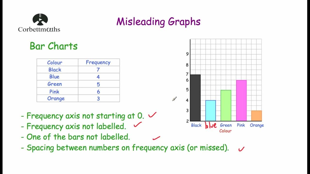
Misleading Graphs - Corbettmaths

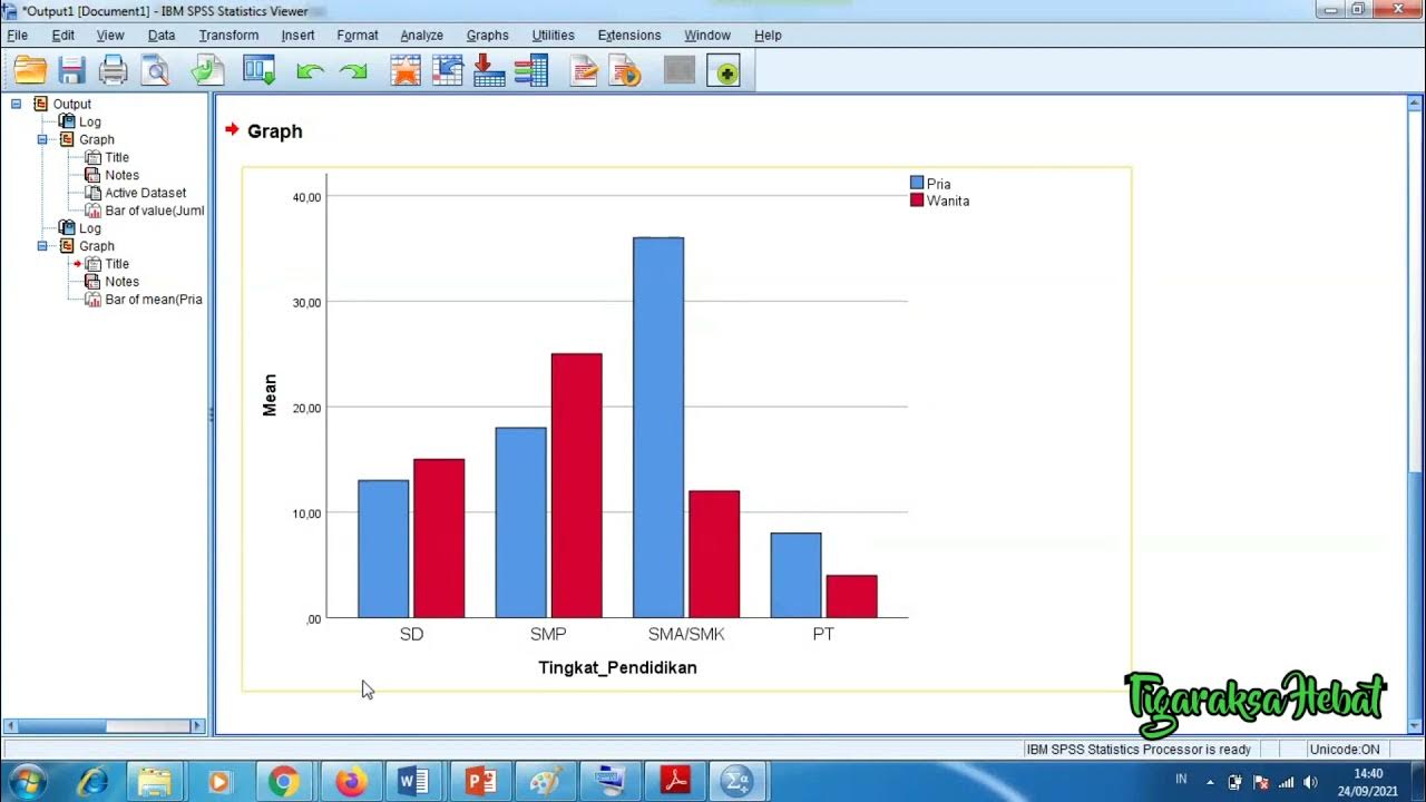
Penyajian Data Statistik Menggunakan SPSS

Statistik#1 : Diagram | Kelas X Fase E Kurikulum Merdeka
5.0 / 5 (0 votes)
