Tim Tries: Figma, Zeplin and Storybook. Mind is blown...
Summary
TLDRIn this video, Tim explores how to integrate design systems with technology, demonstrating how to connect Figma, Zeppelin, and Storybook. He shows how to sync designs with a style guide and code editor, enhancing the workflow for developers and designers by linking components directly to their code and documentation.
Takeaways
- 🔧 The video series 'Tim Tries' explores new tools and technologies for design and development projects.
- 🧠 Tim was inspired by a colleague's demo on integrating creative work with interactive style guides and code editors.
- 🌐 The main tools discussed are Figma, Zeplin, Storybook, and VS Code.
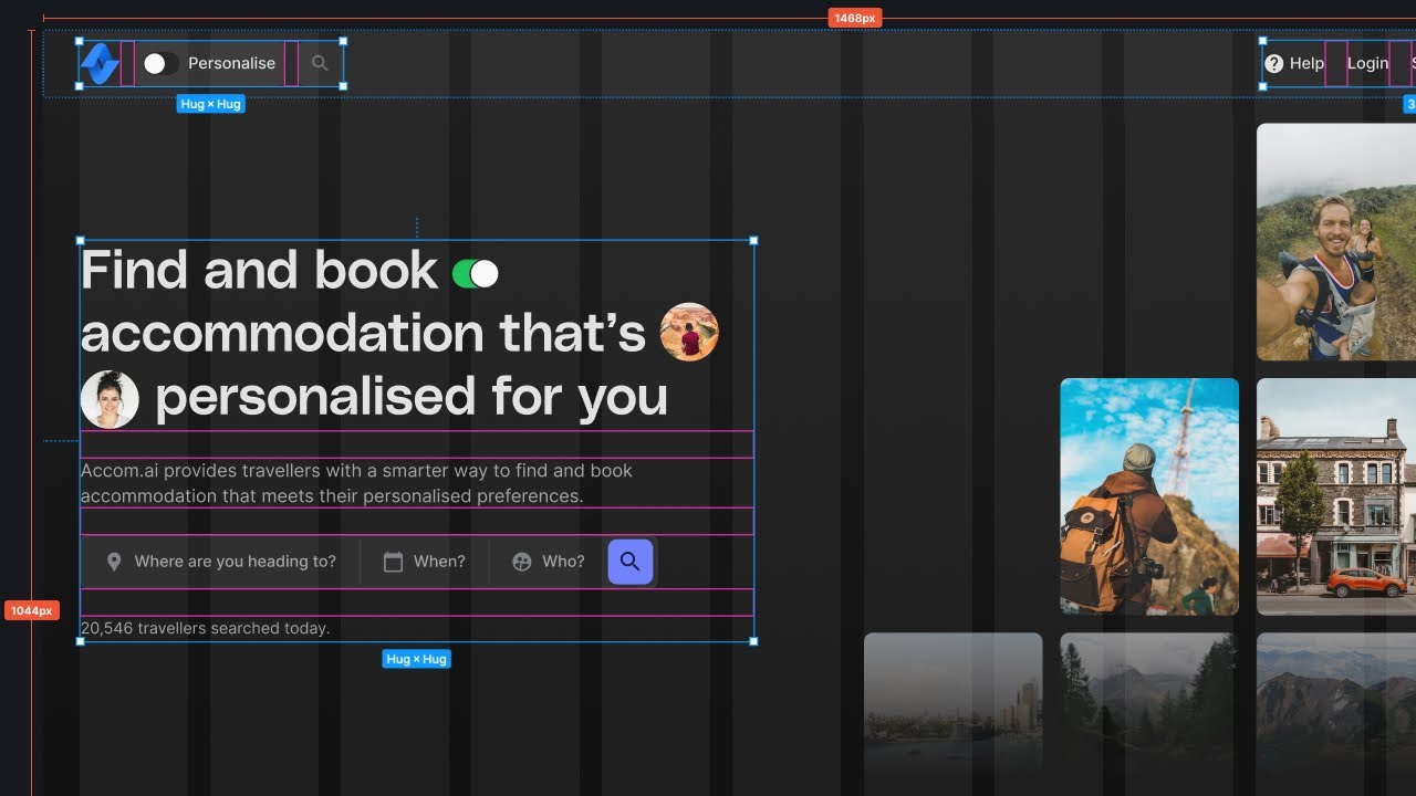
- 🎨 Figma is highlighted as an excellent tool for creating modular and responsive web designs.
- 🔍 Zeplin is used for inspecting design elements and syncing them with various design tools.
- 📖 Storybook acts as a living style guide by showcasing front-end code components.
- 🔗 The integration process involves connecting Figma designs with Zeplin and then linking Zeplin components with Storybook and VS Code.
- 🛠️ Tim demonstrates creating a simple button in Figma, exporting it to Zeplin, and linking it to code in VS Code.
- 🖥️ The setup allows for seamless navigation between design elements in Zeplin, code in VS Code, and components in Storybook.
- 📚 Additional features include linking to external resources like GitHub repositories and Confluence pages for a comprehensive development workflow.
Q & A
What is the main focus of the video?
-The main focus of the video is to demonstrate how to connect a design system to technology, specifically how to integrate Figma, Zeplin, and Storybook with a code editor like VS Code.
What is Figma and how is it beneficial for web development?
-Figma is a web-based design tool that is often considered the new Photoshop or Sketch. It is beneficial for web development because it allows for the creation of modular, reusable, and responsive designs that can be easily shared and collaborated on in a browser.
What is Zeplin and how does it relate to Figma?
-Zeplin is a tool that acts as a style guide and allows designers to sync their work from various platforms like Photoshop, Sketch, and Figma. It enables team members to view designs online, inspect elements, and see the associated code, making it a source of truth for design in a team.
How does Storybook differ from Zeplin?
-While Zeplin is focused on design and style guides, Storybook is a tool that extends the concept of a style guide to include actual front-end code. It is referred to as a 'living style guide' and allows developers to see how designs translate into code.
What is the significance of connecting Figma and Zeplin?
-Connecting Figma and Zeplin allows for seamless synchronization of design work. Designers can create components in Figma, which can then be viewed, inspected, and used as a reference in Zeplin, providing a consistent and accessible design resource for the team.
Why is it beneficial to connect Zeplin to Storybook?
-Connecting Zeplin to Storybook enables developers to see how the designs from Zeplin are implemented in code. This direct link between design and code can help ensure that the final product matches the original design intent and can facilitate easier collaboration and debugging.
What is the role of the VS Code plugin in this setup?
-The VS Code plugin acts as a bridge between Zeplin and the developer's codebase. It allows developers to view Zeplin components directly within their code editor, access related Storybook stories, and even link to external resources like GitHub, Confluence, or JIRA.
How does the video demonstrate the integration process?
-The video demonstrates the integration process by showing the creation of a simple button in Figma, syncing it to Zeplin, and then connecting Zeplin to Storybook and VS Code. It also shows how to add links to GitHub and potentially other systems like Confluence.
What are the potential benefits of having a connected design and development workflow?
-A connected design and development workflow can lead to increased efficiency, better communication between designers and developers, and a more accurate translation of designs into code. It also provides a single source of truth for design specifications and makes it easier to maintain consistency across a project.
What are some potential challenges in setting up this integrated workflow?
-Some potential challenges include the initial setup and configuration of the various tools and plugins, ensuring that all team members are familiar with the workflow, and maintaining the synchronization between the tools as designs and code evolve.
Outlines
🌟 Exploring Design Systems
In this video, Tim explores connecting design systems with technology. He was inspired by a colleague's demo showing how to integrate creative work with interactive style guides and code editors. This video will cover tools like Figma, Zeplin, Storybook, and VS Code, illustrating their integration.
🔗 Connecting Figma and Zeplin
Tim demonstrates how to connect Figma with Zeplin. After designing a button in Figma, he exports it to Zeplin, showing how it becomes part of a style guide. This setup allows inspection of design elements, linking them to code components.
📘 Setting Up Storybook
The video continues with setting up Storybook, a tool for viewing components alongside actual front-end code. Tim walks through linking a Figma design to a Storybook component, emphasizing the seamless integration between design and development environments.
🛠️ Integrating with VS Code
Tim installs a Zeplin plugin for VS Code to connect code components directly with Zeplin. He sets up configuration files to link code with design elements, showcasing a streamlined workflow for developers to access and edit design-related code efficiently.
🎬 Final Thoughts and Wrap-Up
Tim concludes the video by summarizing the potential of these integrations. He reflects on the benefits of having a centralized hub for design and development, highlighting how these tools can improve collaboration and efficiency in design workflows.
Mindmap
Keywords
💡Design System
💡Figma
💡Zeppelin
💡Storybook
💡Component
💡Interactive Style Guide
💡Code Editor
💡Sync
💡Visual Studio Code (VS Code)
💡Repository
💡Confluence
Highlights
Tim introduces the video series 'Tim Tries,' where he explores new things he's never done before.
Tim plans to explore connecting design systems to technology using tools like Figma, Zeppelin, Storybook, and VS Code.
Tim was inspired by a colleague's demo showing the integration of creative work with interactive style guides and code editors.
Figma is described as a modern web-based design tool that allows for modular and responsive design components.
Zeppelin is highlighted as a tool similar to InVision, where designs can be inspected and viewed online, showing components and style guides.
Storybook is introduced as a living style guide that contains actual front-end code, making it a bridge between design and development.
Tim explains how to connect Figma and Zeppelin using a native plugin, allowing web developers to sync designs with Zeppelin.
Tim demonstrates creating a simple button component in Figma and exporting it to Zeppelin.
Tim installs the Zeppelin plugin for VS Code to connect design components directly to code components.
Using the Zeppelin CLI, Tim connects the Figma component to his Storybook code component, creating a unified workflow.
Tim adds a repository link to GitHub in Zeppelin, allowing quick access to the source code from the design view.
Tim discovers the ability to add custom links in Zeppelin, such as to Confluence or Jira, enhancing the central hub functionality.
Tim showcases the seamless navigation between design components in Zeppelin and their corresponding code in VS Code and Storybook.
Tim highlights the potential of this integration to streamline collaboration between designers and developers.
Tim concludes by emphasizing the simplicity and efficiency of having a connected design and development workflow.
Transcripts
what is up welcome back to yet another
tim tries so in this video series i try
out stuff
that i never did before so i genuinely
look at something the first time
so this time i'm going to look into how
to make sure that your design system for
your project
really connect to your technology and so
a couple of weeks ago
i saw my colleague brian from new york
give this demo
on how to connect the creative work
to the interactive style guide and to
your code editor
and my mind was blown and i always
wanted to use this but i never really
saw it in practice it was really hard to
do
and now that the technology advanced a
little bit i'm more senior i kind of
know what i want now
i thought okay it's time i'm just gonna
try this
so after the intro we'll dive in what
you can do
with figma zepplin storybook and vs go
there we go
[Music]
all right so here in my browser i just
loaded a little image that i just
photoshopped together
and here you'll see we have figma
zeppelin
and storybook so basically let me just
go over what i think those are
figma is kind of the new photoshop the
new sketch but then
online it's all in a browser it's
really good it's really good for web
development it's really good for making
designs that are modular with components
and reusable stuff and
responsive stuff great stuff right so
then we have zeppelin
and zeppelin is similar to projects like
envision
where you can kind of look at your
designs
online and they're all synced there so
photoshop can sing their sketch can sing
their
figma can sync there probably more and
then
you can actually look at all the screens
and you can inspect so when you click on
a button you can actually see
the code or you can see whatever
it's really cool so it also has like a
style guide and you can see reusable
components in
it so zeppelin is kind of your source of
truth for your design for everybody in
your team
and then we have storybook which is
basically what sapling is but then with
actual front-end code so here this which
we call our living style
guide so apparently what my colleague
showed me you can connect
all of them up so figma and zeppelin
have a native connection there's like a
plugin you can use so when you design
something you can sync it with zeppelin
so then web developers would go to
zeppelin and actually have a look at
that design
but wouldn't it be cool if those designs
were directly also matched with your
storybook work
where you put your real code and
wouldn't it be cool
if i could also link to let's say
confluence or a wiki or
a ticketing system or my github
or my fiest code all from zeppelin so
this becomes like the hub
and this is possible so today i'm gonna
try that so when you have a look here
you actually have this connected
components
from zeppelin so this came out somewhere
last year you see six months ago
so this is pretty new and actually when
you
go over it you can see here in zeppelin
you have some really cool side panel
that actually shows me
like this i guess this is a react button
right and it has an opening github open
in storybook
i want this stuff so i already did
a bit of homework because i didn't want
you to
look at me creating projects and designs
and setting up everything so i have a
storybook running with one button
inside i already built it so how about
we go to figma
create a button and then sync that
to zeppelin and then connect zeppelin
to my vs code and how everything
connects basically
let's let's go for that so first let's
open figma so this is very simple we're
just going to make
like a really simple button okay
i'm going to make it black
and then inside i'm going to write
something
and that's going to have to be white
and let's maybe center it nicely okay
i'm just literally gonna
use it like this well this is a bit big
maybe can we
change the font size
um you know what let's not go there what
you can do though is actually connect
this and make this a component
so this is what i've learned so now that
i created a component out of this
we can actually look at the assets and
then here we have local components so
this thing you can reuse everywhere in
your design
so for now i'm not going to dive in and
do more this is literally it
we don't need more from figma so what
i've seen um
i already connected a zeppelin two figma
so we can actually go plugins
zeppelin let's see what it does
so it's loading my zeppelin so now i
have to select what i want
to sync and i want to do export
so now it's launching my zeppelin local
app
okay and so i have an amazing um web
design
thing already so you can see here this
is also amazing web design i just made
two projects
so i'm gonna be like okay let's just
export let's run with it
okay so now it opens zeppelin
imported component one so i think this
is going to be in the style guide
components yes i think yes
so now what we did when i click on this
i can actually click on this and inspect
it and it actually says i am a button
this is my class name
and it has like width and height and
font family and stuff like that
i can go into all the specifics that i
need
and this is also not a zeppelin video so
i'm not going to dive deeper into that
but this basically
has a local style light where i have a
button that is going to be able to be
reused
but then look here on the side connect
this component
to your components in code and see quick
links and stuff like that so that's what
we're going for
so basically this will be the heart this
page here
or maybe color palette or dashboard or
whatever but let's say
our style guide is the heart of our
project and i want to be able to link to
everywhere from here right so turns out
there is a video oh not video a vs code
plugin
for vs code that connects zeppelin and
then
in there you can actually do a whole
bunch so let's install that
oh before we go um why not i'll show you
um the button that i built in storybook
mdm run
story book
okay running running running
so now it's basically just opening
storybook
and there's my button so this i
pre-built
this is just a vgs button very simple
you have some props and
on click action there's nothing else or
you can look at the docs and you can see
like i did nothing else to this there's
no different variations of the button
nothing else it's just the same as in
figma basically
right and i've also already created a
git
repository because i want to later on
connect git
to my zeppelin okay so now let's go to
vs code and find this zeppelin
plugin
okay so zepplin this is this thing the
thing
we're just looking at so okay so let's
install
reload
okay we just got a little icon here
okay
this is my design project so um
i'm guilty here because a couple of
weeks ago
my colleague brian that showed me this
say hey you just installed that vs code
plugin
and so i'm already logged in to my
my zeppelin that doesn't mean that i
know what i'm doing
but that just i thought when i
uninstalled it and reinstalled it for
the video i would have to log in
but it's smart nice it's still there so
basically this is my amazing design
screens and components which is
basically
this is also the my amazing design
project there we go and this is the cell
guide with components
so let's have a look and then we can see
components here
component one um
let's just open it up oh and it just
opened from field code into this that is
pretty decent
that's a nice start right but i know and
i've seen you can actually connect
all of this code that we see here my um
my story file here you can connect this
also to zeppelin
and there is a documentation here so we
looked at this before right so
basically getting started so we are
using fjs in this case
so let's just open this tab and try to
install it
okay so um
yeah so they're talking about this
configuration file and i've seen that
before
so let's go to vs code and actually try
to just type zeppelin here
create zeppelin configuration file
so okay i've seen brian do this so
basically this is the components.json
that connects everything together and
i think what you can even do because
there's a zeppelin cli that i've also
previously installed
you can actually when you hit zeppelin
connect
you can connect this file to the files
in your code base right
to zeppelin so there's like an api
connection so
let's add a project so i am in my
personal workspace and you can see all
my projects here
so in my amazing design project i don't
think we have a style guide but we do
have components
and then actually now it finds oh yeah
this is my local
button.view yeah that's my component ok
and now so it's found a component with
the
path to my button and then we can
connect that to a zeppelin component
which is my
component one okay
so now i saved it and eslint or
prettier did something to it but
basically it now created
it knows the project and it knows my
components now um
i think however we can do more here
because what i saw
when we go back to that fuji s thing is
that this oh yeah
so prepare the configuration file we
just did that
um yeah we did all of this add
components from your code base we did
and then isn't there like okay so this
is zeppelin names
yeah so the cli thing i did that before
and then we have to install the plug-in
okay this we can do
and we have to turn off this and install
this
while we wait let's read a bit more okay
so we just have to add that plug-in
to the configuration
okay let's do it
okay so now it has the zeppelin cli
connect plug-in view
and then what they're saying oh here we
go
run the zeppelin cli so with the sapling
connect so
this is the thing i tried before so i'm
just gonna go and click that now
so i think what it did now is it
basically looked at
that connection thing that components
are json and connected it to zeppelin so
let's open zaplin click on that button
and now we can see
there's this my button thing so this is
basically an instance of my code
and it says to because it probably read
my
props so it knows this is a string and
that that's pretty decent
so it kind of okay so it's in storage
button.view
so when i click this i want to go to
visual studio code and
open
the magic this is actually my component
it's a pity that it didn't open it in my
open project already but you know it's
nice
let's get back because i think
okay so this we did let me see
this is the fuji s one right because i
saw here
look we can add repository links but
also storybook links
i think that's what we want to do first
so let's
open storybook and have a look
okay so we're going to have to install
that plugin also
to be honest it's a pity that it's
global installs i don't really like that
again you know whatever
i prefer that it's local so i don't
pollute my global scope or whatever
okay so it installed that it's really
fast that's nice
um so then i'm gonna have to add my
plug-in
okay we can do this so another plug-in
and they look at localhost 9009
but my thing i think it ran at 606
right yeah
okay let's see um what else because just
with this i don't think that's gonna be
enough oh we can also have a remote
instance okay so when i
um output my storybook maybe to
whatever versal or netlify we can link
there that's pretty cool
okay so the component stuff we did this
yes we did that too
ah but look there's actually a storybook
property
okay let's add this
to our zeppelin names actually i don't
like this component one but i never gave
it a nice name
in oh look whoa it actually has like a
nice view of it
imagine if this was like a proper
component that looks cool
so it is a design system button but
let's just call it component one because
well that's actually what it is right
and it
has different stories so i know i made
one story
right when we look at my stories i just
have the primary
the default one or when you look it's as
hilly as okay so let's call it primary
then that's the only one that i have
let's see do we need to do more
i don't think so i think we just aye we
sappling connect again
well we can do that
let's connect it ah detective storybook
at 6006
nice so it's found the story
okay
oh yeah opening storybook
yeah that's cool so now
we can actually go from
in this place we can now go to storybook
we can go to visual studio code and we
can see our component here
but i know there's more i know we can
also have links to github
and we can have links to let's say your
wiki and stuff like that so let's have a
look
so here repository links i think that's
what we want
let's have a look
i think this is probably not even a
plug-in they probably just
understand it already um
ah so we can literally just say okay oh
that's my mistake
github okay let's put that in
i said where did i want it below
components
and of course this is timpanics and i
made it
called i called it this one
would that that's it
wait let's read i never read i should
read
ah because probably it knows this path
so i i'm assuming it's just gonna work
ah branch yeah i actually have master
oops it's json not javascript
okay let's zaplin connect again and see
what it added for us
okay
okay there's the github let's click
beam there's my source stories
button.view
what i like this so much
man and it's you know what this is also
it's so simple
i want to know if there's more now okay
we did this one
custom links and then we have style
guidelines i don't use that so probably
not
so but let's have a look what the custom
links do
oh i can literally choose what it is
okay i can have a links property
and then say confluence and then have a
url okay
well i won't do that now because i don't
have a confluence page but potentially
that's pretty cool
oh and then you can add a confluence
property with the url
path okay so the link here for type
confluence
it's like the base url and then you add
the url
path it's basically like the path of
your code
with the github one yeah okay that kind
of makes sense
so with this we can open it in
confluence we can open it in
jira maybe we have some other systems
maybe we can
you know i'm liking it
um is there anything else we should dive
into i don't think so
i'm already talking for 18 minutes so
let's like this is awesome right now
my zeppelin and imagine this was a rich
experience right with a lot of content
imagine how easy it is for a developer
to actually have a look and say okay
this is my
my thing this is the props i need let's
open it in github or in storybook let's
open in storybook
let's see if my code is actually the
same right i can put that side by side
and actually have a look and i can see
now my padding is probably a little bit
off
but what's interesting to me is we also
have figma
and maybe what i want to do is this
oh red doesn't work okay
okay and then we're just gonna sync this
okay export complete
i don't think i did that right you know
what screw it doesn't matter
um i did too much anyways thank you for
watching and i'll see you next time
Browse More Related Video
How to THINK LIKE A DEVELOPER using Dev Mode in Figma!
The Perfect Spacing Framework in UI Design | Figma Tutorial
Figma Goes All In On Developers
Documenting Your JavaScript | JSDoc Crash Course
How To Build A $10,000 Website With No-Code + AI
Understanding Provisioning Profiles and Certificates | Xcode | iOS App Development
5.0 / 5 (0 votes)