Oracle APEX Chart | Stack Unstack | Horizontal Vertical Orientation - Part 25
Summary
TLDRTech mining's video tutorial introduces a graphical report using Oracle JET bar charts to visualize order amounts by category. The interactive chart features multiple slices for different order types, with tooltips for detailed amounts. It includes drill-down functionality to customer profiles, customizable chart orientation, and options for stacked or unstacked data presentation. The tutorial guides through the creation process, from SQL queries to dynamic actions for orientation and data stacking, ensuring an engaging and informative experience.
Takeaways
- 📊 The video demonstrates creating a graphical report using Oracle JET bar chart to display order amounts by category.
- 🔍 Each bar in the chart has multiple slices representing different orders, with tooltips showing amounts when hovered over.
- 🔄 The chart includes drill-down functionality, allowing users to click a bar and navigate to a detailed customer profile page.
- 🔧 Users can change the chart's orientation between horizontal and vertical.
- 📈 The chart can be presented in both stacked and unstacked formats, offering flexibility in data visualization.
- 📝 The source code for the project is provided in the video description for reference.
- 🗂️ The SQL query used fetches summarized order figures categorized by men, women, and accessories.
- 📊 The 'stack' property in the chart determines whether data items are displayed as stacked bars.
- 🎨 Automatic animation settings are applied for the chart, enhancing the visual experience when data changes.
- 📑 The 'location' and 'source' attributes specify where to extract the data for the chart series from the SQL query.
- 🔑 The 'label' and 'value' attributes define the x-axis labels and the ordered values on the chart, respectively.
- 🔗 Clicking a chart bar drills down to a specific page for customer details, with the link active only for the 'kids' category.
- 🛠️ Additional buttons are added to change the chart's orientation and to render the series data as stacked or unstacked.
- 🌐 The chart's orientation change applies to bar, line, area, combo, and funnel charts, enhancing versatility in presentation.
Q & A
What is the main feature of the graphical report demonstrated in the Tech mining video?
-The main feature is an Oracle Jet bar chart that displays the amount of orders by category, with each bar having multiple slices representing different orders. It also includes drill-down functionality and the ability to change the chart's orientation.
How does the tooltip in the bar chart provide additional information?
-When you move your mouse over the slices in the bar chart, a tooltip displays the corresponding amount for each order, providing more detail about the data.
What happens when you click on a bar in the bar chart?
-Clicking a bar in the bar chart enables drill-down functionality, taking you to page 7 where you can see the profile of the selected customer.
Can the orientation of the bar chart be changed, and if so, how?
-Yes, the chart's orientation can be changed between horizontal and vertical by clicking the respective buttons provided in the interface.
What are the two additional options provided for presenting the data in the bar chart?
-The two additional options for presenting the data are as a stacked or unstacked bar chart.
What is the purpose of the 'stack' property in the bar chart?
-The 'stack' property specifies whether the data items are stacked on top of each other in the bar chart, which is useful for comparing the relative sizes of different categories.
What does the 'automatic animation' setting in the chart do?
-The 'automatic animation' setting specifies whether animation is shown when data is changed on the chart, enhancing the user experience with visual transitions.
How does the 'label' attribute in the chart define the x-axis?
-The 'label' attribute selects a column name that is used for defining the labels of the x-axis on the chart, categorizing the data accordingly.
What is the significance of the 'value' property in the chart?
-The 'value' property is used for defining the ordered value on the chart, representing the quantity or amount of orders for each category.
How can the series data be rendered as stacked or unstacked?
-There are buttons provided that, when clicked, trigger dynamic actions to render the series data as stacked or unstacked, offering different visual representations of the data.
What is the role of the 'static ID' in the customer orders region?
-The 'static ID', set to 'dual chart', allows the region to be recognized and manipulated by JavaScript code when changing the chart's orientation or other properties.
Outlines

This section is available to paid users only. Please upgrade to access this part.
Upgrade NowMindmap

This section is available to paid users only. Please upgrade to access this part.
Upgrade NowKeywords

This section is available to paid users only. Please upgrade to access this part.
Upgrade NowHighlights

This section is available to paid users only. Please upgrade to access this part.
Upgrade NowTranscripts

This section is available to paid users only. Please upgrade to access this part.
Upgrade NowBrowse More Related Video
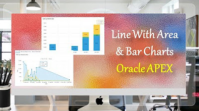
Line With Area & Bar Charts with Region Display Selector Oracle APEX - Part 27
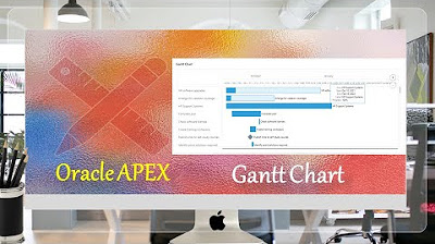
Create Gantt Chart | Oracle APEX - Part 30

TOP 5 Excel Data Visualization Tips (Become a Data Visualization PRO)

Customize Interactive Report With Actions Menu - Part 11
Statistik : Penyajian Data - Part 1
Penyajian Data Statistik Menggunakan SPSS
5.0 / 5 (0 votes)