AdTypo_2_Typographic Composition
Summary
TLDRThis advanced typography lecture explores the principles of typographic composition, emphasizing how typography is not just about letter creation but about the arrangement of text within a given space. The video covers key systems like the grid system, environmental grids, and postmodern typography, highlighting the balance between structure and creative chaos. It delves into the use of design principles such as emphasis, symmetry, and movement to create engaging layouts. The lecture encourages students to experiment with typographic systems and challenge traditional boundaries to create innovative and visually exciting compositions.
Takeaways
- 😀 Typography composition involves the arrangement of letters and large amounts of text within a given space, whether it's print, digital, or tactile.
- 😀 Composition principles like emphasis, isolation, repetition, symmetry, and alignment can be applied to typography, but some are easier to translate than others.
- 😀 The rule of thirds, though typically a photographic concept, can be applied in typography for effective placement of important information in a given space.
- 😀 The grid system, derived from letterpress printing, remains a popular and versatile tool in typography, helping create structured layouts while maintaining flexibility.
- 😀 Modern typography systems, such as those developed by Swiss designers, use the grid to bring order to design, ensuring readability while still allowing for creative expression.
- 😀 Postmodern typography systems challenge traditional order by embracing chaos, randomness, and asymmetry, often prioritizing visual excitement over strict legibility.
- 😀 The environmental grid system draws inspiration from existing structures (like architecture or paintings) and uses these as a framework for organizing typographic information.
- 😀 Form and movement in typography explore how information is dynamically placed across multiple pages to maintain engagement and visual interest.
- 😀 The addition of elements like color, text, and images should be done incrementally in design exercises, ensuring a balance of complexity and creativity.
- 😀 The combination of legibility, readability, and memorability in typography is a delicate balance—pushing the boundaries of traditional design often requires experimentation and a willingness to explore new ideas.
Q & A
What is the main focus of the advanced typography module discussed in the transcript?
-The main focus is on typographic composition, which involves the arrangement of textual information in a given space, whether it's on paper, digital platforms, or physical spaces.
What is the difference between typography and topography in the context of design?
-Typography pertains to the creation of letters, while topography deals with the arrangement of large amounts of text within a defined space. This distinction is important when discussing typographic composition.
How do design principles such as emphasis, isolation, and alignment translate into typographic composition?
-These principles, common in 2D design, can be easily applied to typography, though some, like repetition and perspective, can be more challenging to adapt directly in typographic layouts.
What is the rule of thirds, and how does it relate to typography?
-The rule of thirds is a photographic guide suggesting a space be divided into three columns and three rows, with points of interest placed at the intersections. While not commonly used in typography, it can be helpful for placing important text within a layout.
Why is the grid system considered the most pragmatic in typographic composition?
-The grid system is based on letterpress printing and remains highly versatile, allowing for easy organization and readability. It is still used today due to its ability to create an ordered structure that enhances reading comfort.
What is the key difference between modernist and postmodernist approaches to typographic systems?
-Modernist typography emphasized order and clarity, while postmodernist typography embraced chaos, randomness, and asymmetry, challenging conventional design rules to create more dynamic and expressive compositions.
How does the environmental grid system differ from other typographic systems?
-The environmental grid system draws inspiration from existing structures (like architecture) and extracts key lines from these structures to form a grid. This allows for the creation of unique layouts tied to the context of the space, rather than just abstract design principles.
What does the concept of 'forming movement' in typography mean?
-Forming movement in typography involves creating a sense of progression and flow across multiple pages or layouts, using grids to ensure that elements move and evolve in a visually engaging way, which helps to maintain reader interest.
How can 'form and movement' principles be applied to book design?
-In book design, form and movement principles are applied by ensuring that each spread connects with the previous one, either through a consistent grid structure or through dynamic, changing elements that guide the reader's eye across pages.
What is the role of complexity in typographic composition?
-Complexity in typography should be introduced incrementally. Adding new elements like images or color to a layout should not overwhelm the design, but instead should enhance the overall structure and flow, keeping the reader engaged without creating confusion.
Outlines

This section is available to paid users only. Please upgrade to access this part.
Upgrade NowMindmap

This section is available to paid users only. Please upgrade to access this part.
Upgrade NowKeywords

This section is available to paid users only. Please upgrade to access this part.
Upgrade NowHighlights

This section is available to paid users only. Please upgrade to access this part.
Upgrade NowTranscripts

This section is available to paid users only. Please upgrade to access this part.
Upgrade NowBrowse More Related Video

History of Typography - Domestika
MEMBUAT TIPOGRAFI DAN LOGO | VIDEO PEMBELAJARAN KELAS 7 SEMESTER 2 KURIKULUM MERDEKA
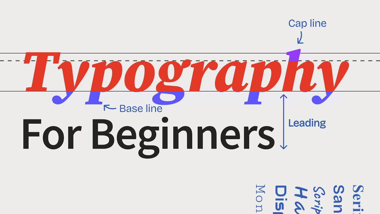
The ULTIMATE Guide To Typography For Beginners

15 rules to adjust typography like a pro (Web Design tutorial)

Typography - now you see it: Shelley Gruendler at TEDxSFU

6 UI Hacks I Wish I Knew As A Beginner
5.0 / 5 (0 votes)