Jenis Peta Tematik Kartografi Tematik
Summary
TLDRThis video discusses thematic maps, which are specialized maps focused on specific themes like population density, economy, or climate in defined geographic areas. It explains various types, including diagram maps, dot distribution maps, choropleth maps, dasymetric maps, and isoline maps. The video also covers how different symbols and colors represent qualitative or quantitative data, such as population numbers, economic activity, and more. The video provides examples and explanations of these map types, aiming to highlight the significance and usage of thematic maps in geography and data analysis.
Takeaways
- 😀 Thematic maps focus on specific geographical themes, such as population, economy, or culture, and help represent data about a particular subject.
- 😀 Unlike general topographic maps, thematic maps are specialized to show detailed aspects of one or more themes connected to a specific geographic area.
- 😀 Diagram maps represent data using various diagrams like bar charts, pie charts, and line graphs to display thematic relationships in specific locations.
- 😀 Dot distribution maps use dots as symbols to represent quantitative data, helping to visualize the spatial distribution of variables such as population or businesses.
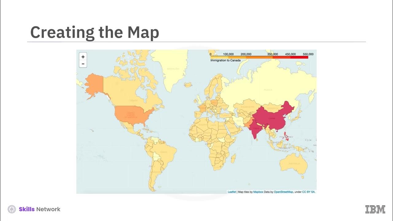
- 😀 Choropleth maps use different colors or shading to represent quantitative data such as population density, where darker colors often signify higher values.
- 😀 Dasymetric maps refine the boundaries of choropleth maps by using survey data areas instead of administrative boundaries, providing more accurate spatial distributions.
- 😀 Solo chromatic maps represent qualitative data using different colors for categories such as vegetation types or soil classifications, without implying numerical values.
- 😀 Isoline maps show continuous data values with lines connecting areas of equal values, such as isobars for air pressure or contour lines for elevation.
- 😀 Flowline maps use lines of varying thickness to represent the movement or frequency of specific phenomena, such as the frequency of flights or trade routes.
- 😀 Peta tematik (thematic maps) can be used to depict a wide variety of data, from social and political phenomena to physical characteristics like soil or vegetation distribution.
Q & A
What is a thematic map?
-A thematic map is a type of map that focuses on specific information related to a particular theme or subject, such as physical, social, political, cultural, economic, or agricultural aspects, within a geographical area.
What distinguishes a thematic map from a topographic map?
-Thematic maps focus on a specific theme or subject within a geographical area, whereas topographic maps show all natural phenomena together in a non-specific manner.
What is a diagram map, and how is it used?
-A diagram map presents data in the form of proportional diagrams, such as bar graphs, pie charts, or line graphs, to show the relationship between two or more thematic subjects at specific locations on the map.
What is a dot distribution map?
-A dot distribution map uses dot symbols to represent specific quantities of data, with each dot symbol representing a certain value or count of a variable, such as population or businesses in a given area.
How is a choropleth map different from other thematic maps?
-A choropleth map uses varying shades or colors to represent different values or quantities of data within administrative boundaries, such as population density or income levels across a region.
What is the purpose of a dasymetric map?
-A dasymetric map differs from a choropleth map in that it is based on survey areas rather than administrative boundaries, showing data concentrations more accurately according to the actual distribution of phenomena.
What does an isoline map represent?
-An isoline map uses lines to connect points with equal values of a particular variable, such as pressure, temperature, or altitude. Examples include isobars (pressure) or isotherms (temperature).
What is the significance of an isobar in an isoline map?
-An isobar is a line that connects points of equal atmospheric pressure on a map, commonly used in weather maps to show pressure patterns and aid in weather forecasting.
What does a flowline map display?
-A flowline map displays the movement or frequency of a particular phenomenon, such as transportation routes or migration patterns, represented by lines of varying thickness to indicate frequency.
What kind of information can be derived from a flowline map?
-A flowline map provides insights into the intensity and direction of movement, such as travel frequency between locations, represented by lines whose thickness varies with the frequency or magnitude of the activity.
Outlines

This section is available to paid users only. Please upgrade to access this part.
Upgrade NowMindmap

This section is available to paid users only. Please upgrade to access this part.
Upgrade NowKeywords

This section is available to paid users only. Please upgrade to access this part.
Upgrade NowHighlights

This section is available to paid users only. Please upgrade to access this part.
Upgrade NowTranscripts

This section is available to paid users only. Please upgrade to access this part.
Upgrade NowBrowse More Related Video
V2 Choropleth Maps
BAB 2 PETA, PENGINDRAAN JAUH, DAN SISTEM INFORMASI GEOGRAFIS | GEOGRAFI X SMA/MA | KURIKULUM MERDEKA

Geografi Kelas X (6) Pengertian, Jenis dan Fungsi Peta

Pengertian Peta dan Jenis Peta #Geografi #Kelas10
Pengetahuan Dasar Peta #part 1

Belajar Bersama, Bab 2 Dasar-dasar Pemetaan, Penginderaan Jauh dan Sistem Informasi Geografi Kelas X
5.0 / 5 (0 votes)