Animated PowerPoint Slide Tutorial 2023
Summary
TLDRThis tutorial teaches how to create dynamic chapter slides in PowerPoint. It covers techniques for designing professional slides using shapes, gradients, and animations. Key steps include creating layered rectangle shapes with drop shadows, adjusting transparency for subtle effects, and utilizing the Morph transition for smooth animations. The video also guides on adding text, numbers, and icons, and organizing content to create an engaging, polished presentation. With clear instructions and visual demonstrations, the tutorial ensures a visually appealing and impactful PowerPoint design.
Takeaways
- 😀 Start with a blank slide and add a large purple rectangle, leaving some space at the edge.
- 😀 Insert a smaller rectangle on top of the large rectangle, remove the outline, and match the color.
- 😀 Duplicate the small rectangle four times and distribute them evenly along the top of the large rectangle.
- 😀 Format the background to be slightly darker for better contrast.
- 😀 Duplicate the slide four times, adjusting the shapes slightly on each slide to create a layered effect.
- 😀 Merge the shapes on each slide, and apply a gradient that lightens as it moves upward.
- 😀 Add a drop shadow effect to the shapes with a 60% transparency, 10% blur, and 5-point distance.
- 😀 Position the second slide’s shape over the first to preview the drop shadow and ensure alignment.
- 😀 Add content like titles, numbers, and text to the right side of the slides for clarity and structure.
- 😀 Use the 'Align Center' tool to ensure all content is properly centered on each slide.
- 😀 Apply the Morph transition between slides to create smooth animations and effects as elements shift.
Q & A
What is the first step in creating chapter slides in PowerPoint?
-The first step is to start with a blank slide and add a rectangle. The rectangle should not extend all the way to the edge of the slide, leaving a margin on one side. The rectangle should then be colored purple.
How should the small rectangle on top of the large one be formatted?
-The small rectangle should be positioned on the right side of the large rectangle. It should have the same purple color and no outline.
What is the purpose of duplicating and distributing the small rectangles?
-Duplicating and distributing the small rectangles evenly helps to create a balanced and organized layout for the chapter slide design.
How do you modify the slide background color?
-The background color should be adjusted to a slightly darker shade to create contrast and make the purple shapes stand out more.
What is the purpose of merging the shapes on each slide?
-Merging the shapes allows for a unified look, ensuring that all the rectangles and other elements are grouped together, creating a seamless design.
What kind of effect is applied to the shapes after merging them?
-A gradient effect is applied to the shapes, making them lighter as they go towards the top, which adds depth and a polished look.
How do you enhance the visibility of the shapes with shadows?
-A drop shadow is added to the shapes, with settings including a 60% transparency, 10 blur, and 5 points of distance. This effect helps give the design depth and makes the shapes stand out.
How should text and icons be arranged on the slides?
-Text and icons should be placed on the right side of the slide, leaving the left side clear. This positioning will allow the tabs to be pulled out and overlayed later in the animation process.
What is the purpose of the Morph transition in the slides?
-The Morph transition is used to create smooth and visually appealing animations between slides. It allows elements on the slide to move and transform seamlessly from one slide to the next.
How do you add numbers to the slides, and why is their color important?
-Numbers are added to each slide in the same color as the layer beneath it. As the layers progress (from 4 to 1), the number color should become lighter to create a natural, layered look.
Outlines

This section is available to paid users only. Please upgrade to access this part.
Upgrade NowMindmap

This section is available to paid users only. Please upgrade to access this part.
Upgrade NowKeywords

This section is available to paid users only. Please upgrade to access this part.
Upgrade NowHighlights

This section is available to paid users only. Please upgrade to access this part.
Upgrade NowTranscripts

This section is available to paid users only. Please upgrade to access this part.
Upgrade NowBrowse More Related Video

How to make a good PowerPoint slide - Easy Tutorial

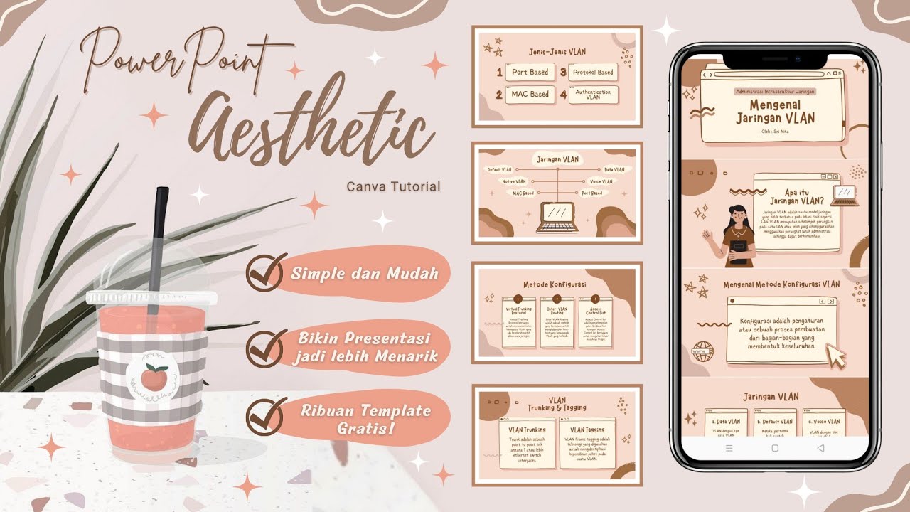
Cara Membuat PowerPoint Aesthetic di Hp dengan Canva

Tutorial Membuat PPT Bergerak Animasi Morph | PPT Morph Seminar Proposal atau sidang skripsi

TUTORIAL SPACE SLIDE ZOOM POWERPOINT KEREN | ANIMASI POWERPOINT

Tutorial Membuat Spin Game di Powerpoint Mudah | FREE Template | Putri Octaviani

Cara Menggunakan Morph di Powerpoint
5.0 / 5 (0 votes)