Academic Skills - Presenting Effectively - Part 3
Summary
TLDRThis presentation offers practical guidance for creating impactful PowerPoint slides for academic and professional settings. Key advice includes using minimal text, emphasizing clarity with large, readable fonts, and avoiding over-complicated visuals. The speaker recommends limiting slide content to essential points, using simple animations, and ensuring high contrast for text and background. He also emphasizes the importance of focusing on key ideas, avoiding distractions like clipart and excessive animations, and tailoring content to fit the allotted presentation time. Overall, the goal is to create clear, visually effective presentations that support and engage the audience.
Takeaways
- 😀 Keep slides simple: Use minimal text, no full sentences or paragraphs. The slides should support the spoken presentation, not replace it.
- 😀 Use between 5 and 8 bullet points per slide for clarity and focus. Avoid overwhelming your audience with too much information at once.
- 😀 Stick to the 'one slide per minute' rule as a general guideline. For a 20-minute presentation, aim for 20 slides or fewer.
- 😀 Use clear and large fonts: 18-32 point text for body text, and 36-40 point text for headings. Sans serif fonts like Arial or Calibri are preferred for readability.
- 😀 Contrast text with the background to ensure visibility. Black text on a white background is a simple but effective choice.
- 😀 Avoid using PowerPoint templates. Start with a blank slide to maintain full control over your design.
- 😀 Keep animations simple: Use simple transitions like wipe animations instead of distracting, complex effects.
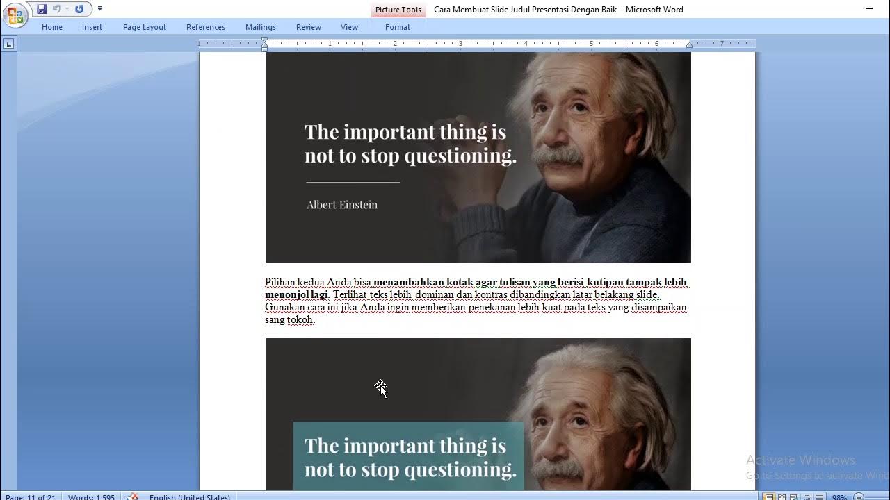
- 😀 When using images, consider adding drop shadows to make them stand out. Use shaded boxes to emphasize key information without cluttering the slide.
- 😀 For complex visuals like datasets, simplify by breaking them down into smaller, manageable parts across multiple slides. This ensures your audience can follow along easily.
- 😀 Avoid using clipart or stick figures in professional presentations. Instead, opt for high-quality, relevant images and always credit their source.
- 😀 Focus on engaging with the audience: Maintain eye contact and avoid reading directly from the slides. Your focus should be on conveying the message clearly and confidently.
Q & A
What is the recommended approach for creating an impactful PowerPoint slide?
-The recommended approach is to keep the slide simple, with minimal text and a high-impact visual that supports the message. For example, an image related to the topic (such as premature birth in the example) enhances the slide's impact.
How much text should be included on each slide?
-Each slide should have minimal text, ideally between 5 and 8 key points. Avoid using full sentences or paragraphs, as the slide is meant to support the speaker, not be the main source of information.
What is the rule of thumb for the number of slides in a presentation?
-The rule of thumb is to have no more slides than the number of minutes in your presentation. For example, in a 20-minute presentation, aim for 20 slides.
What is the benefit of using a slide advancer during presentations?
-A slide advancer helps presenters stay engaged with the audience by allowing them to move through slides without being tethered to the keyboard, offering more freedom to focus on communication.
What font size is recommended for text in PowerPoint presentations?
-For the body text, use font sizes between 18 and 32 points, and for headings, use 36 to 40 points. This ensures readability from a distance.
Why should sans-serif fonts be preferred in presentations?
-Sans-serif fonts, such as Arial or Calibri, are easier to read on screens compared to serif fonts like Times New Roman, which have small decorative elements.
What should presenters consider when using background and text contrast in slides?
-Ensure there is sufficient contrast between the text and the background. Black text on a white background is highly recommended for simplicity and readability.
What types of animations are appropriate for PowerPoint slides?
-Simple animations, like the wipe animation, are effective. Avoid complex, distracting animations (such as twirling or diamond effects) as they can reduce focus and professionalism.
How can complex images or data be presented effectively in PowerPoint?
-Instead of displaying complex data all at once, break it down into smaller, manageable sections. Use animations to reveal parts of the image or data sequentially to help the audience absorb the information more easily.
What are some things presenters should avoid doing in PowerPoint presentations?
-Avoid using clipart, stick figures, fancy fonts (like Comic Sans), excessive text, and thank you slides. These elements can detract from the professionalism and clarity of the presentation.
Outlines

This section is available to paid users only. Please upgrade to access this part.
Upgrade NowMindmap

This section is available to paid users only. Please upgrade to access this part.
Upgrade NowKeywords

This section is available to paid users only. Please upgrade to access this part.
Upgrade NowHighlights

This section is available to paid users only. Please upgrade to access this part.
Upgrade NowTranscripts

This section is available to paid users only. Please upgrade to access this part.
Upgrade NowBrowse More Related Video
5.0 / 5 (0 votes)


