How Bright Should Things Be?
Summary
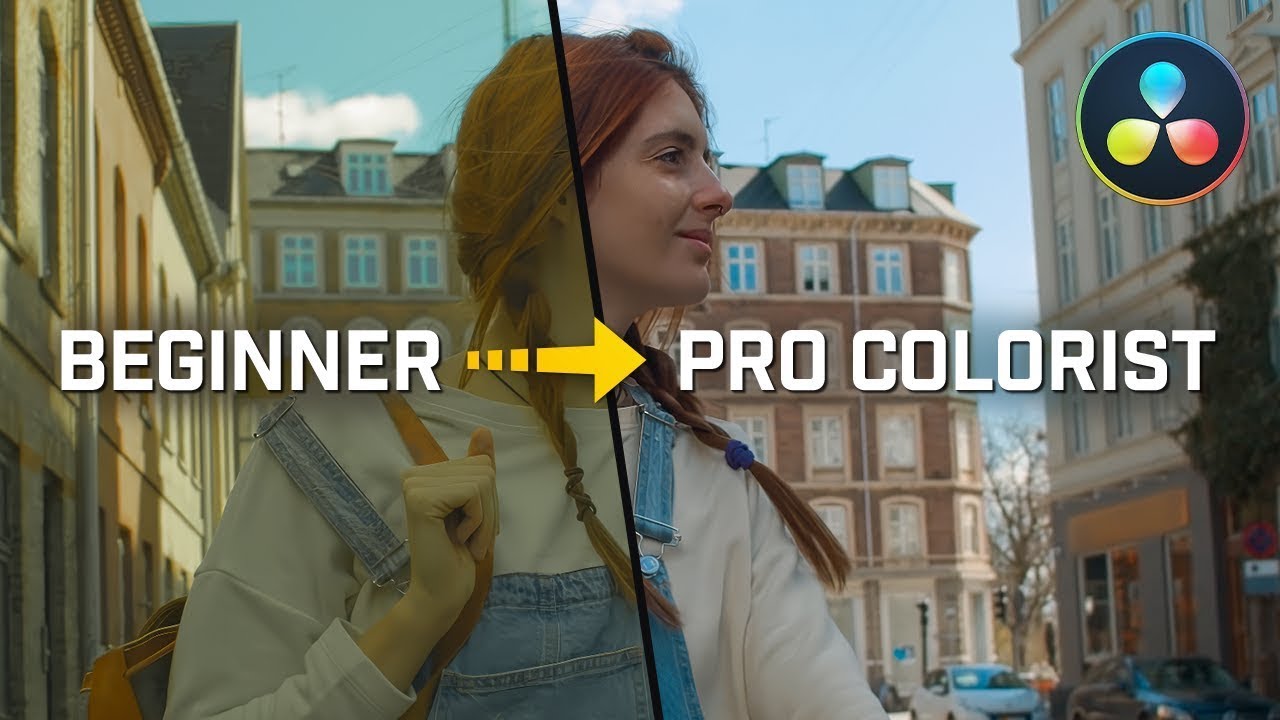
TLDRThis video offers in-depth insights into the nuances of color grading, focusing on balancing luminance, brightness, and contrast. The speaker emphasizes the importance of creative intent, allowing for 'lost' details in highlights or shadows when it serves the narrative. By using a scene-referred and color-managed workflow, adjustments can feel more natural and cinematic. Key techniques include starting with broad adjustments, refining midtones, and focusing on the emotional tone of the scene. Ultimately, it's about using color grading as a storytelling tool, not just following technical guidelines.
Takeaways
- 😀 Luminance refers to the actual light emitted by a source, while brightness is a subjective perception of how light or dark an image appears.
- 😀 Don't be afraid to lose information in the highlights or shadows—this can be a powerful tool for creative expression.
- 😀 The waveform can inform your grading decisions, but don’t grade solely based on technical numbers—focus on the story and emotional impact of your shot.
- 😀 A scene-referred, color-managed workflow ensures your adjustments feel more natural and closer to how exposure works in-camera.
- 😀 Start with broad, global adjustments (e.g., midtones and overall exposure) before refining specific areas like shadows and highlights.
- 😀 The three-step rule: Make broad adjustments first, then refine—this approach reduces unnecessary tweaking and gives you a solid foundation for grading.
- 😀 It's important to match shots for continuity in your scene—adjust color and contrast to ensure they feel cohesive as part of the narrative.
- 😀 Introduce contrast carefully to avoid an overly stark image, using midtones to balance and smooth out strong contrasts.
- 😀 Color grading is a tool for storytelling. Prioritize the emotional tone and mood of a scene over rigid adherence to technical standards.
- 😀 When grading, it’s essential to ensure that adjustments are aligned with the story you want to tell, using techniques that support the narrative flow.
- 😀 Don't be afraid to break continuity when it enhances the visual storytelling, as long as it serves the emotional impact of the sequence.
Q & A
What is the difference between luminance and brightness in color grading?
-Luminance refers to the actual light emitted by a light source and is a measurable, objective quantity. Brightness, on the other hand, is subjective and depends on the viewer's perception, influenced by the context of the image or scene.
Why should you not worry too much about losing information in highlights or shadows during grading?
-Losing information in highlights or shadows is not inherently problematic. In fact, creative color grading often involves intentionally losing detail to enhance mood or focus, as long as it serves the visual narrative.
How can adjusting midtones impact the contrast of an image?
-Adjusting midtones can reduce or increase contrast. Lifting midtones makes an image appear brighter and softer, whereas lowering them can enhance contrast by deepening shadows without affecting the highlights as drastically.
What is a 'scene-referred' color grading workflow, and why is it important?
-A scene-referred workflow ensures that your color adjustments are based on the light and color information present in the scene, before any color space transformations. This helps maintain natural-looking adjustments that align with the original scene's intent.
Why is the three-step rule useful in color grading, and what are the steps?
-The three-step rule provides a simplified approach to color grading, focusing on broad adjustments before refining details. The steps are: 1) Global adjustments (e.g., exposure), 2) Contrast adjustments (e.g., shadows), and 3) Refining the midtones or other details.
What does it mean to grade with 'the path of least resistance'?
-Grading with the path of least resistance means starting with broad adjustments to get a feel for the image and making gradual, intuitive changes, rather than overcomplicating the process with excessive, detailed tweaks early on.
How does the subjective nature of brightness affect your color grading decisions?
-Since brightness is subjective and context-dependent, your grading decisions should prioritize visual storytelling over technical accuracy. What feels bright or dark can vary based on the scene’s mood or the viewer's interpretation.
Why should you avoid focusing too much on numerical values like the waveform when grading?
-Focusing too much on numerical values like the waveform can limit creativity. While waveforms are useful tools, color grading should be driven by the emotional and narrative goals of the project, rather than adhering strictly to technical parameters.
What role does contrast play in shaping the emotional impact of a shot?
-Contrast can significantly affect the emotional tone of a shot. Increasing contrast can create a more dramatic, intense feel, while reducing it can evoke a softer, more serene mood. The appropriate contrast level should align with the intended emotional narrative.
What are the benefits of grading for continuity between shots in a sequence?
-Grading for continuity ensures that the visual flow between shots feels cohesive and natural. It helps maintain consistent lighting, color balance, and mood across a sequence, which is essential for keeping the audience immersed in the story.
Outlines

This section is available to paid users only. Please upgrade to access this part.
Upgrade NowMindmap

This section is available to paid users only. Please upgrade to access this part.
Upgrade NowKeywords

This section is available to paid users only. Please upgrade to access this part.
Upgrade NowHighlights

This section is available to paid users only. Please upgrade to access this part.
Upgrade NowTranscripts

This section is available to paid users only. Please upgrade to access this part.
Upgrade Now5.0 / 5 (0 votes)


