Penyajian Data Dalam Bentuk Dot Plot
Summary
TLDRThis video lesson introduces the concept of dot plots for presenting data. The instructor explains how to create a dot plot by sorting data, building a frequency distribution table, and representing the data with dots on a graph. The lesson covers practical examples, such as vaccination data, shoe sales, and candy box sales over several days, demonstrating how dot plots provide a clear visual representation of data with low frequencies. The video concludes with an invitation for viewers to ask questions and stay engaged with the channel for more educational content.
Takeaways
- 😀 Dot plots are a simple way to visualize data using dots, each representing a data point.
- 😀 Dot plots are most useful for small datasets, where the frequency of data points is low.
- 😀 To create a dot plot, first organize the data and create a frequency distribution table.
- 😀 The dot plot is created by plotting dots along a number line, with each dot representing a data point's frequency.
- 😀 Dot plots can be arranged either vertically or horizontally to display data.
- 😀 Dot plots are difficult to read with large datasets due to the density of dots, making them best for small datasets.
- 😀 An example of a dot plot involves displaying the number of babies vaccinated across different regions.
- 😀 Another example shows dot plots of shoe sales by size, helping to visualize frequency for each shoe size sold.
- 😀 In dot plots, each point on the line corresponds to a specific value, with the number of dots indicating the frequency for that value.
- 😀 Dot plots help students understand the distribution and frequency of data, making it easier to analyze trends and outliers.
- 😀 Viewers are encouraged to ask questions in the comments for further clarification and to engage with the content.
Q & A
What is the main topic of this lesson?
-The main topic of the lesson is data presentation using diagrams, specifically focusing on dot plots.
What is a dot plot?
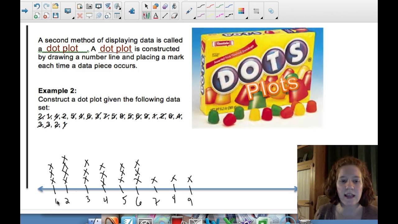
-A dot plot is a simple data presentation method that uses dots to represent individual data points, grouped based on their values. It helps in visualizing the distribution of data.
What are the two main axes in a dot plot?
-In a dot plot, the first axis represents the range of values or categories, and the second axis shows the frequency or count of data points in each category.
When is a dot plot most useful?
-A dot plot is most useful for small datasets with low frequency, as it helps visualize the distribution clearly. It becomes less effective when the data has high frequency, as the dots may overlap and become difficult to read.
What is the first step in creating a dot plot?
-The first step in creating a dot plot is to sort the data and create a frequency distribution table.
What is the next step after creating the frequency distribution table?
-After creating the frequency distribution table, the next step is to plot the dots on the diagram, either vertically or horizontally, to represent the data points.
Why can’t dot plots be used effectively for high-frequency data?
-Dot plots become ineffective for high-frequency data because the dots will pile up, making it hard to interpret and read the distribution of the data.
How do you determine the number of dots to place in a dot plot?
-The number of dots to place in a dot plot corresponds to the frequency of each data point or category. For instance, if a data point has a frequency of 5, you would place five dots in the corresponding category.
What was the example given to illustrate the dot plot creation?
-The script provides the example of vaccination data for newborns in different regions, where the number of vaccinated babies is represented using a dot plot.
How is a dot plot used in analyzing the sales of shoes in a store?
-The sales of shoes in a store are represented in a dot plot by categorizing the shoes based on their sizes and placing dots to indicate the frequency of each size sold.
Outlines

Этот раздел доступен только подписчикам платных тарифов. Пожалуйста, перейдите на платный тариф для доступа.
Перейти на платный тарифMindmap

Этот раздел доступен только подписчикам платных тарифов. Пожалуйста, перейдите на платный тариф для доступа.
Перейти на платный тарифKeywords

Этот раздел доступен только подписчикам платных тарифов. Пожалуйста, перейдите на платный тариф для доступа.
Перейти на платный тарифHighlights

Этот раздел доступен только подписчикам платных тарифов. Пожалуйста, перейдите на платный тариф для доступа.
Перейти на платный тарифTranscripts

Этот раздел доступен только подписчикам платных тарифов. Пожалуйста, перейдите на платный тариф для доступа.
Перейти на платный тарифПосмотреть больше похожих видео
6 - 3 Part 1 Frequency Tables, Dot Plots, HIstograms
Visualisasi Data - Informatika Kelas X

Statistika 06 | Visualisasi Data dalam Statistika | Data Visualization | Belajar Statistika
Normal Data Analysis with Software Part 1

PENYAJIAN DATA || TABEL DIAGRAM GRAFIK (PART 1)
Bar Charts, Pie Charts, Histograms, Stemplots, Timeplots (1.2)
5.0 / 5 (0 votes)
