ACC 406 - Mixed Costs Part 3 (Scatterplot Method)
Summary
TLDRThe video explains the scatter plot method for analyzing data by plotting the number of cars against total costs on a graph. It emphasizes drawing a line of best fit through the data points while considering outliers, such as an anomaly where costs were lower than expected. Although subjective in nature, this method offers quick visual insights and helps identify outliers, aiding in more accurate estimations. The presenter also outlines the process for estimating fixed costs and slopes to create an equation, contrasting this approach with more objective methods like least squares regression analysis.
Takeaways
- 📊 The scatter plot method involves plotting data points on a graph, with the number of cars on the x-axis and the total cost on the y-axis.
- 🟡 The general shape of the scatter plot is determined by the data points, which may not be perfectly to scale.
- ✏️ A line should be drawn through the majority of the data points to represent the relationship between output and cost.
- 🔍 Outliers are data points that deviate significantly from the trend, such as a low cost for high output or vice versa.
- 🤔 Outliers may arise due to unique circumstances, like increased productivity in a specific month or factory issues.
- 🚫 Ignoring outliers can improve the accuracy of the resulting equation in scatter plot analysis.
- 📉 The scatter plot method is subjective, relying on estimation rather than precise calculations like in the high-low method.
- ⚡ Despite its subjectivity, the scatter plot method is quick and visually identifies outliers.
- 📏 To estimate the equation, first identify the fixed costs (B value) and then determine the slope (M value) using selected data points.
- 🧮 The estimation of the slope involves selecting two points on the line to calculate the rate of change between them.
Q & A
What is the primary purpose of the scatter plot method?
-The scatter plot method is used to visually analyze the relationship between two variables, specifically the number of cars (x-axis) and the total cost (y-axis) in millions.
How is the line of best fit determined in the scatter plot method?
-The line of best fit is drawn through the majority of data points on the graph, estimating a line that best represents the overall trend of the data.
What are outliers, and why are they significant in this analysis?
-Outliers are data points that deviate significantly from other observations. They are significant because they can indicate unusual circumstances, such as extraordinary productivity or errors, which may skew the results.
Can outliers be ignored when creating the line of best fit? If so, under what conditions?
-Yes, outliers can be ignored if the reason for their occurrence is understood and determined to not be a factor that will persist in the future.
What are the advantages of using the scatter plot method?
-Advantages include its speed and ease of use, as well as the ability to visually identify outliers, which aids in data interpretation.
What is a limitation of the scatter plot method compared to other methods like least squares regression?
-A key limitation of the scatter plot method is its subjectivity, as it relies on personal judgment to draw the line of best fit, whereas least squares regression provides a more objective calculation.
How can one estimate the fixed costs in the scatter plot method?
-Fixed costs can be estimated by identifying a point where the number of cars is zero and determining the corresponding cost value on the y-axis.
What is the role of the slope (M value) in the scatter plot method?
-The slope (M value) represents the change in total cost relative to the change in the number of cars produced, providing insights into cost behavior as output increases.
What could be a reason for a low cost with a higher output, as mentioned in the example?
-A potential reason could be an exceptional increase in productivity, possibly due to motivated workers or improvements in efficiency during a specific period.
What are the next steps after identifying outliers in the scatter plot analysis?
-After identifying outliers, the next steps involve analyzing the reasons behind their occurrence and determining if they should be included or excluded in further calculations to enhance accuracy.
Outlines

Этот раздел доступен только подписчикам платных тарифов. Пожалуйста, перейдите на платный тариф для доступа.
Перейти на платный тарифMindmap

Этот раздел доступен только подписчикам платных тарифов. Пожалуйста, перейдите на платный тариф для доступа.
Перейти на платный тарифKeywords

Этот раздел доступен только подписчикам платных тарифов. Пожалуйста, перейдите на платный тариф для доступа.
Перейти на платный тарифHighlights

Этот раздел доступен только подписчикам платных тарифов. Пожалуйста, перейдите на платный тариф для доступа.
Перейти на платный тарифTranscripts

Этот раздел доступен только подписчикам платных тарифов. Пожалуйста, перейдите на платный тариф для доступа.
Перейти на платный тарифПосмотреть больше похожих видео

Exemplo de análise com gráfico de dispersão em serviços

Menggambar Diagram Pencar Secara Manual - Matematika Wajib SMA Kelas XI Kurikulum Merdeka

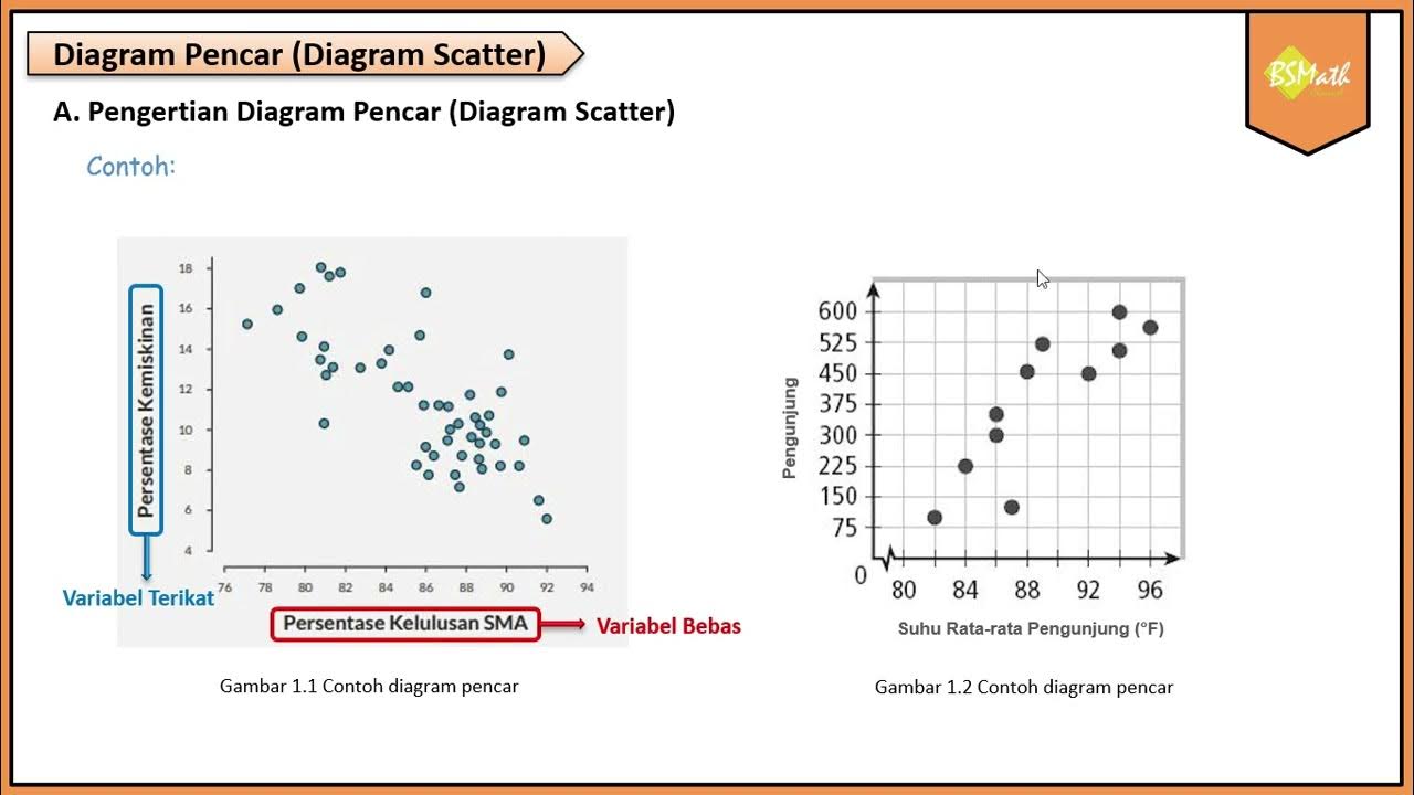
Pengertian Diagram Pencar - Matematika Wajib SMA Kelas XI Kurikulum Merdeka

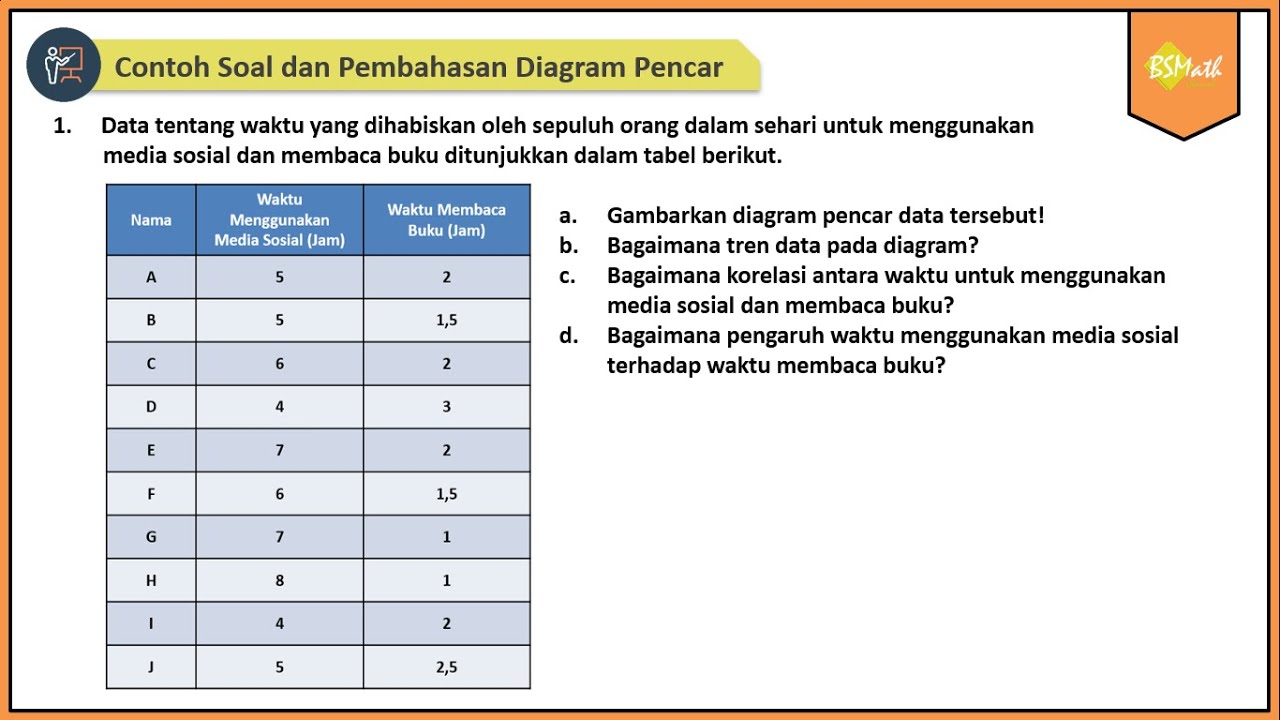
Contoh Soal dan Pembahasan Diagram Pencar | Matematika SMA Kelas XI Kurikulum Merdeka

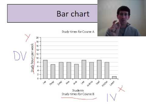
Research methods graphs

Belajar Statistika - [Scatter Plot] Diagram Pencar (bagian 1)
5.0 / 5 (0 votes)
