Menggambar Diagram Pencar Secara Manual - Matematika Wajib SMA Kelas XI Kurikulum Merdeka
Summary
TLDRIn this tutorial, the presenter explains how to manually create a scatter plot (diagram pencar) from bivariate data. Key steps include determining the independent and dependent variables, setting up Cartesian axes, and scaling the axes appropriately. The process continues with plotting data points and finalizing the scatter plot. Using the example of YouTubers' daily time spent and subscriber counts, the video emphasizes understanding variable relationships and ensuring consistent scaling. The video concludes with tips on interpreting scatter plots and encourages practice to master the technique.
Takeaways
- 😀 Understanding the scatter plot: A scatter plot (diagram Pencar) is used to visualize the relationship between two variables in a bivariate dataset.
- 😀 The importance of variable identification: The independent variable (X-axis) is used to predict the dependent variable (Y-axis), and it’s crucial to correctly identify them.
- 😀 Cartesian coordinate system: A scatter plot is drawn using a Cartesian coordinate system with an X-axis and a Y-axis, where data points are plotted based on the values of the variables.
- 😀 Equal scaling is necessary: Both the X-axis and Y-axis should be scaled equally to ensure accurate representation of the data and maintain consistency between the axes.
- 😀 How to set appropriate scales: The scales for the axes are determined by the smallest and largest values in the dataset, ensuring all data points fit within the graph.
- 😀 Correct plotting technique: Data points are plotted where the values of the independent variable (X) and dependent variable (Y) intersect on the graph.
- 😀 Analyzing example data: The provided YouTube data (average time spent per day and number of subscribers) is used as a practical example to illustrate how to apply the steps to create a scatter plot.
- 😀 Avoiding mistakes with data intervals: Ensure the intervals between data points on both axes are consistent. Irregular intervals can result in an inaccurate plot.
- 😀 Use of gridlines in plotting: Using graph paper or gridlines simplifies the process of plotting by keeping the distances between the points consistent.
- 😀 Practice is key: To master scatter plot creation, practice is essential, particularly in understanding how to identify the correct independent and dependent variables.
Q & A
What is a scatter plot (diagram pencar)?
-A scatter plot is a graphical representation that shows the relationship between two variables, typically displayed on a Cartesian plane with points plotted based on pairs of data values.
What is the first step in drawing a scatter plot manually?
-The first step is to identify the independent variable (X-axis) and the dependent variable (Y-axis). The independent variable is the one that influences the dependent variable.
How do you determine the independent and dependent variables for a scatter plot?
-The independent variable is the one that can be used to predict or explain the dependent variable. In the example of YouTubers, the average time spent per day (X-axis) is the independent variable, while the number of subscribers (Y-axis) is the dependent variable.
Why is it important to correctly identify the independent and dependent variables?
-Correctly identifying these variables is crucial because swapping them will lead to incorrect conclusions and errors when drawing the scatter plot and interpreting the data.
What is the purpose of the Cartesian plane in drawing a scatter plot?
-The Cartesian plane serves as the grid on which you plot the data points. It consists of two axes: the horizontal X-axis for the independent variable and the vertical Y-axis for the dependent variable.
What does it mean to set a consistent scale for the axes in a scatter plot?
-Setting a consistent scale means ensuring that the distances between the numbers on both axes are equal, so that the graph is proportional and the plotted data points are accurate.
How do you determine the scale for the axes in a scatter plot?
-The scale for each axis is determined by the range of the data. For example, if the smallest value on the X-axis is 3.3 and the largest is 8.3, the scale should be set to cover this range, with evenly spaced intervals.
What role does graph paper play when drawing a scatter plot manually?
-Graph paper helps maintain consistent spacing and scale between the points on the scatter plot. The grid lines provide an easy reference for plotting data accurately.
Why should the scales on both the X and Y axes be the same?
-The scales on both axes should be the same to maintain a consistent relationship between the variables and ensure that the plotted points are accurately represented in relation to one another.
What is the final step in creating a scatter plot manually?
-The final step is to plot the data points on the Cartesian plane, corresponding to the values from the dataset. Each pair of data points (X, Y) is plotted as a dot on the graph.
How can you interpret the scatter plot once it's completed?
-Once the scatter plot is completed, you can observe the pattern of points to understand the relationship between the two variables. For instance, a trend line or clustering of points can indicate a correlation or pattern.
Why is it not advisable to use the exact values from the table as the scale for a scatter plot?
-Using exact values from the table may result in inconsistent intervals between the data points. It's better to adjust the scale to ensure uniform spacing, which makes the scatter plot more readable and accurate.
Outlines

This section is available to paid users only. Please upgrade to access this part.
Upgrade NowMindmap

This section is available to paid users only. Please upgrade to access this part.
Upgrade NowKeywords

This section is available to paid users only. Please upgrade to access this part.
Upgrade NowHighlights

This section is available to paid users only. Please upgrade to access this part.
Upgrade NowTranscripts

This section is available to paid users only. Please upgrade to access this part.
Upgrade NowBrowse More Related Video

Menggambar Diagram Pencar Kelas XI Fase F Kurikulum Merdeka
Pengertian Diagram Pencar - Matematika Wajib SMA Kelas XI Kurikulum Merdeka

STATISTIKA Part 5 - DIAGRAM PENCAR
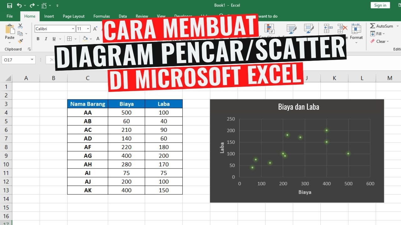
Cara Membuat Diagram Pencar atau Scatter di Excel
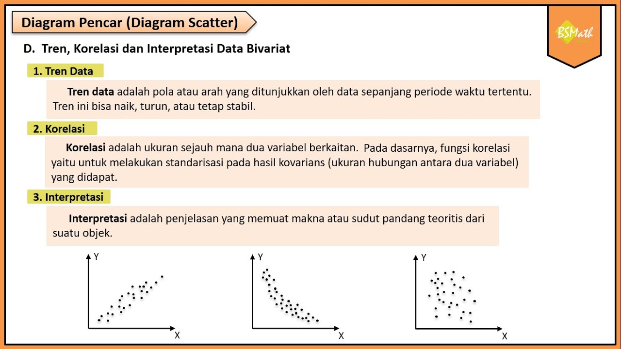
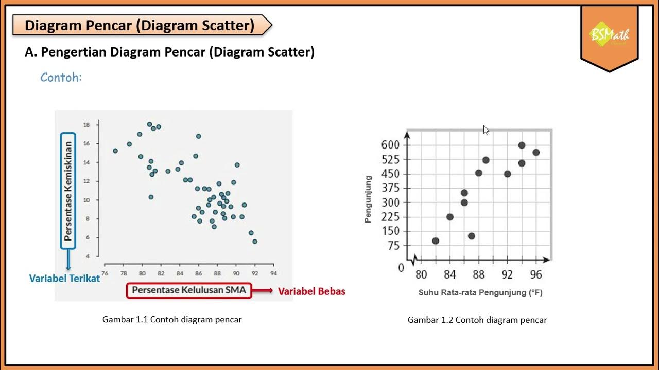
Tren Data, Korelasi dan Interpretasi Data Bivariat | Matematika Wajib SMA Kelas XI Kurikulum Merdeka
Metode Kuadrat Terkecil Hal 97-101 Bab 3 STATISTIK Kelas 11 SMA Kurikulum Merdeka
5.0 / 5 (0 votes)