Belajar Statistika - [Scatter Plot] Diagram Pencar (bagian 1)
Summary
TLDRIn this educational video, viewers are introduced to scatter diagrams, a key concept in statistics for grade 10 mathematics. The video provides a step-by-step guide to constructing scatter diagrams from paired data, explaining the process of determining the X and Y variables, finding the highest and lowest values, and plotting the points on a Cartesian plane. An example involving the relationship between height and shoe size is used to demonstrate the method. The video concludes with a preview of the next part, focusing on interpreting and understanding the patterns in scatter diagrams.
Takeaways
- 😀 A scatter diagram helps visualize the relationship between two numerical variables.
- 😀 The first part of the lesson focuses on creating a scatter diagram from a pair of data.
- 😀 A scatter diagram consists of points plotted on a Cartesian plane.
- 😀 The x-variable is assumed to influence the y-variable when constructing a scatter diagram.
- 😀 The first step in creating a scatter diagram is to determine which variable will be on the x-axis and y-axis.
- 😀 Find the highest and lowest values for each variable before plotting the points.
- 😀 The Cartesian plane should be drawn with an appropriate scale based on the highest and lowest values of the data.
- 😀 Points on the scatter diagram are plotted based on the corresponding values of the two variables.
- 😀 The example used in the video involves plotting data for height (x-variable) and shoe size (y-variable).
- 😀 To reinforce learning, viewers are encouraged to try constructing their own scatter diagrams with provided data.
- 😀 The second part of the lesson will cover interpreting and analyzing the scatter diagram.
Q & A
What is the main focus of the video?
-The main focus of the video is to teach viewers how to create and interpret scatter plots in statistics, specifically for investigating the relationship between two numerical variables.
What is a scatter plot?
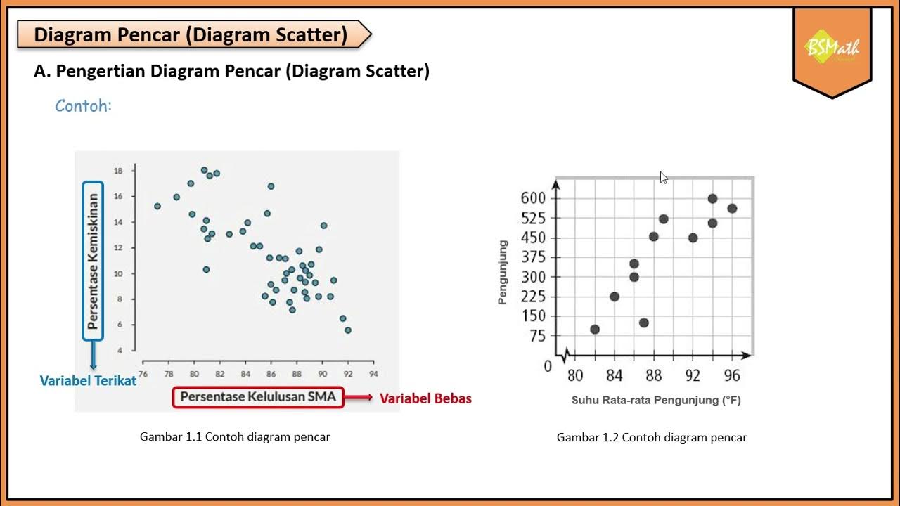
-A scatter plot is a diagram that displays points in a Cartesian plane to show the relationship between two numerical variables. Each point represents a pair of data values.
What are the two variables in the example of the scatter plot?
-In the example, the two variables are height (as the x-variable) and shoe size (as the y-variable).
What is the first step in creating a scatter plot?
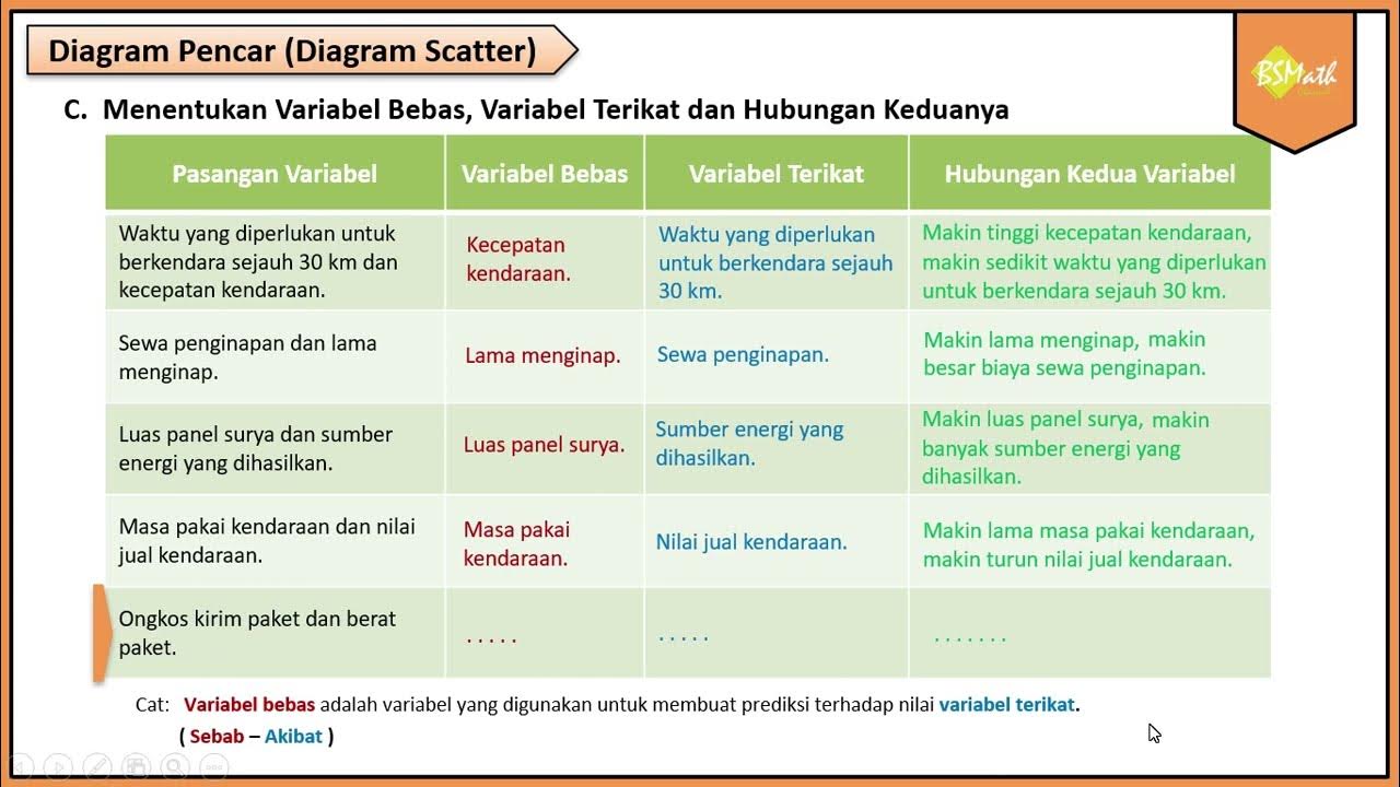
-The first step is to identify the x and y variables. The x-variable is typically the one suspected to influence the y-variable.
Why is the x-variable chosen to be the independent variable?
-The x-variable is chosen as the independent variable because it is presumed to have an effect or influence on the y-variable, which is considered the dependent variable.
What do you need to do after identifying the variables?
-After identifying the variables, you need to find the highest and lowest values for both the x and y variables.
What is the purpose of creating a Cartesian diagram with scaling?
-The purpose of creating a Cartesian diagram with appropriate scaling is to properly represent the range of data values and ensure that the data points fit within the graph without overcrowding.
What is the final step in creating a scatter plot?
-The final step is to plot the points on the diagram, placing each point according to the pair of values for the x and y variables.
How does the video suggest enhancing understanding of the scatter plot concept?
-The video encourages viewers to practice by creating their own scatter plots with provided datasets to reinforce the concept.
What will be covered in the second video of the series?
-The second video will focus on interpreting and understanding the relationships shown in the scatter plot, analyzing how the variables relate to one another.
Outlines

This section is available to paid users only. Please upgrade to access this part.
Upgrade NowMindmap

This section is available to paid users only. Please upgrade to access this part.
Upgrade NowKeywords

This section is available to paid users only. Please upgrade to access this part.
Upgrade NowHighlights

This section is available to paid users only. Please upgrade to access this part.
Upgrade NowTranscripts

This section is available to paid users only. Please upgrade to access this part.
Upgrade NowBrowse More Related Video

Pengertian Diagram Pencar - Matematika Wajib SMA Kelas XI Kurikulum Merdeka

Menentukan Variabel Bebas dan Variabel Terikat - Matematika Wajib SMA Kelas XI Kurikulum Merdeka

LOMBA VIDEO INOVASI PEMBELAJARAN / BEST PRACTICE / INOBEL / VIDEO PRAKTIK BAIK

Statistika - Penyajian Data Eps.2 l Ruang Belajar #StudyWithDiida

Kurikulum Merdeka Materi Matematika Kelas 7 Bab 6 Data dan Diagram

STATISTIKA Part 5 - DIAGRAM PENCAR
5.0 / 5 (0 votes)