Contoh Soal dan Pembahasan Diagram Pencar | Matematika SMA Kelas XI Kurikulum Merdeka
Summary
TLDRIn this video, the presenter explains how to create and analyze a scatter plot using data on social media usage and book reading time. The process includes identifying independent and dependent variables, setting up axes, and plotting data points. The presenter emphasizes the importance of understanding variable relationships for correct analysis. Key concepts such as trend determination, correlation, and the impact of social media usage on book reading are thoroughly discussed. The video provides a clear step-by-step guide for students to visualize data trends, interpret correlations, and understand the influence of one variable on the other.
Takeaways
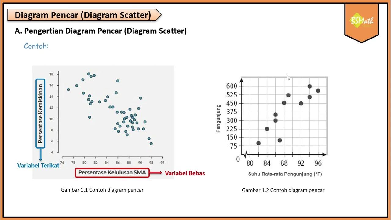
- 😀 The video discusses how to draw and analyze scatter plots, focusing on the correlation between time spent on social media and reading books.
- 😀 To create a scatter plot, first identify the independent (X) and dependent (Y) variables, ensuring correct placement on the axes.
- 😀 The independent variable (X) represents the time spent on social media, while the dependent variable (Y) represents the time spent reading books.
- 😀 The second step involves setting up the horizontal (X) and vertical (Y) axes, with proper labeling and scaling.
- 😀 The scale for both axes should be evenly divided to represent the data points accurately.
- 😀 After defining the scales, mark the data points on the scatter plot based on the pairs of values provided in the dataset.
- 😀 It’s essential to correctly plot the data points to create an accurate visual representation of the correlation.
- 😀 Once the scatter plot is drawn, analyze the trend of the data by looking at the pattern of the points and drawing a line to assess its shape.
- 😀 A linear trend indicates a positive or negative correlation, depending on whether the line ascends or descends from left to right.
- 😀 In this case, a negative correlation is observed, meaning that as time on social media increases, the time spent reading books decreases.
- 😀 The video emphasizes the importance of distinguishing between independent and dependent variables, as this impacts the entire analysis, including trends, correlations, and interpretations.
Q & A
What is the main topic of the video?
-The video discusses how to create and analyze a scatter plot, focusing on the relationship between the time spent on social media and reading books.
What are the key steps in drawing a scatter plot as described in the video?
-The key steps include: 1) Identifying the independent (x-axis) and dependent (y-axis) variables, 2) Setting up the axes with appropriate scales, 3) Plotting data points based on the coordinates, and 4) Analyzing the trend, correlation, and interpretation.
How does the video suggest determining which variable is independent and which is dependent?
-The video suggests determining the independent variable (x-axis) as the one that influences the other. In this case, the time spent on social media is the independent variable, as it is believed to affect the time spent reading books.
What does the video emphasize about choosing the correct scale for the axes?
-The video emphasizes that the scale should be consistent and should include the minimum and maximum values from the data. It advises taking a few values below the smallest and above the largest data points to ensure that the scatter plot represents all data points properly.
What is the purpose of analyzing the trend of data points in a scatter plot?
-Analyzing the trend helps determine the pattern or relationship between the variables. It shows whether the data follows a linear, curvilinear, or no clear trend, which is essential for understanding the nature of the correlation between the variables.
How is the correlation between the two variables determined?
-The correlation is determined by observing the direction of the trend line. If the line slopes downward from left to right, the correlation is negative, meaning as one variable increases, the other decreases. If the line slopes upward, the correlation is positive.
What conclusion can be drawn from the scatter plot in the video regarding social media usage and book reading?
-The scatter plot shows a negative correlation, meaning that as time spent on social media increases, the time spent reading books tends to decrease. This suggests that excessive time on social media may reduce the time available for reading books.
What does the video say about the shape of the data distribution in the scatter plot?
-The video explains that the data distribution appears to form or approach a straight line, which indicates a linear trend between the two variables.
What is the difference between positive and negative correlations in a scatter plot?
-A positive correlation occurs when both variables increase together, meaning as one variable goes up, the other does as well. A negative correlation occurs when one variable increases while the other decreases, as shown in the example where time on social media increases and reading time decreases.
What insight does the video provide regarding the impact of social media on book reading?
-The video suggests that the more time people spend on social media, the less time they tend to spend on reading books. This highlights the potential negative impact of excessive social media use on other activities like reading.
Outlines

This section is available to paid users only. Please upgrade to access this part.
Upgrade NowMindmap

This section is available to paid users only. Please upgrade to access this part.
Upgrade NowKeywords

This section is available to paid users only. Please upgrade to access this part.
Upgrade NowHighlights

This section is available to paid users only. Please upgrade to access this part.
Upgrade NowTranscripts

This section is available to paid users only. Please upgrade to access this part.
Upgrade NowBrowse More Related Video

Menggambar Diagram Pencar Secara Manual - Matematika Wajib SMA Kelas XI Kurikulum Merdeka
Pengertian Diagram Pencar - Matematika Wajib SMA Kelas XI Kurikulum Merdeka

Latihan Soal Diagram Pencar

EDA - Part 02 - Final Chapter
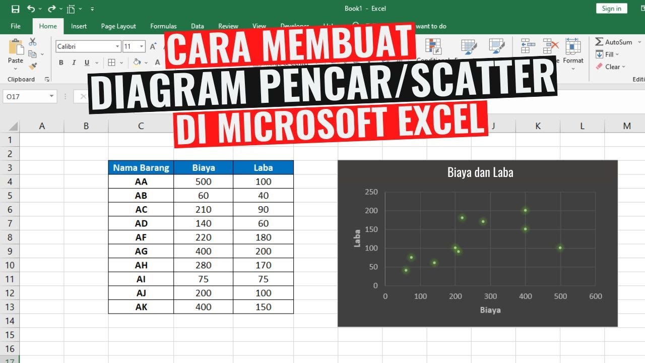
Cara Membuat Diagram Pencar atau Scatter di Excel
Reading Graphs (Simplifying Math)
5.0 / 5 (0 votes)