UX Revolution with Visual Level PAGINATION in Power BI
Summary
TLDRThis Power BI tutorial demonstrates how to create dynamic pagination in reports, allowing users to control the number of items per page or opt for a scrolling experience. It covers setting up a page filter, adjusting slicer visuals, and handling user input for displaying various numbers of items per page. The speaker explains how to enable both pagination and scrolling functionalities while ensuring a smooth user experience. The video invites viewers to join a Power BI design transformation program for further learning and explores additional Power BI tips in other tutorials.
Takeaways
- 😀 The script demonstrates how to use Power BI's page filter to manage the number of items displayed on a page.
- 😀 Pagination is useful for organizing large datasets into smaller, more manageable pages for better navigation.
- 😀 The filter can be adjusted to show different numbers of items per page (e.g., 1, 10, 25 items), allowing for flexible viewing.
- 😀 The slicer width can be adjusted to enhance the appearance and make the interface more user-friendly.
- 😀 If a user inputs a very low number (e.g., 3 items), it results in many pages, which requires proper pagination settings.
- 😀 You can use pagination to create a clean and organized layout while maintaining functionality for large datasets.
- 😀 For those who prefer a scrollable interface, increasing the number of items per page eliminates pagination and offers a continuous scroll bar.
- 😀 Power BI allows for user customization in report navigation, giving users control over how they view their data.
- 😀 To ensure the scroll bar appears, the numeric range setting must be adjusted to allow larger values like 100 items per page.
- 😀 The presenter invites feedback and engagement from viewers, encouraging them to share comments and questions for further learning.
- 😀 The tutorial promotes an upcoming Power BI program aimed at teaching a structured approach to developing and implementing Power BI reports.
Q & A
What is the main topic discussed in the tutorial?
-The tutorial focuses on how to implement pagination and scroll functionality in Power BI reports, allowing users to control the number of items displayed per page or enabling a continuous scroll bar.
How does the page filter work in the context of pagination?
-The page filter is applied to control how many items appear on each page of the report. By setting the filter to a specific number (e.g., 10), it divides the data into pages, allowing users to navigate between different pages of the report.
What happens when the user selects a very low number of items per page?
-If the user selects a low number of items per page, more pages will be created, potentially leading to many pages and the need for users to navigate through them to see all the data.
How can users switch between pagination and a scroll bar?
-Users can switch between pagination and the scroll bar by adjusting the number of items per page. For example, selecting a large number of items (e.g., 50 or 100) results in a single-page view with a scroll bar, while selecting smaller numbers enables pagination.
What adjustments are needed to allow the scroll bar when a large number of items are shown?
-To enable the scroll bar, the number of items per page must be set to a high value (e.g., 50 or 100), which leads to a single page being displayed and the ability to scroll through all items.
Why does the pagination not work as expected when a very high number of items is selected?
-The pagination may not work properly if the numeric range parameter is not adjusted to match the number of items selected. For instance, if the limit is set to 50 but the user selects 100 items, the pagination may not display the expected results.
What change is needed to fix the pagination issue when selecting 100 items per page?
-To fix the issue, the numeric range parameter in the data model needs to be updated from 50 to 100. This change ensures that all 100 items are displayed in a single page with a scroll bar.
How can the width of the page slice be adjusted for a better user interface?
-The width of the page slice can be adjusted by reducing its size to make it more visually appealing and user-friendly. This helps improve the layout and ensures it fits well within the report's design.
What is the benefit of allowing users to choose between pagination and a scroll bar?
-Allowing users to choose between pagination and a scroll bar provides flexibility in how they interact with the report. Some users prefer to scroll through all items, while others prefer to navigate through pages for a more organized view.
What is the Power BI design transformation program mentioned in the tutorial?
-The Power BI design transformation program is an upcoming course where the speaker will teach a structured process for developing and implementing Power BI reports effectively. The program aims to help users build successful reports every time.
Outlines

このセクションは有料ユーザー限定です。 アクセスするには、アップグレードをお願いします。
今すぐアップグレードMindmap

このセクションは有料ユーザー限定です。 アクセスするには、アップグレードをお願いします。
今すぐアップグレードKeywords

このセクションは有料ユーザー限定です。 アクセスするには、アップグレードをお願いします。
今すぐアップグレードHighlights

このセクションは有料ユーザー限定です。 アクセスするには、アップグレードをお願いします。
今すぐアップグレードTranscripts

このセクションは有料ユーザー限定です。 アクセスするには、アップグレードをお願いします。
今すぐアップグレード関連動画をさらに表示
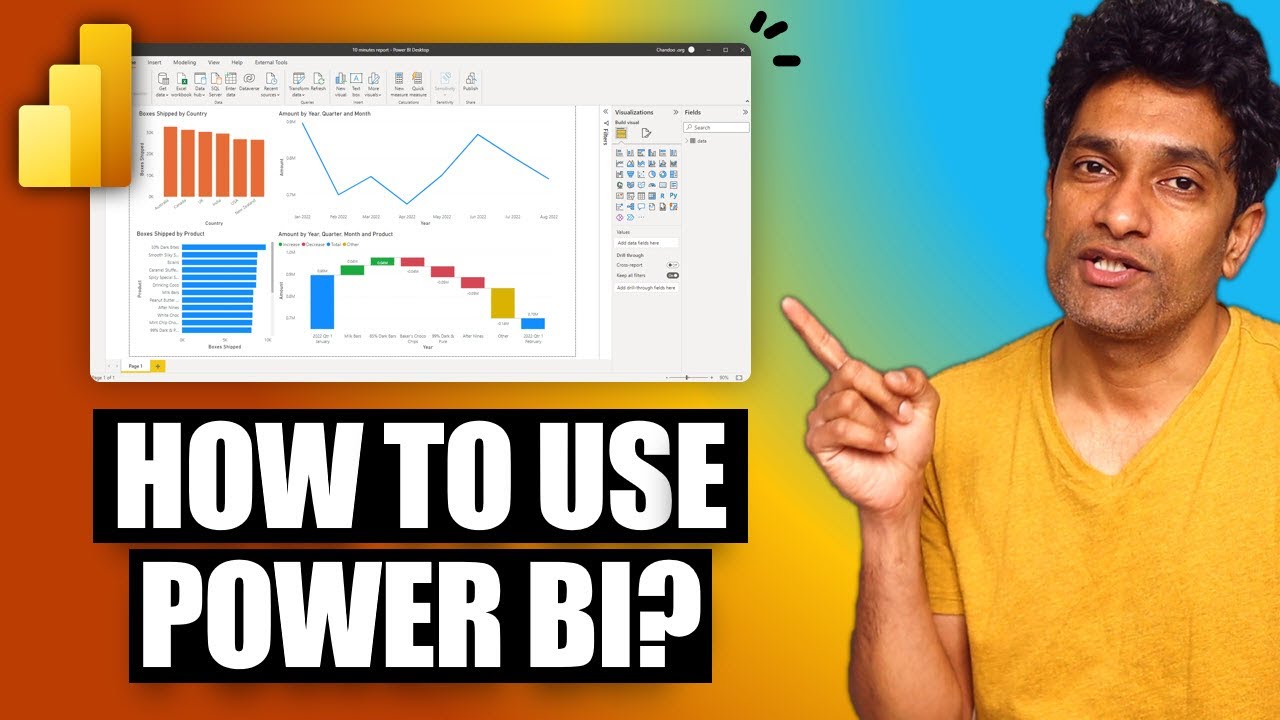
Your first 10 minutes of Power BI - A no-nonsense getting started tutorial for beginners
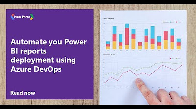
Automate you Power BI reports deployment using Azure DevOps

Power BI Tutorial For Beginners | Create Your First Dashboard Now (Practice Files included)

Tutorial HTML Pemula: Buat Link yang Menghubungkan ke Bagian yang Sama dalam Halaman
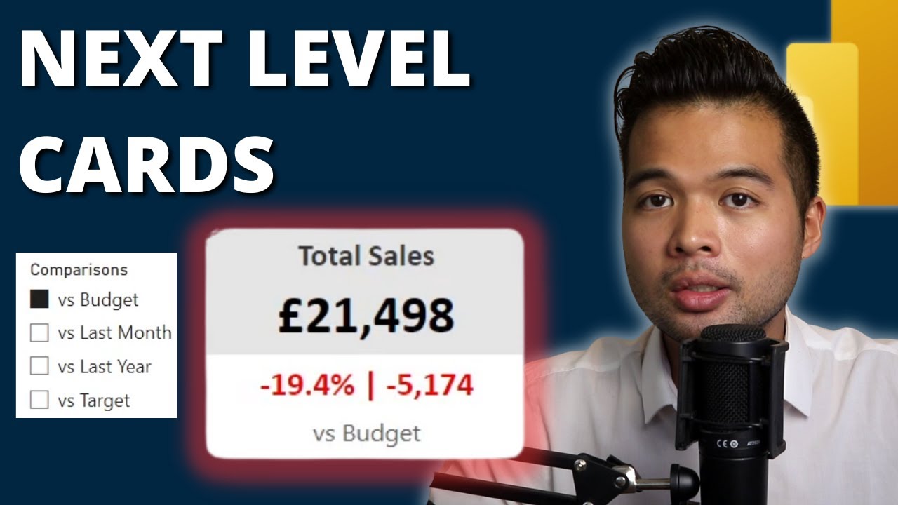
NEXT LEVEL KPI CARD using NO CUSTOM VISUALS // Power BI Tips and Tricks in 2023

Filter your data on last 30/60/90 days using this trick! // Beginners Guide to Power BI in 2021
5.0 / 5 (0 votes)
