Membuat Ogive Positif dan Ogive Negarif dari Tabel Distribusi Frekuensi
Summary
TLDRIn this tutorial, the speaker explains how to create both positive and negative ogives from a frequency table. The process begins with calculating cumulative frequencies, both 'less than' and 'more than' types. The speaker walks through determining class boundaries, followed by plotting the data to create ogives. The positive ogive is drawn by connecting cumulative frequencies 'less than' with class boundaries, while the negative ogive connects 'more than' frequencies. The tutorial provides clear, step-by-step instructions, making it easy to understand and apply these techniques for statistical graphing.
Takeaways
- 😀 The video explains how to create positive and negative ogives from a frequency table.
- 😀 The first step is to calculate cumulative frequencies, both 'less than' and 'more than'.
- 😀 For cumulative 'less than' frequencies, start from the smallest value and add frequencies sequentially.
- 😀 For cumulative 'more than' frequencies, start from the largest value and add frequencies in reverse order.
- 😀 Adjust the class boundaries by subtracting or adding 0.5 to create proper intervals for plotting.
- 😀 Plot the cumulative frequencies on a graph to represent the data visually.
- 😀 Connect the plotted points to form the positive ogive curve, moving from left to right.
- 😀 Connect the plotted points to form the negative ogive curve, moving from right to left.
- 😀 Positive and negative ogives can be displayed together on the same graph or separately.
- 😀 The video emphasizes that creating ogives is straightforward once cumulative frequencies and class boundaries are correctly determined.
Q & A
What is the first step in creating a frequency table for plotting ogives?
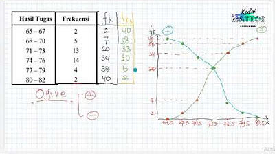
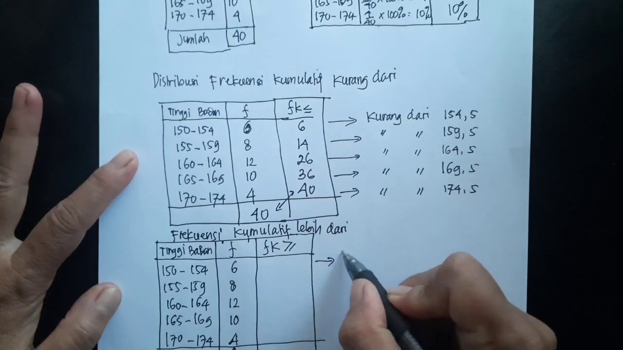
-The first step is to determine the cumulative frequencies, both 'less than' and 'more than'. This is done by progressively adding the frequencies of each class interval to the cumulative total.
How do you calculate the cumulative frequency less than (CFL)?
-To calculate the cumulative frequency less than (CFL), start with the first frequency, then add each subsequent class frequency to the previous cumulative total. For example, if the first frequency is 4 and the second is 9, the CFL for the second class would be 13.
What is the method to calculate the cumulative frequency more than (CFM)?
-The cumulative frequency more than (CFM) is calculated by starting from the highest frequency and adding the frequencies in reverse order. For instance, if the last frequency is 12, the next value would be 12 + 9 = 21.
Why do we calculate boundary values for the class intervals?
-Boundary values are calculated to avoid overlap between class intervals and to accurately represent the data on a graph. This is done by subtracting 0.5 from the lower limit and adding 0.5 to the upper limit.
What is the purpose of plotting the positive ogive?
-The positive ogive is used to visually represent the cumulative frequency less than values, showing how the frequency accumulates as you move from lower to higher class intervals.
How do you construct the positive ogive on a graph?
-To construct the positive ogive, plot the cumulative frequency less than (CFL) against the upper boundary of each class interval. After plotting these points, connect them with a line to form the curve.
How do you construct the negative ogive?
-To construct the negative ogive, plot the cumulative frequency more than (CFM) against the lower boundary of each class interval. After plotting the points, connect them with a line to form the decreasing curve.
What is the significance of the intersection of the positive and negative ogives?
-The intersection of the positive and negative ogives typically represents the median of the data. This point indicates where the cumulative frequencies from both sides meet.
Can the positive and negative ogives be plotted together on the same graph?
-Yes, the positive and negative ogives can be plotted on the same graph for comparison. This allows a visual analysis of the cumulative frequency data from both perspectives.
How do we interpret the data after plotting the ogives?
-After plotting the ogives, we can interpret various statistical measures such as the median, distribution shape, and frequency trends. The ogives help visualize how the data accumulates and can highlight key statistical insights.
Outlines

このセクションは有料ユーザー限定です。 アクセスするには、アップグレードをお願いします。
今すぐアップグレードMindmap

このセクションは有料ユーザー限定です。 アクセスするには、アップグレードをお願いします。
今すぐアップグレードKeywords

このセクションは有料ユーザー限定です。 アクセスするには、アップグレードをお願いします。
今すぐアップグレードHighlights

このセクションは有料ユーザー限定です。 アクセスするには、アップグレードをお願いします。
今すぐアップグレードTranscripts

このセクションは有料ユーザー限定です。 アクセスするには、アップグレードをお願いします。
今すぐアップグレード関連動画をさらに表示
Statistika Deskriptif (Bag 1): Cara Membuat dan Membaca OGIVE
FREKUENSI RELATIF DAN FREKUENSI KUMULATIF, HISTOGRAM, DAN POLIGON
Statistika - Penyajian Data ( Histogram, Poligon & Ogive )
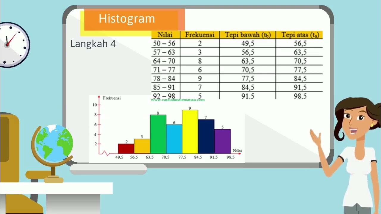
HISTOGRAM
VIDEO ANIMASI MATEMATIKA MATERI PENYAJIAN DATA KELAS 10
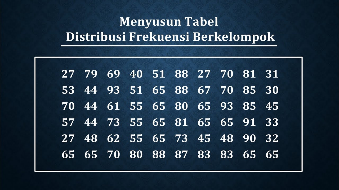
Cara menyusun tabel distribusi frekuensi berkelompok
5.0 / 5 (0 votes)
