FREKUENSI RELATIF DAN FREKUENSI KUMULATIF, HISTOGRAM, DAN POLIGON
Summary
TLDRThis video script provides a thorough introduction to calculating relative frequency and cumulative frequency using a dataset of student heights. It explains the process of determining relative frequency as a percentage of the total, as well as cumulative frequency in both less-than and more-than formats. The script also covers the creation of histograms and polygons, including cumulative frequency polygons (ogives). Key points include visualizing the data through both positive and negative ogives, making the concepts of frequency distributions accessible and clear for students. It’s a comprehensive guide to interpreting and visualizing frequency data.
Takeaways
- 😀 Frequency distribution tables are essential for organizing data into intervals for analysis.
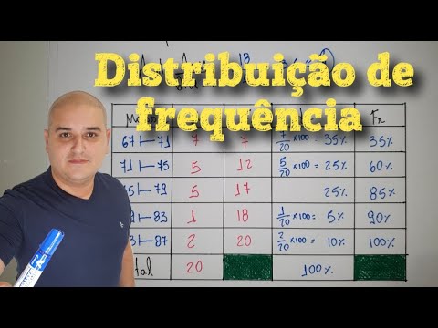
- 😀 Relative frequency is calculated by dividing the frequency of each class by the total number of data points and multiplying by 100 to get percentages.
- 😀 Cumulative frequency accumulates the frequencies of intervals, and can be represented as 'less than' or 'more than' types.
- 😀 'Less than' cumulative frequency shows the accumulation of frequencies up to and including a specific class interval.
- 😀 'More than' cumulative frequency represents the accumulation of frequencies greater than a specific class interval.
- 😀 The total of all frequencies in the distribution should always equal the total number of data points (e.g., 40 in this case).
- 😀 A histogram visually represents the frequency distribution, where the height of each bar corresponds to the frequency of a given interval.
- 😀 A polygon connects the midpoints of the bars in a histogram to show trends in the data distribution.
- 😀 The **Ogive Positive** curve represents the cumulative frequency less than a certain value and always rises.
- 😀 The **Ogive Negative** curve represents the cumulative frequency more than a certain value and typically falls.
- 😀 Creating and analyzing histograms, polygons, and Ogive curves helps in understanding how data is distributed and aids in making predictions or drawing conclusions.
Q & A
What is the purpose of calculating relative frequency in this context?
-Relative frequency helps to determine the proportion of occurrences of each data range compared to the total number of data points, expressed as a percentage.
How do you calculate the relative frequency for a given class interval?
-The relative frequency is calculated by dividing the frequency of a class interval by the total number of data points, then multiplying by 100 to express it as a percentage.
What is cumulative frequency and how is it different from regular frequency?
-Cumulative frequency is the running total of the frequencies, which adds up all previous frequencies. It differs from regular frequency, which only counts occurrences within a single class interval.
What does the 'less than' cumulative frequency represent?
-The 'less than' cumulative frequency represents the total number of data points that are less than or equal to the upper boundary of each class interval.
How is the 'more than' cumulative frequency calculated?
-The 'more than' cumulative frequency is calculated by starting from the total number of data points and subtracting the cumulative frequency for each class interval as you move through the data.
What is the purpose of a histogram in frequency distribution?
-A histogram is used to visually represent the frequency distribution of data, where the height of each bar corresponds to the frequency of data points in each class interval.
How does a polygon differ from a histogram in representing frequency data?
-A polygon connects the midpoints of the tops of the bars in a histogram with a line, providing a smoother visualization of the data distribution, while a histogram uses bars to represent frequencies.
What is an Ogive curve and what does it represent?
-An Ogive curve is a graph that represents cumulative frequencies. The 'less than' Ogive shows increasing cumulative frequencies, while the 'more than' Ogive shows decreasing cumulative frequencies.
What does an 'Ogive positive' curve look like and when is it used?
-An 'Ogive positive' curve is an upward-sloping line, representing cumulative frequencies 'less than' a given value. It is used to show how data accumulates up to a certain point.
What does an 'Ogive negative' curve represent?
-An 'Ogive negative' curve is a downward-sloping line, representing cumulative frequencies 'more than' a given value. It shows how data decreases as you move through the class intervals.
Outlines

This section is available to paid users only. Please upgrade to access this part.
Upgrade NowMindmap

This section is available to paid users only. Please upgrade to access this part.
Upgrade NowKeywords

This section is available to paid users only. Please upgrade to access this part.
Upgrade NowHighlights

This section is available to paid users only. Please upgrade to access this part.
Upgrade NowTranscripts

This section is available to paid users only. Please upgrade to access this part.
Upgrade NowBrowse More Related Video
Distribuição de frequência com classes

Representações Gráficas I | Estatística Básica 03
Statistik : Penyajian Data - Part 4

TABEL DISTRIBUSI FREKUENSI KUMULATIF DAN RELATIF
Statistika 05 | Distribusi Frekuensi dalam Statistika | Frequency Distribution | Belajar Statistika

DISTRIBUIÇÃO DE FREQUÊNCIA ✅ ESTATÍSTICA
5.0 / 5 (0 votes)