VIDEO ANIMASI MATEMATIKA MATERI PENYAJIAN DATA KELAS 10
Summary
TLDRIn this morning meeting, the focus is on statistical data presentation methods: histograms, frequency polygons, and ogives. The lesson covers key techniques for presenting data, starting with creating a frequency distribution table, calculating limits, and constructing visual representations. Students are taught to draw histograms, find midpoints for frequency polygons, and calculate cumulative frequencies for ogives. The goal is to ensure students can effectively use these methods to analyze and present data, with practice questions included to reinforce learning and comprehension.
Takeaways
- 😀 The meeting focuses on teaching statistical methods for data presentation, specifically histograms, frequency polygons, and ogives.
- 😀 Students are expected to listen carefully and record notes in their notebooks for later review and a quiz.
- 😀 The first learning objective is for students to present data using histograms effectively.
- 😀 The second objective is to present data using frequency polygons, ensuring accuracy and clarity.
- 😀 The third objective is to present data using ogives, with a focus on cumulative frequencies.
- 😀 The final objective involves solving problems related to histograms, frequency polygons, and ogives.
- 😀 Studying this material helps in understanding and visualizing a group of data more easily.
- 😀 Learning these methods enables the analysis of data trends, such as the ups and downs of data development.
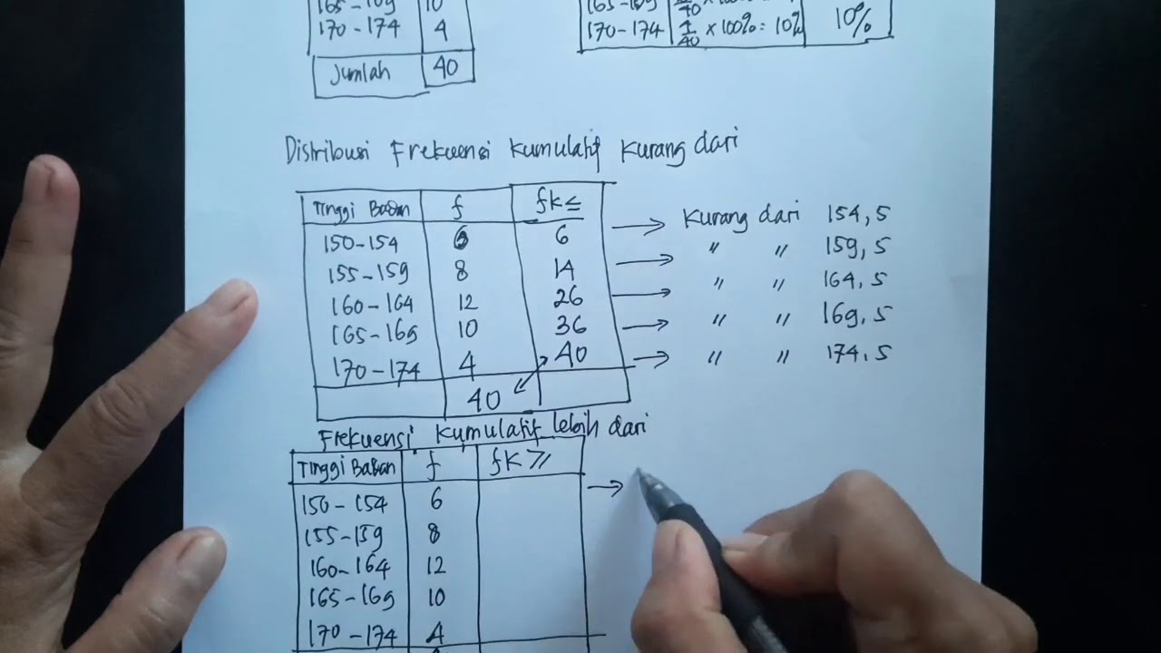
- 😀 To create a histogram, start by forming a frequency distribution table and adjusting class intervals by 0.5.
- 😀 The frequency polygon is created by determining midpoints of class intervals and connecting adjacent points on a graph.
- 😀 To create an ogive, calculate cumulative frequencies (both less than and more than) and plot them on a graph for better understanding.
Q & A
What is the main objective of the lesson discussed in the script?
-The main objective is to help students learn how to present data using histograms, frequency polygons, and ogives, and to solve related problems.
What should students do during the lesson to prepare for the quiz?
-Students should listen carefully, record the material in their notebooks, and ensure their books are ready for the teacher to check at the end of the lesson.
What are the benefits of studying data presentation techniques?
-Studying data presentation techniques makes it easier to understand and visualize a group of data, and helps analyze the ups and downs in data development.
What is the first step in presenting data as a histogram?
-The first step is to present the data in the form of a frequency distribution table.
How do you determine the lower and upper edges when preparing data for a histogram?
-The lower edge is determined by subtracting 0.5 from the lower limit, and the upper edge is determined by adding 0.5 to the upper limit.
What is the purpose of the horizontal and vertical axes in a histogram?
-The horizontal axis represents the class intervals (or values), while the vertical axis represents the frequency of the data.
How is a frequency polygon different from a histogram?
-A frequency polygon is created by plotting the midpoints of each class interval on the horizontal axis and connecting adjacent points, while a histogram uses rectangles to represent frequencies for each class interval.
What is the key step in creating a frequency polygon?
-The key step is to determine the midpoint of each class interval, then connect the adjacent points on the graph.
What are the two types of cumulative frequencies used in an ogive?
-The two types of cumulative frequencies used in an ogive are cumulative frequency less than (using the upper limit) and cumulative frequency more than (using the lower limit).
What is the final step in creating an ogive graph?
-The final step is to plot the cumulative frequencies on a graph, with the horizontal axis for values and the vertical axis for frequencies.
Outlines

This section is available to paid users only. Please upgrade to access this part.
Upgrade NowMindmap

This section is available to paid users only. Please upgrade to access this part.
Upgrade NowKeywords

This section is available to paid users only. Please upgrade to access this part.
Upgrade NowHighlights

This section is available to paid users only. Please upgrade to access this part.
Upgrade NowTranscripts

This section is available to paid users only. Please upgrade to access this part.
Upgrade NowBrowse More Related Video
Statistika - Penyajian Data ( Histogram, Poligon & Ogive )
FREKUENSI RELATIF DAN FREKUENSI KUMULATIF, HISTOGRAM, DAN POLIGON
Statistik : Penyajian Data - Part 1
4.2 | DATA COLLECTION & PRESENTATION | DATA MANAGEMENT | MATHEMATICS IN THE MODERN WORLD | ALOPOGS
Distribusi Frekuensi: Definisi, Fungsi, dan Jenis-Jenisnya

Statistik : Penyajian Data - Part 5
5.0 / 5 (0 votes)