StatQuest: PCA main ideas in only 5 minutes!!!
Summary
TLDRIn this engaging video, Josh Stommer introduces Principal Component Analysis (PCA), a powerful technique for simplifying complex data by reducing dimensions. He explains how PCA reveals correlations among data points—such as gene expression levels in cells—by clustering similar data together in a 2D plot. The importance of each axis is highlighted, showing how the first principal component captures the most variance. Josh also mentions other dimensionality reduction methods, encouraging viewers to explore further resources for a deeper understanding of PCA and related techniques.
Takeaways
- 😀 PCA helps visualize relationships between different types of cells based on gene expression.
- 😀 The analysis can be applied to various subjects, not just biology; examples include people, cars, or cities.
- 😀 Sequencing messenger RNA allows for identifying active genes in cells, indicating their function.
- 😀 Correlations between cells can be visualized through scatter plots, illustrating similarities or differences.
- 😀 PCA condenses complex, multidimensional data into a simpler 2D graph for easier interpretation.
- 😀 Clusters of highly correlated cells can be color-coded in PCA plots to enhance visibility.
- 😀 The first principal component (PC1) is the most important axis in PCA, indicating the greatest variation.
- 😀 Distance between clusters in a PCA plot reflects the degree of difference between the groups.
- 😀 PCA is just one method for dimensionality reduction; other techniques include heat maps and t-SNE plots.
- 😀 For more detailed explanations of PCA, viewers can refer to previous StatQuest videos.
Q & A
What is the main purpose of Principal Component Analysis (PCA)?
-PCA is used to reduce the dimensionality of data while preserving as much variance as possible, making it easier to visualize and interpret complex datasets.
How does PCA help in identifying differences among similar items?
-PCA analyzes the correlations among variables in the data, allowing it to cluster similar items together based on their characteristics, even when these differences aren't immediately observable.
What kind of data does Josh Stommer use as an example in the video?
-He uses gene expression data from cells, demonstrating how different genes are transcribed in various cells to highlight similarities and differences.
Why is plotting all cells on traditional graphs impractical?
-As the number of items increases, traditional plots become cluttered and difficult to interpret, which makes PCA a more efficient option for visualization.
What does it mean when cells are positively correlated in PCA?
-When cells are positively correlated, it suggests they are behaving similarly, using similar genes or processes.
How are the axes of a PCA plot structured?
-The axes in a PCA plot are ranked by importance, with the first principal component capturing the most significant variance in the data, followed by subsequent components.
What visual aids does Stommer suggest to enhance the interpretation of PCA results?
-He recommends using color-coding to distinguish between different clusters of data points in the PCA plot.
What are some alternative methods to PCA mentioned in the video?
-Stommer mentions methods like heat maps, t-SNE plots, and multidimensional scaling as other techniques for dimensionality reduction.
What should viewers do if they find the concept of dimension reduction confusing?
-Stommer encourages viewers to check out his original stat quest on PCA, which explains the concept more slowly and clearly.
What does Stommer invite viewers to do at the end of the video?
-He invites viewers to subscribe for more content and to share ideas for additional topics they would like him to cover in future stat quests.
Outlines

このセクションは有料ユーザー限定です。 アクセスするには、アップグレードをお願いします。
今すぐアップグレードMindmap

このセクションは有料ユーザー限定です。 アクセスするには、アップグレードをお願いします。
今すぐアップグレードKeywords

このセクションは有料ユーザー限定です。 アクセスするには、アップグレードをお願いします。
今すぐアップグレードHighlights

このセクションは有料ユーザー限定です。 アクセスするには、アップグレードをお願いします。
今すぐアップグレードTranscripts

このセクションは有料ユーザー限定です。 アクセスするには、アップグレードをお願いします。
今すぐアップグレード関連動画をさらに表示

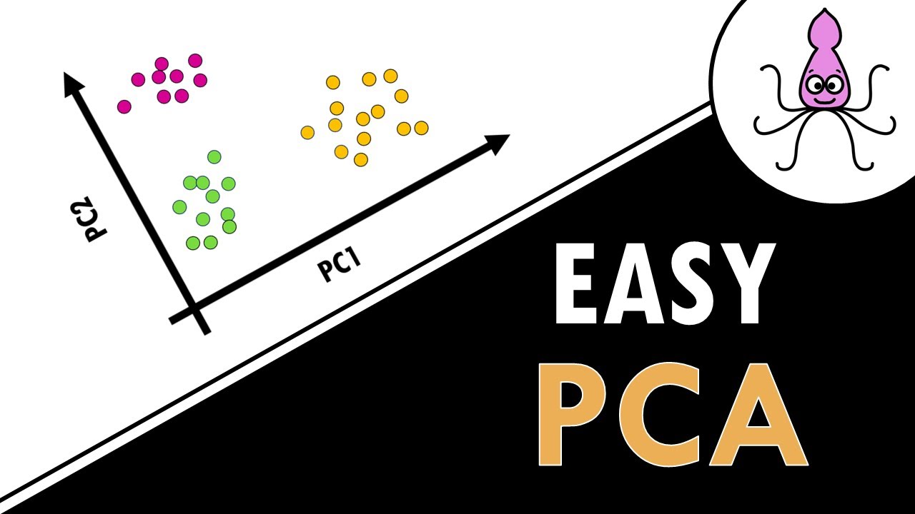
Lec-46: Principal Component Analysis (PCA) Explained | Machine Learning

Principal Component Analysis (PCA) - easy and practical explanation

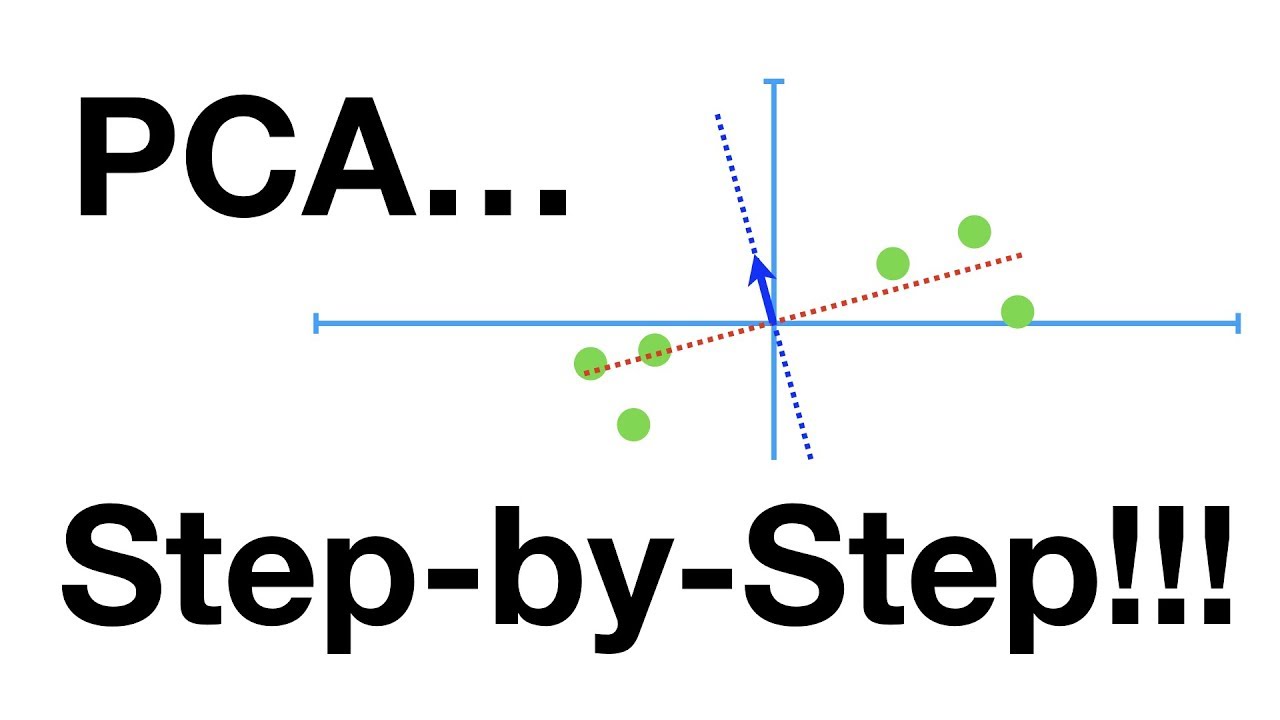
StatQuest: Principal Component Analysis (PCA), Step-by-Step

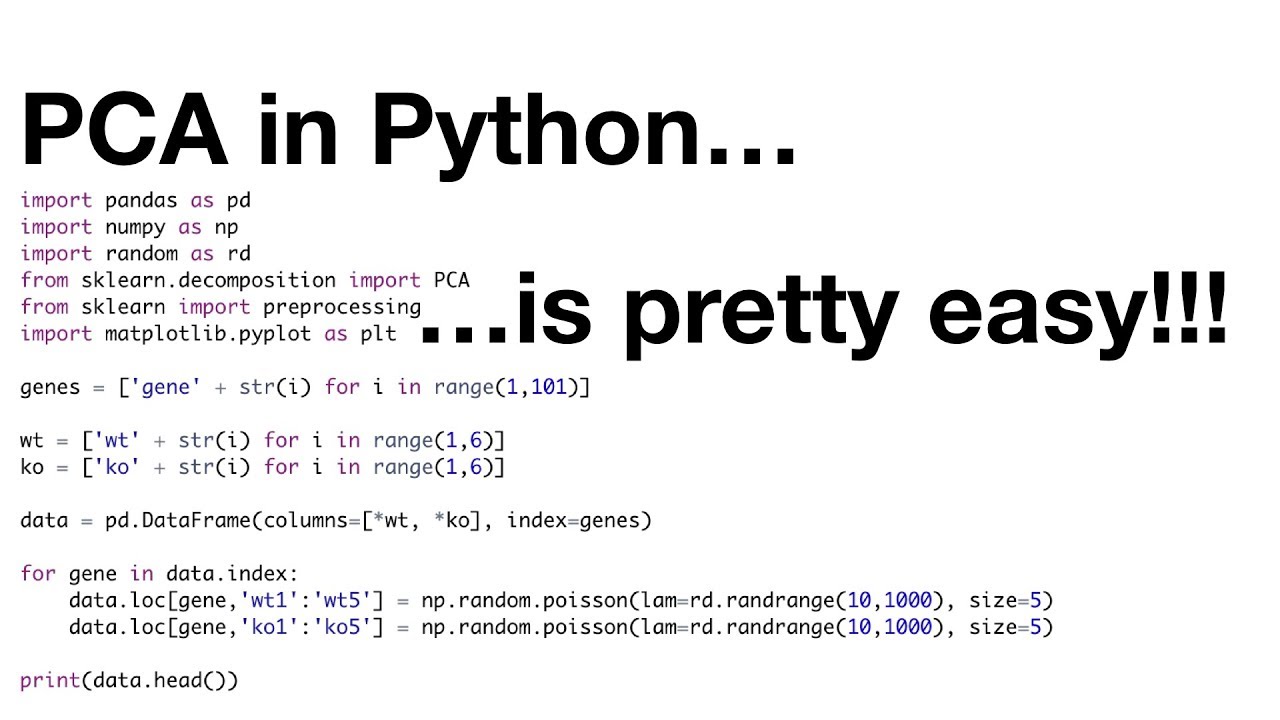
StatQuest: PCA in Python

PCA Algorithm | Principal Component Analysis Algorithm | PCA in Machine Learning by Mahesh Huddar

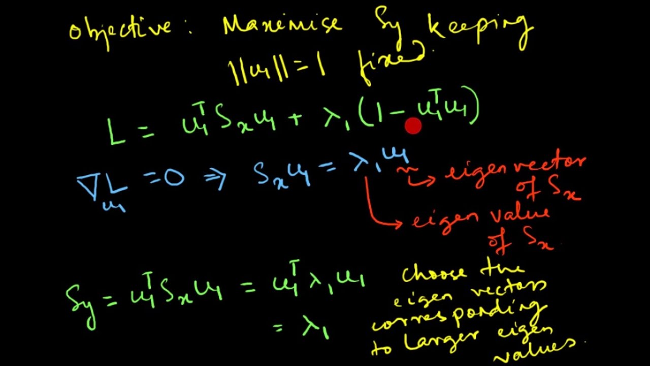
Principal Component Analysis (PCA) : Mathematical Derivation
5.0 / 5 (0 votes)
