Grouped Mean, Quartile, Decile, Percentile, and Percentile Rank Using MS Excel. Statistics
Summary
TLDRThe video provides a comprehensive tutorial on calculating key statistical measures from a dataset, including the first quartile, second quartile, eighth decile, and the 44th percentile. It explains the necessary formulas, such as the quartile and percentile formulas, and demonstrates how to derive cumulative frequencies, class intervals, and the corresponding statistical values using Excel. The presentation highlights practical applications of these calculations, ensuring viewers understand how to interpret and manipulate data effectively for analysis.
Takeaways
- 😀 The video outlines the process of calculating various statistical measures such as quartiles, deciles, and percentiles from a dataset.
- 📊 A total of 150 observations were analyzed, with a maximum value of 150 and a minimum value of 120, resulting in a range of 30.
- 🔢 The first quartile (Q1) was calculated to be 77.5, indicating that 25% of the data falls below this value.
- 📈 The second quartile (Q2), also known as the median, was determined to be 107.85, with 50% of the data below this point.
- 📉 The third quartile (Q3) was found to be 136.10, signifying that 75% of the observations are less than this value.
- 🔟 The eighth decile (D8) was calculated as 143.6, representing the value below which 80% of the data falls.
- 📍 The 44th percentile (P44) was determined to be 99.38, indicating that 44% of the data is below this value.
- 📊 Statistical calculations utilized formulas that incorporate lower class boundaries, cumulative frequency, and frequency distribution.
- ⚖️ The formula for percentiles is similar to that of quartiles, adapting for the specific percentile being calculated.
- 📊 A percentile rank for the value 125 was calculated, showing that 65.5% of the data lies below this value, while 34.5% is above.
Q & A
What are the key statistical values being computed in the video?
-The video computes the group mean, first quartile, eighth decile, and 44th percentile.
How is the maximum value determined from the data?
-The maximum value is determined to be 150 based on the raw data grid provided.
What formula is used to calculate the range of the data?
-The range is calculated by subtracting the minimum value from the maximum value.
What does 'K' represent in the calculations?
-In the calculations, 'K' represents the number of partitions or intervals being used to divide the data.
How is the first quartile (Q1) calculated in the script?
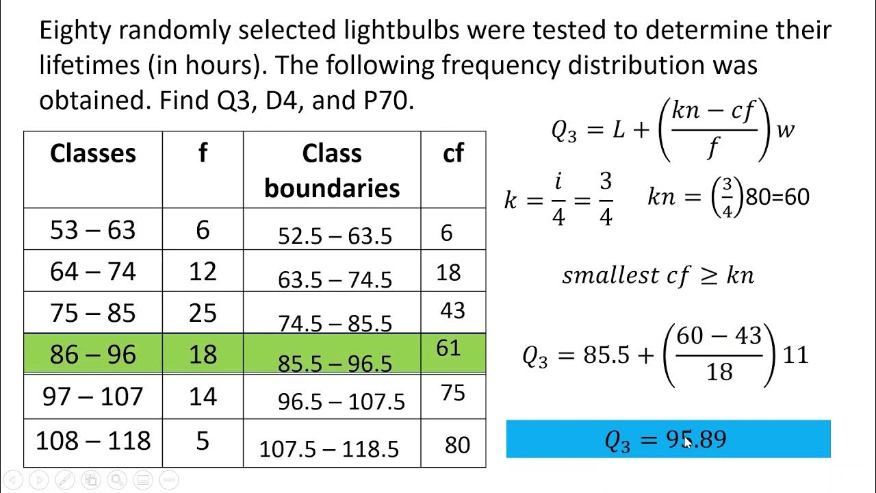
-The first quartile is calculated using the formula Q1 = L + (n/4 - CF) / f * I, where L is the lower class boundary, n is the total number of observations, CF is the cumulative frequency, f is the frequency of the quartile class, and I is the class width.
What is the significance of the cumulative frequency in the context of quartiles?
-Cumulative frequency helps identify how many observations fall below a certain class boundary, which is essential for calculating quartiles.
What value did the script compute for the eighth decile?
-The script computes the eighth decile (D8) to be 143.6.
What is the formula used to find the 44th percentile?
-The formula for the 44th percentile is similar to that of quartiles: P = L + (k*n/100 - CF) / f * I, where P is the percentile, L is the lower class boundary, k is the desired percentile rank, n is the total number of observations, CF is the cumulative frequency, f is the frequency of the class, and I is the class width.
What is the final percentile rank computed for the value of 125?
-The final percentile rank for the value of 125 is computed to be 65.5%, indicating that 65.5% of the data falls below this value.
How is the interpretation of results conveyed in the video?
-The interpretation of results is conveyed through calculated values, explaining what these statistics mean in terms of data distribution and ranking.
Outlines

Cette section est réservée aux utilisateurs payants. Améliorez votre compte pour accéder à cette section.
Améliorer maintenantMindmap

Cette section est réservée aux utilisateurs payants. Améliorez votre compte pour accéder à cette section.
Améliorer maintenantKeywords

Cette section est réservée aux utilisateurs payants. Améliorez votre compte pour accéder à cette section.
Améliorer maintenantHighlights

Cette section est réservée aux utilisateurs payants. Améliorez votre compte pour accéder à cette section.
Améliorer maintenantTranscripts

Cette section est réservée aux utilisateurs payants. Améliorez votre compte pour accéder à cette section.
Améliorer maintenantVoir Plus de Vidéos Connexes

How Do I Compare to the Group?

Statistika - Ukuran Letak Data (Kuartil, Desil, Persentil)

MEASURES OF POSITION OF GROUPED DATA | MATHEMATICS IN THE MODERN WORLD

STATISTIKA - Cara mudah menentukan nilai Jangkauan, Jangkauan antarkuartil dan Simpangan kuartil

Quartile, Decile and Percentile for grouped data

Ukuran Penyebaran Data | Statistika Kelas 8
5.0 / 5 (0 votes)
